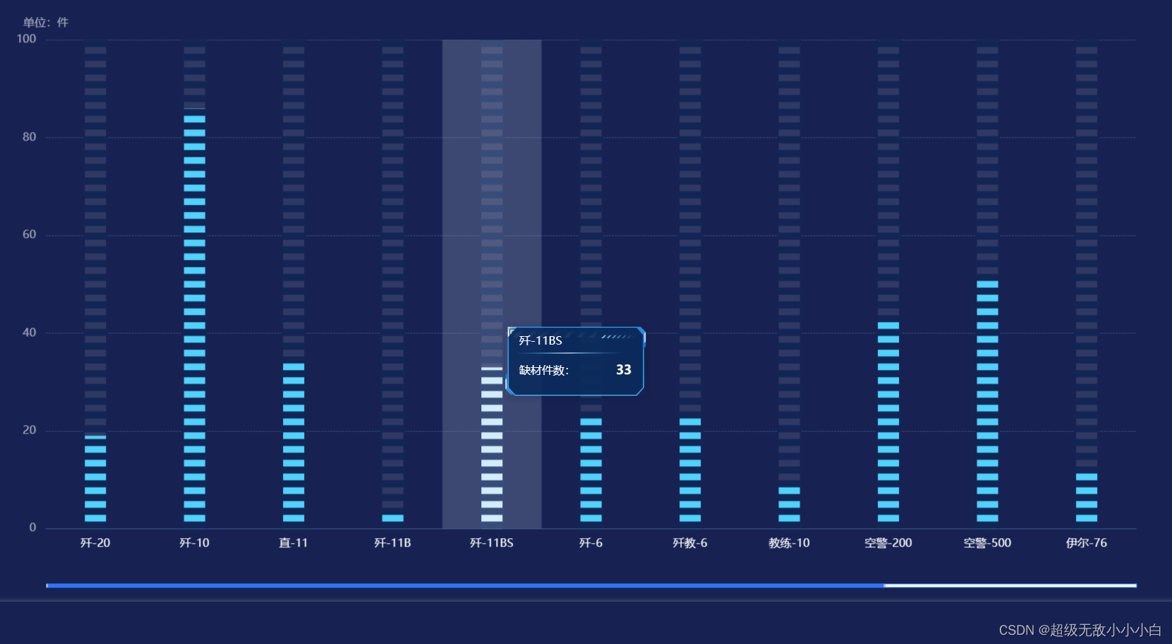
该示例有如下几个特点:
①实现数据过多时滚动展示(echarts 数据过多时展示滚动条-CSDN博客)
②实现tooltip自定义样式(echarts 实现tooltip提示框样式自定义-CSDN博客)
③鼠标放置时柱状图颜色更改
代码如下:
this.options = {animation: true,grid: {top: "8%",bottom: "12%",right: "5%",left: "5%",},tooltip: {trigger: "axis",axisPointer: {type: "shadow",},className: 'custom-tooltip-box',formatter: function(params) {return `<div class='custom-tooltip-style'><span>${params[0].name}</span></br><div class="span"><span>缺材件数:</span><span>${params[0].value}</span></div></div>`},},xAxis: {data: this.xAxisData,axisLine: {show: true, //隐藏X轴轴线lineStyle: {color: "#355d8d", // 坐标轴线线的颜色},},axisTick: {show: false, //隐藏X轴轴线},splitLine: {show: false,},axisLabel: {show: true,margin: 14,fontSize: 16,textStyle: {color: "#fff" //X轴文字颜色}},},yAxis: [{type: "value",name: "单位:件",nameTextStyle: {fontSize: this.handleWidth(16),color: "#FFFFFF99",},gridIndex: 0,// interval: 25,splitLine: {show: true,lineStyle: {color: "#87C2FF66",width: 0.7,type: "dashed"},},axisTick: {show: false,},axisLine: {show: false,},axisLabel: {show: true,margin: 14,fontSize: 16,textStyle: {color: "#FFFFFF99"}}}],series: [{type: 'bar',barWidth: 30,showBackground: true,backgroundStyle: {color: 'rgba(255,255,255,0.1)'},itemStyle: {normal: {color: "#50D5FF"}},lineStyle: {show: true},data: this.echartData,z: 0,zlevel: 0,emphasis:{itemStyle: {color: "#D1F1FF"}}},{type: 'pictorialBar',barWidth: 30,itemStyle: {normal: {color: '#0b2856', //数据的间隔颜色},},symbolRepeat: 'fixed',symbolMargin: 5,symbol: 'rect',symbolSize: [35, 10],symbolPosition: 'end',symbolOffset: [0, 0],data: this.echartData,z: 1,zlevel: 0},],dataZoom: [{// 设置滚动条的隐藏与显示show: this.xAxisData.length > 11 ? true : false,// 设置滚动条类型type: "slider",// 设置背景颜色backgroundColor: "#fff",// 设置选中范围的填充颜色fillerColor: "#027FFF",// 设置边框颜色borderColor: "#027FFF",// 是否显示detail,即拖拽时候显示详细数值信息showDetail: false,// 数据窗口范围的起始数值// startValue: 4,// 数据窗口范围的结束数值(一页显示多少条数据,从0开始)endValue: 10,// empty:当前数据窗口外的数据,被设置为空。// 即不会影响其他轴的数据范围filterMode: "empty",// 设置滚动条宽度,相对于盒子宽度// width: "50%",// 设置滚动条高度height: this.handleWidth(6),bottom: 20,// 设置滚动条显示位置// left: 20,// right: 10, //右边的距离// 是否锁定选择区域(或叫做数据窗口)的大小zoomLoxk: true,// 控制手柄的尺寸// handleSize: 0,// dataZoom-slider组件离容器下侧的距离xAxisIndex: [0],// start: 50,// end: 50,// zoomLock: true, //锁定区域禁止缩放(鼠标滚动会缩放,所以禁止)brushSelect: false, //刷选功能borderRadius: 3,showDataShadow: false, //是否显示数据阴影 默认auto// filterMode: "filter",},{// 没有下面这块的话,只能拖动滚动条,// 鼠标滚轮在区域内不能控制外部滚动条type: "inside",// 滚轮是否触发缩放zoomOnMouseWheel: false,// 鼠标滚轮触发滚动moveOnMouseMove: true,moveOnMouseWheel: true,},],
}
效果图如下:
该示例中的属性可在官网中查阅,若有其他疑问可私信留言互相交流学习~