使用pyecharts绘制柱状图:
from pyecharts.charts import Bar
from pyecharts import options as opts# cities = ['上海', '北京', '广州', '深圳', '杭州', '成都', '苏州', '武汉', '南京', '合肥', '长沙', '全国', '无锡', '天津', '重庆', '西安', '青岛', '佛山', '郑州', '厦门', '济南']
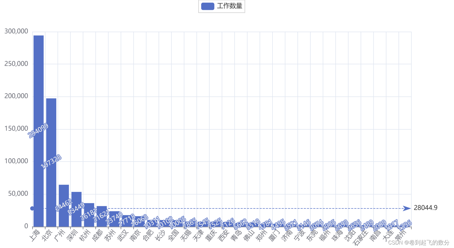
# populations = [294099, 197328, 64462, 53449, 36181, 31621, 23740, 17718, 16068, 10311, 10102, 10005, 7865, 7545, 7525, 7126, 5662, 5518, 4781, 4495, 3521]data = [['上海', 294099],['北京', 197328],['广州', 64462],['深圳', 53449],['杭州', 36181],['成都', 31621],['苏州', 23740],['武汉', 17718],['南京', 16068],['合肥', 10311],['长沙', 10102],['全国', 10005],['无锡', 7865],['天津', 7545],['重庆', 7525],['西安', 7126],['青岛', 5662],['佛山', 5518],['郑州', 4781],['厦门', 4495],['济南', 3521],['宁波', 3146],['东莞', 3074],['福州', 2905],['珠海', 2693],['沈阳', 2656],['石家庄', 2489],['南昌', 2009],['大连', 1917],['常州', 1336]
]
cities = [item[0] for item in data]
populations = [item[1] for item in data]bar = Bar()
bar.add_xaxis(cities)
bar.set_global_opts(xaxis_opts=opts.AxisOpts(axislabel_opts=opts.LabelOpts(rotate=50))
)
bar.add_yaxis("工作数量", populations, markline_opts=opts.MarkLineOpts(data=[opts.MarkLineItem(type_="average", name="平均值")]),label_opts=opts.LabelOpts(rotate=30 # 旋转角度为30度)
)bar.render("bar_with_30.html")
效果展示: