通过页签进行内容视图切换的容器组件,每个页签对应一个内容视图。
说明:
该组件从API Version 7开始支持。后续版本如有新增内容,则采用上角标单独标记该内容的起始版本。
该组件从API Version 11开始默认支持安全区避让特性(默认值为:expandSafeArea([SafeAreaType.SYSTEM], [SafeAreaEdge.BOTTOM])),开发者可以重写该属性覆盖默认行为,API Version 11之前的版本需配合expandSafeArea属性实现安全区避让。
子组件
仅可包含子组件TabContent。
说明:
Tabs子组件的visibility属性设置为None,或者visibility属性设置为Hidden时,对应子组件不显示,但依然会在视窗内占位。
接口
Tabs(value?: {barPosition?: BarPosition, index?: number, controller?: TabsController})
参数:
| 参数名 | 参数类型 | 必填 | 参数描述 |
|---|---|---|---|
| barPosition | BarPosition | 否 | 设置Tabs的页签位置。 默认值:BarPosition.Start |
| index | number | 否 | 设置当前显示页签的索引。 默认值:0 说明: 设置为小于0的值时按默认值显示。 可选值为[0, TabContent子节点数量-1]。 直接修改index跳页时,切换动效不生效。 使用TabController的changeindex时,默认生效切换动效,可以设置animationDuration为0关闭动画。 从API version 10开始,该参数支持$$双向绑定变量。 |
| controller | TabsController | 否 | 设置Tabs控制器。 |
BarPosition枚举说明
| 名称 | 描述 |
|---|---|
| Start | vertical属性方法设置为true时,页签位于容器左侧;vertical属性方法设置为false时,页签位于容器顶部。 |
| End | vertical属性方法设置为true时,页签位于容器右侧;vertical属性方法设置为false时,页签位于容器底部。 |
属性
除支持通用属性外,还支持以下属性:
| 名称 | 参数类型 | 描述 |
|---|---|---|
| vertical | boolean | 设置为false是为横向Tabs,设置为true时为纵向Tabs。 默认值:false |
| scrollable | boolean | 设置为true时可以通过滑动页面进行页面切换,为false时不可滑动切换页面。 默认值:true |
| barMode | BarMode,ScrollableBarModeOptions | TabBar布局模式,BarMode为必选项,ScrollableBarModeOptions为可选项,具体描述见BarMode枚举说明、ScrollableBarModeOptions对象说明。从API version 10开始,支持ScrollableBarModeOptions参数。其中ScrollableBarModeOptions参数仅Scrollable模式下有效,非必填参数。 默认值:BarMode.Fixed |
| barWidth | number | Length8+ | TabBar的宽度值。 默认值: 未设置SubTabBarStyle和BottomTabBarStyle的TabBar且vertical属性为false时,默认值为Tabs的宽度。 未设置SubTabBarStyle和BottomTabBarStyle的TabBar且vertical属性为true时,默认值为56vp。 设置SubTabbarStyle样式且vertical属性为false时,默认值为Tabs的宽度。 设置SubTabbarStyle样式且vertical属性为true时,默认值为56vp。 设置BottomTabbarStyle样式且vertical属性为true时,默认值为96vp。 设置BottomTabbarStyle样式且vertical属性为false时,默认值为Tabs的宽度。 说明: 设置为小于0或大于Tabs宽度值时,按默认值显示。 |
| barHeight | number | Length8+ | TabBar的高度值。 默认值: 未设置带样式的TabBar且vertical属性为false时,默认值为56vp。 未设置带样式的TabBar且vertical属性为true时,默认值为Tabs的高度。 设置SubTabbarStyle样式且vertical属性为false时,默认值为56vp。 设置SubTabbarStyle样式且vertical属性为true时,默认值为Tabs的高度。 设置BottomTabbarStyle样式且vertical属性为true时,默认值为Tabs的高度。 设置BottomTabbarStyle样式且vertical属性为false时,默认值为56vp。 说明: 设置为小于0或大于Tabs高度值时,按默认值显示。 |
| animationDuration | number | 点击TabBar页签切换TabContent的动画时长。 默认值: API version 10及以前,不设置该属性时,默认值为0ms,即点击TabBar页签切换TabContent无动画。设置为小于0的异常值时,默认值为300ms。 API version 11及以后,不设置该属性或设置为小于0的异常值,且设置TabBar为BottomTabBarStyle样式时,默认值为0ms。设置TabBar为其他样式时,默认值为300ms。 说明: 该参数不支持百分比设置。 |
| divider10+ | DividerStyle | null | 用于设置区分TabBar和TabContent的分割线样式设置分割线样式,默认不显示分割线。 DividerStyle: 分割线的样式; null: 不显示分割线。 |
| fadingEdge10+ | boolean | 设置页签超过容器宽度时是否渐隐消失。 默认值:true 说明: 建议配合barBackgroundColor属性一起使用,如果barBackgroundColor属性没有定义,会默认显示页签末端为白色的渐隐效果。 |
| barOverlap10+ | boolean | 设置TabBar是否背后变模糊并叠加在TabContent之上。 默认值:false |
| barBackgroundColor10+ | ResourceColor | 设置TabBar的背景颜色。 默认值:透明 |
| barGridAlign10+ | BarGridColumnOptions | 以栅格化方式设置TabBar的可见区域。具体参见BarGridColumnOptions对象。仅水平模式下有效,不适用于XS、XL和XXL设备。 |
DividerStyle10+对象说明
| 名称 | 参数类型 | 必填 | 描述 |
|---|---|---|---|
| strokeWidth | Length | 是 | 分割线的线宽(不支持百分比设置)。 |
| color | ResourceColor | 否 | 分割线的颜色。 默认值:#33182431 |
| startMargin | Length | 否 | 分割线与侧边栏顶端的距离(不支持百分比设置)。 默认值:0.0 单位:vp |
| endMargin | Length | 否 | 分割线与侧边栏底端的距离(不支持百分比设置)。 默认值:0.0 单位:vp |
BarGridColumnOptions10+对象说明
| 名称 | 参数类型 | 必填 | 描述 |
|---|---|---|---|
| margin | Dimension | 否 | 网格模式下的column边距(不支持百分比设置)。 默认值:24.0 单位:vp |
| gutter | Dimension | 否 | 网格模式下的column间隔(不支持百分比设置)。 默认值:24.0 单位:vp |
| sm | number | 否 | 小屏下,页签占用的columns数量,必须是非负偶数。小屏为大于等于320vp但小于600vp。 默认值为-1,代表页签占用TabBar全部宽度。 |
| md | number | 否 | 中屏下,页签占用的columns数量,必须是非负偶数。中屏为大于等于600vp但小于800vp。 默认值为-1,代表页签占用TabBar全部宽度。 |
| lg | number | 否 | 大屏下,页签占用的columns数量,必须是非负偶数。大屏为大于等于840vp但小于1024vp。 默认值为-1,代表页签占用TabBar全部宽度。 |
ScrollableBarModeOptions10+对象说明
| 名称 | 参数类型 | 必填 | 描述 |
|---|---|---|---|
| margin | Dimension | 否 | Scrollable模式下的TabBar的左右边距(不支持百分比设置)。 默认值:0.0 单位:vp |
| nonScrollableLayoutStyle | LayoutStyle | 否 | Scrollable模式下不滚动时的页签排布方式。 默认值:LayoutStyle.ALWAYS_CENTER |
BarMode枚举说明
| 名称 | 描述 |
|---|---|
| Scrollable | 每一个TabBar均使用实际布局宽度,超过总长度(横向Tabs的barWidth,纵向Tabs的barHeight)后可滑动。 |
| Fixed | 所有TabBar平均分配barWidth宽度(纵向时平均分配barHeight高度)。 |
LayoutStyle10+枚举说明
| 名称 | 描述 |
|---|---|
| ALWAYS_CENTER | 当页签内容超过TabBar宽度时,TabBar可滚动。 当页签内容不超过TabBar宽度时,TabBar不可滚动,页签紧凑居中。 |
| ALWAYS_AVERAGE_SPLITE | 当页签内容超过TabBar宽度时,TabBar可滚动。 当页签内容不超过TabBar宽度时,TabBar不可滚动,且所有页签平均分配TabBar宽度。 仅水平模式下有效,否则视为LayoutStyle.ALWAYS_CENTER。 |
| SPACE_BETWEEN_OR_CENTER | 当页签内容超过TabBar宽度时,TabBar可滚动。 当页签内容不超过TabBar宽度但超过TabBar宽度一半时,TabBar不可滚动,页签紧凑居中。 当页签内容不超过TabBar宽度一半时,TabBar不可滚动,保证页签居中排列在TabBar宽度一半,且间距相同。 |
事件
除支持通用事件外,还支持以下事件:
| 名称 | 功能描述 |
|---|---|
| onChange(event: (index: number) => void) | Tab页签切换后触发的事件。 - index:当前显示的index索引,索引从0开始计算。 触发该事件的条件: 1、TabContent支持滑动时,组件触发滑动时触发。 2、通过控制器API接口调用。 3、通过状态变量构造的属性值进行修改。 4、通过页签处点击触发。 |
| onTabBarClick(event: (index: number) => void)10+ | Tab页签点击后触发的事件。 - index:被点击的index索引,索引从0开始计算。 触发该事件的条件: 通过页签处点击触发。 |
| onAnimationStart11+(handler: (index: number, targetIndex: number, event: TabsAnimationEvent) => void) | 切换动画开始时触发该回调。 - index:当前显示元素的索引。 - targetIndex:切换动画目标元素的索引。 - event:动画相关信息,包括主轴方向上当前显示元素和目标元素相对Tabs起始位置的位移,以及离手速度。 说明: 参数为动画开始前的index值(不是最终结束动画的index值)。 |
| onAnimationEnd11+(handler: (index: number, event: TabsAnimationEvent) => void) | 切换动画结束时触发该回调。 - index:当前显示元素的索引。 - event:动画相关信息,只返回主轴方向上当前显示元素相对于Tabs起始位置的位移。 说明: 当Tabs切换动效结束时触发,包括动画过程中手势中断。参数为动画结束后的index值。 |
| onGestureSwipe11+(handler: (index: number, event: TabsAnimationEvent) => void) | 在页面跟手滑动过程中,逐帧触发该回调。 - index:当前显示元素的索引。 - event:动画相关信息,只返回主轴方向上当前显示元素相对于Tabs起始位置的位移。 |
| customContentTransition11+(delegate: (from: number, to: number) => TabContentAnimatedTransition | undefined) | 自定义Tabs页面切换动画。其中,from和to参数为返回给开发者使用的值,代表的含义如下: - from:动画开始时,当前页面的index值。 - to:动画开始时,目标页面的index值。 使用说明: 1、当使用自定义切换动画时,Tabs组件自带的默认切换动画会被禁用,同时,页面也无法跟手滑动。 2、当设置为undefined时,表示不使用自定义切换动画,仍然使用组件自带的默认切换动画。 3、当前自定义切换动画不支持打断。 4、目前自定义切换动画只支持两种场景触发:点击页签和调用TabsController.changeIndex()接口。 5、当使用自定义切换动画时,Tabs组件支持的事件中,除了onGestureSwipe,其他事件均支持。 6、onChange和onAnimationEnd事件的触发时机需要特殊说明:如果在第一次自定义动画执行过程中,触发了第二次自定义动画,那么在开始第二次自定义动画时,就会触发第一次自定义动画的onChange和onAnimationEnd事件。 7、当使用自定义动画时,参与动画的页面布局方式会改为Stack布局。如果开发者未主动设置相关页面的zIndex属性,那么所有页面的zIndex值是一样的,页面的渲染层级会按照在组件树上的顺序(即页面的index值顺序)确定。因此,开发者需要主动修改页面的zIndex属性,来控制页面的渲染层级。 |
TabsController
Tabs组件的控制器,用于控制Tabs组件进行页签切换。不支持一个TabsController控制多个Tabs组件。
导入对象
let controller: TabsController = new TabsController()changeIndex
changeIndex(value: number): void
控制Tabs切换到指定页签。
参数:
| 参数名 | 参数类型 | 必填 | 参数描述 |
|---|---|---|---|
| value | number | 是 | 页签在Tabs里的索引值,索引值从0开始。 说明: 设置小于0或大于最大数量的值时,取默认值0。 |
示例
示例1
本示例通过onChange实现切换时自定义tabBar和TabContent的联动。
// xxx.ets
@Entry
@Component
struct TabsExample {@State fontColor: string = '#182431'@State selectedFontColor: string = '#007DFF'@State currentIndex: number = 0private controller: TabsController = new TabsController()@Builder tabBuilder(index: number, name: string) {Column() {Text(name).fontColor(this.currentIndex === index ? this.selectedFontColor : this.fontColor).fontSize(16).fontWeight(this.currentIndex === index ? 500 : 400).lineHeight(22).margin({ top: 17, bottom: 7 })Divider().strokeWidth(2).color('#007DFF').opacity(this.currentIndex === index ? 1 : 0)}.width('100%')}build() {Column() {Tabs({ barPosition: BarPosition.Start, index: this.currentIndex, controller: this.controller }) {TabContent() {Column().width('100%').height('100%').backgroundColor('#00CB87')}.tabBar(this.tabBuilder(0, 'green'))TabContent() {Column().width('100%').height('100%').backgroundColor('#007DFF')}.tabBar(this.tabBuilder(1, 'blue'))TabContent() {Column().width('100%').height('100%').backgroundColor('#FFBF00')}.tabBar(this.tabBuilder(2, 'yellow'))TabContent() {Column().width('100%').height('100%').backgroundColor('#E67C92')}.tabBar(this.tabBuilder(3, 'pink'))}.vertical(false).barMode(BarMode.Fixed).barWidth(360).barHeight(56).animationDuration(400).onChange((index: number) => {this.currentIndex = index}).width(360).height(296).margin({ top: 52 }).backgroundColor('#F1F3F5')}.width('100%')}
}
示例2
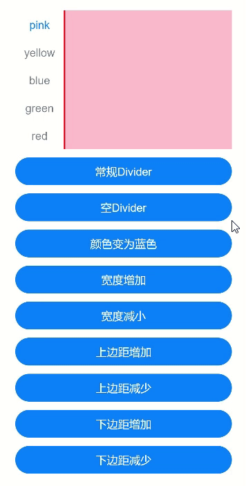
本示例通过divider实现了分割线各种属性的展示。
// xxx.ets
@Entry
@Component
struct TabsDivider1 {private controller1: TabsController = new TabsController()@State dividerColor: string = 'red'@State strokeWidth: number = 2@State startMargin: number = 0@State endMargin: number = 0@State nullFlag: boolean = falsebuild() {Column() {Tabs({ controller: this.controller1 }) {TabContent() {Column().width('100%').height('100%').backgroundColor(Color.Pink)}.tabBar('pink')TabContent() {Column().width('100%').height('100%').backgroundColor(Color.Yellow)}.tabBar('yellow')TabContent() {Column().width('100%').height('100%').backgroundColor(Color.Blue)}.tabBar('blue')TabContent() {Column().width('100%').height('100%').backgroundColor(Color.Green)}.tabBar('green')TabContent() {Column().width('100%').height('100%').backgroundColor(Color.Red)}.tabBar('red')}.vertical(true).scrollable(true).barMode(BarMode.Fixed).barWidth(70).barHeight(200).animationDuration(400).onChange((index: number) => {console.info(index.toString())}).height('200vp').margin({ bottom: '12vp' }).divider(this.nullFlag ? null : {strokeWidth: this.strokeWidth,color: this.dividerColor,startMargin: this.startMargin,endMargin: this.endMargin})Button('常规Divider').width('100%').margin({ bottom: '12vp' }).onClick(() => {this.nullFlag = false;this.strokeWidth = 2;this.dividerColor = 'red';this.startMargin = 0;this.endMargin = 0;})Button('空Divider').width('100%').margin({ bottom: '12vp' }).onClick(() => {this.nullFlag = true})Button('颜色变为蓝色').width('100%').margin({ bottom: '12vp' }).onClick(() => {this.dividerColor = 'blue'})Button('宽度增加').width('100%').margin({ bottom: '12vp' }).onClick(() => {this.strokeWidth += 2})Button('宽度减小').width('100%').margin({ bottom: '12vp' }).onClick(() => {if (this.strokeWidth > 2) {this.strokeWidth -= 2}})Button('上边距增加').width('100%').margin({ bottom: '12vp' }).onClick(() => {this.startMargin += 2})Button('上边距减少').width('100%').margin({ bottom: '12vp' }).onClick(() => {if (this.startMargin > 2) {this.startMargin -= 2}})Button('下边距增加').width('100%').margin({ bottom: '12vp' }).onClick(() => {this.endMargin += 2})Button('下边距减少').width('100%').margin({ bottom: '12vp' }).onClick(() => {if (this.endMargin > 2) {this.endMargin -= 2}})}.padding({ top: '24vp', left: '24vp', right: '24vp' })}
}
示例3
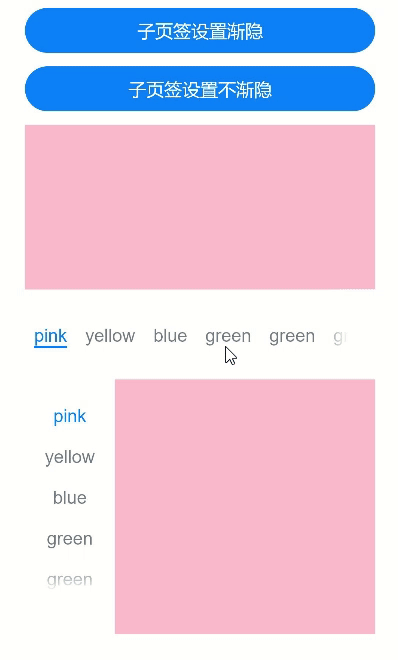
本示例通过fadingEdge实现了切换子页签渐隐和不渐隐。
// xxx.ets
@Entry
@Component
struct TabsOpaque {@State message: string = 'Hello World'private controller: TabsController = new TabsController()private controller1: TabsController = new TabsController()@State selfFadingFade: boolean = true;build() {Column() {Button('子页签设置渐隐').width('100%').margin({ bottom: '12vp' }).onClick((event?: ClickEvent) => {this.selfFadingFade = true;})Button('子页签设置不渐隐').width('100%').margin({ bottom: '12vp' }).onClick((event?: ClickEvent) => {this.selfFadingFade = false;})Tabs({ barPosition: BarPosition.End, controller: this.controller }) {TabContent() {Column().width('100%').height('100%').backgroundColor(Color.Pink)}.tabBar('pink')TabContent() {Column().width('100%').height('100%').backgroundColor(Color.Yellow)}.tabBar('yellow')TabContent() {Column().width('100%').height('100%').backgroundColor(Color.Blue)}.tabBar('blue')TabContent() {Column().width('100%').height('100%').backgroundColor(Color.Green)}.tabBar('green')TabContent() {Column().width('100%').height('100%').backgroundColor(Color.Green)}.tabBar('green')TabContent() {Column().width('100%').height('100%').backgroundColor(Color.Green)}.tabBar('green')TabContent() {Column().width('100%').height('100%').backgroundColor(Color.Green)}.tabBar('green')TabContent() {Column().width('100%').height('100%').backgroundColor(Color.Green)}.tabBar('green')}.vertical(false).scrollable(true).barMode(BarMode.Scrollable).barHeight(80).animationDuration(400).onChange((index: number) => {console.info(index.toString())}).fadingEdge(this.selfFadingFade).height('30%').width('100%')Tabs({ barPosition: BarPosition.Start, controller: this.controller1 }) {TabContent() {Column().width('100%').height('100%').backgroundColor(Color.Pink)}.tabBar('pink')TabContent() {Column().width('100%').height('100%').backgroundColor(Color.Yellow)}.tabBar('yellow')TabContent() {Column().width('100%').height('100%').backgroundColor(Color.Blue)}.tabBar('blue')TabContent() {Column().width('100%').height('100%').backgroundColor(Color.Green)}.tabBar('green')TabContent() {Column().width('100%').height('100%').backgroundColor(Color.Green)}.tabBar('green')TabContent() {Column().width('100%').height('100%').backgroundColor(Color.Green)}.tabBar('green')}.vertical(true).scrollable(true).barMode(BarMode.Scrollable).barHeight(200).barWidth(80).animationDuration(400).onChange((index: number) => {console.info(index.toString())}).fadingEdge(this.selfFadingFade).height('30%').width('100%')}.padding({ top: '24vp', left: '24vp', right: '24vp' })}
}
示例4
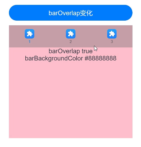
本示例通过barOverlap实现了TabBar是否背后变模糊并叠加在TabContent之上。
// xxx.ets
@Entry
@Component
struct barBackgroundColorTest {private controller: TabsController = new TabsController()@State barOverlap: boolean = true;@State barBackgroundColor: string = '#88888888';build() {Column() {Button("barOverlap变化").width('100%').margin({ bottom: '12vp' }).onClick((event?: ClickEvent) => {if (this.barOverlap) {this.barOverlap = false;} else {this.barOverlap = true;}})Tabs({ barPosition: BarPosition.Start, index: 0, controller: this.controller }) {TabContent() {Column() {Text(`barOverlap ${this.barOverlap}`).fontSize(16).margin({ top: this.barOverlap ? '56vp' : 0 })Text(`barBackgroundColor ${this.barBackgroundColor}`).fontSize(16)}.width('100%').width('100%').height('100%').backgroundColor(Color.Pink)}.tabBar(new BottomTabBarStyle($r('sys.media.ohos_app_icon'), "1"))TabContent() {Column() {Text(`barOverlap ${this.barOverlap}`).fontSize(16).margin({ top: this.barOverlap ? '56vp' : 0 })Text(`barBackgroundColor ${this.barBackgroundColor}`).fontSize(16)}.width('100%').width('100%').height('100%').backgroundColor(Color.Yellow)}.tabBar(new BottomTabBarStyle($r('sys.media.ohos_app_icon'), "2"))TabContent() {Column() {Text(`barOverlap ${this.barOverlap}`).fontSize(16).margin({ top: this.barOverlap ? '56vp' : 0 })Text(`barBackgroundColor ${this.barBackgroundColor}`).fontSize(16)}.width('100%').width('100%').height('100%').backgroundColor(Color.Green)}.tabBar(new BottomTabBarStyle($r('sys.media.ohos_app_icon'), "3"))}.vertical(false).barMode(BarMode.Fixed).height('60%').barOverlap(this.barOverlap).scrollable(true).animationDuration(10).barBackgroundColor(this.barBackgroundColor)}.height(500).padding({ top: '24vp', left: '24vp', right: '24vp' })}
}
示例5
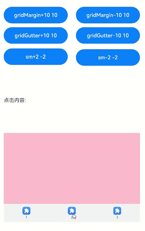
本示例通过barGridAlign实现了以栅格化方式设置TabBar的可见区域。
// xxx.ets
@Entry
@Component
struct TabsExample5 {private controller: TabsController = new TabsController()@State gridMargin: number = 10@State gridGutter: number = 10@State sm: number = -2@State clickedContent: string = "";build() {Column() {Row() {Button("gridMargin+10 " + this.gridMargin).width('47%').height(50).margin({ top: 5 }).onClick((event?: ClickEvent) => {this.gridMargin += 10}).margin({ right: '6%', bottom: '12vp' })Button("gridMargin-10 " + this.gridMargin).width('47%').height(50).margin({ top: 5 }).onClick((event?: ClickEvent) => {this.gridMargin -= 10}).margin({ bottom: '12vp' })}Row() {Button("gridGutter+10 " + this.gridGutter).width('47%').height(50).margin({ top: 5 }).onClick((event?: ClickEvent) => {this.gridGutter += 10}).margin({ right: '6%', bottom: '12vp' })Button("gridGutter-10 " + this.gridGutter).width('47%').height(50).margin({ top: 5 }).onClick((event?: ClickEvent) => {this.gridGutter -= 10}).margin({ bottom: '12vp' })}Row() {Button("sm+2 " + this.sm).width('47%').height(50).margin({ top: 5 }).onClick((event?: ClickEvent) => {this.sm += 2}).margin({ right: '6%' })Button("sm-2 " + this.sm).width('47%').height(50).margin({ top: 5 }).onClick((event?: ClickEvent) => {this.sm -= 2})}Text("点击内容:" + this.clickedContent).width('100%').height(200).margin({ top: 5 })Tabs({ barPosition: BarPosition.End, controller: this.controller }) {TabContent() {Column().width('100%').height('100%').backgroundColor(Color.Pink)}.tabBar(BottomTabBarStyle.of($r("sys.media.ohos_app_icon"), "1"))TabContent() {Column().width('100%').height('100%').backgroundColor(Color.Green)}.tabBar(BottomTabBarStyle.of($r("sys.media.ohos_app_icon"), "2"))TabContent() {Column().width('100%').height('100%').backgroundColor(Color.Blue)}.tabBar(BottomTabBarStyle.of($r("sys.media.ohos_app_icon"), "3"))}.width('350vp').animationDuration(300).height('60%').barGridAlign({ sm: this.sm, margin: this.gridMargin, gutter: this.gridGutter }).backgroundColor(0xf1f3f5).onTabBarClick((index: number) => {this.clickedContent += "now index " + index + " is clicked\n";})}.width('100%').height(500).margin({ top: 5 }).padding('10vp')}
}
示例6
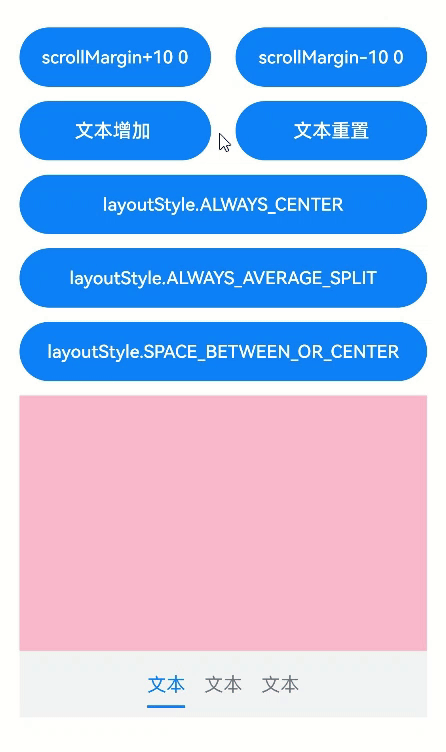
本示例实现了barMode的ScrollableBarModeOptions参数,该参数仅在Scrollable模式下有效。
// xxx.ets
@Entry
@Component
struct TabsExample6 {private controller: TabsController = new TabsController()@State scrollMargin: number = 0@State layoutStyle: LayoutStyle = LayoutStyle.ALWAYS_CENTER@State text: string = "文本"build() {Column() {Row() {Button("scrollMargin+10 " + this.scrollMargin).width('47%').height(50).margin({ top: 5 }).onClick((event?: ClickEvent) => {this.scrollMargin += 10}).margin({ right: '6%', bottom: '12vp' })Button("scrollMargin-10 " + this.scrollMargin).width('47%').height(50).margin({ top: 5 }).onClick((event?: ClickEvent) => {this.scrollMargin -= 10}).margin({ bottom: '12vp' })}Row() {Button("文本增加 ").width('47%').height(50).margin({ top: 5 }).onClick((event?: ClickEvent) => {this.text += '文本增加'}).margin({ right: '6%', bottom: '12vp' })Button("文本重置").width('47%').height(50).margin({ top: 5 }).onClick((event?: ClickEvent) => {this.text = "文本"}).margin({ bottom: '12vp' })}Row() {Button("layoutStyle.ALWAYS_CENTER").width('100%').height(50).margin({ top: 5 }).fontSize(15).onClick((event?: ClickEvent) => {this.layoutStyle = LayoutStyle.ALWAYS_CENTER;}).margin({ bottom: '12vp' })}Row() {Button("layoutStyle.ALWAYS_AVERAGE_SPLIT").width('100%').height(50).margin({ top: 5 }).fontSize(15).onClick((event?: ClickEvent) => {this.layoutStyle = LayoutStyle.ALWAYS_AVERAGE_SPLIT;}).margin({ bottom: '12vp' })}Row() {Button("layoutStyle.SPACE_BETWEEN_OR_CENTER").width('100%').height(50).margin({ top: 5 }).fontSize(15).onClick((event?: ClickEvent) => {this.layoutStyle = LayoutStyle.SPACE_BETWEEN_OR_CENTER;}).margin({ bottom: '12vp' })}Tabs({ barPosition: BarPosition.End, controller: this.controller }) {TabContent() {Column().width('100%').height('100%').backgroundColor(Color.Pink)}.tabBar(SubTabBarStyle.of(this.text))TabContent() {Column().width('100%').height('100%').backgroundColor(Color.Green)}.tabBar(SubTabBarStyle.of(this.text))TabContent() {Column().width('100%').height('100%').backgroundColor(Color.Blue)}.tabBar(SubTabBarStyle.of(this.text))}.animationDuration(300).height('60%').backgroundColor(0xf1f3f5).barMode(BarMode.Scrollable, { margin: this.scrollMargin, nonScrollableLayoutStyle: this.layoutStyle })}.width('100%').height(500).margin({ top: 5 }).padding('24vp')}
}
示例7
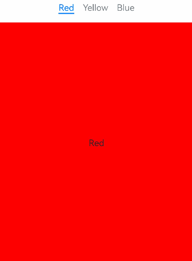
本示例通过customContentTransition实现了自定义Tabs页面的切换动画。
// xxx.ets
@Entry
@Component
struct TabsCustomAnimationExample {@State useCustomAnimation: boolean = true@State tabContent0Scale: number = 1.0@State tabContent1Scale: number = 1.0@State tabContent0Opacity: number = 1.0@State tabContent1Opacity: number = 1.0@State tabContent2Opacity: number = 1.0tabsController: TabsController = new TabsController()private firstTimeout: number = 3000private secondTimeout: number = 5000private first2secondDuration: number = 3000private second2thirdDuration: number = 5000private first2thirdDuration: number = 2000private baseCustomAnimation: (from: number, to: number) => TabContentAnimatedTransition = (from: number, to: number) => {if ((from === 0 && to === 1) || (from === 1 && to === 0)) {// 缩放动画let firstCustomTransition = {timeout: this.firstTimeout,transition: (proxy: TabContentTransitionProxy) => {if (proxy.from === 0 && proxy.to === 1) {this.tabContent0Scale = 1.0this.tabContent1Scale = 0.5} else {this.tabContent0Scale = 0.5this.tabContent1Scale = 1.0}animateTo({duration: this.first2secondDuration,onFinish: () => {proxy.finishTransition()}}, () => {if (proxy.from === 0 && proxy.to === 1) {this.tabContent0Scale = 0.5this.tabContent1Scale = 1.0} else {this.tabContent0Scale = 1.0this.tabContent1Scale = 0.5}})}} as TabContentAnimatedTransition;return firstCustomTransition;} else {// 透明度动画let secondCustomTransition = {timeout: this.secondTimeout,transition: (proxy: TabContentTransitionProxy) => {if ((proxy.from === 1 && proxy.to === 2) || (proxy.from === 2 && proxy.to === 1)) {if (proxy.from === 1 && proxy.to === 2) {this.tabContent1Opacity = 1.0this.tabContent2Opacity = 0.5} else {this.tabContent1Opacity = 0.5this.tabContent2Opacity = 1.0}animateTo({duration: this.second2thirdDuration,onFinish: () => {proxy.finishTransition()}}, () => {if (proxy.from === 1 && proxy.to === 2) {this.tabContent1Opacity = 0.5this.tabContent2Opacity = 1.0} else {this.tabContent1Opacity = 1.0this.tabContent2Opacity = 0.5}})} else if ((proxy.from === 0 && proxy.to === 2) || (proxy.from === 2 && proxy.to === 0)) {if (proxy.from === 0 && proxy.to === 2) {this.tabContent0Opacity = 1.0this.tabContent2Opacity = 0.5} else {this.tabContent0Opacity = 0.5this.tabContent2Opacity = 1.0}animateTo({duration: this.first2thirdDuration,onFinish: () => {proxy.finishTransition()}}, () => {if (proxy.from === 0 && proxy.to === 2) {this.tabContent0Opacity = 0.5this.tabContent2Opacity = 1.0} else {this.tabContent0Opacity = 1.0this.tabContent2Opacity = 0.5}})}}} as TabContentAnimatedTransition;return secondCustomTransition;}}build() {Column() {Tabs({ controller: this.tabsController }) {TabContent() {Text("Red")}.tabBar("Red").scale({ x: this.tabContent0Scale, y: this.tabContent0Scale }).backgroundColor(Color.Red).opacity(this.tabContent0Opacity).width(100).height(100)TabContent() {Text("Yellow")}.tabBar("Yellow").scale({ x: this.tabContent1Scale, y: this.tabContent1Scale }).backgroundColor(Color.Yellow).opacity(this.tabContent1Opacity).width(200).height(200)TabContent() {Text("Blue")}.tabBar("Blue").backgroundColor(Color.Blue).opacity(this.tabContent2Opacity).width(300).height(300)}.backgroundColor(0xf1f3f5).width('100%').height(500).margin({ top: 5 }).customContentTransition(this.useCustomAnimation ? this.baseCustomAnimation : undefined).barMode(BarMode.Scrollable).onChange((index: number) => {console.info("onChange index: " + index)}).onTabBarClick((index: number) => {console.info("onTabBarClick index: " + index)})}}
}
示例8
本示例通过onChange、onAnimationStart、onAnimationEnd、onGestureSwipe等接口实现了自定义TabBar的切换动画。
// xxx.ets
@Entry
@Component
struct TabsExample {@State currentIndex: number = 0@State animationDuration: number = 300@State indicatorLeftMargin: number = 0@State indicatorWidth: number = 0private tabsWidth: number = 0@BuildertabBuilder(index: number, name: string) {Column() {Text(name).fontSize(16).fontColor(this.currentIndex === index ? '#007DFF' : '#182431').fontWeight(this.currentIndex === index ? 500 : 400).id(index.toString()).onAreaChange((oldValue: Area,newValue: Area) => {if (this.currentIndex === index && (this.indicatorLeftMargin === 0 || this.indicatorWidth === 0)){if (newValue.position.x != undefined) {let positionX = Number.parseFloat(newValue.position.x.toString())this.indicatorLeftMargin = Number.isNaN(positionX) ? 0 : positionX}let width = Number.parseFloat(newValue.width.toString())this.indicatorWidth = Number.isNaN(width) ? 0 : width}})}.width('100%')}build() {Stack({ alignContent: Alignment.TopStart }) {Tabs({ barPosition: BarPosition.Start }) {TabContent() {Column().width('100%').height('100%').backgroundColor('#00CB87')}.tabBar(this.tabBuilder(0, 'green'))TabContent() {Column().width('100%').height('100%').backgroundColor('#007DFF')}.tabBar(this.tabBuilder(1, 'blue'))TabContent() {Column().width('100%').height('100%').backgroundColor('#FFBF00')}.tabBar(this.tabBuilder(2, 'yellow'))TabContent() {Column().width('100%').height('100%').backgroundColor('#E67C92')}.tabBar(this.tabBuilder(3, 'pink'))}.onAreaChange((oldValue: Area,newValue: Area)=> {let width = Number.parseFloat(newValue.width.toString())this.tabsWidth = Number.isNaN(width) ? 0 : width}).barWidth('100%').barHeight(56).width('100%').height(296).backgroundColor('#F1F3F5').animationDuration(this.animationDuration).onChange((index: number) => {this.currentIndex = index  // 监听索引index的变化,实现页签内容的切换。}).onAnimationStart((index: number, targetIndex: number, event: TabsAnimationEvent) => {// 切换动画开始时触发该回调。下划线跟着页面一起滑动,同时宽度渐变。this.currentIndex = targetIndexlet targetIndexInfo = this.getTextInfo(targetIndex)this.startAnimateTo(this.animationDuration, targetIndexInfo.left, targetIndexInfo.width)}).onAnimationEnd((index: number,event: TabsAnimationEvent) => {// 切换动画结束时触发该回调。下划线动画停止。let currentIndicatorInfo = this.getCurrentIndicatorInfo(index,event)this.startAnimateTo(0,currentIndicatorInfo.left,currentIndicatorInfo.width)}).onGestureSwipe((index: number,event: TabsAnimationEvent) => {// 在页面跟手滑动过程中,逐帧触发该回调。let currentIndicatorInfo = this.getCurrentIndicatorInfo(index,event)this.currentIndex = currentIndicatorInfo.indexthis.indicatorLeftMargin = currentIndicatorInfo.leftthis.indicatorWidth = currentIndicatorInfo.width})Column().height(2).width(this.indicatorWidth).margin({ left: this.indicatorLeftMargin, top:48}).backgroundColor('#007DFF')}.width('100%')}private getTextInfo(index: number): Record<string, number> {let strJson = getInspectorByKey(index.toString())try {let obj: Record<string, string> = JSON.parse(strJson)let rectInfo: number[][] = JSON.parse('[' + obj.$rect + ']')return { 'left': px2vp(rectInfo[0][0]), 'width': px2vp(rectInfo[1][0] - rectInfo[0][0]) }} catch (error) {return { 'left': 0, 'width': 0 }}}private getCurrentIndicatorInfo(index: number, event: TabsAnimationEvent): Record<string, number> {let nextIndex = indexif (index > 0 && event.currentOffset > 0) {nextIndex--} else if (index < 3 && event.currentOffset < 0) {nextIndex++}let indexInfo = this.getTextInfo(index)let nextIndexInfo = this.getTextInfo(nextIndex)let swipeRatio = Math.abs(event.currentOffset / this.tabsWidth)let currentIndex = swipeRatio > 0.5 ? nextIndex : index  // 页面滑动超过一半,tabBar切换到下一页。let currentLeft = indexInfo.left + (nextIndexInfo.left - indexInfo.left) * swipeRatiolet currentWidth = indexInfo.width + (nextIndexInfo.width - indexInfo.width) * swipeRatioreturn { 'index': currentIndex, 'left': currentLeft, 'width': currentWidth }}private startAnimateTo(duration: number, leftMargin: number, width: number) {animateTo({duration: duration, // 动画时长curve: Curve.Linear, // 动画曲线iterations: 1, // 播放次数playMode: PlayMode.Normal, // 动画模式onFinish: () => {console.info('play end')}}, () => {this.indicatorLeftMargin = leftMarginthis.indicatorWidth = width})}
}最后,有很多小伙伴不知道学习哪些鸿蒙开发技术?不知道需要重点掌握哪些鸿蒙应用开发知识点?而且学习时频繁踩坑,最终浪费大量时间。所以有一份实用的鸿蒙(HarmonyOS NEXT)资料用来跟着学习是非常有必要的。
这份鸿蒙(HarmonyOS NEXT)资料包含了鸿蒙开发必掌握的核心知识要点,内容包含了(ArkTS、ArkUI开发组件、Stage模型、多端部署、分布式应用开发、音频、视频、WebGL、OpenHarmony多媒体技术、Napi组件、OpenHarmony内核、Harmony南向开发、鸿蒙项目实战等等)鸿蒙(HarmonyOS NEXT)技术知识点。
希望这一份鸿蒙学习资料能够给大家带来帮助,有需要的小伙伴自行领取,限时开源,先到先得~无套路领取!!
获取这份完整版高清学习路线,请点击→纯血版全套鸿蒙HarmonyOS学习资料
鸿蒙(HarmonyOS NEXT)最新学习路线
-
HarmonOS基础技能
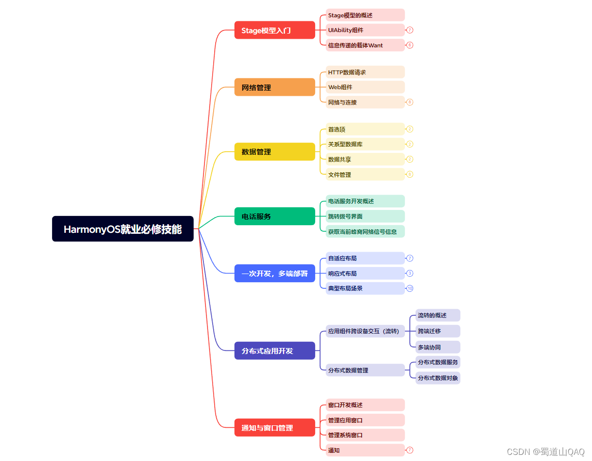
- HarmonOS就业必备技能
- HarmonOS多媒体技术
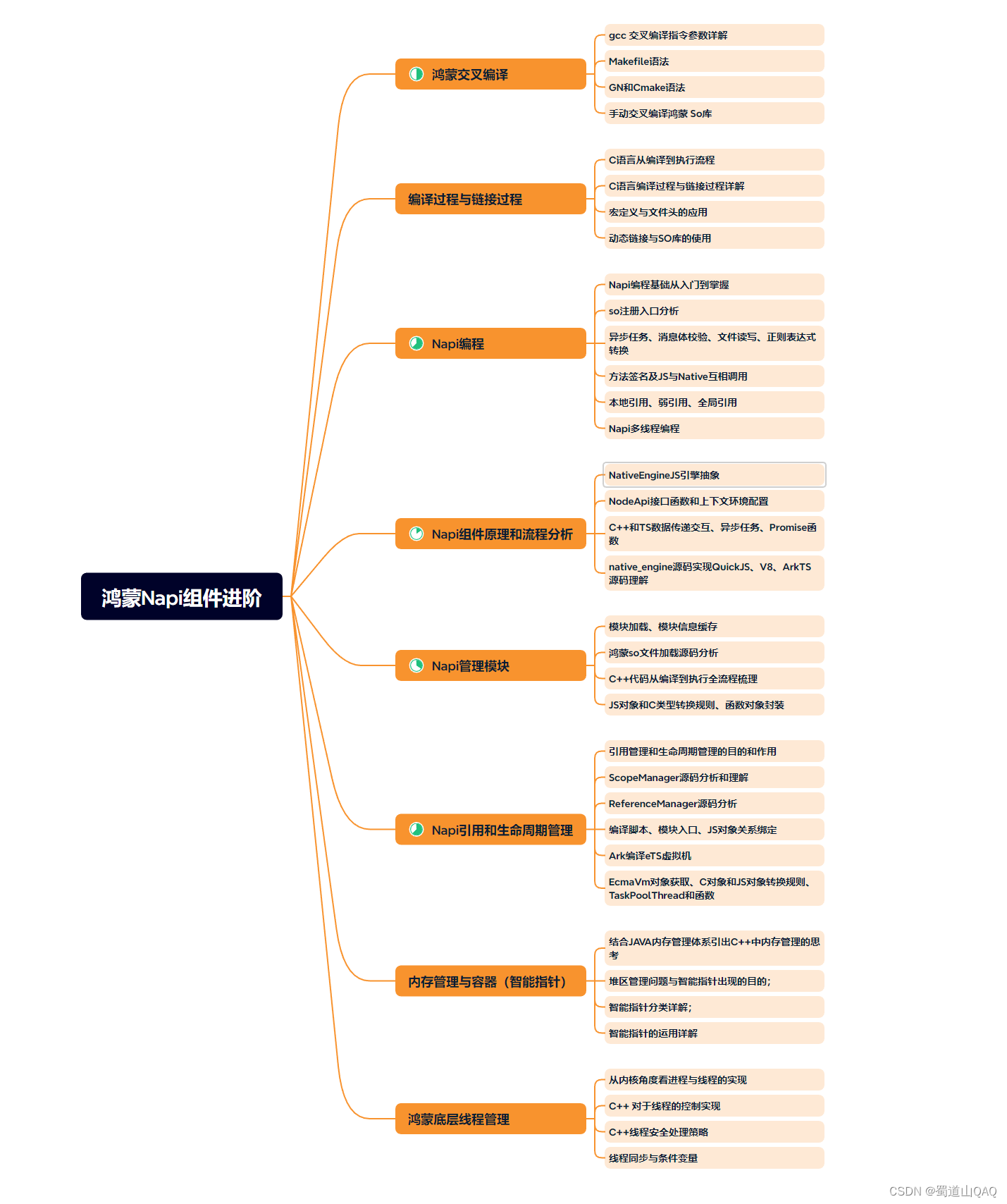
- 鸿蒙NaPi组件进阶
- HarmonOS高级技能
- 初识HarmonOS内核
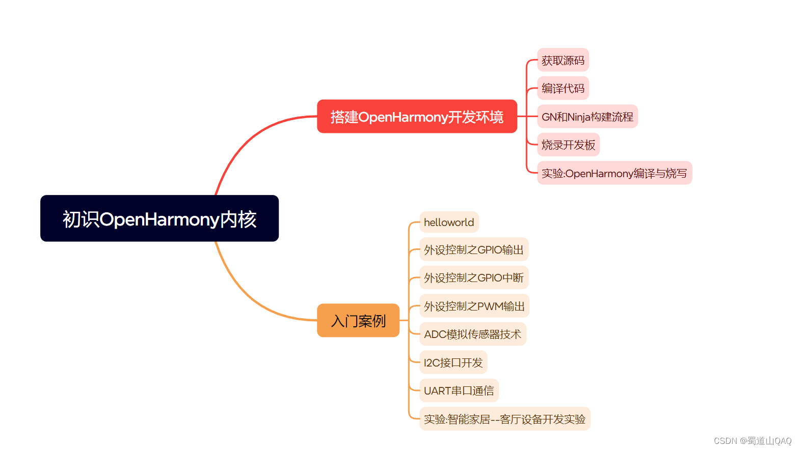
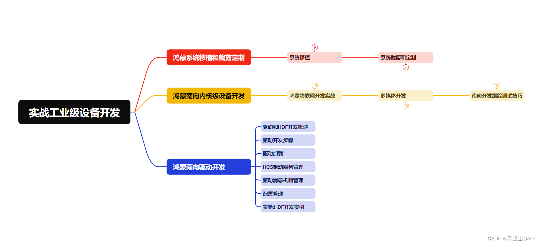
- 实战就业级设备开发
有了路线图,怎么能没有学习资料呢,小编也准备了一份联合鸿蒙官方发布笔记整理收纳的一套系统性的鸿蒙(OpenHarmony )学习手册(共计1236页)与鸿蒙(OpenHarmony )开发入门教学视频,内容包含:ArkTS、ArkUI、Web开发、应用模型、资源分类…等知识点。
获取以上完整版高清学习路线,请点击→纯血版全套鸿蒙HarmonyOS学习资料
《鸿蒙 (OpenHarmony)开发入门教学视频》
《鸿蒙生态应用开发V2.0白皮书》

《鸿蒙 (OpenHarmony)开发基础到实战手册》
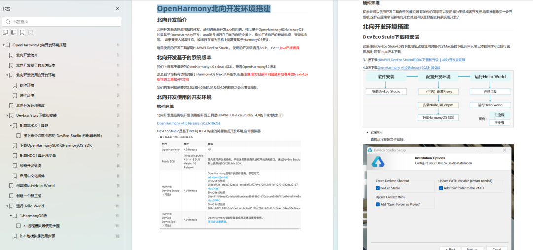
OpenHarmony北向、南向开发环境搭建
《鸿蒙开发基础》
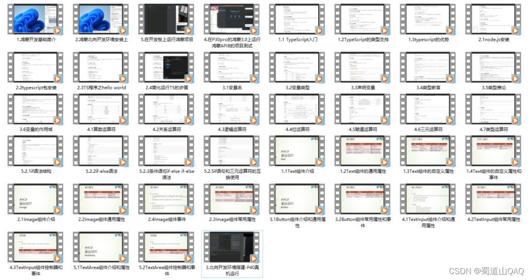
- ArkTS语言
- 安装DevEco Studio
- 运用你的第一个ArkTS应用
- ArkUI声明式UI开发
- .……
《鸿蒙开发进阶》
- Stage模型入门
- 网络管理
- 数据管理
- 电话服务
- 分布式应用开发
- 通知与窗口管理
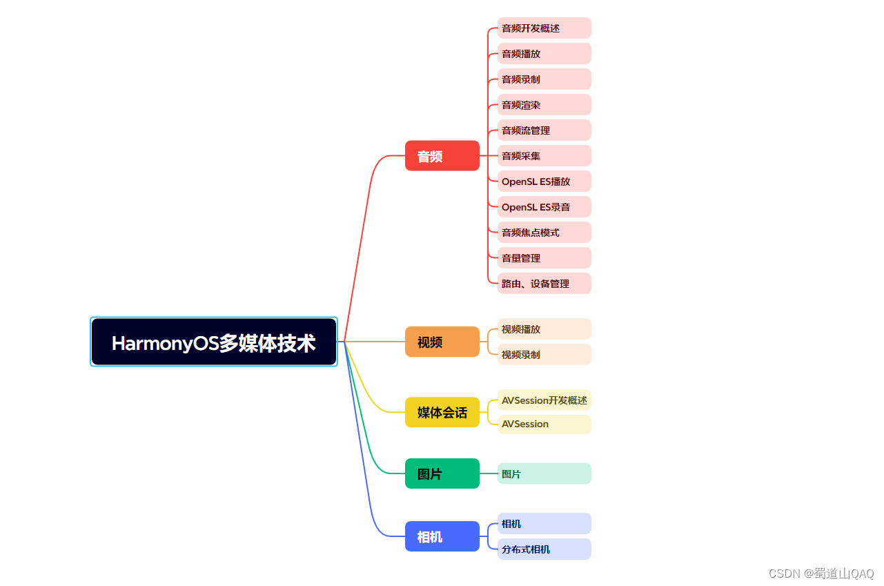
- 多媒体技术
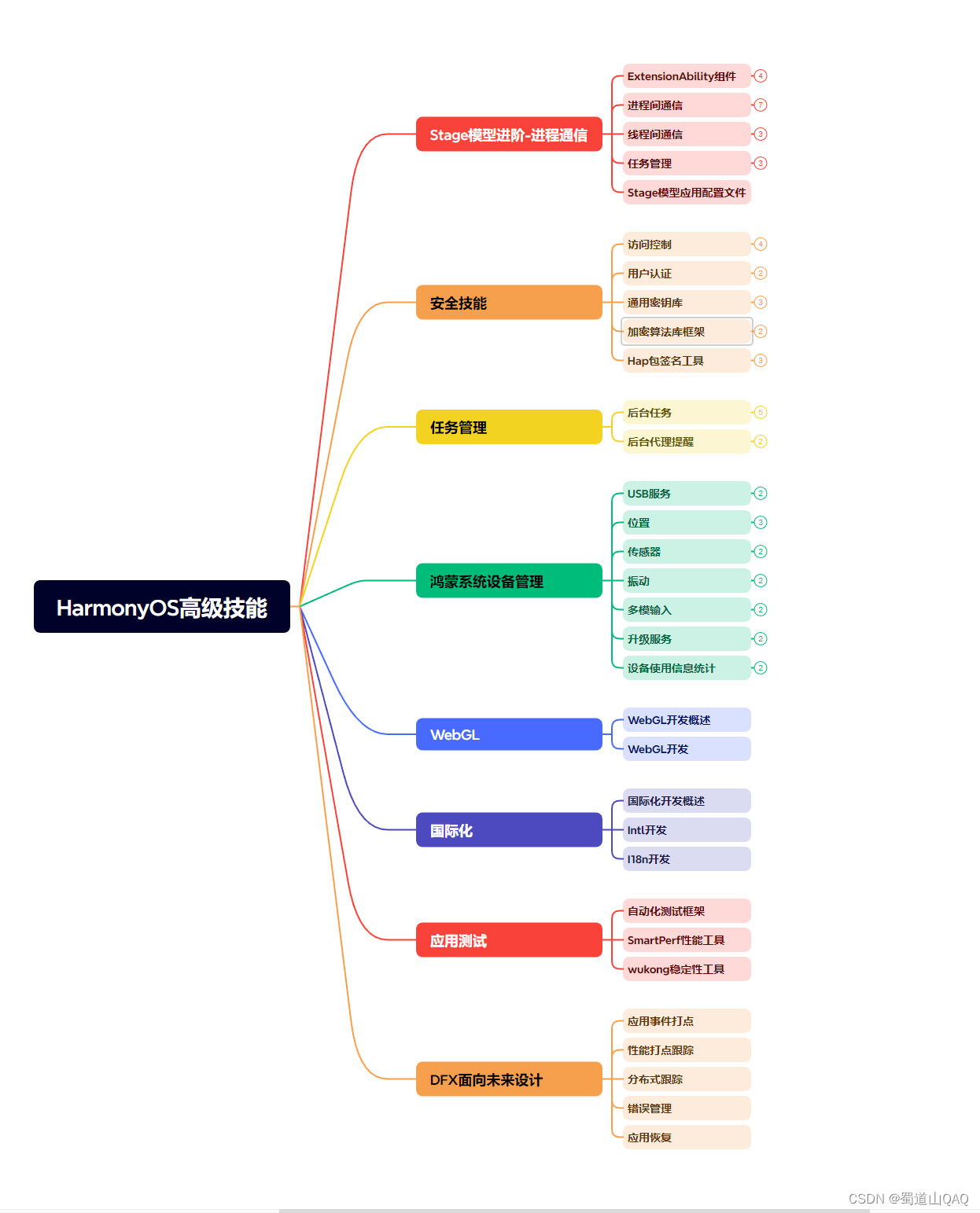
- 安全技能
- 任务管理
- WebGL
- 国际化开发
- 应用测试
- DFX面向未来设计
- 鸿蒙系统移植和裁剪定制
- ……
《鸿蒙进阶实战》
- ArkTS实践
- UIAbility应用
- 网络案例
- ……
获取以上完整鸿蒙HarmonyOS学习资料,请点击→纯血版全套鸿蒙HarmonyOS学习资料
总结
总的来说,华为鸿蒙不再兼容安卓,对中年程序员来说是一个挑战,也是一个机会。只有积极应对变化,不断学习和提升自己,他们才能在这个变革的时代中立于不败之地。