今天继续CSS的学习 以下是学习内容
CSS3新特性
圆角 border-dadius
div{
width:500x;
height:50px;
background-color: red;
}
假期修行11
本文来自互联网用户投稿,该文观点仅代表作者本人,不代表本站立场。本站仅提供信息存储空间服务,不拥有所有权,不承担相关法律责任。如若转载,请注明出处:http://www.hqwc.cn/news/879725.html
如若内容造成侵权/违法违规/事实不符,请联系编程知识网进行投诉反馈email:809451989@qq.com,一经查实,立即删除!相关文章
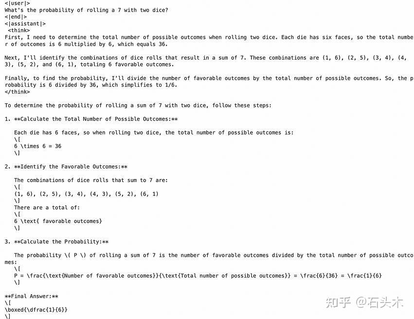
如何蒸馏 Deepseek-R1
如何蒸馏 Deepseek-R1
深度学习模型已经彻底改变了人工智能领域,但其庞大的规模和计算需求可能成为现实世界应用的瓶颈。模型蒸馏是一种强大的技术,通过将知识从大型复杂模型(教师)转移到较小、更高效的模型(学生)来解决这一挑战。
在这篇博客中,这里将介绍如何使用 LoR…

UU 跑腿云原生化,突围同城配送赛道
我们起初是把业务部署在 IDC,但经历过频繁的服务器网线意外断掉,震网病毒在无通知的情况下封禁一批端口,其中包含数据库 alwayson 的端口,导致大量的同步日志挤压,最终数据库崩溃,无法启动。这些都严重制约了我们业务的发展,于是真正决定要开始上云。作者:袁沼&望宸…
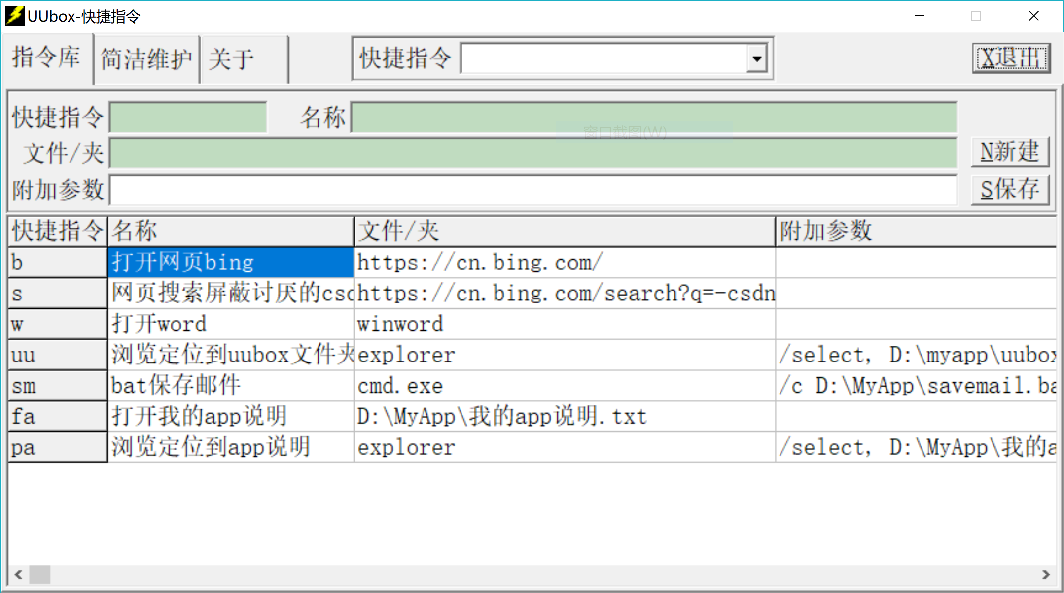
UUbox-FastCMD:windows下自定义快捷指令
【快捷指令 UUbox-fastcmd】
windows版,绿色免费免安装。
适用于PC端经常需要切换工作场景的需求,可以将高频次操作自定义位快捷文字指令。
主页面:【下载地址】https://files.cnblogs.com/files/blogs/837238/UUbox-FastCMD_V0.1.rar?t=1738832053&download=true
【功…
微软发布基于PostgreSQL的开源文档数据库平台DocumentDB
我们很高兴地宣布正式发布DocumentDB——一个开源文档数据库平台,以及基于 vCore、基于 PostgreSQL 构建的 Azure Cosmos DB for MongoDB 的引擎。过去,NoSQL 数据库提供云专用解决方案,而没有通用的互操作性标准。这导致对可互操作、可移植且完全支持生产就绪的文档数据存储…
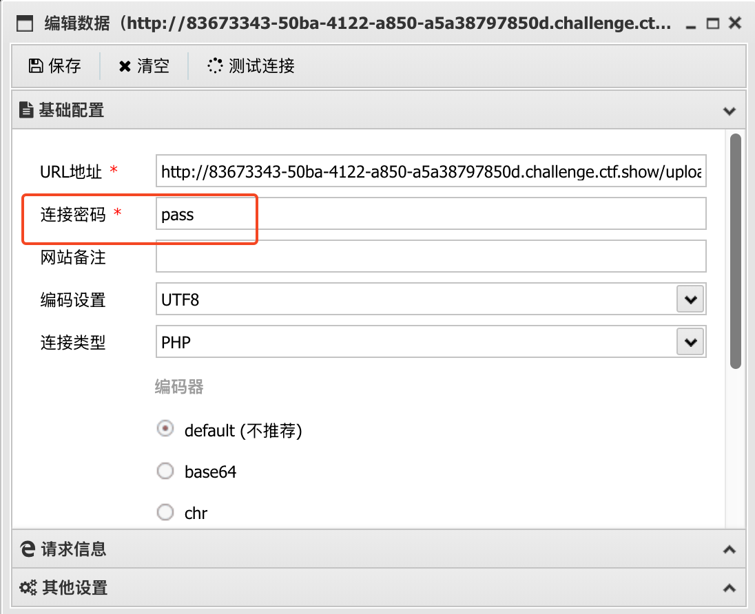
CTFShow-Web151:文件上传漏洞
CTFShow-Web151:文件上传漏洞
🛠️ Web151 题解
本题考察 文件上传漏洞,仅在前端进行了文件类型验证,允许上传 .png 图片文件。我们可以通过抓包修改文件后缀的方式绕过限制并获取 WebShell。
🔍 源码分析
在 upload.php 代码中,我们发现了以下 HTML 代码片段:
<bu…

云大使 X 函数计算 FC 专属活动上线!享返佣,一键打造 AI 应用
通过函数计算 FC 一键部署 Flux 模型,快速生成毛茸茸萌宠风格图像。我们将为您提供预置的工作流文件+内置大模型+Lora 模型,让您基于函数计算部署 ComfyUI 快速体验AI生图。如今,AI 技术已经成为推动业务创新和增长的重要力量。但对于许多企业和开发者来说,如何高效、便捷地…
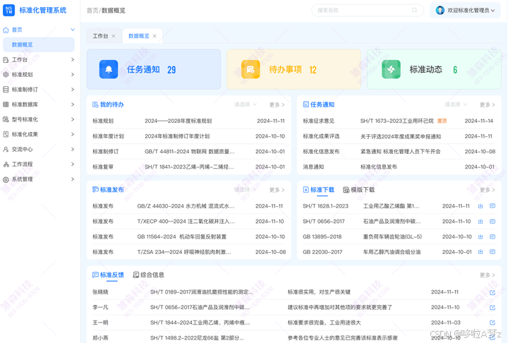
标准化管理数字化转型的实践与价值
在当下数字化转型的汹涌浪潮中,企业所处的竞争环境变得愈发复杂且瞬息万变。
标准化管理作为企业实现高质量发展的稳固基石,正切实面临着前所未有的机遇与严峻挑战。
从机遇层面来看,数字化技术的迅猛发展为标准化管理带来了全新的手段和方法,使管理效率和精准度提升成为可…
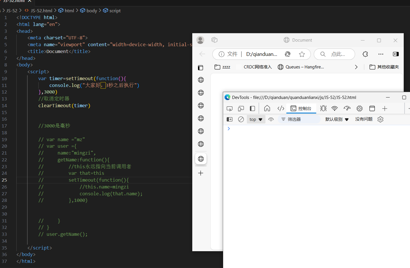
JS-52 定时器之setTimeout()
JavaScript提供定时执行代码的功能,叫做定时器(timer),主要由setTimeout和setlnterval()这两个函数来完成。他们向任务队列添加定时任务
setTimeout函数用来指定某个函数或某段代码,在多少毫秒之后执行。它返回一个整数,表示定时器的编号,以后可以用来取消这个定时器。…

博客园-awescnb插件-geek皮肤优化-Markdown样式支持
💖简介
博客园-awescnb插件-geek皮肤下,Markdown语法中对部分样式未正常支持,可以通过自定义CSS进行完善。
✨定义列表定义自定义CSS
博客园->管理->设置->页面定制 CSS 代码
添加代码/* 定义列表 */
dl dt{font-size: 14px;font-weight: bold;font-style: italic…
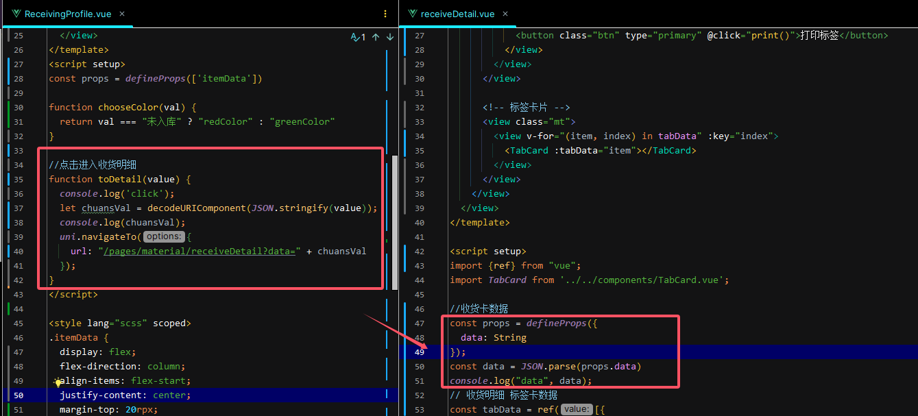
uniapp vue3 路由传参 利用props获取参数
A页面跳转B页面
A页面
function toDetail(value) {console.log(click);let chuansVal = decodeURIComponent(JSON.stringify(value));console.log(chuansVal);uni.navigateTo({url: "/pages/material/receiveDetail?data=" + chuansVal});
}B页面
const props = def…

团队协作工具私有化部署优选:板栗看板的安全与高效之道
在进行企业私有化选择时,建议详细咨询软件供应商或查看其官方文档以获取最准确的信息。板栗看板是一款非常适合中小团队的协作工具,尤其在任务管理、项目进度跟踪和沟通协作方面表现出色。如果你正在寻找一款简洁高效、功能强大的团队协作工具进行企业私有化,板栗看板无疑是…