前端开发day2
今日概要:
- 案例应用(利用之前所学知识)
- CSS知识点
- 模板 + CSS + 构建页面
1.CSS案例
1.1 内容回顾
-
HT
-
ML标签
固定格式,记住标签长什么样子,例如: h/div/span/a/img/ul/li/table/input/form -
CSS样式
-
引用CSS:标签、头部、文件
.xx{... }<div class='xx xx'></div> -
CSS样式
高度/宽度/块级or行内or块级行内/浮动/字体/文字对齐方式/内边距/外边距 关于边距:- body- 区域居中 -
页面布局
根据你看到的页面把他们划分成很多的小区域,再去填充样式。
-
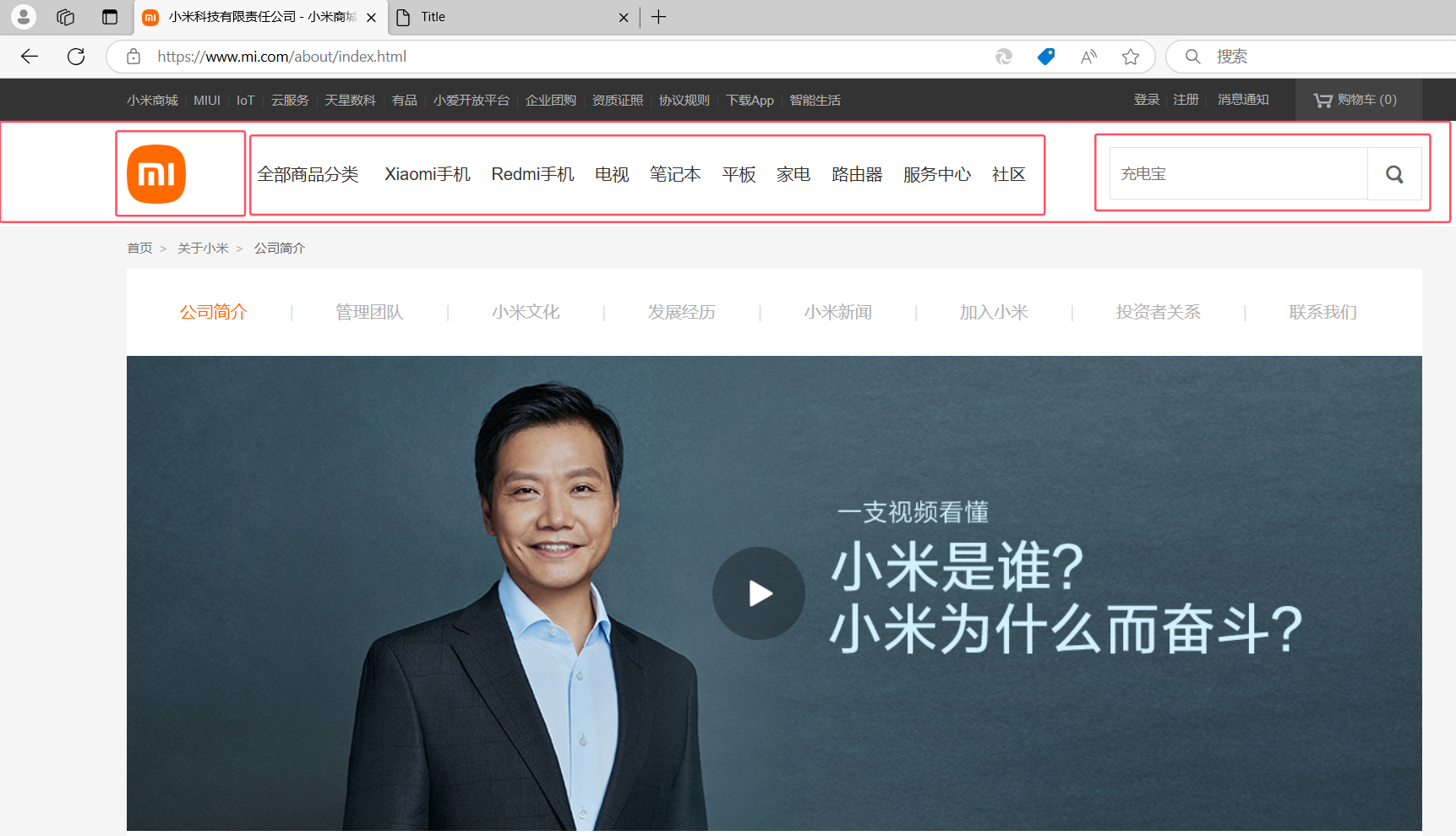
1.2 案例:二级菜单
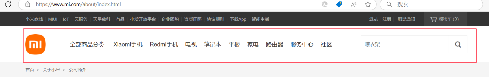
1.2.1 划分区域
1.2.2 搭建骨架
<!DOCTYPE html>
<html lang="en">
<head><meta charset="UTF-8"><title>Title</title><style>body{margin: 0;}.sub-header{height: 100px;background-color: #b0b0b0;}.container{width: 1128px;margin: 0 auto;}.sub-header .ht{height: 100px;}.sub-header .logo{width: 234px;float: left;}.sub-header .menu-list{float: left;}.sub-header .search{float: right;}</style>
</head>
<body>
<div class="sub-header"><div class="container"><div class="ht logo">1</div><div class="ht menu-list">2</div><div class="ht search">3</div><div class="clear:both;"></div></div>
</div></body>
</html>
1.2.3 Logo区域
<!DOCTYPE html>
<html lang="en">
<head><meta charset="UTF-8"><title>Title</title><style>body {margin: 0;}.sub-header {height: 100px;background-color: #b0b0b0;}.container {width: 1128px;margin: 0 auto;}.sub-header .ht {height: 100px;}.sub-header .logo {width: 234px;float: left;border: 1px solid red;}.sub-header .logo a {margin-top: 22px;/*让logo在div中居中*/display: inline-block/*让a标签具备块级元素属性使margin生效*/}.sub-header .logo a img {height: 56px;width: 56px;}.sub-header .menu-list {float: left;}.sub-header .search {float: right;}</style>
</head>
<body>
<div class="sub-header"><div class="container"><div class="ht logo"><!-- a,行内标签;默认设置高度、边距无效。 -> 块级 & 行内+块级 --><a href="https://www.mi.com/"><img src="image/xiaomi.png" alt=""></a></div><div class="ht menu-list">2</div><div class="ht search">3</div><div class="clear:both;"></div></div>
</div></body>
</html>
1.2.4 菜单部分
<!DOCTYPE html>
<html lang="en">
<head><meta charset="UTF-8"><title>Title</title><style>body {margin: 0;}.sub-header {height: 100px;}.container {width: 1128px;margin: 0 auto;}.sub-header .ht {height: 100px;}.sub-header .logo {width: 234px;float: left;}.sub-header .logo a {margin-top: 22px;display: inline-block}.sub-header .logo a img {height: 56px;width: 56px;}.sub-header .menu-list {float: left;line-height: 100px;}.sub-header .menu-list a{display: inline-block;padding: 0 10px;color: #333;font-size: 16px;text-decoration: none;}.sub-header .menu-list a:hover{color: #ff6700;}.sub-header .search {float: right;}</style>
</head>
<body>
<div class="sub-header"><div class="container"><div class="ht logo"><!-- a,行内标签;默认设置高度、边距无效。 -> 块级 & 行内+块级 --><a href="https://www.mi.com/"><img src="image/xiaomi.png" alt=""></a></div><div class="ht menu-list"><a href="https://www.mi.com/">Xiaomi手机</a><a href="https://www.mi.com/">RADMI红米</a><a href="https://www.mi.com/">电视</a><a href="https://www.mi.com/">笔记本</a><a href="https://www.mi.com/">平板</a><a href="https://www.mi.com/">家电</a><a href="https://www.mi.com/">路由器</a><a href="https://www.mi.com/">服务中心</a><a href="https://www.mi.com/">社区</a></div><div class="ht search"></div><div class="clear:both;"></div></div>
</div></body>
</html>
1.3 案例:顶部菜单 + 二级菜单
<!DOCTYPE html>
<html lang="en">
<head><meta charset="UTF-8"><title>Title</title><style>body {margin: 0;}.container {width: 1226px;margin: 0 auto;}.header {background: #333;}.header .menu {float: left;color: white;}.header .account {float: right;color: white;}.header a {color: #b0b0b0;line-height: 40px;display: inline-block;font-size: 12px;margin-right: 10px;text-decoration: none;}.header a:hover{color: white;}.sub-header {height: 100px;}.sub-header .ht {height: 100px;}.sub-header .logo {width: 234px;float: left;}.sub-header .logo a {margin-top: 22px;display: inline-block}.sub-header .logo a img {height: 56px;width: 56px;}.sub-header .menu-list {float: left;line-height: 100px;}.sub-header .menu-list a {display: inline-block;padding: 0 10px;color: #333;font-size: 16px;text-decoration: none;}.sub-header .menu-list a:hover {color: #ff6700;}.sub-header .search {float: right;}</style>
</head>
<body><div class="header"><div class="container"><div class="menu"><a href="https://www.mi.com/">小米商城</a><a href="https://www.mi.com/">MIUI</a><a href="https://www.mi.com/">云服务</a><a href="https://www.mi.com/">有品</a><a href="https://www.mi.com/">开放平台</a></div><div class="account"><a href="https://www.mi.com/">登录</a><a href="https://www.mi.com/">注册</a><a href="https://www.mi.com/">消息通知</a></div><div style="clear: both"></div></div>
</div><div class="sub-header"><div class="container"><div class="ht logo"><!-- a,行内标签;默认设置高度、边距无效。 -> 块级 & 行内+块级 --><a href="https://www.mi.com/"><img src="image/xiaomi.png" alt=""></a></div><div class="ht menu-list"><a href="https://www.mi.com/">Xiaomi手机</a><a href="https://www.mi.com/">RADMI红米</a><a href="https://www.mi.com/">电视</a><a href="https://www.mi.com/">笔记本</a><a href="https://www.mi.com/">平板</a><a href="https://www.mi.com/">家电</a><a href="https://www.mi.com/">路由器</a><a href="https://www.mi.com/">服务中心</a><a href="https://www.mi.com/">社区</a></div><div class="ht search"></div><div class="clear:both;"></div></div>
</div></body>
</html>
小结
-
a标签是行内标签,行内标签的高度、内外边距,默认无效。
- 将行内元素转换为行内块级元素(
display: inline-block;),或者块级元素(display: block;),就可以正常地应用这些属性了。
- 将行内元素转换为行内块级元素(
-
垂直方向居中
- 本文 + line-height
- 父容器有固定的高度,并希望其中的文字垂直居中,可以通过设置与父容器高度相同的
.menu-list{line-height:100px来实现,适用于单行文本。
- 父容器有固定的高度,并希望其中的文字垂直居中,可以通过设置与父容器高度相同的
- 图片 + 边距
- 对于图片等替换元素,可以使用上下边距(
margin-top和margin-bottom)来调整其垂直位置。
- 对于图片等替换元素,可以使用上下边距(
- 本文 + line-height
-
a标签默认有下划线。
- 通过:
text-decoration: none;来移除这个下划线。
- 通过:
-
鼠标放上去之后hover
.c1:hover{...
}
a:hover{}
1.4 案例:推荐区域
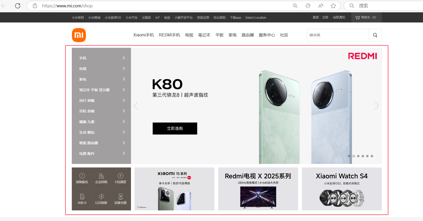
1.4.1 划分区域
1.4.2 搭建骨架
 <!DOCTYPE html>
<html lang="en">
<head><meta charset="UTF-8"><title>Title</title><style>body {margin: 0;}img {width: 100%;height: 100%;}.container {width: 1226px;margin: 0 auto;}.header {background: #333;}.header .menu {float: left;color: white;}.header .account {float: right;color: white;}.header a {color: #b0b0b0;line-height: 40px;display: inline-block;font-size: 12px;margin-right: 10px;text-decoration: none;}.header a:hover {color: white;}.sub-header {height: 100px;}.sub-header .ht {height: 100px;}.sub-header .logo {width: 234px;float: left;}.sub-header .logo a {margin-top: 22px;display: inline-block}.sub-header .logo a img {height: 56px;width: 56px;}.sub-header .menu-list {float: left;line-height: 100px;}.sub-header .menu-list a {display: inline-block;padding: 0 10px;color: #333;font-size: 16px;text-decoration: none;}.sub-header .menu-list a:hover {color: #ff6700;}.sub-header .search {float: right;}.slider .sd-img {width: 1226px;height: 460px;}</style>
</head>
<body><div class="header"><div class="container"><div class="menu"><a href="https://www.mi.com/">小米商城</a><a href="https://www.mi.com/">MIUI</a><a href="https://www.mi.com/">云服务</a><a href="https://www.mi.com/">有品</a><a href="https://www.mi.com/">开放平台</a></div><div class="account"><a href="https://www.mi.com/">登录</a><a href="https://www.mi.com/">注册</a><a href="https://www.mi.com/">消息通知</a></div><div style="clear: both"></div></div>
</div><div class="sub-header"><div class="container"><div class="ht logo"><!-- a,行内标签;默认设置高度、边距无效。 -> 块级 & 行内+块级 --><a href="https://www.mi.com/"><img src="images/xiaomi.png" alt=""></a></div><div class="ht menu-list"><a href="https://www.mi.com/">Xiaomi手机</a><a href="https://www.mi.com/">RADMI红米</a><a href="https://www.mi.com/">电视</a><a href="https://www.mi.com/">笔记本</a><a href="https://www.mi.com/">平板</a><a href="https://www.mi.com/">家电</a><a href="https://www.mi.com/">路由器</a><a href="https://www.mi.com/">服务中心</a><a href="https://www.mi.com/">社区</a></div><div class="ht search"></div><div class="clear:both;"></div></div>
</div><div class="slider"><div class="container"><div class="sd-img"><img src="images/REDMI.jpg" alt=""></div></div>
</div><div class="news"><div class="container"><div class="channel"></div><div class="list-item"></div><div class="list-item"></div><div class="list-item"></div></div>
</div></body>
</html>
1.4.3 案例的实现
<!DOCTYPE html>
<html lang="en">
<head><meta charset="UTF-8"><title>Title</title><style>body {margin: 0;}img {width: 100%;height: 100%;}.left {float: left;}.container {width: 1226px;margin: 0 auto;}.header {background: #333;}.header .menu {float: left;color: white;}.header .account {float: right;color: white;}.header a {color: #b0b0b0;line-height: 40px;display: inline-block;font-size: 12px;margin-right: 10px;text-decoration: none;}.header a:hover {color: white;}.sub-header {height: 100px;}.sub-header .ht {height: 100px;}.sub-header .logo {width: 234px;float: left;}.sub-header .logo a {margin-top: 22px;display: inline-block}.sub-header .logo a img {height: 56px;width: 56px;}.sub-header .menu-list {float: left;line-height: 100px;}.sub-header .menu-list a {display: inline-block;padding: 0 10px;color: #333;font-size: 16px;text-decoration: none;}.sub-header .menu-list a:hover {color: #ff6700;}.sub-header .search {float: right;}.slider .sd-img {width: 1226px;height: 460px;}.news{margin-top: 14px;}.news .channel {width: 228px;height: 164px;background-color: #5f5750;padding: 3px;}.news .channel .item {height: 82px;width: 76px;float: left;text-align: center;}.news .channel .item a{display: inline-block;font-size: 12px;padding-top: 18px;color: #fff;text-decoration: none;opacity: 0.7;}.news .channel .item a:hover{opacity: 1;}.news .channel .item  img{height: 24px;width: 24px;display: block;margin: 0 auto 4px;}.news .list-item {width: 316px;height: 170px;}</style>
</head>
<body><div class="header"><div class="container"><div class="menu"><a href="https://www.mi.com/">小米商城</a><a href="https://www.mi.com/">MIUI</a><a href="https://www.mi.com/">云服务</a><a href="https://www.mi.com/">有品</a><a href="https://www.mi.com/">开放平台</a></div><div class="account"><a href="https://www.mi.com/">登录</a><a href="https://www.mi.com/">注册</a><a href="https://www.mi.com/">消息通知</a></div><div style="clear: both"></div></div>
</div><div class="sub-header"><div class="container"><div class="ht logo"><!-- a,行内标签;默认设置高度、边距无效。 -> 块级 & 行内+块级 --><a href="https://www.mi.com/"><img src="images/xiaomi.png" alt=""></a></div><div class="ht menu-list"><a href="https://www.mi.com/">Xiaomi手机</a><a href="https://www.mi.com/">RADMI红米</a><a href="https://www.mi.com/">电视</a><a href="https://www.mi.com/">笔记本</a><a href="https://www.mi.com/">平板</a><a href="https://www.mi.com/">家电</a><a href="https://www.mi.com/">路由器</a><a href="https://www.mi.com/">服务中心</a><a href="https://www.mi.com/">社区</a></div><div class="ht search"></div><div class="clear:both;"></div></div>
</div><div class="slider"><div class="container"><div class="sd-img"><img src="images/REDMI.jpg" alt=""></div></div>
</div><div class="news"><div class="container"><div class="channel left"><div class="item"><a href="https://www.mi.com/"><img src="images/v1.png" alt=""><span>保障服务</span></a></div><div class="item"><a href="https://www.mi.com/"><img src="images/v1.png" alt=""><span>保障服务</span></a></div><div class="item"><a href="https://www.mi.com/"><img src="images/v1.png" alt=""><span>保障服务</span></a></div><div class="item"><a href="https://www.mi.com/"><img src="images/v1.png" alt=""><span>保障服务</span></a></div><div class="item"><a href="https://www.mi.com/"><img src="images/v1.png" alt=""><span>保障服务</span></a></div><div class="item"><a href="https://www.mi.com/"><img src="images/v1.png" alt=""><span>保障服务</span></a></div><div class="clear:both"></div></div><div class="list-item left" style="margin-left: 14px"><img src="images/xim1.png"/></div><div class="list-item left" style="margin-left: 15px"><img src="images/xim2.png"/></div><div class="list-item left" style="margin-left: 15px"><img src="images/xim3.png"/></div><div class="clear:both"></div></div>
</div></body>
</html>
小结
-
设置透明度
opacity:0.5; /* 0 ~ 1 */
2.CSS知识点
2.1 hover(伪类)
用于选择用户指针悬停在其上的元素。
通过为元素添加 :hover 样式,可以创建交互式的视觉反馈,如改变颜色、背景色、边框、尺寸等,从而提升网站的互动性和用户体验。
display: none;当元素的 display 属性被设置为 none 时,该元素将完全从文档流中移除,不会出现在页面上。
display: block;元素的 display 属性被设置为 block 时,它将成为一个块级元素,意味着它会在页面上独占一行,前后各有一个换行符。
<!DOCTYPE html>
<html lang="en">
<head><meta charset="UTF-8"><title>Title</title><style>.c1 {color: red;font-size: 18px;}.c1:hover {color: green;font-size: 50px;}.c2 {height: 300px;width: 500px;border: 3px solid red;}.c2:hover {border: 3px solid green;}.download {display: none;}.app:hover .download {display: block;}.app:hover .title{color: red;}</style>
</head>
<body>
<div class="c1">联通</div>
<div class="c2">广西</div><div class="app"><div class="title">下载APP</div><div class="download"><img src="images/qcode.png" alt=""></div>
</div></body>
</html>
2.2 after(伪类)
用于在指定元素的内容之后插入生成的内容。
通常用来装饰性地添加额外内容,比如图标、分隔符、清除浮动等。
<!DOCTYPE html>
<html lang="en">
<head><meta charset="UTF-8"><title>Title</title><style>.c1:after{content: "大帅哥";}</style>
</head>
<body><div class="c1">吴阳军</div><div class="c1">梁吉宁</div>
</body>
</html>
很重要的应用:
<!DOCTYPE html>
<html lang="en">
<head><meta charset="UTF-8"><title>Title</title><style>/*.clearfix:after:这是一个伪元素选择器,*/.clearfix:after{content: "";display: block;clear: both;/*通过 clear: both; 属性清除所有方向上的浮动,从而防止父容器的高度塌陷*/}.item{float: left;}</style>
</head>
<body><div class="clearfix"><div class="item">1</div><div class="item">2</div><div class="item">3</div></div>
</body>
</html>
2.3 position
-
fixed:将元素固定在浏览器窗口中的某个位置,不随页面滚动而移动。- 可以通过
top,bottom,left,right等属性来精确指定元素相对于视口的位置。
- 可以通过
-
relative:相对于自身原始位置偏移,但仍保留原有空间。- 使用
top,bottom,left,right来调整元素的位置时,它是相对于自身原本的位置进行移动的。
- 使用
-
absolute:相对于最近的已定位祖先元素或视口定位,完全脱离文档流。- 可以通过
top,bottom,left,right来相对于最近的已定位祖先元素或视口进行定位。
- 可以通过
1. position: fixed;
固定在窗口的某个位置。
案例:返回顶部
<!DOCTYPE html>
<html lang="en">
<head><meta charset="UTF-8"><title>Title</title><style>.back{position: fixed;width: 60px;height: 60px;border: 1px solid red;right: 10px;bottom: 50px;}</style>
</head>
<body><div style="height: 1000px;background-color: #5f5750"></div><div class="back"></div></body>
</html>
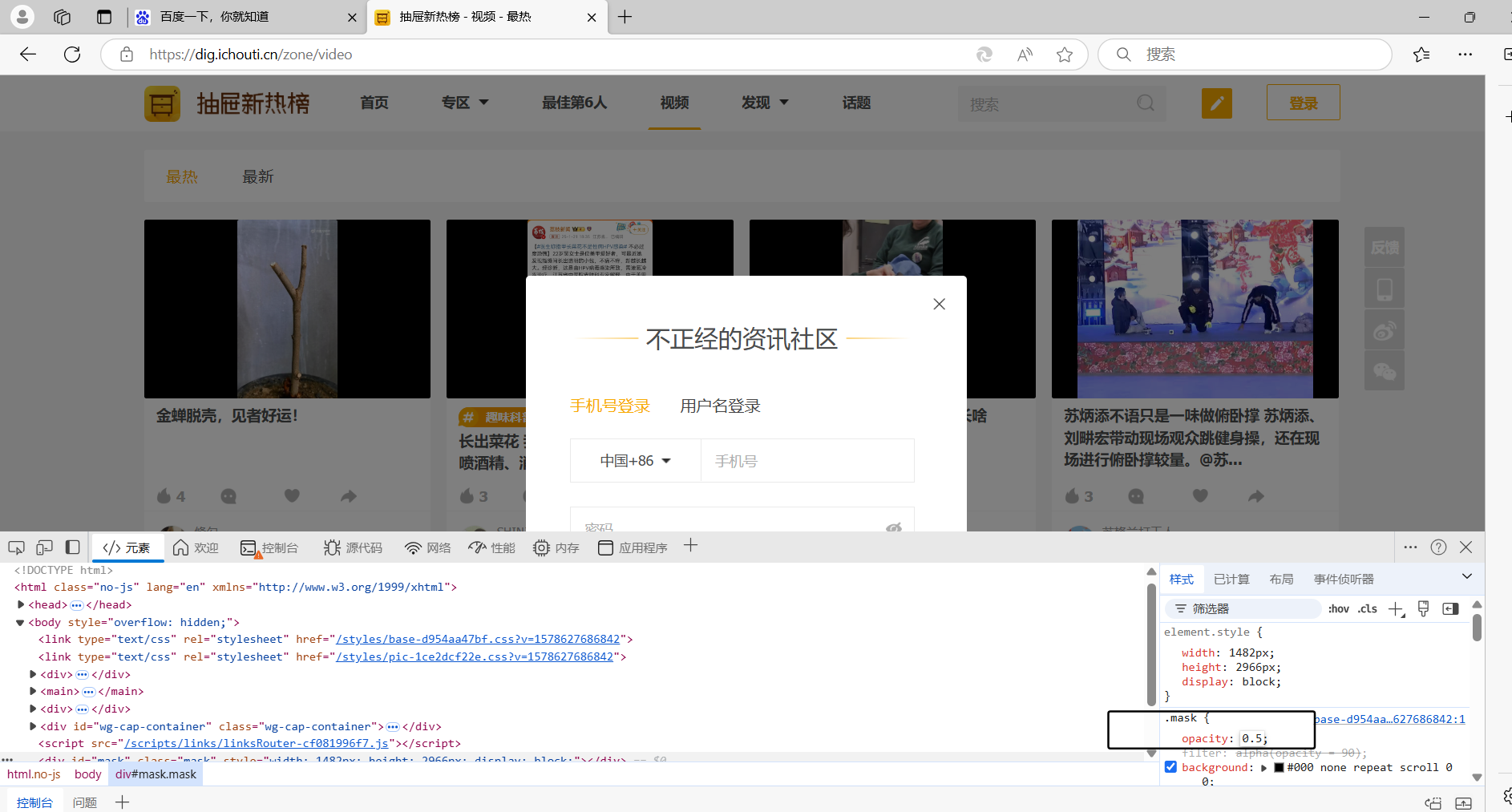
案例:对话框
z-index: 指定了一个元素在其包含块内的堆叠层次。具有较高 z-index 值的元素会覆盖较低 z-index 值的元素。
<!DOCTYPE html>
<html lang="en">
<head><meta charset="UTF-8"><title>Title</title><style>body {margin: 0;}.dialog {position: fixed;height: 300px;width: 500px;background-color: white;left: 0;right: 0;margin: 0 auto;top: 200px;z-index: 1000;/*指定了一个元素在其包含块内的堆叠层次。具有较高 z-index 值的元素会覆盖较低 z-index 值的元素。*/}.mask {background-color: black;position: fixed;left: 0;right: 0;top: 0;bottom: 0;opacity: 0.7;z-index: 999;/*谁的z-index大,幕布谁就在上面*/}</style>
</head>
<body><div style="height: 1000px">asdfasdfasd</div><div class="mask"></div>
<div class="dialog"></div></body>
</html>
2. relative和absolute
<!DOCTYPE html>
<html lang="en">
<head><meta charset="UTF-8"><title>Title</title><style>.c1{height: 300px;width: 500px;border: 1px solid red;margin: 100px;position: relative;}.c1 .c2{height: 59px;width: 59px;background-color: #00FF7F;position: absolute;right: 20px;bottom: 10px;}</style>
</head>
<body><div class="c1"><!--将 .c1 设置为相对定位,它的任何绝对定位的子元素都将相对于它进行定位。--><div class="c2"></div><!--将 .c2 设置为绝对定位,它会脱离正常的文档流,并且根据最近的已定位祖先元素(这里是 .c1)来确定位置。--></div>
</body>
</html>
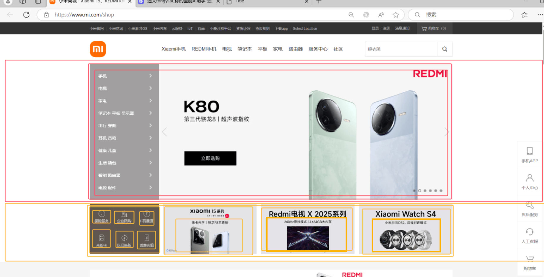
案例:小米商城下载app
<!DOCTYPE html>
<html lang="en">
<head><meta charset="UTF-8"><title>Title</title><style>body {margin: 0;}img {width: 100%;height: 100%;}.left {float: left;}.container {width: 1226px;margin: 0 auto;}.header {background: #333;}.header .menu {float: left;color: white;}.header .app {position: relative;}.app .download{position: absolute;height: 90px;width: 90px;display: none;}.app:hover .download{display: block;}.header .account {float: right;color: white;}.header a {color: #b0b0b0;line-height: 40px;display: inline-block;font-size: 12px;margin-right: 10px;text-decoration: none;}.header a:hover {color: white;}.sub-header {height: 100px;}.sub-header .ht {height: 100px;}.sub-header .logo {width: 234px;float: left;}.sub-header .logo a {margin-top: 22px;display: inline-block}.sub-header .logo a img {height: 56px;width: 56px;}.sub-header .menu-list {float: left;line-height: 100px;}.sub-header .menu-list a {display: inline-block;padding: 0 10px;color: #333;font-size: 16px;text-decoration: none;}.sub-header .menu-list a:hover {color: #ff6700;}.sub-header .search {float: right;}.slider .sd-img {width: 1226px;height: 460px;}.news{margin-top: 14px;}.news .channel {width: 228px;height: 164px;background-color: #5f5750;padding: 3px;}.news .channel .item {height: 82px;width: 76px;float: left;text-align: center;}.news .channel .item a{display: inline-block;font-size: 12px;padding-top: 18px;color: #fff;text-decoration: none;opacity: 0.7;}.news .channel .item a:hover{opacity: 1;}.news .channel .item  img{height: 24px;width: 24px;display: block;margin: 0 auto 4px;}.news .list-item {width: 316px;height: 170px;}</style>
</head>
<body><div class="header"><div class="container"><div class="menu"><a href="https://www.mi.com/">小米官网</a><a href="https://www.mi.com/">小米商城</a><a href="https://www.mi.com/">小米澎湃OS</a><a href="https://www.mi.com/">小米汽车</a><a href="https://www.mi.com/">云服务</a><a href="https://www.mi.com/">IOT</a><a href="https://www.mi.com/">有品</a><a href="https://www.mi.com/">小爱开放平台</a><a href="https://www.mi.com/">资质凭照</a><a href="https://www.mi.com/">协议规则</a><a href="https://www.mi.com/" class="app">下载app<div class="download"><img src="images/qcode.jpg"></div></a></div><div class="account"><a href="https://www.mi.com/">登录</a><a href="https://www.mi.com/">注册</a><a href="https://www.mi.com/">消息通知</a></div><div style="clear: both"></div></div>
</div><div class="sub-header"><div class="container"><div class="ht logo"><!-- a,行内标签;默认设置高度、边距无效。 -> 块级 & 行内+块级 --><a href="https://www.mi.com/"><img src="images/xiaomi.png" alt=""></a></div><div class="ht menu-list"><a href="https://www.mi.com/">Xiaomi手机</a><a href="https://www.mi.com/">RADMI红米</a><a href="https://www.mi.com/">电视</a><a href="https://www.mi.com/">笔记本</a><a href="https://www.mi.com/">平板</a><a href="https://www.mi.com/">家电</a><a href="https://www.mi.com/">路由器</a><a href="https://www.mi.com/">服务中心</a><a href="https://www.mi.com/">社区</a></div><div class="ht search"></div><div class="clear:both;"></div></div>
</div><div class="slider"><div class="container"><div class="sd-img"><img src="images/REDMI.jpg" alt=""></div></div>
</div><div class="news"><div class="container"><div class="channel left"><div class="item"><a href="https://www.mi.com/"><img src="images/v1.png" alt=""><span>保障服务</span></a></div><div class="item"><a href="https://www.mi.com/"><img src="images/v1.png" alt=""><span>保障服务</span></a></div><div class="item"><a href="https://www.mi.com/"><img src="images/v1.png" alt=""><span>保障服务</span></a></div><div class="item"><a href="https://www.mi.com/"><img src="images/v1.png" alt=""><span>保障服务</span></a></div><div class="item"><a href="https://www.mi.com/"><img src="images/v1.png" alt=""><span>保障服务</span></a></div><div class="item"><a href="https://www.mi.com/"><img src="images/v1.png" alt=""><span>保障服务</span></a></div><div class="clear:both"></div></div><div class="list-item left" style="margin-left: 14px"><img src="images/xim1.png"/></div><div class="list-item left" style="margin-left: 15px"><img src="images/xim2.png"/></div><div class="list-item left" style="margin-left: 15px"><img src="images/xim3.png"/></div><div class="clear:both"></div></div>
</div></body>
</html>
2.4 border
边框样式可以设置边框(上、右、下、左)的宽度、样式和颜色
边框的属性
-
border-width:指定边框的宽度,可以使用像素 (px)、相对单位 (em,rem) 或预定义关键字(如thin,medium,thick)。 -
border-style:定义边框的样式,常见的值包括:none:无边框(默认值)hidden:与none类似,但在表格单元格中处理不同dotted:点线dashed:虚线solid:实线double:双线
-
border-color:设置边框的颜色,可以是颜色名称、十六进制值、RGB/RGBA 值或 HSL/HSLA 值。 -
border<!DOCTYPE html> <html lang="en"> <head><meta charset="UTF-8"><title>Title</title><style>.c1{height: 300px;width: 500px;border: 1px solid red;border-left: 3px solid #00FF7F;margin: 100px;}</style> </head> <body><div class="c1"></div> </body> </html> -
圆角边框
-
border-radius属性,可以创建圆角边框,使元素的边角变得柔和。 -
<!DOCTYPE html>
<html lang="en">
<head>
<meta charset="UTF-8">
<title>Title</title>
<style>.white-bordered-box, .blue-rounded-box {width: 150px;height: 150px;background-color: #00FF7F;}.white-bordered-box {border: 5px solid pink;}.blue-rounded-box {border: 5px solid blue;border-radius: 50%;}
</style>
</head>
<body>
<div class="white-bordered-box"></div>
<div class="blue-rounded-box"></div>
</body>
</html>
-
-
透明色:
transparent表示完全透明的颜色<!DOCTYPE html> <html lang="en"> <head><meta charset="UTF-8"><title>Title</title><style>.c1{height: 50px;width: 500px;margin: 100px;background-color: #5f5750;border-left: 2px solid transparent;}.c1:hover{border-left: 2px solid red;}</style> </head> <body><div class="c1">菜单</div> </body> </html>
2.5 背景色
<!DOCTYPE html>
<html lang="en">
<head><meta charset="UTF-8"><title>Title</title><style>.c1{height: 50px;width: 500px;margin: 100px;background-color: #5f5750;}</style>
</head>
<body><div class="c1">菜单</div>
</body>
</html>
总结
至此,CSS部分的知识全部讲完。
-
大家:大致了解了页面的样式和标签。
-
模板:
-
模板的基本使用逻辑。
-
模板 + 自己CSS知识点(开发页面)
-
3.BootStrap
是别人帮我们已写好的CSS样式,我们如果想要使用这个BootStrap:
- 下载BootStrap
- 使用
- 在页面上引入BootStrap
- 编写HTML时,按照BootStrap的规定来编写 + 自定制。
3.1 初识
https://v3.bootcss.com/
<!DOCTYPE html>
<html lang="en">
<head><meta charset="UTF-8"><title>Title</title><!-- HTML注释:开发版本 --><link rel="stylesheet" href="static/plugins/bootstrap-3.4.1/css/bootstrap.css"><!-- 生产版本 --><!-- <link rel="stylesheet" href="static/plugins/bootstrap-3.4.1/css/bootstrap.min.css"> -->
</head>
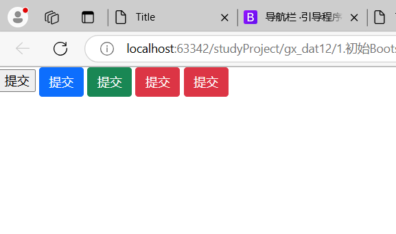
<body><input type="button" value="提交" /><input type="button" value="提交" class="btn btn-primary" /><input type="button" value="提交" class="btn btn-success" /><input type="button" value="提交" class="btn btn-danger" /><input type="button" value="提交" class="btn btn-danger btn-xs" /></body>
</html>
3.2 导航
<!DOCTYPE html>
<html lang="en">
<head><meta charset="UTF-8"><title>Title</title><link rel="stylesheet" href="static/plugins/bootstrap-3.4.1/css/bootstrap.css"><style>.navbar {border-radius: 0;}</style>
</head>
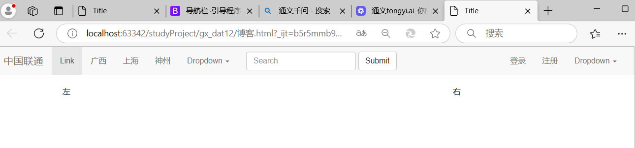
<body><div class="navbar navbar-default"><div class="container-fluid"><!-- Brand and toggle get grouped for better mobile display --><div class="navbar-header"><button type="button" class="navbar-toggle collapsed" data-toggle="collapse"data-target="#bs-example-navbar-collapse-1" aria-expanded="false"><span class="sr-only">Toggle navigation</span><span class="icon-bar"></span><span class="icon-bar"></span><span class="icon-bar"></span></button><a class="navbar-brand" href="#">中国联通</a></div><!-- Collect the nav links, forms, and other content for toggling --><div class="collapse navbar-collapse" id="bs-example-navbar-collapse-1"><ul class="nav navbar-nav"><li class="active"><a href="#">Link <span class="sr-only">(current)</span></a></li><li><a href="#">广西</a></li><li><a href="#">上海</a></li><li><a href="#">神州</a></li><li class="dropdown"><a href="#" class="dropdown-toggle" data-toggle="dropdown" role="button" aria-haspopup="true"aria-expanded="false">Dropdown <span class="caret"></span></a><ul class="dropdown-menu"><li><a href="#">四川</a></li><li><a href="#">上海</a></li><li><a href="#">Something else here</a></li><li role="separator" class="divider"></li><li><a href="#">Separated link</a></li><li role="separator" class="divider"></li><li><a href="#">One more separated link</a></li></ul></li></ul><form class="navbar-form navbar-left"><div class="form-group"><input type="text" class="form-control" placeholder="Search"></div><button type="submit" class="btn btn-default">Submit</button></form><ul class="nav navbar-nav navbar-right"><li><a href="#">登录</a></li><li><a href="#">注册</a></li><li class="dropdown"><a href="#" class="dropdown-toggle" data-toggle="dropdown" role="button" aria-haspopup="true"aria-expanded="false">Dropdown <span class="caret"></span></a><ul class="dropdown-menu"><li><a href="#">Action</a></li><li><a href="#">Another action</a></li><li><a href="#">Something else here</a></li><li role="separator" class="divider"></li><li><a href="#">Separated link</a></li></ul></li></ul></div><!-- /.navbar-collapse --></div><!-- /.container-fluid -->
</div></body>
</html>
3.3 栅格系统
https://v3.bootcss.com/css/#grid
-
把整体划分为了12格
-
分类
-
响应式,根据屏幕宽度不同
.col-lg- 1170px .col-md- 970px .col-sm- 750px -
非响应式
col-xs-6<!DOCTYPE html> <html lang="en"> <head><meta charset="UTF-8"><title>Title</title><link rel="stylesheet" href="static/plugins/bootstrap-3.4.1/css/bootstrap.css"> </head> <body> <div class="col-xs-6" style="background-color: red">1</div> <div class="col-xs-6" style="background-color: green">2</div></body> </html> -
列偏移
col-sm-offset-2<!DOCTYPE html> <html lang="en"> <head><meta charset="UTF-8"><title>Title</title><link rel="stylesheet" href="static/plugins/bootstrap-3.4.1/css/bootstrap.css"> </head> <body> <div class="col-sm-offset-2 col-xs-6" style="background-color: red">2</div></body> </html>
-
3.4 container
<div class="container"><div class="col-sm-9">左边</div><div class="col-sm-3">右边</div>
</div>
<div class="container-fluid"><div  class="col-xs-9">左</div><div  class="col-xs-3">右</div>
</div>

3.5 面板
<div class="panel panel-default"><div class="panel-heading">Panel heading without title</div><div class="panel-body">Panel content</div>
</div>
案例:博客
<!DOCTYPE html>
<html lang="en">
<head><meta charset="UTF-8"><title>Title</title><link rel="stylesheet" href="static/plugins/bootstrap-3.4.1/css/bootstrap.css"><link rel="stylesheet" href="static/plugins/font-awesome-4.7.0/css/font-awesome.css"><style>.navbar {border-radius: 0;}.more .more-item {display: inline-block;margin-right: 20px;}</style>
</head>
<body><div class="navbar navbar-default"><div class="container-fluid"><!-- Brand and toggle get grouped for better mobile display --><div class="navbar-header"><button type="button" class="navbar-toggle collapsed" data-toggle="collapse"data-target="#bs-example-navbar-collapse-1" aria-expanded="false"><span class="sr-only">Toggle navigation</span><span class="icon-bar"></span><span class="icon-bar"></span><span class="icon-bar"></span></button><a class="navbar-brand" href="#">中国联通</a></div><!-- Collect the nav links, forms, and other content for toggling --><div class="collapse navbar-collapse" id="bs-example-navbar-collapse-1"><ul class="nav navbar-nav"><li class="active"><a href="#">Link <span class="sr-only">(current)</span></a></li><li><a href="#">广西</a></li><li><a href="#">上海</a></li><li><a href="#">神州</a></li><li class="dropdown"><a href="#" class="dropdown-toggle" data-toggle="dropdown" role="button" aria-haspopup="true"aria-expanded="false">Dropdown <span class="caret"></span></a><ul class="dropdown-menu"><li><a href="#">四川</a></li><li><a href="#">上海</a></li><li><a href="#">Something else here</a></li><li role="separator" class="divider"></li><li><a href="#">Separated link</a></li><li role="separator" class="divider"></li><li><a href="#">One more separated link</a></li></ul></li></ul><form class="navbar-form navbar-left"><div class="form-group"><input type="text" class="form-control" placeholder="Search"></div><button type="submit" class="btn btn-default"><i class="fa fa-search" aria-hidden="true"></i></button></form><ul class="nav navbar-nav navbar-right"><li><a href="#">登录</a></li><li><a href="#">注册</a></li><li><a data-toggle="modal" data-target="#myModal">对话框</a></li><li class="dropdown"><a href="#" class="dropdown-toggle" data-toggle="dropdown" role="button" aria-haspopup="true"aria-expanded="false">Dropdown <span class="caret"></span></a><ul class="dropdown-menu"><li><a href="#">Action</a></li><li><a href="#">Another action</a></li><li><a href="#">Something else here</a></li><li role="separator" class="divider"></li><li><a href="#">Separated link</a></li></ul></li></ul></div><!-- /.navbar-collapse --></div><!-- /.container-fluid -->
</div><div class="container-fluid clearfix"><div class="col-sm-9"><div class="media"><div class="media-left"><a href="#"><img class="media-object" data-src="holder.js/64x64" alt="64x64"src="data:image/svg+xml;base64,PD94bWwgdmVyc2lvbj0iMS4wIiBlbmNvZGluZz0iVVRGLTgiIHN0YW5kYWxvbmU9InllcyI/PjxzdmcgeG1sbnM9Imh0dHA6Ly93d3cudzMub3JnLzIwMDAvc3ZnIiB3aWR0aD0iNjQiIGhlaWdodD0iNjQiIHZpZXdCb3g9IjAgMCA2NCA2NCIgcHJlc2VydmVBc3BlY3RSYXRpbz0ibm9uZSI+PCEtLQpTb3VyY2UgVVJMOiBob2xkZXIuanMvNjR4NjQKQ3JlYXRlZCB3aXRoIEhvbGRlci5qcyAyLjYuMC4KTGVhcm4gbW9yZSBhdCBodHRwOi8vaG9sZGVyanMuY29tCihjKSAyMDEyLTIwMTUgSXZhbiBNYWxvcGluc2t5IC0gaHR0cDovL2ltc2t5LmNvCi0tPjxkZWZzPjxzdHlsZSB0eXBlPSJ0ZXh0L2NzcyI+PCFbQ0RBVEFbI2hvbGRlcl8xN2QzYzQyY2ZjNyB0ZXh0IHsgZmlsbDojQUFBQUFBO2ZvbnQtd2VpZ2h0OmJvbGQ7Zm9udC1mYW1pbHk6QXJpYWwsIEhlbHZldGljYSwgT3BlbiBTYW5zLCBzYW5zLXNlcmlmLCBtb25vc3BhY2U7Zm9udC1zaXplOjEwcHQgfSBdXT48L3N0eWxlPjwvZGVmcz48ZyBpZD0iaG9sZGVyXzE3ZDNjNDJjZmM3Ij48cmVjdCB3aWR0aD0iNjQiIGhlaWdodD0iNjQiIGZpbGw9IiNFRUVFRUUiLz48Zz48dGV4dCB4PSIxMy40NjA5Mzc1IiB5PSIzNi41Ij42NHg2NDwvdGV4dD48L2c+PC9nPjwvc3ZnPg=="data-holder-rendered="true" style="width: 64px; height: 64px;"></a></div><div class="media-body"><h4 class="media-heading">Top aligned media</h4><div><i class="fa fa-star" aria-hidden="true" style="color: #f0ad4e"></i><i class="fa fa-star" aria-hidden="true" style="color: #f0ad4e"></i><i class="fa fa-star" aria-hidden="true" style="color: #f0ad4e"></i><i class="fa fa-star" aria-hidden="true" style="color: #f0ad4e"></i><i class="fa fa-star-o" aria-hidden="true"></i></div><p>Cras sit amet nibh libero, in gravida nulla. Nulla vel metus scelerisque ante sollicitudin commodo.Cras purus odio, vestibulum in vulputate at, tempus viverra turpis. Fusce condimentum nunc ac nisivulputate fringilla. Donec lacinia congue felis in faucibus.</p><p>Donec sed odio dui. Nullam quis risus eget urna mollis ornare vel eu leo. Cum sociis natoquepenatibus et magnis dis parturient montes, nascetur ridiculus mus.</p><div class="more clearfix"><div class="more-item"><i class="fa fa-calendar" aria-hidden="true"></i> 2021-11-11</div><div class="more-item"><i class="fa fa-user-circle" aria-hidden="true"></i> 佩奇</div><div class="more-item"><i class="fa fa-comments-o" aria-hidden="true"></i> 1000</div><div class="more-item" style="float:right;"><i class="fa fa-comments-o" aria-hidden="true"></i> 1000</div></div></div></div><div class="media"><div class="media-left"><a href="#"><img class="media-object" data-src="holder.js/64x64" alt="64x64"src="data:image/svg+xml;base64,PD94bWwgdmVyc2lvbj0iMS4wIiBlbmNvZGluZz0iVVRGLTgiIHN0YW5kYWxvbmU9InllcyI/PjxzdmcgeG1sbnM9Imh0dHA6Ly93d3cudzMub3JnLzIwMDAvc3ZnIiB3aWR0aD0iNjQiIGhlaWdodD0iNjQiIHZpZXdCb3g9IjAgMCA2NCA2NCIgcHJlc2VydmVBc3BlY3RSYXRpbz0ibm9uZSI+PCEtLQpTb3VyY2UgVVJMOiBob2xkZXIuanMvNjR4NjQKQ3JlYXRlZCB3aXRoIEhvbGRlci5qcyAyLjYuMC4KTGVhcm4gbW9yZSBhdCBodHRwOi8vaG9sZGVyanMuY29tCihjKSAyMDEyLTIwMTUgSXZhbiBNYWxvcGluc2t5IC0gaHR0cDovL2ltc2t5LmNvCi0tPjxkZWZzPjxzdHlsZSB0eXBlPSJ0ZXh0L2NzcyI+PCFbQ0RBVEFbI2hvbGRlcl8xN2QzYzQyY2ZjNyB0ZXh0IHsgZmlsbDojQUFBQUFBO2ZvbnQtd2VpZ2h0OmJvbGQ7Zm9udC1mYW1pbHk6QXJpYWwsIEhlbHZldGljYSwgT3BlbiBTYW5zLCBzYW5zLXNlcmlmLCBtb25vc3BhY2U7Zm9udC1zaXplOjEwcHQgfSBdXT48L3N0eWxlPjwvZGVmcz48ZyBpZD0iaG9sZGVyXzE3ZDNjNDJjZmM3Ij48cmVjdCB3aWR0aD0iNjQiIGhlaWdodD0iNjQiIGZpbGw9IiNFRUVFRUUiLz48Zz48dGV4dCB4PSIxMy40NjA5Mzc1IiB5PSIzNi41Ij42NHg2NDwvdGV4dD48L2c+PC9nPjwvc3ZnPg=="data-holder-rendered="true" style="width: 64px; height: 64px;"></a></div><div class="media-body"><h4 class="media-heading">Top aligned media</h4><p>Cras sit amet nibh libero, in gravida nulla. Nulla vel metus scelerisque ante sollicitudin commodo.Cras purus odio, vestibulum in vulputate at, tempus viverra turpis. Fusce condimentum nunc ac nisivulputate fringilla. Donec lacinia congue felis in faucibus.</p><p>Donec sed odio dui. Nullam quis risus eget urna mollis ornare vel eu leo. Cum sociis natoquepenatibus et magnis dis parturient montes, nascetur ridiculus mus.</p></div></div><div class="media"><div class="media-left"><a href="#"><img class="media-object" data-src="holder.js/64x64" alt="64x64"src="data:image/svg+xml;base64,PD94bWwgdmVyc2lvbj0iMS4wIiBlbmNvZGluZz0iVVRGLTgiIHN0YW5kYWxvbmU9InllcyI/PjxzdmcgeG1sbnM9Imh0dHA6Ly93d3cudzMub3JnLzIwMDAvc3ZnIiB3aWR0aD0iNjQiIGhlaWdodD0iNjQiIHZpZXdCb3g9IjAgMCA2NCA2NCIgcHJlc2VydmVBc3BlY3RSYXRpbz0ibm9uZSI+PCEtLQpTb3VyY2UgVVJMOiBob2xkZXIuanMvNjR4NjQKQ3JlYXRlZCB3aXRoIEhvbGRlci5qcyAyLjYuMC4KTGVhcm4gbW9yZSBhdCBodHRwOi8vaG9sZGVyanMuY29tCihjKSAyMDEyLTIwMTUgSXZhbiBNYWxvcGluc2t5IC0gaHR0cDovL2ltc2t5LmNvCi0tPjxkZWZzPjxzdHlsZSB0eXBlPSJ0ZXh0L2NzcyI+PCFbQ0RBVEFbI2hvbGRlcl8xN2QzYzQyY2ZjNyB0ZXh0IHsgZmlsbDojQUFBQUFBO2ZvbnQtd2VpZ2h0OmJvbGQ7Zm9udC1mYW1pbHk6QXJpYWwsIEhlbHZldGljYSwgT3BlbiBTYW5zLCBzYW5zLXNlcmlmLCBtb25vc3BhY2U7Zm9udC1zaXplOjEwcHQgfSBdXT48L3N0eWxlPjwvZGVmcz48ZyBpZD0iaG9sZGVyXzE3ZDNjNDJjZmM3Ij48cmVjdCB3aWR0aD0iNjQiIGhlaWdodD0iNjQiIGZpbGw9IiNFRUVFRUUiLz48Zz48dGV4dCB4PSIxMy40NjA5Mzc1IiB5PSIzNi41Ij42NHg2NDwvdGV4dD48L2c+PC9nPjwvc3ZnPg=="data-holder-rendered="true" style="width: 64px; height: 64px;"></a></div><div class="media-body"><h4 class="media-heading">Top aligned media</h4><p>Cras sit amet nibh libero, in gravida nulla. Nulla vel metus scelerisque ante sollicitudin commodo.Cras purus odio, vestibulum in vulputate at, tempus viverra turpis. Fusce condimentum nunc ac nisivulputate fringilla. Donec lacinia congue felis in faucibus.</p><p>Donec sed odio dui. Nullam quis risus eget urna mollis ornare vel eu leo. Cum sociis natoquepenatibus et magnis dis parturient montes, nascetur ridiculus mus.</p></div></div><ul class="pagination"><li class="disabled"><a href="#" aria-label="Previous"><span aria-hidden="true">«</span></a></li><li class="active"><a href="#">1 <span class="sr-only">(current)</span></a></li><li><a href="#">2</a></li><li><a href="#">3</a></li><li><a href="#">4</a></li><li><a href="#">5</a></li><li><a href="#" aria-label="Next"><span aria-hidden="true">»</span></a></li></ul></div><div class="col-sm-3"><div class="panel panel-default"><div class="panel-heading"><i class="fa fa-fire" aria-hidden="true" style="color:#f0ad4e;font-size: 18px"></i>最新推荐</div><div class="panel-body">Panel contentPanel contentPanel content</div></div><div class="panel panel-primary"><div class="panel-heading">Panel heading without title</div><div class="panel-body">Panel content</div></div><div class="panel panel-danger"><div class="panel-heading">Panel heading without title</div><div class="panel-body">Panel content</div></div></div>
</div><!-- Modal -->
<div class="modal fade" id="myModal" tabindex="-1" role="dialog" aria-labelledby="myModalLabel"><div class="modal-dialog" role="document"><div class="modal-content"><div class="modal-header"><button type="button" class="close" data-dismiss="modal" aria-label="Close"><span aria-hidden="true">×</span></button><h4 class="modal-title" id="myModalLabel">用户信息处理</h4></div><div class="modal-body">...</div><div class="modal-footer"><button type="button" class="btn btn-default" data-dismiss="modal">关闭</button><button type="button" class="btn btn-primary">确 定</button></div></div></div>
</div><script src="static/js/jquery-3.6.0.min.js"></script>
<script src="static/plugins/bootstrap-3.4.1/js/bootstrap.min.js"></script></body>
</html>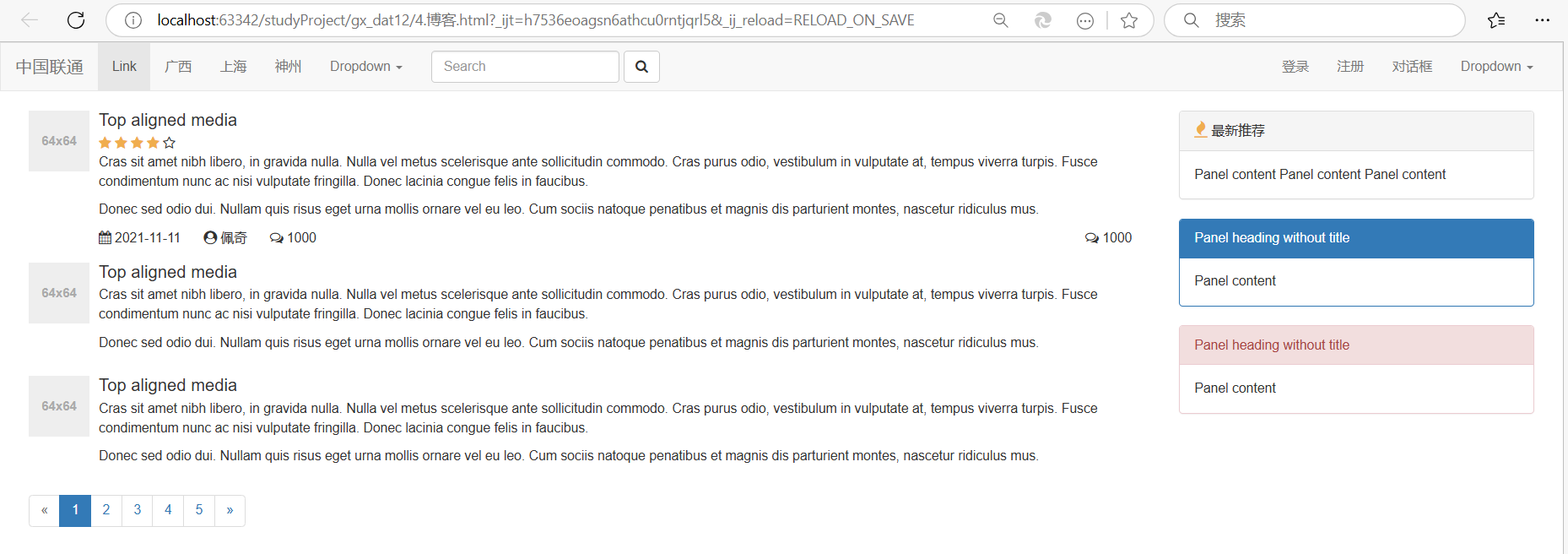
案例:登录
- 宽度 + 居中(区域居中)
- 内边距
- 表单
<!DOCTYPE html>
<html lang="en">
<head><meta charset="UTF-8"><title>Title</title><link rel="stylesheet" href="static/plugins/bootstrap-3.4.1/css/bootstrap.css"><style>.account{width: 400px;height: 500px;border: 1px solid #00FF7F;margin-left: auto;margin-right: auto;margin-top: 20px;padding: 20px 40px;border-radius: 10px;box-shadow: 5px 5px 20px #51585e;}.account h1{text-align: center;margin-top: 10px;}</style>
</head>
<body><div class="account"><h1>用户登录</h1><form><div class="form-group"><label for="exampleInputEmail1">用户名或手机号</label><input type="email" class="form-control" id="exampleInputEmail1" placeholder="请输入用户名"></div><div class="form-group"><label for="exampleInputPassword1">密码</label><input type="password" class="form-control" id="exampleInputPassword1" placeholder="请输入密码"></div><button type="submit" class="btn btn-primary">登录</button></form></div></body>
</html>
案例:后台管理

- 导航
- 新建,按钮。
- 表格,
<!DOCTYPE html>
<html lang="en">
<head><meta charset="UTF-8"><title>Title</title><link rel="stylesheet" href="static/plugins/bootstrap-3.4.1/css/bootstrap.css"><style>.navbar {border-radius: 0;}</style>
</head>
<body>
<div class="navbar navbar-default"><div class="container"><div class="navbar-header"><button type="button" class="navbar-toggle collapsed" data-toggle="collapse"data-target="#bs-example-navbar-collapse-1" aria-expanded="false"><span class="sr-only">Toggle navigation</span><span class="icon-bar"></span><span class="icon-bar"></span><span class="icon-bar"></span></button><a class="navbar-brand" href="#">中国联通xx系统</a></div><div class="collapse navbar-collapse" id="bs-example-navbar-collapse-1"><ul class="nav navbar-nav"><li><a href="#">广西</a></li><li><a href="#">上海</a></li></ul><ul class="nav navbar-nav navbar-right"><li><a href="#">登录</a></li><li><a href="#">注册</a></li></ul></div></div>
</div><div class="container"><div><input type="button" value="新 建" class="btn btn-primary"/></div><div style="margin-top: 20px"><table class="table table-bordered table-hover"><thead><tr><th>#</th><th>First Name</th><th>Last Name</th><th>Username</th></tr></thead><tbody><tr><th scope="row">1</th><td>Mark</td><td>Otto</td><td>@mdo</td></tr><tr><th scope="row">2</th><td>Jacob</td><td>Thornton</td><td>@fat</td></tr><tr><th scope="row">3</th><td>Larry</td><td>the Bird</td><td>@twitter</td></tr></tbody></table></div></div></body>
</html>
案例:后台管理+面板
<!DOCTYPE html>
<html lang="en">
<head><meta charset="UTF-8"><title>Title</title><link rel="stylesheet" href="static/plugins/bootstrap-3.4.1/css/bootstrap.css"><style>.navbar {border-radius: 0;}</style>
</head>
<body>
<div class="navbar navbar-default"><div class="container"><div class="navbar-header"><button type="button" class="navbar-toggle collapsed" data-toggle="collapse"data-target="#bs-example-navbar-collapse-1" aria-expanded="false"><span class="sr-only">Toggle navigation</span><span class="icon-bar"></span><span class="icon-bar"></span><span class="icon-bar"></span></button><a class="navbar-brand" href="#">中国联通xx系统</a></div><div class="collapse navbar-collapse" id="bs-example-navbar-collapse-1"><ul class="nav navbar-nav"><li><a href="#">广西</a></li><li><a href="#">上海</a></li></ul><ul class="nav navbar-nav navbar-right"><li><a href="#">登录</a></li><li><a href="#">注册</a></li></ul></div></div>
</div><div class="container"><div class="panel panel-default"><div class="panel-heading">表单区域</div><div class="panel-body"><form class="form-inline"><div class="form-group"><label class="sr-only" for="exampleInputEmail3">Email address</label><input type="email" class="form-control" id="exampleInputEmail3" placeholder="Email"></div><div class="form-group"><label class="sr-only" for="exampleInputPassword3">Password</label><input type="password" class="form-control" id="exampleInputPassword3" placeholder="Password"></div><button type="submit" class="btn btn-success">保 存</button></form></div></div><div class="panel panel-default"><div class="panel-heading">数据列表</div><!--<div class="panel-body">注意:以下我们经过筛选出来的重要数据。</div>--><table class="table table-bordered table-hover"><thead><tr><th>#</th><th>First Name</th><th>Last Name</th><th>操作</th></tr></thead><tbody><tr><th scope="row">1</th><td>Mark</td><td>Otto</td><td><a class="btn btn-primary btn-xs">编辑</a><a class="btn btn-danger btn-xs">删除</a></td></tr><tr><th scope="row">2</th><td>Jacob</td><td>Thornton</td><td><a class="btn btn-primary btn-xs">编辑</a><a class="btn btn-danger btn-xs">删除</a></td></tr><tr><th scope="row">3</th><td>Larry</td><td>the Bird</td><td><a class="btn btn-primary btn-xs">编辑</a><a class="btn btn-danger btn-xs">删除</a></td></tr></tbody></table></div><ul class="pagination"><li class="disabled"><a href="#" aria-label="Previous"><span aria-hidden="true">«</span></a></li><li class="active"><a href="#">1 <span class="sr-only">(current)</span></a></li><li><a href="#">2</a></li><li><a href="#">3</a></li><li><a href="#">4</a></li><li><a href="#">5</a></li><li><a href="#" aria-label="Next"><span aria-hidden="true">»</span></a></li></ul></div></body>
</html>
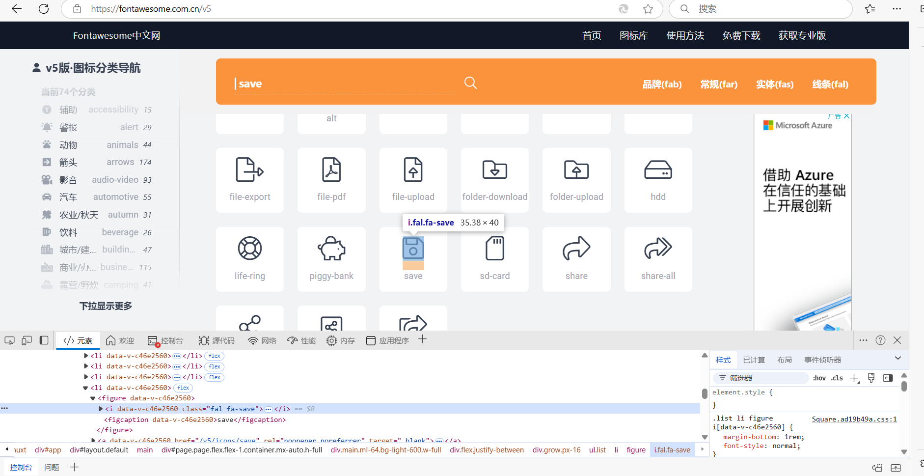
3.6 图标
-
bootstrap提供,不多。
-
fontawesome组件
-
https://fontawesome.com.cn/-
下载并引入:
<link rel="stylesheet" href="static/plugins/font-awesome-4.7.0/css/font-awesome.css">复制使用:
-
3.7 BootStrap依赖
BootStrap依赖JavaScript的类库,jQuery。
-
下载 jQuery,在页面上应用上jQuery。
-
在页面上应用BootStrap的JavaScript类库。
- JavaScript,网页动态交互
-
引用:
<script src="static/js/jquery-3.6.0.min.js"></script>
<script src="static/plugins/bootstrap-3.4.1/js/bootstrap.min.js"></script>