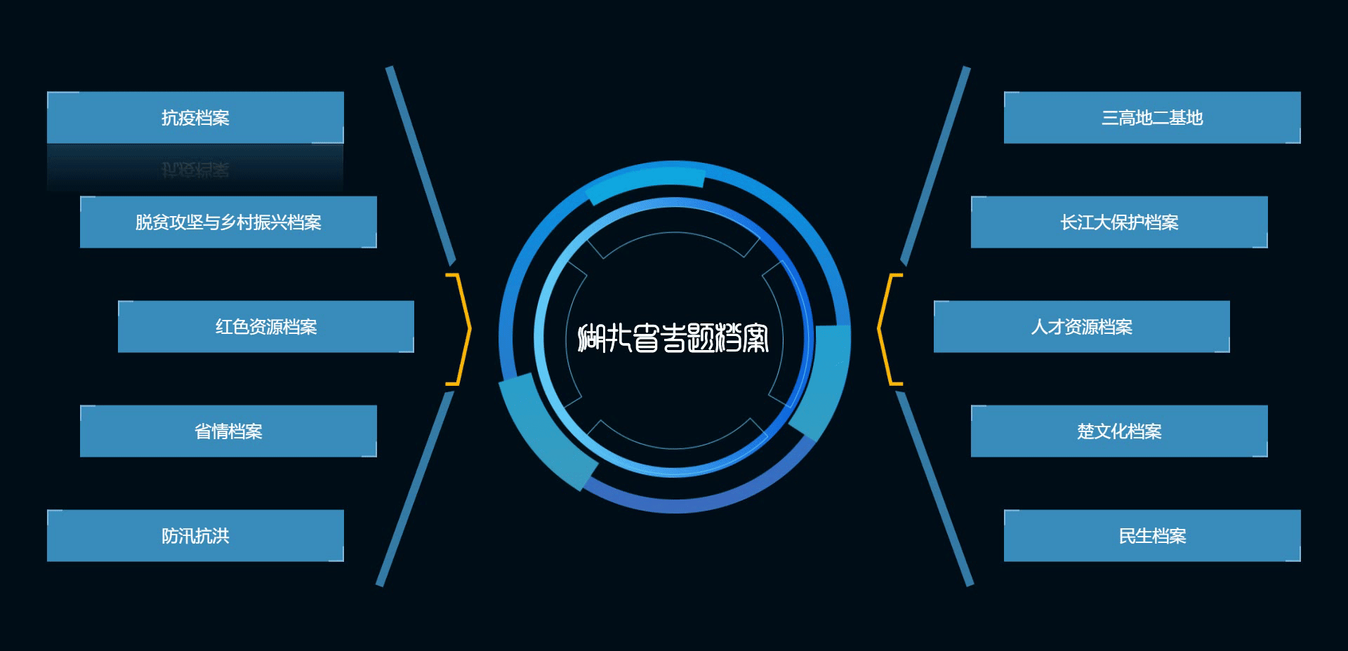
vue模板中代码
<div class="contentBox clearfix home"><div class="circle"><img class="in-circle" src="../../assets/img/in-circle.png" alt=""><img class="out-circle" src="../../assets/img/out-circle.png" alt=""><div><img src="../../assets/img/hbsztda.png" alt=""></div></div><div class="leftAndRight left-wing"><div class="left-1"  @click="goPath(ztList[0])" style="color: #fff">{{ ztList[0].name }}</div><div class="left-2"  @click="goPath(ztList[1])">{{ ztList[1].name }}</div><div class="left-3"  @click="goPath(ztList[2])">{{ ztList[2].name }}</div><div class="left-4"  @click="goPath(ztList[3])">{{ ztList[3].name }}</div><div class="left-5"  @click="goPath(ztList[4])">{{ ztList[4].name }}</div></div><div class="leftAndRight right-wing"><div class="right-1"  @click="goPath(ztList[5])">{{ ztList[5].name }}</div><div class="right-2"  @click="goPath(ztList[6])">{{ ztList[6].name }}</div><div class="right-3"  @click="goPath(ztList[7])">{{ ztList[7].name }}</div><div class="right-4"  @click="goPath(ztList[8])">{{ ztList[8].name }}</div><div class="right-5"  @click="goPath(ztList[9])">{{ ztList[9].name }}</div></div>
</div>
css代码
.home {width: 100vw;height: 100%;background: #000F17;position: relative;display: flex;justify-content: center;align-items: center;.circle {width: 505px;height: 505px;max-width: 100%;max-height: 100%;text-align: center;background-size: 100% 100%;color: #FFFFFF;font-size: 40px;font-family: Microsoft YaHei UI, Microsoft YaHei UI;font-weight: 400;position: relative;display: grid;place-items: center;.in-circle {width: 400px;height: 400px;position: absolute;transition: 0.5s;transform-origin: center center; animation: rotation 10s linear infinite;}@-webkit-keyframes rotation{from {-webkit-transform: rotate(0deg);}to {-webkit-transform: rotate(360deg);}}.out-circle {width: 100%;height: 100%;position: absolute;transition: 0.5s;transform-origin: center center; animation: rotateImg 10s linear infinite;}@-webkit-keyframes rotateImg{from {-webkit-transform: rotate(0deg);}to {-webkit-transform: rotate(-360deg);}}div {margin: auto;}}.leftAndRight {width: 35vw;height: 80vh;position: absolute;top: 50%;transform: translateY(-50%);font-size: 24px;color: #FFFFFF;display: flex;flex-direction: column;justify-content: space-around;}.left-wing {left: 0;background: url('../../assets/img/left.png') no-repeat;background-position: right;background-size: auto 100%;text-align: right;}.right-wing {right: 0;background: url('../../assets/img/right.png') no-repeat;background-size: auto 100%;align-items: flex-end;}.left-1,.left-2, .left-3,.left-4,.left-5 {width: 22vw;height: 8vh;line-height: 8vh;text-align: center;box-sizing: border-box;border: 0.5px solid #D8D8D8;cursor: pointer;color: #fff;background-color: plum;background-color:#bb65c3;border: none;transition: all 0.3s ease-in-out;filter: hue-rotate(calc(4.6 * 137deg));}.left-1 {margin-left: 10%;}.left-2 {margin-left: 17%;}.left-3 {margin-left: 25%;}.left-4 {margin-left: 17%;}.left-5 {margin-left: 10%;}.left-1::before,.left-1::after,.left-2::before,.left-2::after,.left-3::before,.left-3::after,.left-4::before,.left-4::after,.left-5::before,.left-5::after,.right-1::before,.right-1::after,.right-2::before,.right-2::after,.right-3::before,.right-3::after,.right-4::before,.right-4::after,.right-5::before,.right-5::after {/* 将两个伪元素的相同部分写在一起 */content: "";position: absolute;width: 20px;height: 20px;border: 2px solid plum;/* 动画过渡 最后的0.3s是延迟时间 */transition: all 0.3s ease-in-out 0.3s;}.left-1::before,.left-2::before,.left-3::before,.left-4::before,.left-5::before,.right-1::before,.right-2::before,.right-3::before,.right-4::before,.right-5::before {top: 0;left: 0;/* 删除左边元素的右、下边框 */border-right: 0;border-bottom: 0;}.left-1::after,.left-2::after,.left-3::after,.left-4::after,.left-5::after,.right-1::after,.right-2::after,.right-3::after,.right-4::after,.right-5::after {bottom: 0;right: 0;/* 删除右边元素的左、上边框 */border-top: 0;border-left: 0;}.left-1:hover,.left-2:hover,.left-3:hover,.left-4:hover,.left-5:hover,.right-1:hover,.right-2:hover,.right-3:hover,.right-4:hover,.right-5:hover {background-color: plum;// color: #000;/* 发光效果和倒影 */box-shadow: 0 0 50px plum;/* below是下倒影 1px是倒影的元素相隔的距离 最后是个渐变颜色 */-webkit-box-reflect: below 1px linear-gradient(transparent,rgba(0,0,0,0.3));/* 设置以上属性的延迟时间 */// transition-delay: 0.4s;background-color:#bb65c3;border: none;}.left-1:hover::before,.left-1:hover::after,.left-2:hover::before,.left-2:hover::after,.left-3:hover::before,.left-3:hover::after,.left-4:hover::before,.left-4:hover::after,.left-5:hover::before,.left-5:hover::after,.right-1:hover::before,.right-1:hover::after,.right-2:hover::before,.right-2:hover::after,.right-3:hover::before,.right-3:hover::after,.right-4:hover::before,.right-4:hover::after,.right-5:hover::before,.right-5:hover::after {width: 60%;height: 60%;transition-delay: 0s;}.right-1,.right-2, .right-3,.right-4,.right-5 {width: 22vw;height: 8vh;line-height: 8vh;text-align: center;box-sizing: border-box;cursor: pointer;color: #fff;background-color: plum;background-color:#bb65c3;border: none;transition: all 0.3s ease-in-out;filter: hue-rotate(calc(4.6 * 137deg));}.right-1 {margin-right: 10%;}.right-2 {margin-right: 17%;}.right-3 {margin-right: 25%;}.right-4 {margin-right: 17%;}.right-5 {margin-right: 10%;}}@media screen and (max-width:1600px){.home .circle{font-size: 28px;width: 385px;height: 385px;line-height: 385px;.in-circle {width: 300px;height: 300px;}}.home .leftAndRight {font-size: 22px;}}@media screen and (max-width:1366px){.home .circle{width: 205px;height: 205px;line-height: 205px;font-size: 26px;.in-circle {width: 200px;height: 200px;}}.home .leftAndRight {font-size: 20px;}}运行效果