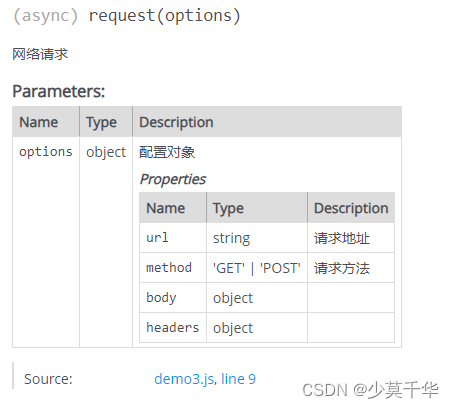
HarmonyOS提供了一套复杂且强大的Java UI框架,其中Component提供内容显示,是界面中所有组件的基类。ComponentContainer作为容器容纳Component或ComponentContainer对象,并对它们进行布局。
Java UI框架也提供了一部分Component和ComponentContainer的具体子类,即常用的组件(比如:Text、Button、Image等)和常用的布局(比如:DirectionalLayout、DependentLayout等)。如果现有的组件和布局无法满足设计需求,例如仿遥控器的圆盘按钮、可滑动的环形控制器等,可以通过自定义组件和自定义布局来实现。
自定义组件是由开发者定义的具有一定特性的组件,通过扩展Component或其子类实现,可以精确控制屏幕元素的外观,也可响应用户的点击、触摸、长按等操作。
自定义布局是由开发者定义的具有特定布局规则的容器类组件,通过扩展ComponentContainer或其子类实现,可以将各子组件摆放到指定的位置,也可响应用户的滑动、拖拽等事件。
自定义组件
当Java UI框架提供的组件无法满足设计需求时,可以创建自定义组件,根据设计需求添加绘制任务,并定义组件的属性及事件响应,完成组件的自定义。
常用接口
| 接口名 | 作用 |
|---|---|
| setEstimateSizeListener | 设置测量组件的侦听器。 |
| setEstimatedSize | 设置测量的宽度和高度。 |
| onEstimateSize | 测量组件的大小以确定宽度和高度。 |
| EstimateSpec.getChildSizeWithMode | 基于指定的大小和模式为子组件创建度量规范。 |
| EstimateSpec.getSize | 从提供的度量规范中提取大小。 |
| EstimateSpec.getMode | 获取该组件的显示模式。 |
| addDrawTask | 添加绘制任务。 |
| onDraw | 通过绘制任务更新组件时调用。 |
如何实现自定义组件
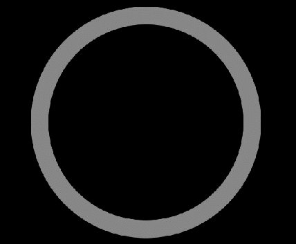
下面以自定义圆环组件为例,介绍自定义组件的通用配置方法:在屏幕中绘制圆环,并实现点击改变圆环颜色的功能。
在界面中显示的自定义圆环组件
1. 创建自定义组件的类,并继承Component或其子类,添加构造方法。
示例代码如下
public class CustomComponent extends Component{public CustomComponent(Context context) {this(context, null);}//如需支持xml创建自定义组件,必须添加该构造方法public CustomComponent(Context context, AttrSet attrSet) {super(context, attrSet);}
}
2. 实现Component.EstimateSizeListener接口,在onEstimateSize方法中进行组件测量,并通过setEstimatedSize方法通知组件。
示例代码如下:
public class CustomComponent extends Component implements Component.EstimateSizeListener {//240为组件默认大小public int width = 240;public int height = 240;public CustomComponent(Context context, AttrSet attrSet) {...// 设置测量组件的侦听器setEstimateSizeListener(this);}...@Overridepublic boolean onEstimateSize(int widthEstimateConfig, int heightEstimateConfig) {int widthSpce = EstimateSpec.getMode(widthEstimateConfig);int heightSpce = EstimateSpec.getMode(heightEstimateConfig);int widthConfig = 0;switch (widthSpce) {case EstimateSpec.UNCONSTRAINT:case EstimateSpec.PRECISE:width = EstimateSpec.getSize(widthEstimateConfig);widthConfig = EstimateSpec.getSizeWithMode(width, EstimateSpec.PRECISE);break;case EstimateSpec.NOT_EXCEED:widthConfig = EstimateSpec.getSizeWithMode(width, EstimateSpec.PRECISE);break;default:break;}int heightConfig = 0;switch (heightSpce) {case EstimateSpec.UNCONSTRAINT:case EstimateSpec.PRECISE:height = EstimateSpec.getSize(heightEstimateConfig);heightConfig = EstimateSpec.getSizeWithMode(height, EstimateSpec.PRECISE);break;case EstimateSpec.NOT_EXCEED:heightConfig = EstimateSpec.getSizeWithMode(height, EstimateSpec.PRECISE);break;default:break;}setEstimatedSize(widthConfig, heightConfig);return true;}
}- 注意事项
- 自定义组件测量出的大小需通过setEstimatedSize通知组件,并且必须返回true使测量值生效。
- setEstimatedSize方法的入参携带模式信息,可使用Component.EstimateSpec.getSizeWithMode方法进行拼接。
- 测量模式
测量组件的宽高需要携带模式信息,不同测量模式下的测量结果也不相同,需要根据实际需求选择适合的测量模式。
测量模式信息
| 模式 | 作用 |
|---|---|
| UNCONSTRAINT | 父组件对子组件没有约束,表示子组件可以任意大小。 |
| PRECISE | 父组件已确定子组件的大小。 |
| NOT_EXCEED | 已为子组件确定了最大大小,子组件不能超过指定大小。 |
3. 自定义xml属性,通过构造方法中携带的参数attrSet,可以获取到在xml中配置的属性值,并应用在该自定义组件中。
示例代码如下:
public class CustomComponent extends Component implements Component.EstimateSizeListener {private static final String ATTR_RING_WIDTH = "ring_width";private static final String ATTR_RING_RADIUS = "ring_radius";private static final String ATTR_DEFAULT_COLOR = "default_color";private static final String ATTR_PRESSED_COLOR = "pressed_color";public float ringWidth = 20f; //圆环宽度public float ringRadius = 100f; //圆环半径public Color defaultColor = Color.YELLOW; //默认颜色public Color pressedColor = Color.CYAN; //按压态颜色   public CustomComponent(Context context, AttrSet attrSet) {...//初始化xml属性initAttrSet(attrSet);}private void initAttrSet(AttrSet attrSet) {if (attrSet == null) return;if (attrSet.getAttr(ATTR_DEFAULT_COLOR).isPresent()) {defaultColor = attrSet.getAttr(ATTR_DEFAULT_COLOR).get().getColorValue();}if (attrSet.getAttr(ATTR_RING_WIDTH).isPresent()) {ringWidth = attrSet.getAttr(ATTR_RING_WIDTH).get().getDimensionValue();}if (attrSet.getAttr(ATTR_RING_RADIUS).isPresent()) {ringRadius = attrSet.getAttr(ATTR_RING_RADIUS).get().getDimensionValue();}if (attrSet.getAttr(ATTR_PRESSED_COLOR).isPresent()) {pressedColor = attrSet.getAttr(ATTR_PRESSED_COLOR).get().getColorValue();}}
}
4. 实现Component.DrawTask接口,在onDraw方法中执行绘制任务,该方法提供的画布Canvas,可以精确控制屏幕元素的外观。在执行绘制任务之前,需要定义画笔Paint。
示例代码如下:
public class CustomComponent extends Component implements Component.DrawTask,Component.EstimateSizeListener {// 绘制圆环的画笔private Paint circlePaint;    public CustomComponen(Context context, AttrSet attrSet) {...// 初始化画笔initPaint();// 添加绘制任务addDrawTask(this);}private void initPaint(){circlePaint = new Paint();circlePaint.setColor(defaultColor);circlePaint.setStrokeWidth(ringWidth);circlePaint.setStyle(Paint.Style.STROKE_STYLE);}@Overridepublic void onDraw(Component component, Canvas canvas) {int x = width / 2;int y = height / 2;canvas.drawCircle(x, y, ringRadius, circlePaint);}...
}
5. 实现Component.TouchEventListener或其他事件的接口,使组件可响应用户输入。
示例代码如下
public class CustomComponent extends Component implements Component.DrawTask, Component.EstimateSizeListener, Component.TouchEventListener {...public CustomComponent(Context context, AttrSet attrSet) {...// 设置TouchEvent响应事件setTouchEventListener(this);}...@Overridepublic boolean onTouchEvent(Component component, TouchEvent touchEvent) {switch (touchEvent.getAction()) {case TouchEvent.PRIMARY_POINT_DOWN:circlePaint.setColor(pressedColor);invalidate();break;case TouchEvent.PRIMARY_POINT_UP:circlePaint.setColor(defaultColor);invalidate();break;}return true;}
}
注意:
- 需要更新UI显示时,可调用invalidate()方法。
- 示例中展示TouchEventListener为响应触摸事件,除此之外还可实现ClickedListener响应点击事件、LongClickedListener响应长按事件等。
6. 在xml文件中创建并配置自定义组件
<?xml version="1.0" encoding="utf-8"?>
<DirectionalLayoutxmlns:ohos="http://schemas.huawei.com/res/ohos"xmlns:custom="http://schemas.huawei.com/res/custom"ohos:height="match_parent"ohos:width="match_parent"ohos:orientation="vertical"><!-- 请根据实际包名和文件路径引入--><com.huawei.harmonyosdemo.custom.CustomComponentohos:height="300vp"ohos:width="match_parent"ohos:background_element="black"ohos:clickable="true"custom:default_color="gray"custom:pressed_color="red"custom:ring_width="20vp"custom:ring_radius="120vp"/>
</DirectionalLayout>
场景示例
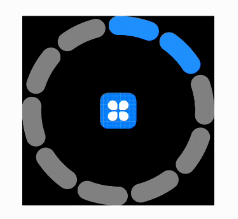
利用自定义组件,绘制环形进度控制器,可通过滑动改变当前进度,也可响应进度的改变,UI显示的样式也可通过设置属性进行调整。
自定义环形进度控制器
示例代码如下:
public class CustomControlBar extends Component implements Component.DrawTask,Component.EstimateSizeListener, Component.TouchEventListener {private final static String ATTR_UN_FILL_COLOR = "unfill_color";private final static String ATTR_FILL_COLOR = "fill_color";private final static String ATTR_CIRCLE_WIDTH = "circle_width";private final static String ATTR_COUNT = "count";private final static String ATTR_CURRENT_PROGRESS = "current_progress";private final static String ATTR_SPLIT_SIZE = "split_size";private final static String ATTR_CIRCLE_RADIUS = "circle_radius";private final static String ATTR_CENTER_PIXELMAP = "center_pixelmap";private final static float CIRCLE_ANGLE = 360.0f;private final static int DEF_UNFILL_COLOR = 0xFF808080;private final static int DEF_FILL_COLOR = 0xFF1E90FF;public int width = 240;public int height = 240;// 圆环轨道颜色private Color unFillColor = new Color(DEF_UNFILL_COLOR);// 圆环覆盖颜色private Color fillColor = new Color(DEF_FILL_COLOR);// 圆环宽度private int circleWidth = 30;// 画笔private final Paint paint;// 个数private int count = 10;// 当前进度private int currentCount = 0;// 间隙值private int splitSize = 10;// 内圆的正切方形private final RectFloat centerRectFloat = new RectFloat();// 中心绘制的图片private PixelMap image = null;private int radius = 100;// 原点坐标private Point centerPoint;// 进度改变的事件响应private ProgressChangeListener listener;public CustomControlBar(Context context) {this(context, null);}public CustomControlBar(Context context, AttrSet attrSet) {super(context, attrSet);paint = new Paint();initAttrSet(attrSet);setEstimateSizeListener(this);if (!isClickable()) setClickable(true);setTouchEventListener(this);addDrawTask(this);listener = null;}// 初始化属性值private void initAttrSet(AttrSet attrSet) {if (attrSet == null) return;if (attrSet.getAttr(ATTR_UN_FILL_COLOR).isPresent()) {unFillColor = attrSet.getAttr(ATTR_UN_FILL_COLOR).get().getColorValue();}if (attrSet.getAttr(ATTR_FILL_COLOR).isPresent()) {fillColor = attrSet.getAttr(ATTR_FILL_COLOR).get().getColorValue();}if (attrSet.getAttr(ATTR_CIRCLE_WIDTH).isPresent()) {circleWidth = attrSet.getAttr(ATTR_CIRCLE_WIDTH).get().getDimensionValue();}if (attrSet.getAttr(ATTR_COUNT).isPresent()) {count = attrSet.getAttr(ATTR_COUNT).get().getIntegerValue();}if (attrSet.getAttr(ATTR_CURRENT_PROGRESS).isPresent()) {currentCount = attrSet.getAttr(ATTR_CURRENT_PROGRESS).get().getIntegerValue();}if (attrSet.getAttr(ATTR_SPLIT_SIZE).isPresent()) {splitSize = attrSet.getAttr(ATTR_SPLIT_SIZE).get().getIntegerValue();}if (attrSet.getAttr(ATTR_CIRCLE_RADIUS).isPresent()) {radius = attrSet.getAttr(ATTR_CIRCLE_RADIUS).get().getDimensionValue();}if (attrSet.getAttr(ATTR_CENTER_PIXELMAP).isPresent()) {Element element = attrSet.getAttr(ATTR_CENTER_PIXELMAP).get().getElement();if (element instanceof PixelMapElement) {image = ((PixelMapElement) element).getPixelMap();}}}@Overridepublic boolean onEstimateSize(int widthEstimateConfig, int heightEstimateConfig) {int widthSpce = EstimateSpec.getMode(widthEstimateConfig);int heightSpce = EstimateSpec.getMode(heightEstimateConfig);int widthConfig = 0;switch (widthSpce) {case EstimateSpec.UNCONSTRAINT:case EstimateSpec.PRECISE:width = EstimateSpec.getSize(widthEstimateConfig);widthConfig = EstimateSpec.getSizeWithMode(width, EstimateSpec.PRECISE);break;case EstimateSpec.NOT_EXCEED:widthConfig = EstimateSpec.getSizeWithMode(width, EstimateSpec.PRECISE);break;default:break;}int heightConfig = 0;switch (heightSpce) {case EstimateSpec.UNCONSTRAINT:case EstimateSpec.PRECISE:height = EstimateSpec.getSize(heightEstimateConfig);heightConfig = EstimateSpec.getSizeWithMode(height, EstimateSpec.PRECISE);break;case EstimateSpec.NOT_EXCEED:heightConfig = EstimateSpec.getSizeWithMode(height, EstimateSpec.PRECISE);break;default:break;}System.out.println("WYT_width:" + width + "   height:" + height + "     width_spec:" + widthSpce + "     height_spec:" + heightSpce);setEstimatedSize(widthConfig, heightConfig);return true;}@Overridepublic void onDraw(Component component, Canvas canvas) {paint.setAntiAlias(true);paint.setStrokeWidth(circleWidth);paint.setStrokeCap(Paint.StrokeCap.ROUND_CAP);paint.setStyle(Paint.Style.STROKE_STYLE);int min = Math.min(width, height);radius = (min >> 1) - circleWidth;centerPoint = new Point(width >> 1, height >> 1);drawCount(canvas);if (image != null) {int inRadius = radius - (circleWidth >> 1);centerRectFloat.left = (float) (width / 2 - Math.sqrt(2) * inRadius);centerRectFloat.top = (float) (height / 2 - Math.sqrt(2) * inRadius);centerRectFloat.right = (float) (width / 2 + Math.sqrt(2) * inRadius);centerRectFloat.bottom = (float) (height / 2 + Math.sqrt(2) * inRadius);// 如果图片比较小,那么根据图片的尺寸放置到正中心Size imageSize = image.getImageInfo().size;if (imageSize.width < Math.sqrt(2) * inRadius) {centerRectFloat.left = (width - imageSize.width * 1.0f) / 2;centerRectFloat.top = (height - imageSize.height * 1.0f) / 2;centerRectFloat.right = (width + imageSize.width * 1.0f) / 2;centerRectFloat.bottom = (height + imageSize.height * 1.0f) / 2;}canvas.drawPixelMapHolderRect(new PixelMapHolder(image), centerRectFloat, paint);}}private void drawCount(Canvas canvas) {float itemSize = (CIRCLE_ANGLE - count * splitSize) / count;RectFloat oval = new RectFloat(centerPoint.getPointX() - radius, centerPoint.getPointY() - radius,centerPoint.getPointX() + radius, centerPoint.getPointY() + radius);paint.setColor(unFillColor);for (int i = 0; i < count; i++) {Arc arc = new Arc((i * (itemSize + splitSize)) - 90, itemSize, false);canvas.drawArc(oval, arc, paint);}paint.setColor(fillColor);for (int i = 0; i < currentCount; i++) {Arc arc = new Arc((i * (itemSize + splitSize)) - 90, itemSize, false);canvas.drawArc(oval, arc, paint);}}@Overridepublic boolean onTouchEvent(Component component, TouchEvent touchEvent) {switch (touchEvent.getAction()) {case TouchEvent.PRIMARY_POINT_DOWN:case TouchEvent.POINT_MOVE:MmiPoint absPoint = touchEvent.getPointerPosition(touchEvent.getIndex());Point point = new Point(absPoint.getX(), absPoint.getY());System.out.println("wyt_centerPoint:" + centerPoint + "   point:" + point);double angle = calcRotationAngleInDegrees(centerPoint, point);double multiple = angle / (CIRCLE_ANGLE / count);if ((multiple - (int) multiple) > 0.4) {currentCount = (int) multiple + 1;} else {currentCount = (int) multiple;}if (listener != null) {listener.onProgressChangeListener(currentCount);}invalidate();break;}return true;}public interface ProgressChangeListener {void onProgressChangeListener(int Progress);}// 计算centerPt到targetPt的夹角,单位为度。返回范围为[0, 360),顺时针旋转。private double calcRotationAngleInDegrees(Point centerPt, Point targetPt) {double theta = Math.atan2(targetPt.getPointY()- centerPt.getPointY(), targetPt.getPointX()- centerPt.getPointX());theta += Math.PI / 2.0;double angle = Math.toDegrees(theta);if (angle < 0) {angle += CIRCLE_ANGLE;}return angle;}public Color getUnFillColor() {return unFillColor;}public CustomControlBar setUnFillColor(Color unFillColor) {this.unFillColor = unFillColor;return this;}public Color getFillColor() {return fillColor;}public CustomControlBar setFillColor(Color fillColor) {this.fillColor = fillColor;return this;}public int getCircleWidth() {return circleWidth;}public CustomControlBar setCircleWidth(int circleWidth) {this.circleWidth = circleWidth;return this;}public int getCount() {return count;}public CustomControlBar setCount(int count) {this.count = count;return this;}public int getCurrentCount() {return currentCount;}public CustomControlBar setCurrentCount(int currentCount) {this.currentCount = currentCount;return this;}public int getSplitSize() {return splitSize;}public CustomControlBar setSplitSize(int splitSize) {this.splitSize = splitSize;return this;}public PixelMap getImage() {return image;}public CustomControlBar setImage(PixelMap image) {this.image = image;return this;}public void build() {invalidate();}public void setProgressChangerListener(ProgressChangeListener listener) {this.listener = listener;}
}
在xml中创建该自定义组件,并设置其属性。
<?xml version="1.0" encoding="utf-8"?>
<DirectionalLayoutxmlns:ohos="http://schemas.huawei.com/res/ohos"xmlns:custom="http://schemas.huawei.com/res/custom"ohos:height="match_parent"ohos:width="match_parent"ohos:orientation="vertical"><!-- 请根据实际包名和文件路径引入--><com.huawei.harmonyosdemo.custom.CustomControlBarohos:id="$+id:custom_control_bar"ohos:height="200vp"ohos:width="match_parent"ohos:background_element="black"ohos:top_margin="50vp"custom:center_pixelmap="$media:icon"custom:circle_radius="80vp"custom:circle_width="15vp"custom:count="10"custom:current_progress="5"custom:fill_color="#1e90ff"custom:split_size="13"custom:unfill_color="gray"/>
</DirectionalLayout>