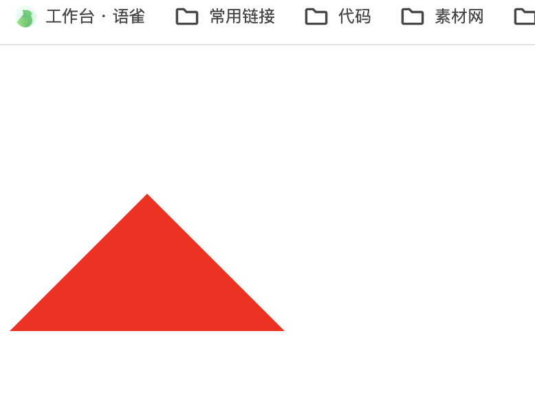
用 CSS 实现一个三角形
效果:
参考代码:
<!DOCTYPE html>
<html>
<head><style>.triangle {width: 0;height: 0;border: 100px solid red;border-top-color: transparent;border-left-color: transparent;border-right-color: transparent;}</style>
</head>
<body><div class="triangle"></div>
</body>
</html>
以上代码会在页面中创建一个边长为 100px 的红色三角形。您可以根据需要调整 border 属性和 width/height 属性的值来改变三角形的大小。 请注意,为了演示方便,我使用了一个 div 元素来容纳三角形,您可以根据实际需要将其放入其他元素或适当调整样式。
用 CSS实现一个自适应的正方形
方法1:利用 CSS3 的 vw 单位
vw 会把视口的宽度平均分为 100 份
.square {width: 10vw;height: 10vw;background: red;
}
方法2:利用 margin 或者 padding 的百分比计算是参照父元素的 width 属性
.square {width: 10%;padding-bottom: 10%;/* 防止内容撑开多余的高度 */height: 0;  background: red;
}
CSS写一个简单的幻灯片页面效果
用 CSS3,使用 animation 动画实现一个简单的幻灯片效果
参考代码:
<!DOCTYPE html>
<html lang="en">
<head><meta charset="UTF-8"><meta name="viewport" content="width=device-width, initial-scale=1.0"><style>.ani {width: 480px;height: 320px;margin: 50px auto;overflow: hidden;box-shadow: 0 0 5px rgba(0, 0, 0, 1);background-size: cover;background-position: center;-webkit-animation-name: "loops";-webkit-animation-duration: 20s;-webkit-animation-iteration-count: infinite;}@keyframes loops {0% {background-image: url(./img/1.jpeg);}25% {background-image: url(./img/2.jpeg);}50% {background-image: url(./img/3.jpeg);}75% {background-image: url(./img/4.jpeg);}100% {background-image: url(./img/5.jpeg);}}</style>
</head><body><div class="ani"><!-- 幻灯片内容 --></div>
</body></html>