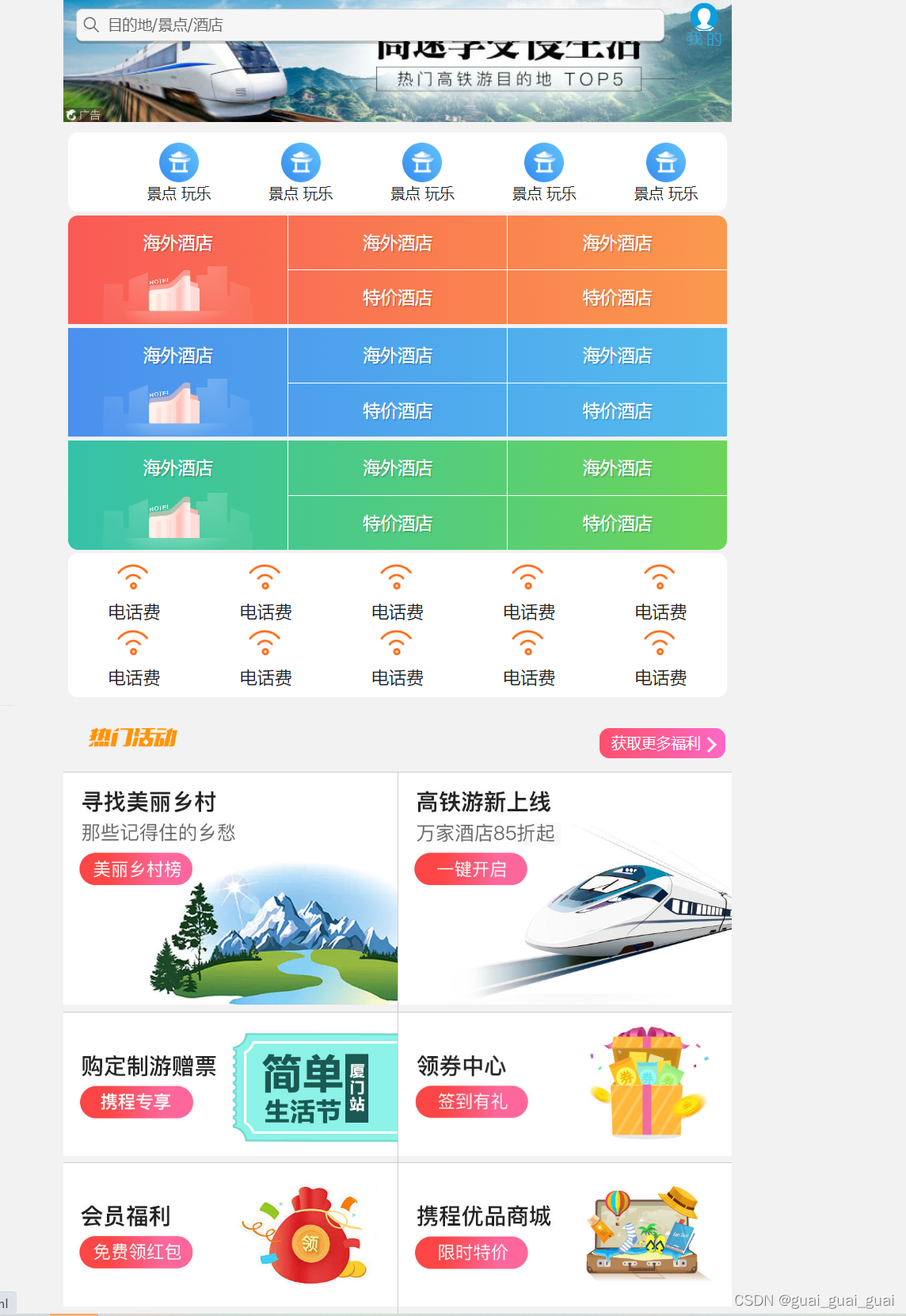
技术选型
方案:采用单独制作移动页面方案
技术:布局采用flex布局
body样式
通常要设置最大宽度,最小宽度,水平居中,字体设置,背景颜色以及相关初始化
body {max-width: 540px;min-width: 320px;margin: 0 auto;font: normal 14px/1.5 Tahoma,"Lucida Grande",Verdana,"Microsoft Yahel",STXihei,hei;color: #000;background-color: #f2f2f2;overflow-x: hidden;-webkit-tap-highlight-color: transparent;
}
搜索模块

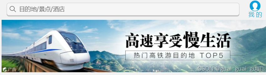
搜索模块是一个固定定位,它与父亲没有关系,只与视口有关,所以设定位置为水平居中时,要以视口为标准。固定定位的盒子要有宽度
.search-index {/* 固定定位跟父亲没有关系 它与视口有关(屏幕) */display: flex;position: fixed;top: 0;left: 50%;transform: translateX(-50%);/* 固定的盒子要有宽度 */width: 100%;height: 44px;max-width: 540px;min-width: 320px;
}- 左边为自适应,右边小盒子定宽定高,这就需要用到flex布局,给右边盒子顶宽定高,左边盒子不设置宽高,直接设置flex:1;即可,记得给父元素加flex属性,display:flex;
- 右边小盒子由两个部分组成,可以只使用一个元素,给这个元素设置伪元素即可
- 给伪元素设置宽度时,要先将其变为块级元素,之后给伪元素设置背景图即可,二倍背景图(精灵图)要先将原图等比例缩小一半,测定坐标,记得也要将原图设置background-size:原宽的一半 auto;
- 设置文字水平居中以及颜色大小等等
<a href="" class="user">我 的</a>.user {width: 44px;height: 44px;background-color: aquamarine;font-size: 12px;text-align: center;color: #2eaae0;
}
.user::before {content: "";display: block;width: 23px;height: 23px;background: url(../images/sprite.png) no-repeat -59px -194px;background-size: 104px auto;margin: 4px auto -3px;
}- 左边搜索区域里的搜索也可用伪元素,同样使用精灵图,但使用伪元素时要将伪元素设置为块级元素,右边的文字就会被挤下去,此时伪元素可采取定位,之后将设置search的padding-left即可
- 文字垂直居中使用line-height时,最好不要和高度相同,而要减去边框的高度,因为使用的时CSS3模型,边框不会扩大盒子,此时的内容区会变小,若使用原高度文字会偏下
<div class="search-index"><div class="search">目的地/景点/酒店</div><a href="" class="user">我 的</a> </div>.search {position: relative;height: 26px;border: 1px solid #ccc;flex: 1;align-self: center;margin: 0 10px;border-radius: 5px;font-size: 12px;color: #666;line-height: 24px;padding-left: 25px;box-shadow: 0 2px rgba(0,0,0,.2);border-top: 1px solid #ccc;border-bottom: 1px solid #ccc;
}
.search::before {position: absolute;top: 5px;left: 5px;content: "";display: block;width: 15px;height: 15px;background: url(../images/sprite.png) no-repeat -59px -279px;background-size: 104px auto;
}焦点图区域
直接添加图片即可,但因为上面搜索区域是固定定位,不占据位置,下方图片某部分会被搜索区域覆盖住,因此要设置焦点图区域的padding-left使其往下方移动
local-nav
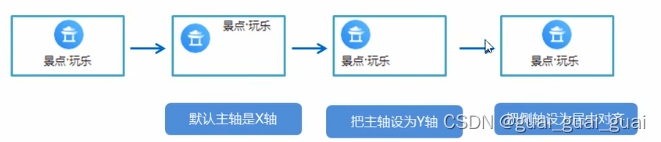
常见flex布局思路
<ul class="local-nav"><li><a href="" title="景点 玩乐"><span class="local-nav-icon"></span><span>景点 玩乐</span></a></li><li><a href="" title="景点 玩乐"><span class="local-nav-icon"></span><span>景点 玩乐</span></a></li><li><a href="" title="景点 玩乐"><span class="local-nav-icon"></span><span>景点 玩乐</span></a></li><li><a href="" title="景点 玩乐"><span class="local-nav-icon"></span><span>景点 玩乐</span></a></li><li><a href="" title="景点 玩乐"><span class="local-nav-icon"></span><span>景点 玩乐</span></a></li></ul>.local-nav {display: flex;height: 64px;background-color: #fff;border-radius: 8px;margin: 3px 4px;
}
.local-nav li {flex: 1;
}
.local-nav a {display: flex;flex-direction: column;font-size: 12px;/* 侧轴居中 */align-items: center;
}
.local-nav-icon {margin-top: 8px;width: 32px;height: 32px;background: url(../images/localnav_bg.png) no-repeat 0 0;background-size: 32px;}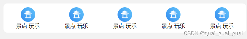
主导航栏
- 将nav设置为flex,三个子元素设置flex:1;这样三个子元素会平分宽度
- 第二个和第三个孩子也设置为flex,将主轴改为column,再让里面的儿子设置为flex;1;就可实现垂直平分
- 接着向里面添加背景图和内容即可
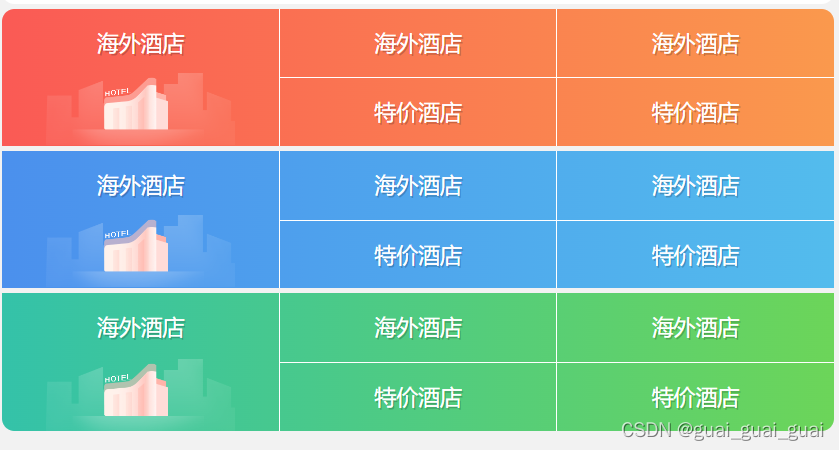
背景线性渐变
语法1:
background:linear-gradient(起始方向,颜色1,颜色2,...);background:-webkit-linear-gradient(left, red,blue);
background:-webkit-linear-gradient(left top,red,blue);
- 背景渐变必须添加浏览器私有前缀
- 起始方向可以是:方位名词或者度数,如果省略默认就是top
    <style>div {width: 600px;height: 200px;/* 背景渐变必须添加浏览器私有前缀 */background: -webkit-linear-gradient(left,red,blue);}</style>
<body><div></div>
</body>

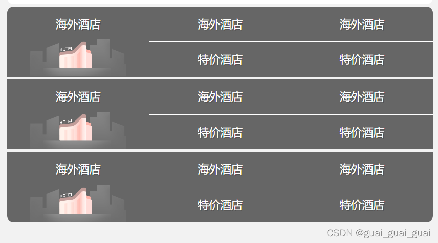
三个子盒子就用到了线性渐变。
<div class="nav"><div class="nav-common"><div class="nav-items"><a href="">海外酒店</a></div><div class="nav-items"><a href="">海外酒店</a><a href="">特价酒店</a></div><div class="nav-items"><a href="">海外酒店</a><a href="">特价酒店</a></div></div><div class="nav-common"><div class="nav-items"><a href="">海外酒店</a></div><div class="nav-items"><a href="">海外酒店</a><a href="">特价酒店</a></div><div class="nav-items"><a href="">海外酒店</a><a href="">特价酒店</a></div></div><div class="nav-common"><div class="nav-items"><a href="">海外酒店</a></div><div class="nav-items"><a href="">海外酒店</a><a href="">特价酒店</a></div><div class="nav-items"><a href="">海外酒店</a><a href="">特价酒店</a></div></div></div>.nav {border-radius: 8px;margin: 0 4px 3px;overflow: hidden;
}.nav-common {display: flex;height: 88px;background-color: #666;
}.nav-common .nav-items {flex: 1;display: flex;flex-direction: column;
}
.nav-items a {flex: 1;text-align: center;line-height: 44px;color: #fff;font-size: 14px;/* 文字阴影 */text-shadow: 1px 1px rgba(0,0,0,.2);
}
.nav-items a:nth-child(1) {border-bottom: 1px solid #fff;
}
.nav-items:nth-child(1) a {border: 0;background: url(..//images/hotel.png) no-repeat bottom center;background-size: 121px auto;
}
.nav-items:nth-child(-n+2) {border-right: 1px solid #fff;
}
.nav-common:nth-child(1) {background: -webkit-linear-gradient(left,#fa5a55,#fa994d);
}
.nav-common:nth-child(2) {margin: 3px 0;background: -webkit-linear-gradient(left,#4b90ed,#53bced);
}
.nav-common:nth-child(3) {background: -webkit-linear-gradient(left,#34c2a9,#6cd559);
}侧导航栏
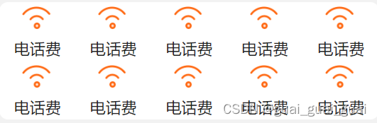
- 侧导航栏的制作与local-nav相似,只是多了一个换行,将父级加上flow-wrap:wrap;
- 子元素设置为flex:20%(相对于父元素)
- 子元素里和local-nav里的子元素一样,将a设置为flex,将主轴改为column,侧边居中即可
<div class="subnav-entry"><li><a href=""><span class="subnav-entry-icon"></span><span>电话费</span></a></li><li><a href=""><span class="subnav-entry-icon"></span><span>电话费</span></a></li><li><a href=""><span class="subnav-entry-icon"></span><span>电话费</span></a></li><li><a href=""><span class="subnav-entry-icon"></span><span>电话费</span></a></li><li><a href=""><span class="subnav-entry-icon"></span><span>电话费</span></a></li><li><a href=""><span class="subnav-entry-icon"></span><span>电话费</span></a></li><li><a href=""><span class="subnav-entry-icon"></span><span>电话费</span></a></li><li><a href=""><span class="subnav-entry-icon"></span><span>电话费</span></a></li><li><a href=""><span class="subnav-entry-icon"></span><span>电话费</span></a></li><li><a href=""><span class="subnav-entry-icon"></span><span>电话费</span></a></li></div>
.subnav-entry {display: flex;border-radius: 8px;background-color: #fff;margin: 0 4px;flex-wrap: wrap;
}.subnav-entry li {/* 里面的盒子可以写百分比 相对于父级来说的 */flex: 20%;
}.subnav-entry a {display: flex;flex-direction: column;align-items: center;
}.subnav-entry-icon {width: 28px;height: 28px;margin-top: 4px;background: url(../images/subnav-bg.png) no-repeat;background-size: 28px auto;
}
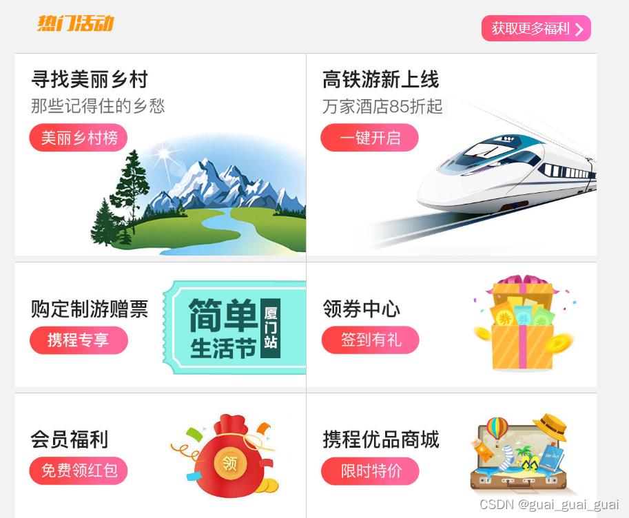
销售模块
- 分为头部和身体,头部热门活动因为SEO优化先写文字,再利用首行缩进将文字隐藏,利用定位添加伪元素设置背景,伪元素添加定位之后就变成行内块元素了,故不需要将其变为块级元素。
- 三角的CSS制作,显示出右边框和下边框,瞬时针旋转45度即可。
- 下面图片区域使用flex布局,里面两个a元素,a元素均flex:1;就能水平平均分布。添加边框即可
整体代码:
<!DOCTYPE html>
<html lang="en"><head><meta charset="UTF-8"><meta name="viewport" content="width=device-width, initial-scale=1.0"><title>携程在手,说走就走</title><link rel="stylesheet" href="./CSS/normalize.css"><link rel="stylesheet" href="./CSS/index.css">
</head><body><div class="search-index"><div class="search">目的地/景点/酒店</div><a href="" class="user">我 的</a></div><!-- 焦点图模块 --><div class="focus"><img src="./upload/focus.jpg" alt=""></div><!-- local-nav --><ul class="local-nav"><li><a href="" title="景点 玩乐"><span class="local-nav-icon"></span><span>景点 玩乐</span></a></li><li><a href="" title="景点 玩乐"><span class="local-nav-icon"></span><span>景点 玩乐</span></a></li><li><a href="" title="景点 玩乐"><span class="local-nav-icon"></span><span>景点 玩乐</span></a></li><li><a href="" title="景点 玩乐"><span class="local-nav-icon"></span><span>景点 玩乐</span></a></li><li><a href="" title="景点 玩乐"><span class="local-nav-icon"></span><span>景点 玩乐</span></a></li></ul><!-- nav --><div class="nav"><div class="nav-common"><div class="nav-items"><a href="">海外酒店</a></div><div class="nav-items"><a href="">海外酒店</a><a href="">特价酒店</a></div><div class="nav-items"><a href="">海外酒店</a><a href="">特价酒店</a></div></div><div class="nav-common"><div class="nav-items"><a href="">海外酒店</a></div><div class="nav-items"><a href="">海外酒店</a><a href="">特价酒店</a></div><div class="nav-items"><a href="">海外酒店</a><a href="">特价酒店</a></div></div><div class="nav-common"><div class="nav-items"><a href="">海外酒店</a></div><div class="nav-items"><a href="">海外酒店</a><a href="">特价酒店</a></div><div class="nav-items"><a href="">海外酒店</a><a href="">特价酒店</a></div></div></div><!-- subnav-entry --><div class="subnav-entry"><li><a href=""><span class="subnav-entry-icon"></span><span>电话费</span></a></li><li><a href=""><span class="subnav-entry-icon"></span><span>电话费</span></a></li><li><a href=""><span class="subnav-entry-icon"></span><span>电话费</span></a></li><li><a href=""><span class="subnav-entry-icon"></span><span>电话费</span></a></li><li><a href=""><span class="subnav-entry-icon"></span><span>电话费</span></a></li><li><a href=""><span class="subnav-entry-icon"></span><span>电话费</span></a></li><li><a href=""><span class="subnav-entry-icon"></span><span>电话费</span></a></li><li><a href=""><span class="subnav-entry-icon"></span><span>电话费</span></a></li><li><a href=""><span class="subnav-entry-icon"></span><span>电话费</span></a></li><li><a href=""><span class="subnav-entry-icon"></span><span>电话费</span></a></li></div><!-- 销售模块 --><div class="sale-box"><div class="sales-hd"><h2>热门活动</h2><a href="" class="more">获取更多福利</a></div><div class="sales-bd"><div class="row"><a href=""><img src="./upload/pic1.jpg" alt=""></a><a href=""><img src="./upload/pic2.jpg" alt=""></a></div><div class="row"><a href=""><img src="./upload/pic3.jpg" alt=""></a><a href=""><img src="./upload/pic4.jpg" alt=""></a></div><div class="row"><a href=""><img src="./upload/pic5.jpg" alt=""></a><a href=""><img src="./upload/pic6.jpg" alt=""></a></div></div></div>
</body></html>
body {max-width: 540px;min-width: 320px;margin: 0 auto;font: normal 14px/1.5 Tahoma, "Lucida Grande", Verdana, "Microsoft Yahel", STXihei, hei;color: #000;background-color: #f2f2f2;overflow-x: hidden;-webkit-tap-highlight-color: transparent;
}div {box-sizing: border-box;
}a {text-decoration: none;color: #222;
}li {list-style: none;margin: 0;padding: 0;
}/* 搜索模块 */
.search-index {/* 固定定位跟父亲没有关系 它与视口有关(屏幕) */display: flex;position: fixed;top: 0;left: 50%;transform: translateX(-50%);/* 固定的盒子要有宽度 */width: 100%;height: 44px;max-width: 540px;min-width: 320px;
}.search {position: relative;height: 26px;border: 1px solid #ccc;flex: 1;align-self: center;margin: 0 10px;border-radius: 5px;font-size: 12px;color: #666;line-height: 24px;padding-left: 25px;box-shadow: 0 2px rgba(0, 0, 0, .2);background-color: #f6f6f6;border-top: 1px solid #ccc;border-bottom: 1px solid #ccc;
}.search::before {position: absolute;top: 5px;left: 5px;content: "";display: block;width: 15px;height: 15px;background: url(../images/sprite.png) no-repeat -59px -279px;background-size: 104px auto;
}.user {width: 44px;height: 44px;font-size: 12px;text-align: center;color: #2eaae0;
}.user::before {content: "";display: block;width: 23px;height: 23px;background: url(../images/sprite.png) no-repeat -59px -194px;background-size: 104px auto;margin: 4px auto -3px;
}/* focus */
.focus {padding-top: 44px;
}.focus img {width: 100%;
}.local-nav {display: flex;height: 64px;background-color: #fff;border-radius: 8px;margin: 3px 4px;
}.local-nav li {flex: 1;
}.local-nav a {display: flex;flex-direction: column;font-size: 12px;/* 侧轴居中 */align-items: center;
}.local-nav-icon {margin-top: 8px;width: 32px;height: 32px;background: url(../images/localnav_bg.png) no-repeat 0 0;background-size: 32px;}/* nav */
.nav {border-radius: 8px;margin: 0 4px 3px;overflow: hidden;
}.nav-common {display: flex;height: 88px;background-color: #666;
}.nav-common .nav-items {flex: 1;display: flex;flex-direction: column;
}.nav-items a {flex: 1;text-align: center;line-height: 44px;color: #fff;font-size: 14px;/* 文字阴影 */text-shadow: 1px 1px rgba(0, 0, 0, .2);
}.nav-items a:nth-child(1) {border-bottom: 1px solid #fff;
}.nav-items:nth-child(1) a {border: 0;background: url(..//images/hotel.png) no-repeat bottom center;background-size: 121px auto;
}.nav-items:nth-child(-n+2) {border-right: 1px solid #fff;
}.nav-common:nth-child(1) {background: -webkit-linear-gradient(left, #fa5a55, #fa994d);
}.nav-common:nth-child(2) {margin: 3px 0;background: -webkit-linear-gradient(left, #4b90ed, #53bced);
}.nav-common:nth-child(3) {background: -webkit-linear-gradient(left, #34c2a9, #6cd559);
}.subnav-entry {display: flex;border-radius: 8px;background-color: #fff;margin: 0 4px;flex-wrap: wrap;padding: 5px 0;
}.subnav-entry li {/* 里面的盒子可以写百分比 相对于父级来说的 */flex: 20%;
}.subnav-entry a {display: flex;flex-direction: column;align-items: center;
}.subnav-entry-icon {width: 28px;height: 28px;margin-top: 4px;background: url(../images/subnav-bg.png) no-repeat;background-size: 28px auto;
}
/* sales-box */
.sales-box {border-top: 1px solid #bbb;background-color: #fff;margin: 0 4px;
}
.sales-hd {position: relative;height: 44px;border-bottom: 1px solid #ccc;
}
.sales-hd h2 {position: relative;text-indent: -999px;overflow: hidden;
}
.sales-hd h2::after {position: absolute;top: 8px;left: 20px;content: "";width: 79px;height: 15px;background: url(../images/hot.png) no-repeat 0 -20px;background-size: 79px auto;
}
.sales-hd .more {position: absolute;top: 8px;right: 5px;border-radius: 8px;padding: 3px 20px 3px 10px;color: #fff;font-size: 12px;background: -webkit-linear-gradient(left,#ff506c,#ff68c6);
}
.more::after {content: "";position: absolute;/* 定位改变行内块 */top: 9px;right: 9px;width: 7px;height: 7px;border-top: 2px solid #fff;border-right: 2px solid #fff;transform: rotate(45deg);
}
.row {display: flex;
}
.row a {flex: 1;border-bottom: 1px solid #ccc;
}
.row a:nth-child(1) {border-right: 1px solid #ccc;
}
.row a img {width: 100%;
}body {max-width: 540px;min-width: 320px;margin: 0 auto;font: normal 14px/1.5 Tahoma, "Lucida Grande", Verdana, "Microsoft Yahel", STXihei, hei;color: #000;background-color: #f2f2f2;overflow-x: hidden;-webkit-tap-highlight-color: transparent;
}div {box-sizing: border-box;
}a {text-decoration: none;color: #222;
}li {list-style: none;margin: 0;padding: 0;
}/* 搜索模块 */
.search-index {/* 固定定位跟父亲没有关系 它与视口有关(屏幕) */display: flex;position: fixed;top: 0;left: 50%;transform: translateX(-50%);/* 固定的盒子要有宽度 */width: 100%;height: 44px;max-width: 540px;min-width: 320px;
}.search {position: relative;height: 26px;border: 1px solid #ccc;flex: 1;align-self: center;margin: 0 10px;border-radius: 5px;font-size: 12px;color: #666;line-height: 24px;padding-left: 25px;box-shadow: 0 2px rgba(0, 0, 0, .2);background-color: #f6f6f6;border-top: 1px solid #ccc;border-bottom: 1px solid #ccc;
}.search::before {position: absolute;top: 5px;left: 5px;content: "";display: block;width: 15px;height: 15px;background: url(../images/sprite.png) no-repeat -59px -279px;background-size: 104px auto;
}.user {width: 44px;height: 44px;font-size: 12px;text-align: center;color: #2eaae0;
}.user::before {content: "";display: block;width: 23px;height: 23px;background: url(../images/sprite.png) no-repeat -59px -194px;background-size: 104px auto;margin: 4px auto -3px;
}/* focus */
.focus {padding-top: 44px;
}.focus img {width: 100%;
}.local-nav {display: flex;height: 64px;background-color: #fff;border-radius: 8px;margin: 3px 4px;
}.local-nav li {flex: 1;
}.local-nav a {display: flex;flex-direction: column;font-size: 12px;/* 侧轴居中 */align-items: center;
}.local-nav-icon {margin-top: 8px;width: 32px;height: 32px;background: url(../images/localnav_bg.png) no-repeat 0 0;background-size: 32px;}/* nav */
.nav {border-radius: 8px;margin: 0 4px 3px;overflow: hidden;
}.nav-common {display: flex;height: 88px;background-color: #666;
}.nav-common .nav-items {flex: 1;display: flex;flex-direction: column;
}.nav-items a {flex: 1;text-align: center;line-height: 44px;color: #fff;font-size: 14px;/* 文字阴影 */text-shadow: 1px 1px rgba(0, 0, 0, .2);
}.nav-items a:nth-child(1) {border-bottom: 1px solid #fff;
}.nav-items:nth-child(1) a {border: 0;background: url(..//images/hotel.png) no-repeat bottom center;background-size: 121px auto;
}.nav-items:nth-child(-n+2) {border-right: 1px solid #fff;
}.nav-common:nth-child(1) {background: -webkit-linear-gradient(left, #fa5a55, #fa994d);
}.nav-common:nth-child(2) {margin: 3px 0;background: -webkit-linear-gradient(left, #4b90ed, #53bced);
}.nav-common:nth-child(3) {background: -webkit-linear-gradient(left, #34c2a9, #6cd559);
}.subnav-entry {display: flex;border-radius: 8px;background-color: #fff;margin: 0 4px;flex-wrap: wrap;padding: 5px 0;
}.subnav-entry li {/* 里面的盒子可以写百分比 相对于父级来说的 */flex: 20%;
}.subnav-entry a {display: flex;flex-direction: column;align-items: center;
}.subnav-entry-icon {width: 28px;height: 28px;margin-top: 4px;background: url(../images/subnav-bg.png) no-repeat;background-size: 28px auto;
}
/* sales-box */
.sales-box {border-top: 1px solid #bbb;background-color: #fff;margin: 0 4px;
}
.sales-hd {position: relative;height: 44px;border-bottom: 1px solid #ccc;
}
.sales-hd h2 {position: relative;text-indent: -999px;overflow: hidden;
}
.sales-hd h2::after {position: absolute;top: 8px;left: 20px;content: "";width: 79px;height: 15px;background: url(../images/hot.png) no-repeat 0 -20px;background-size: 79px auto;
}
.sales-hd .more {position: absolute;top: 8px;right: 5px;border-radius: 8px;padding: 3px 20px 3px 10px;color: #fff;font-size: 12px;background: -webkit-linear-gradient(left,#ff506c,#ff68c6);
}
.more::after {content: "";position: absolute;/* 定位改变行内块 */top: 9px;right: 9px;width: 7px;height: 7px;border-top: 2px solid #fff;border-right: 2px solid #fff;transform: rotate(45deg);
}
.row {display: flex;
}
.row a {flex: 1;border-bottom: 1px solid #ccc;
}
.row a:nth-child(1) {border-right: 1px solid #ccc;
}
.row a img {width: 100%;
}最后加上通用样式即可。