本文[1]将使用从 2,700 PBMC 教程计算的 Seurat 对象来演示 Seurat 中的可视化技术。您可以从 SeuratData[2] 下载此数据集。
SeuratData::InstallData("pbmc3k")
library(Seurat)
library(SeuratData)
library(ggplot2)
library(patchwork)
pbmc3k.final <- LoadData("pbmc3k", type = "pbmc3k.final")
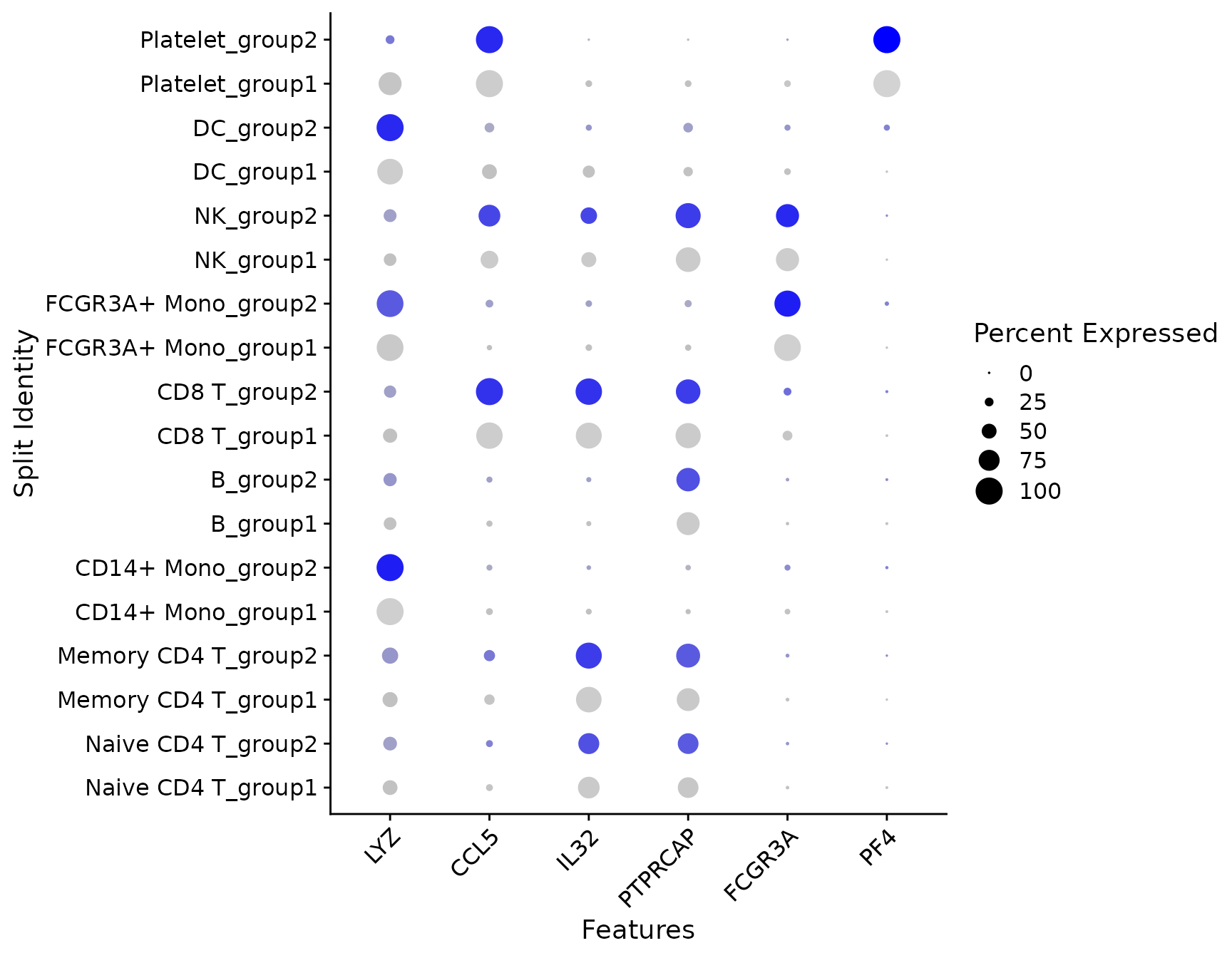
pbmc3k.final$groups <- sample(c("group1", "group2"), size = ncol(pbmc3k.final), replace = TRUE)
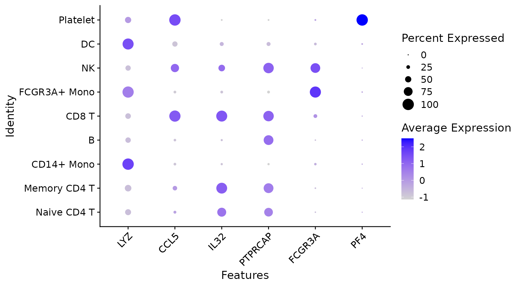
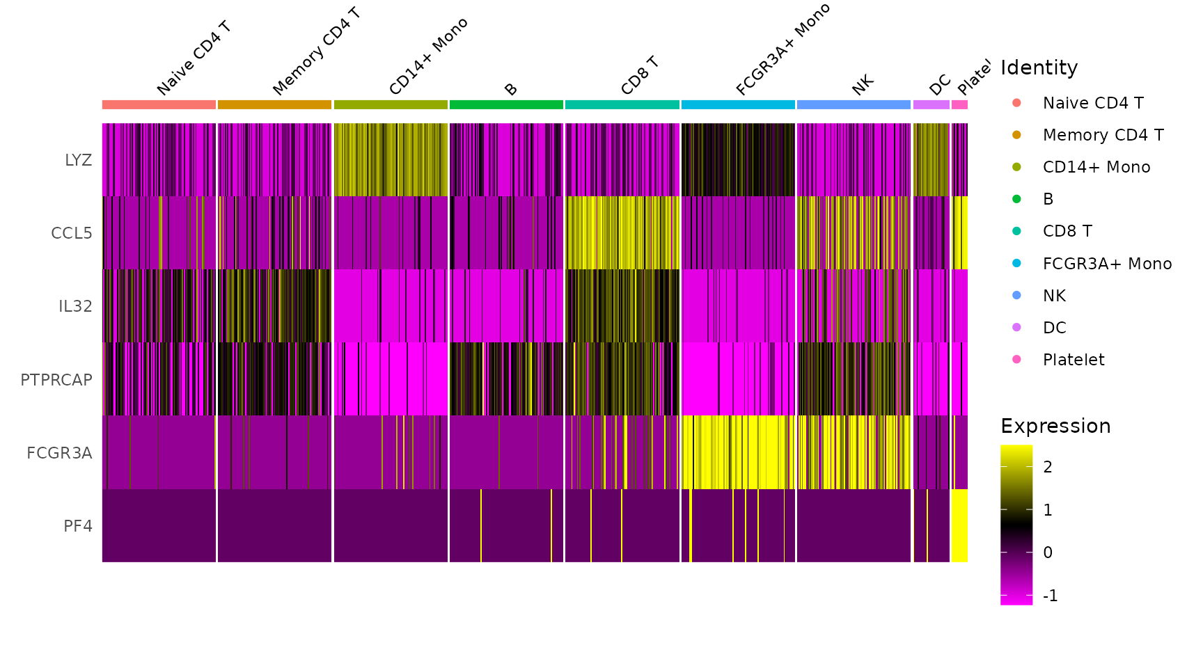
features <- c("LYZ", "CCL5", "IL32", "PTPRCAP", "FCGR3A", "PF4")
pbmc3k.final
## An object of class Seurat
## 13714 features across 2638 samples within 1 assay
## Active assay: RNA (13714 features, 2000 variable features)
##  3 layers present: data, counts, scale.data
##  2 dimensional reductions calculated: pca, umap
marker 特征表达的五种可视化
1. RidgePlot
# Ridge plots - from ggridges. Visualize single cell expression distributions in each cluster
RidgePlot(pbmc3k.final, features = features, ncol = 2)
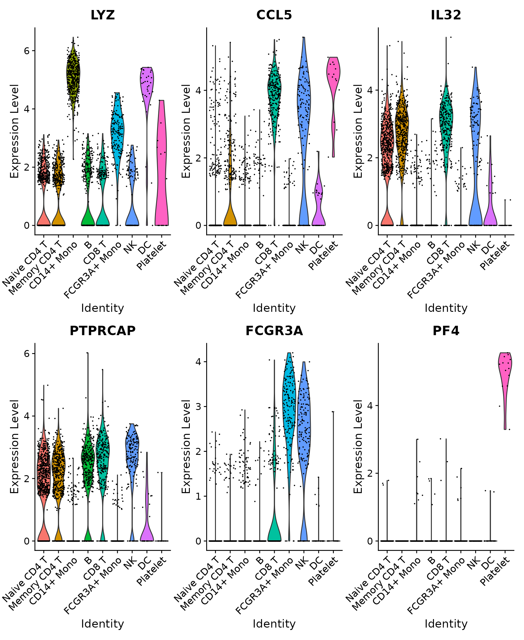
2. VlnPlot
# Violin plot - Visualize single cell expression distributions in each cluster
VlnPlot(pbmc3k.final, features = features)
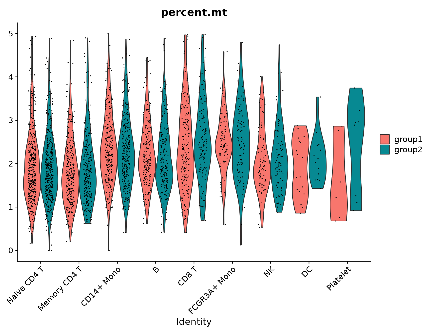
# Violin plots can also be split on some variable. Simply add the splitting variable to object
# metadata and pass it to the split.by argument
VlnPlot(pbmc3k.final, features = "percent.mt", split.by = "groups")
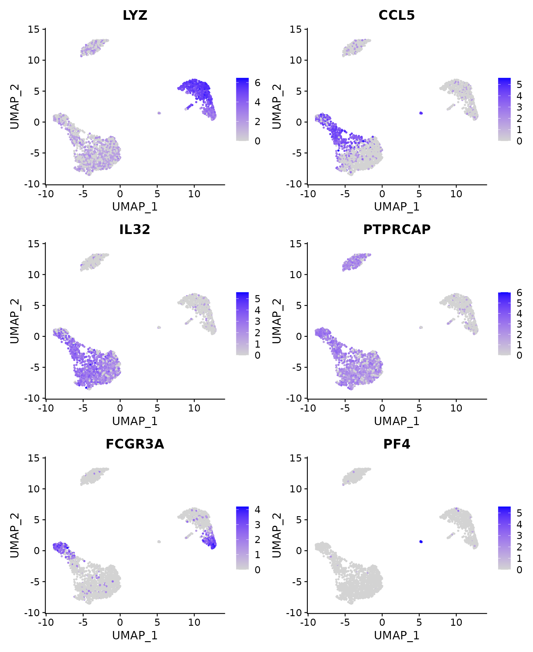
3. FeaturePlot
# Feature plot - visualize feature expression in low-dimensional space
FeaturePlot(pbmc3k.final, features = features)
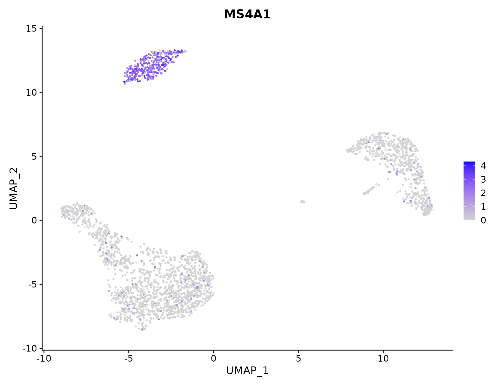
# Plot a legend to map colors to expression levels
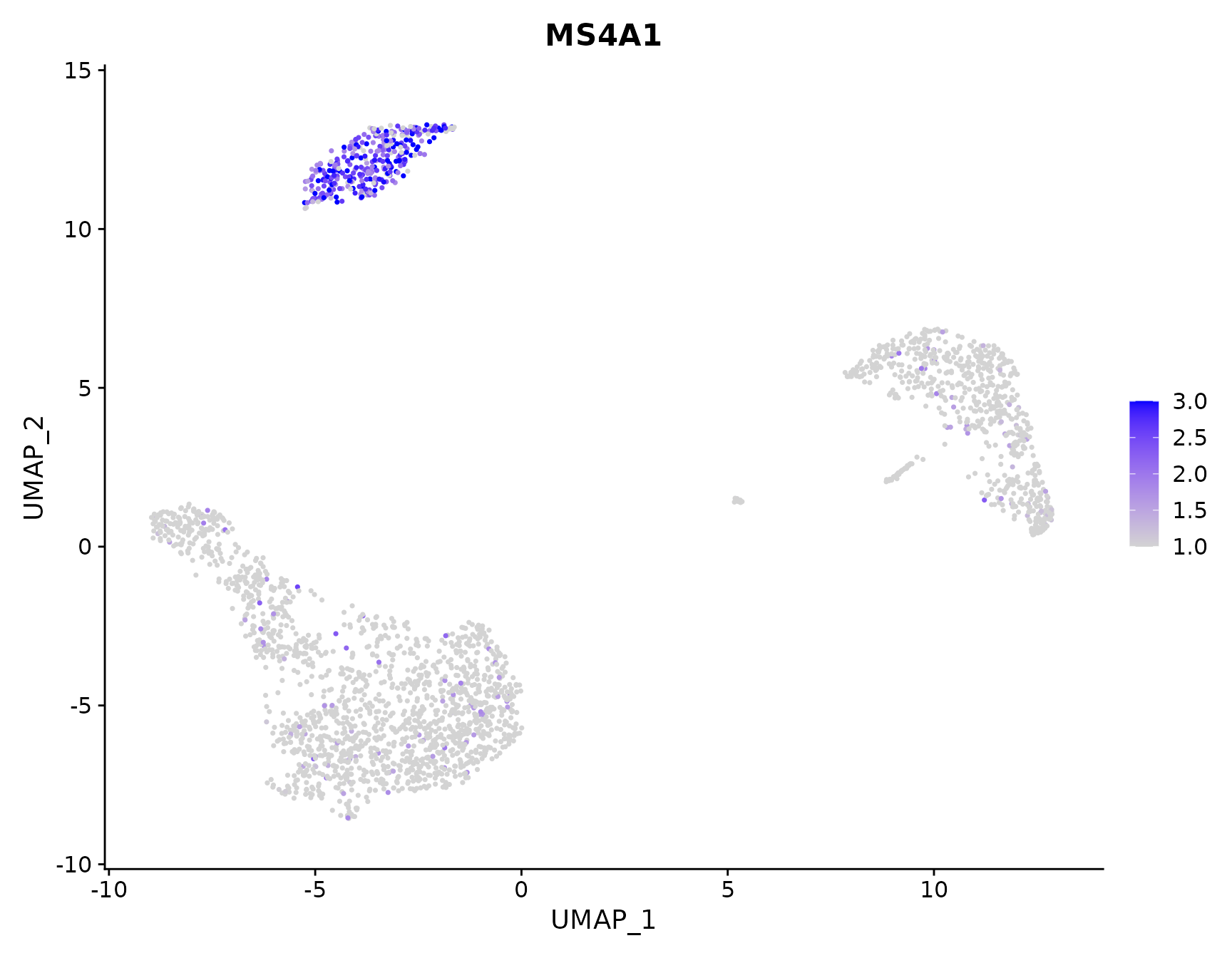
FeaturePlot(pbmc3k.final, features = "MS4A1")
# Adjust the contrast in the plot
FeaturePlot(pbmc3k.final, features = "MS4A1", min.cutoff = 1, max.cutoff = 3)
# Calculate feature-specific contrast levels based on quantiles of non-zero expression.
# Particularly useful when plotting multiple markers
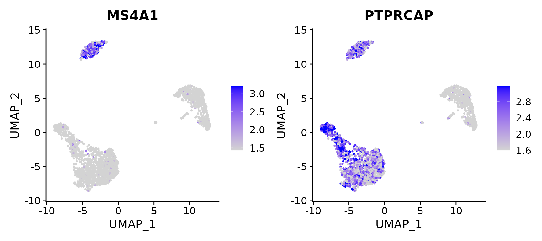
FeaturePlot(pbmc3k.final, features = c("MS4A1", "PTPRCAP"), min.cutoff = "q10", max.cutoff = "q90")
# Visualize co-expression of two features simultaneously
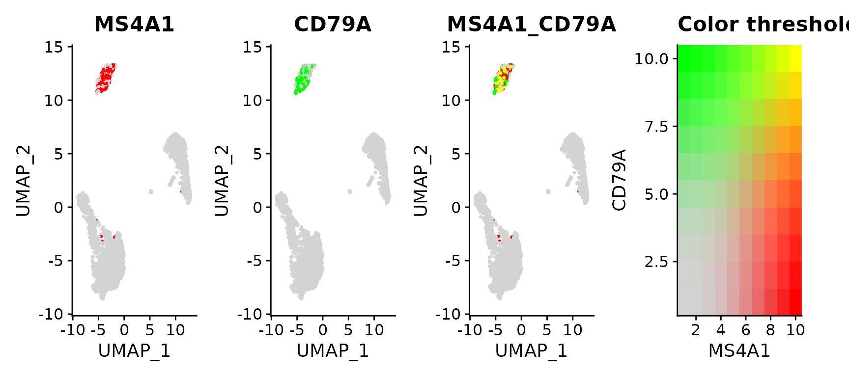
FeaturePlot(pbmc3k.final, features = c("MS4A1", "CD79A"), blend = TRUE)
# Split visualization to view expression by groups (replaces FeatureHeatmap)
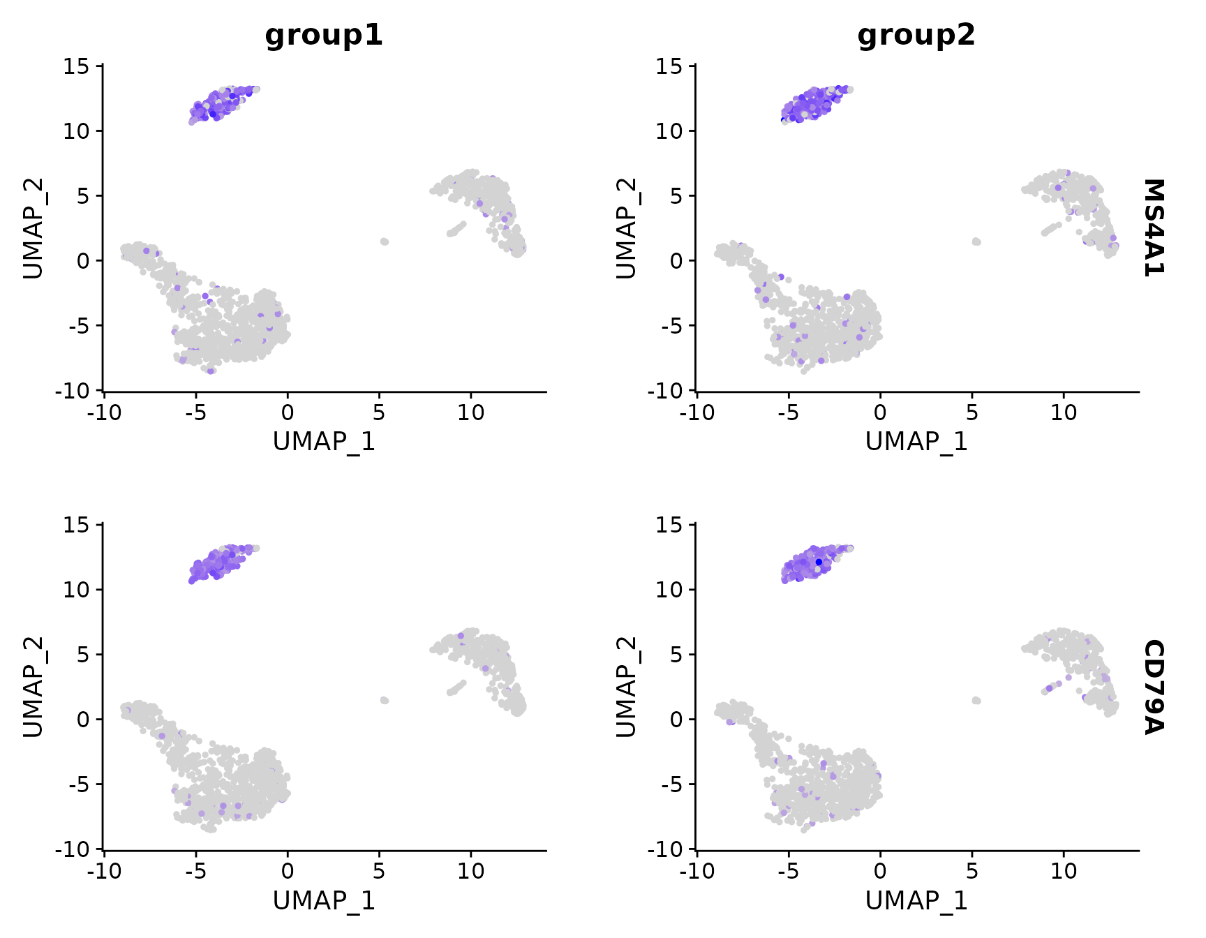
FeaturePlot(pbmc3k.final, features = c("MS4A1", "CD79A"), split.by = "groups")
4. DotPlot
# Dot plots - the size of the dot corresponds to the percentage of cells expressing the
# feature in each cluster. The color represents the average expression level
DotPlot(pbmc3k.final, features = features) + RotatedAxis()
# SplitDotPlotGG has been replaced with the `split.by` parameter for DotPlot
DotPlot(pbmc3k.final, features = features, split.by = "groups") + RotatedAxis()
5. DoHeatmap
## Single cell heatmap of feature expression
DoHeatmap(subset(pbmc3k.final, downsample = 100), features = features, size = 3)
新绘图函数
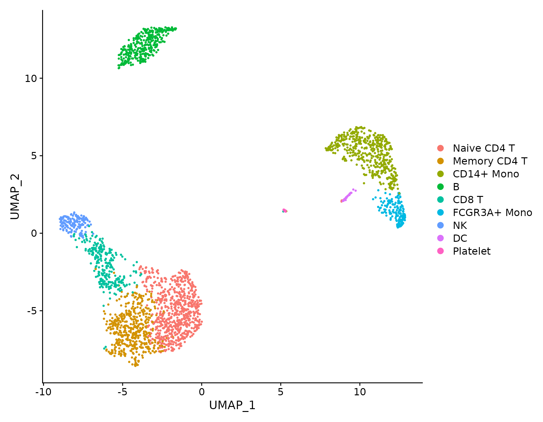
DimPlot
# DimPlot replaces TSNEPlot, PCAPlot, etc. In addition, it will plot either 'umap', 'tsne', or
# 'pca' by default, in that order
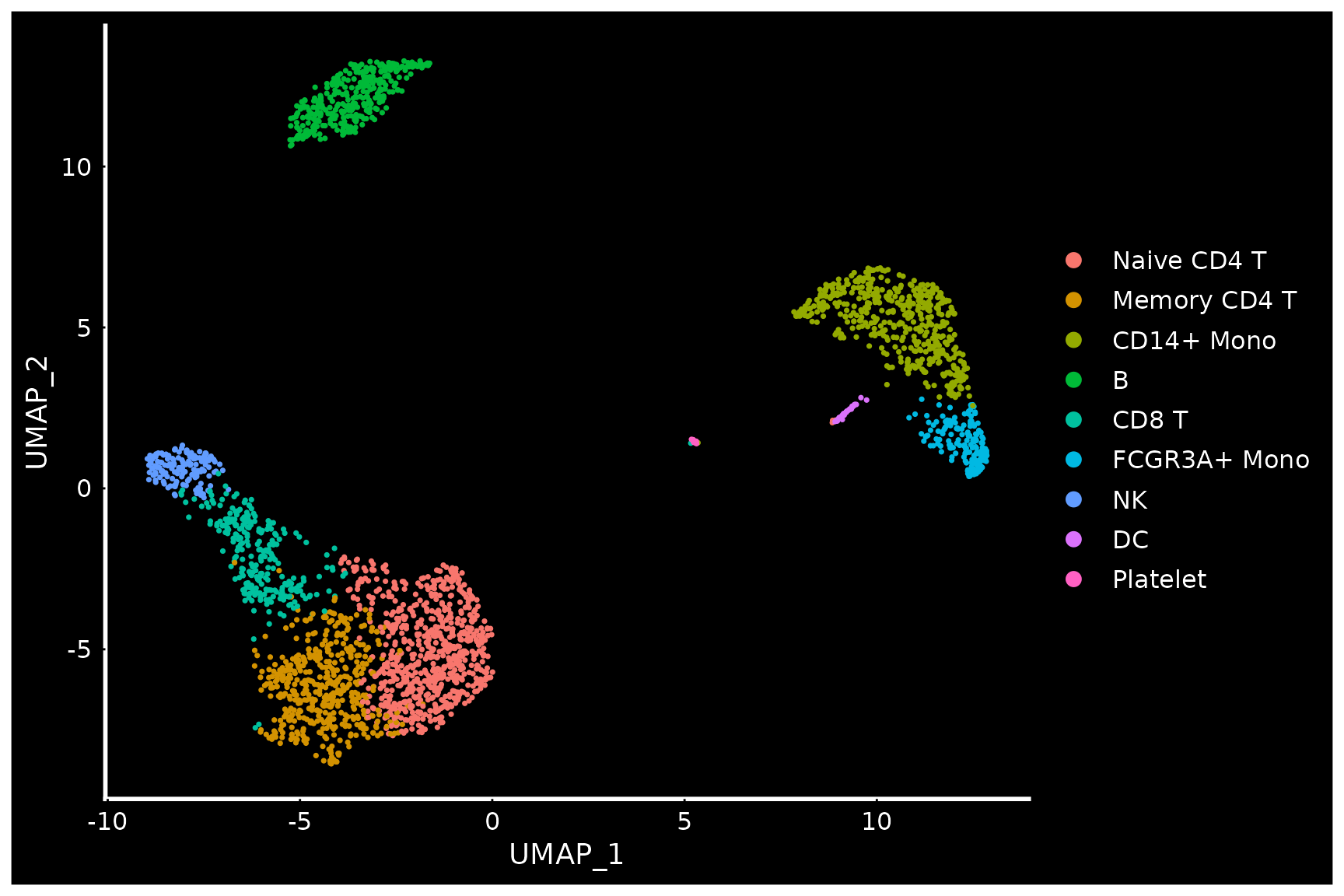
DimPlot(pbmc3k.final)
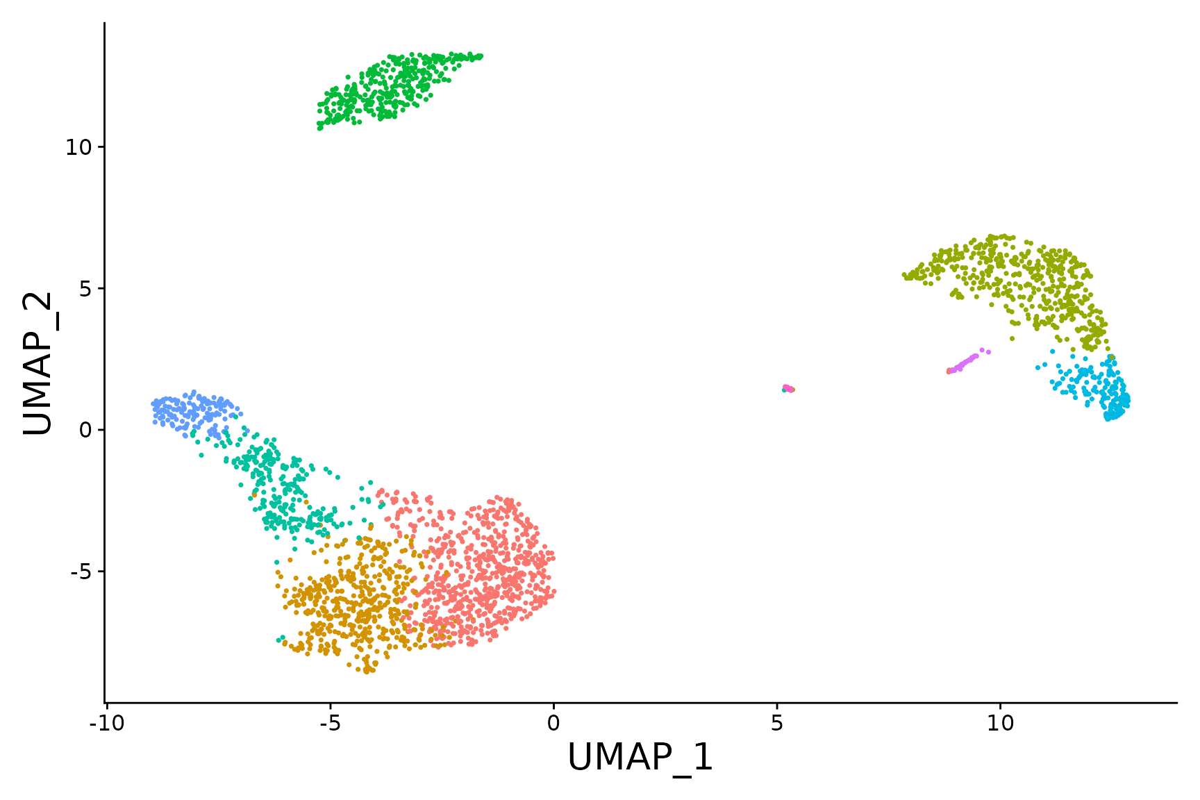
pbmc3k.final.no.umap <- pbmc3k.final
pbmc3k.final.no.umap[["umap"]] <- NULL
DimPlot(pbmc3k.final.no.umap) + RotatedAxis()
DoHeatmap
# DoHeatmap now shows a grouping bar, splitting the heatmap into groups or clusters. This can
# be changed with the `group.by` parameter
DoHeatmap(pbmc3k.final, features = VariableFeatures(pbmc3k.final)[1:100], cells = 1:500, size = 4,
    angle = 90) + NoLegend()
将主题应用于绘图
使用 Seurat,所有绘图函数默认返回基于 ggplot2 的绘图,允许人们像任何其他基于 ggplot2 的绘图一样轻松捕获和操作绘图。
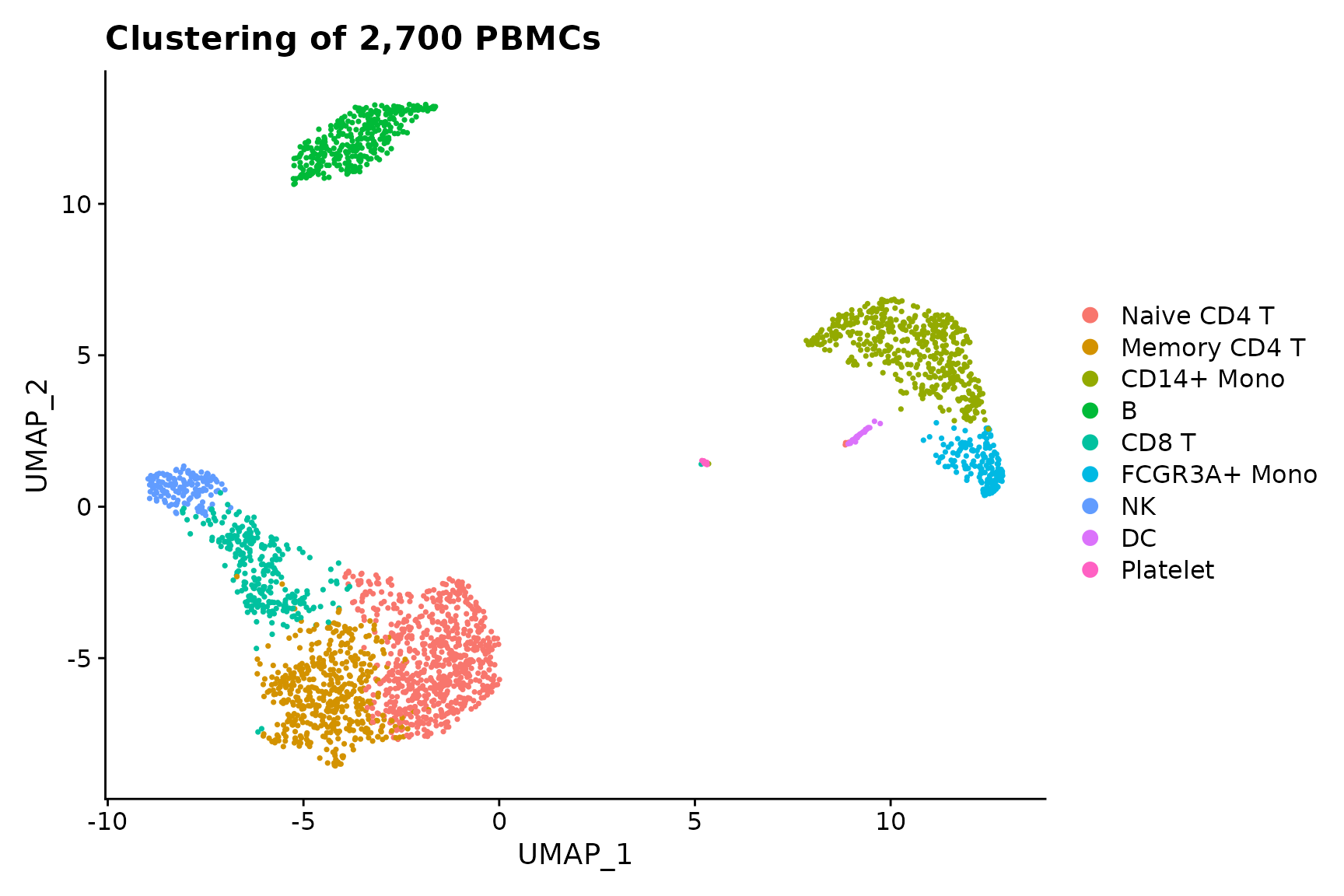
baseplot <- DimPlot(pbmc3k.final, reduction = "umap")
# Add custom labels and titles
baseplot + labs(title = "Clustering of 2,700 PBMCs")
# Use community-created themes, overwriting the default Seurat-applied theme Install ggmin
# with remotes::install_github('sjessa/ggmin')
baseplot + ggmin::theme_powerpoint()
# Seurat also provides several built-in themes, such as DarkTheme; for more details see
# ?SeuratTheme
baseplot + DarkTheme()
# Chain themes together
baseplot + FontSize(x.title = 20, y.title = 20) + NoLegend()
交互式绘图功能
Seurat 利用 R 的绘图库来创建交互式绘图。此交互式绘图功能适用于任何基于 ggplot2 的散点图(需要 geom_point 图层)。使用时,只需制作一个基于 ggplot2 的散点图(例如 DimPlot() 或 FeaturePlot())并将结果图传递给 HoverLocator()
# Include additional data to display alongside cell names by passing in a data frame of
# information. Works well when using FetchData
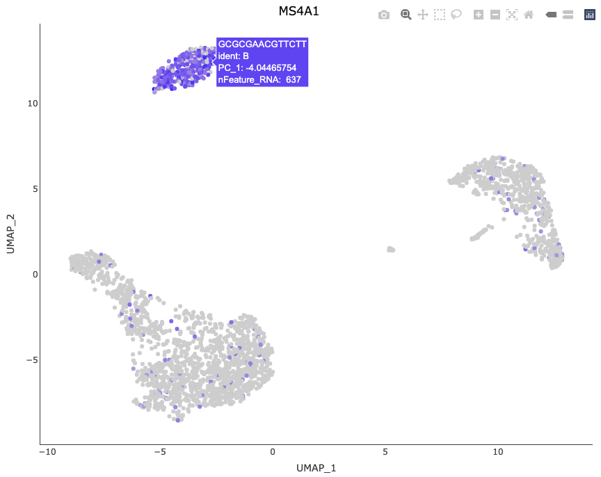
plot <- FeaturePlot(pbmc3k.final, features = "MS4A1")
HoverLocator(plot = plot, information = FetchData(pbmc3k.final, vars = c("ident", "PC_1", "nFeature_RNA")))
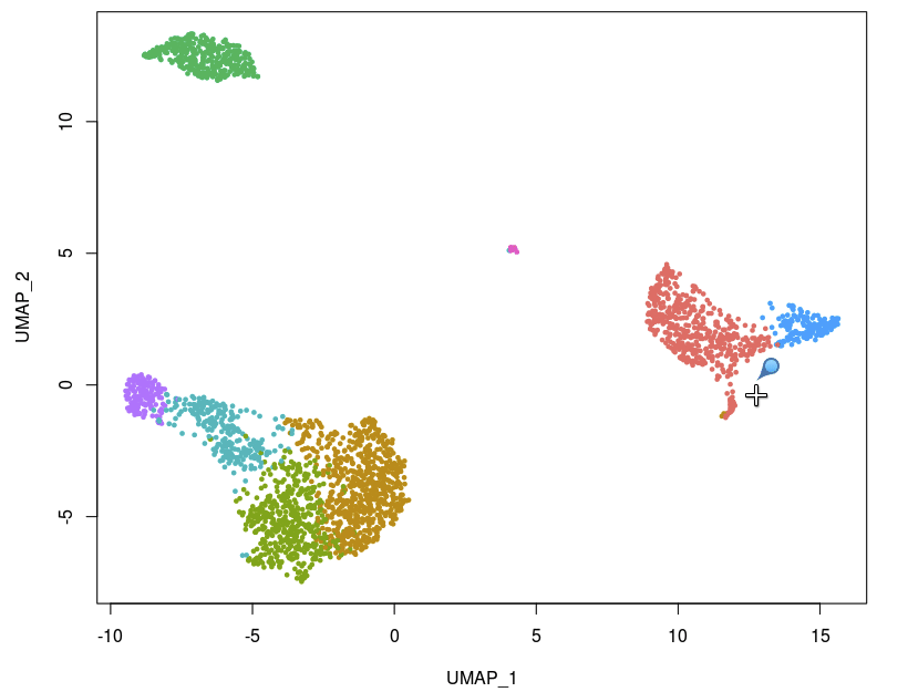
Seurat 提供的另一个交互功能是能够手动选择细胞以进行进一步研究。我们发现这对于小簇特别有用,这些小簇并不总是使用无偏聚类来分离,但看起来却截然不同。现在,您可以通过创建基于 ggplot2 的散点图(例如使用 DimPlot() 或 FeaturePlot(),并将返回的图传递给 CellSelector() 来选择这些单元格。CellSelector() 将返回一个包含所选点名称的向量,这样您就可以将它们设置为新的身份类并执行微分表达式。
例如,假设 DC 在聚类中与单核细胞合并,但我们想根据它们在 tSNE 图中的位置来了解它们的独特之处。
pbmc3k.final <- RenameIdents(pbmc3k.final, DC = "CD14+ Mono")
plot <- DimPlot(pbmc3k.final, reduction = "umap")
select.cells <- CellSelector(plot = plot)
绘图配件
除了为绘图添加交互功能的新函数之外,Seurat 还提供了用于操作和组合绘图的新辅助功能。
# LabelClusters and LabelPoints will label clusters (a coloring variable) or individual points
# on a ggplot2-based scatter plot
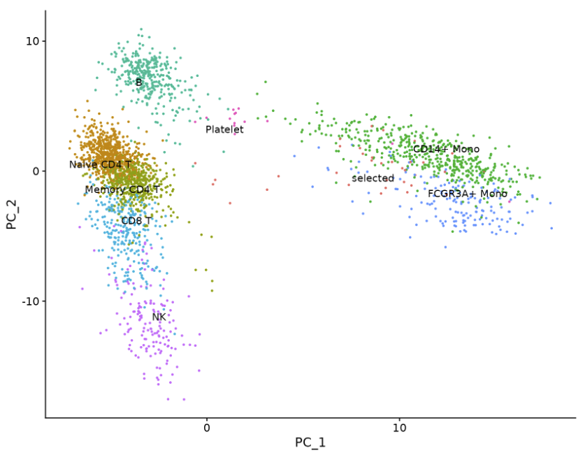
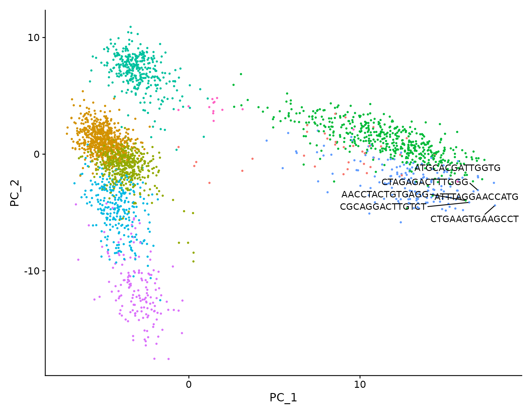
plot <- DimPlot(pbmc3k.final, reduction = "pca") + NoLegend()
LabelClusters(plot = plot, id = "ident")
# Both functions support `repel`, which will intelligently stagger labels and draw connecting
# lines from the labels to the points or clusters
LabelPoints(plot = plot, points = TopCells(object = pbmc3k.final[["pca"]]), repel = TRUE)
绘制多个图之前是通过CombinePlot() 函数实现的。我们不赞成使用此功能,转而使用拼凑系统。下面是一个简短的演示,但请参阅此处的 patchwork[3] 包网站以获取更多详细信息和示例。
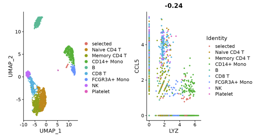
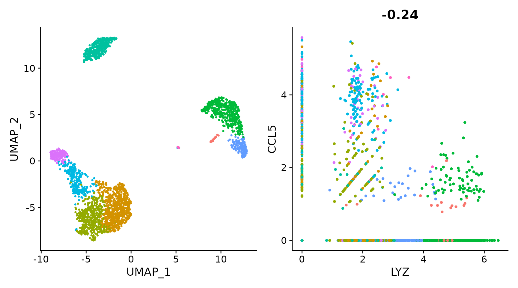
plot1 <- DimPlot(pbmc3k.final)
# Create scatter plot with the Pearson correlation value as the title
plot2 <- FeatureScatter(pbmc3k.final, feature1 = "LYZ", feature2 = "CCL5")
# Combine two plots
plot1 + plot2
# Remove the legend from all plots
(plot1 + plot2) & NoLegend()
Source: https://satijalab.org/seurat/articles/visualization_vignette
[2]Data: https://github.com/satijalab/seurat-data
[3]patchwork: https://patchwork.data-imaginist.com/
本文由 mdnice 多平台发布