一、学习资源:
WPF中文网:https://www.wpfsoft.com/
Visual Studio 2022:https://visualstudio.microsoft.com/zh-hans/vs/
VS2022 激活密钥:https://www.cnblogs.com/soarowl/p/18200602
学习参照教程:https://www.bilibili.com/video/BV1mJ411F7zG
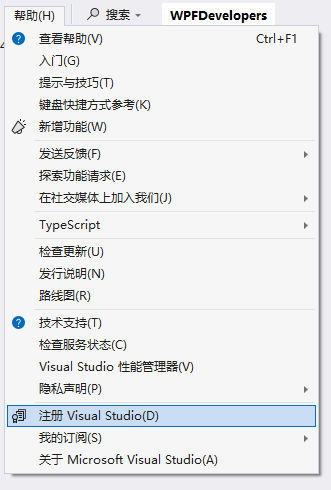
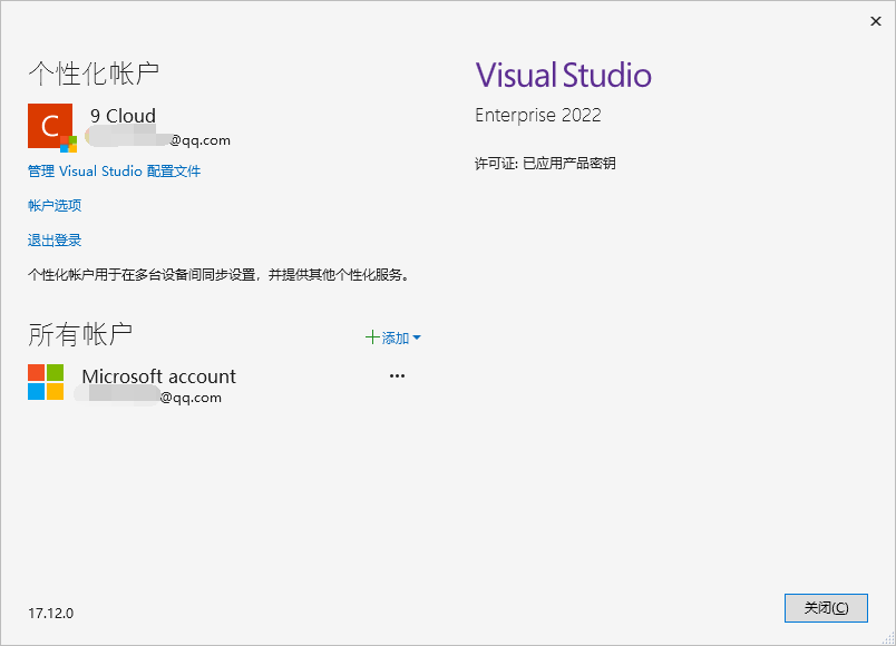
二、VS2022激活:
【帮助】- 【注册 Visual Studio 2022】
除了激活码,还需要注册微软账号绑定支持:
三、编辑器字体设置
Jetbrains 字体需在官网下载:https://www.jetbrains.com/lp/mono/
下载后直接解压到 C:\Windows\Fonts 目录下,自动安装

原生自带字体不好看,习惯使用IDEA产品的JetBrains字体
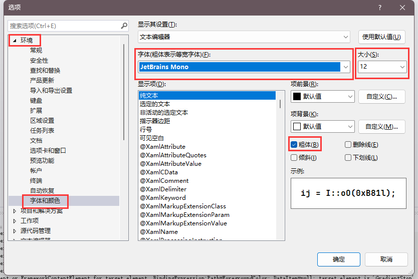
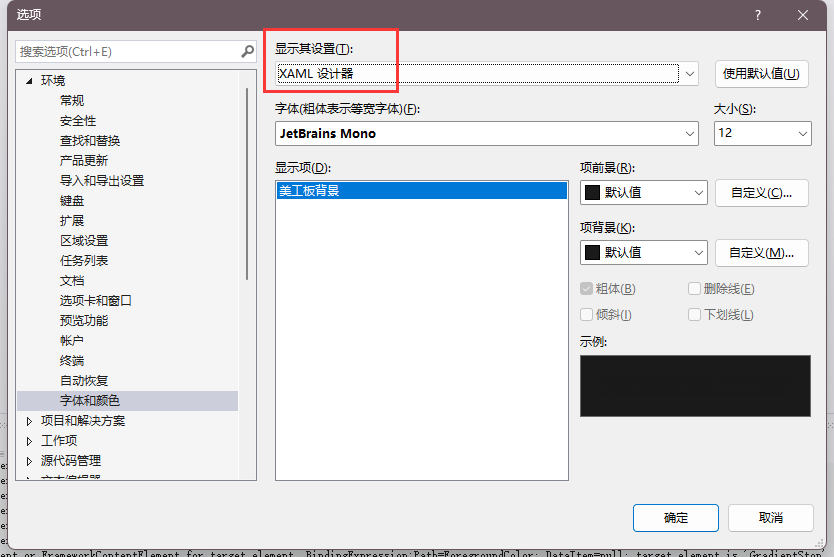
XAML编辑器需要另外选择为这个:
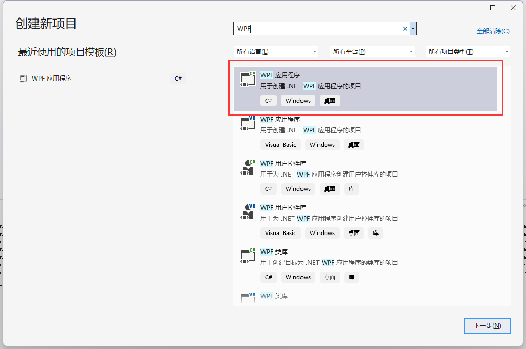
四、新项目创建
五、样式布局
布局样式学习
<Window x:Class="HelloWPF.MainWindow"xmlns="http://schemas.microsoft.com/winfx/2006/xaml/presentation"xmlns:x="http://schemas.microsoft.com/winfx/2006/xaml"xmlns:d="http://schemas.microsoft.com/expression/blend/2008"xmlns:mc="http://schemas.openxmlformats.org/markup-compatibility/2006"xmlns:local="clr-namespace:HelloWPF"mc:Ignorable="d"Title="MainWindow" Height="450" Width="800"><Grid><!-- <TextBlock Text="Hello,World!" FontSize="48"/> --><!-- 堆叠布局容器 分垂直和水平两种布局方式<StackPanel Orientation="Horizontal"><Button Width="100" Height="40">按钮1</Button><Button Width="100" Height="40">按钮2</Button><Button Width="100" Height="40">按钮3</Button><Button Width="100" Height="40">按钮4</Button></StackPanel><StackPanel Orientation="Vertical"><Button Width="100" Height="40">按钮1</Button><Button Width="100" Height="40">按钮2</Button><Button Width="100" Height="40">按钮3</Button><Button Width="100" Height="40">按钮4</Button></StackPanel>--><!-- WrapPanel,包裹布局,在容器内溢出部分向下继续填充 支持水平或垂直排布 Orientation="Vertical" Orientation="Horizontal" <WrapPanel Orientation="Vertical"><Button Width="100" Height="40">按钮1</Button><Button Width="100" Height="40">按钮2</Button><Button Width="100" Height="40">按钮3</Button><Button Width="100" Height="40">按钮4</Button><Button Width="100" Height="40">按钮5</Button><Button Width="100" Height="40">按钮6</Button><Button Width="100" Height="40">按钮7</Button><Button Width="100" Height="40">按钮8</Button><Button Width="100" Height="40">按钮9</Button><Button Width="100" Height="40">按钮10</Button></WrapPanel>--><!-- DockPanel,锚定布局,在容器内的元素通过DockPanel.Dock属性锚定在一个位置上 <DockPanel LastChildFill="False"><Button Width="100" Height="40" DockPanel.Dock="Left">按钮1</Button><Button Width="100" Height="40" DockPanel.Dock="Top">按钮2</Button><Button Width="100" Height="40" DockPanel.Dock="Bottom">按钮3</Button><Button Width="100" Height="40" DockPanel.Dock="Right">按钮4</Button></DockPanel>--><Grid.RowDefinitions><!-- <RowDefinition Height="60"  /> --><!-- <RowDefinition Height="auto" /> --><RowDefinition /><RowDefinition /></Grid.RowDefinitions><Grid.ColumnDefinitions><!-- 按倍数设置 <ColumnDefinition Width="2*" /> --><!-- 自动分配 <ColumnDefinition Width="auto" /> --><ColumnDefinition /><ColumnDefinition /></Grid.ColumnDefinitions><Border Margin="3" Background="Blue" Grid.Row="0" Grid.Column="0" ></Border><Border Margin="3" Background="Red" Grid.Row="0" Grid.Column="1"></Border><Border Margin="3" Background="Yellow" Grid.Row="1" Grid.Column="0"></Border><Border Margin="3" Background="Green" Grid.Row="1" Grid.Column="1" ></Border></Grid>
</Window>
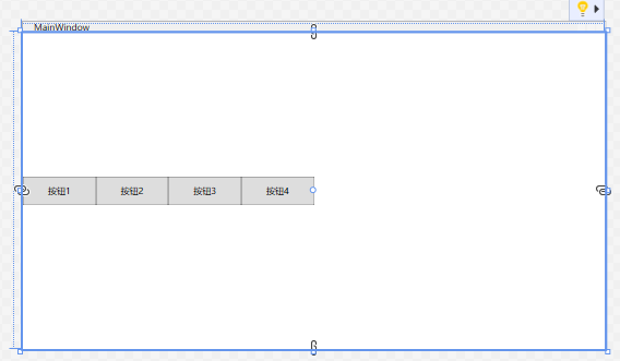
堆叠布局,分为垂直堆叠和水平堆叠
<StackPanel Orientation="Horizontal"><Button Width="100" Height="40">按钮1</Button><Button Width="100" Height="40">按钮2</Button><Button Width="100" Height="40">按钮3</Button><Button Width="100" Height="40">按钮4</Button></StackPanel>
渲染效果
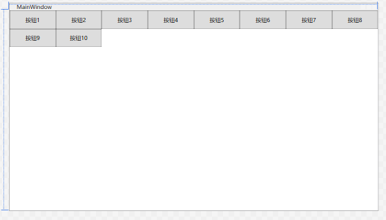
包裹布局,溢出时向容器内空白处继续填充元素
<WrapPanel Orientation="Horizontal"><Button Width="100" Height="40">按钮1</Button><Button Width="100" Height="40">按钮2</Button><Button Width="100" Height="40">按钮3</Button><Button Width="100" Height="40">按钮4</Button><Button Width="100" Height="40">按钮5</Button><Button Width="100" Height="40">按钮6</Button><Button Width="100" Height="40">按钮7</Button><Button Width="100" Height="40">按钮8</Button><Button Width="100" Height="40">按钮9</Button><Button Width="100" Height="40">按钮10</Button></WrapPanel>
分为水平布局和垂直布局两种方式
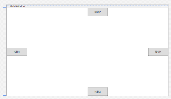
锚定布局,容器内的元素标记锚定布局位置来定位
<DockPanel LastChildFill="False"><Button Width="100" Height="40" DockPanel.Dock="Left">按钮1</Button><Button Width="100" Height="40" DockPanel.Dock="Top">按钮2</Button><Button Width="100" Height="40" DockPanel.Dock="Bottom">按钮3</Button><Button Width="100" Height="40" DockPanel.Dock="Right">按钮4</Button></DockPanel>
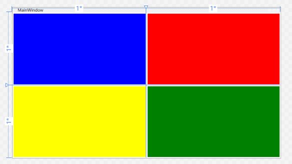
栅格布局,需要先定义有多少行和列,然后再定义内部元素标记为对应的所在行和列上
<Grid.RowDefinitions><!-- <RowDefinition Height="60" /> --><!-- <RowDefinition Height="auto" /> --><RowDefinition /><RowDefinition /></Grid.RowDefinitions><Grid.ColumnDefinitions><!-- 按倍数设置 <ColumnDefinition Width="2*" /> --><!-- 自动分配 <ColumnDefinition Width="auto" /> --><ColumnDefinition /><ColumnDefinition /></Grid.ColumnDefinitions><Border Margin="3" Background="Blue" Grid.Row="0" Grid.Column="0" ></Border><Border Margin="3" Background="Red" Grid.Row="0" Grid.Column="1"></Border><Border Margin="3" Background="Yellow" Grid.Row="1" Grid.Column="0"></Border><Border Margin="3" Background="Green" Grid.Row="1" Grid.Column="1" ></Border>
渲染结果
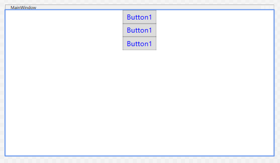
六、样式设置
<Window x:Class="HelloWPF.MainWindow"xmlns="http://schemas.microsoft.com/winfx/2006/xaml/presentation"xmlns:x="http://schemas.microsoft.com/winfx/2006/xaml"xmlns:d="http://schemas.microsoft.com/expression/blend/2008"xmlns:mc="http://schemas.openxmlformats.org/markup-compatibility/2006"xmlns:local="clr-namespace:HelloWPF"mc:Ignorable="d"Title="MainWindow" Height="450" Width="800"><Window.Resources><Style x:Key="defaultStyle" TargetType="Button"><Setter Property="FontSize" Value="20"></Setter><Setter Property="Foreground" Value="Blue"></Setter><Setter Property="Width" Value="100"></Setter><Setter Property="Height" Value="40"></Setter></Style></Window.Resources><Grid><StackPanel Orientation="Vertical"><Button Style="{ StaticResource defaultStyle }" Content="Button1"></Button><Button Style="{ StaticResource defaultStyle }" Content="Button1"></Button><Button Style="{ StaticResource defaultStyle }" Content="Button1"></Button></StackPanel></Grid>
</Window>
设置效果,静态资源指定样式,对绑定的元素都起作用
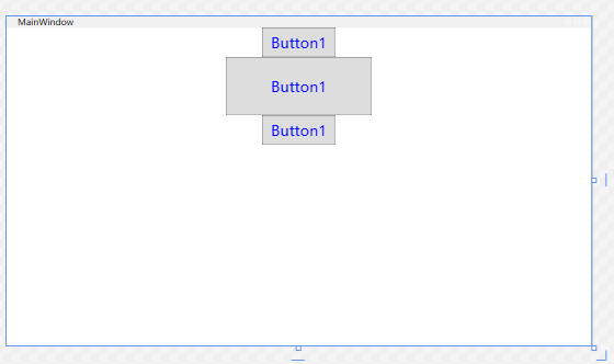
样式继承
通过BaseOn属性来继承某一样式的设定
例如,可以设置两种defaultStyle,一种是小的宽高,一种是大的宽高,但是都是使用20的字号和蓝颜色
<Window x:Class="HelloWPF.MainWindow"xmlns="http://schemas.microsoft.com/winfx/2006/xaml/presentation"xmlns:x="http://schemas.microsoft.com/winfx/2006/xaml"xmlns:d="http://schemas.microsoft.com/expression/blend/2008"xmlns:mc="http://schemas.openxmlformats.org/markup-compatibility/2006"xmlns:local="clr-namespace:HelloWPF"mc:Ignorable="d"Title="MainWindow" Height="450" Width="800"><Window.Resources><Style x:Key="baseButtonStyle" TargetType="Button"><Setter Property="FontSize" Value="20"></Setter><Setter Property="Foreground" Value="Blue"></Setter></Style><Style x:Key="defaultStyle" TargetType="Button" BasedOn="{StaticResource baseButtonStyle}"><Setter Property="Width" Value="100"></Setter><Setter Property="Height" Value="40"></Setter></Style><Style x:Key="default2Style" TargetType="Button" BasedOn="{StaticResource baseButtonStyle}"><Setter Property="Width" Value="200"></Setter><Setter Property="Height" Value="80"></Setter></Style></Window.Resources><Grid><StackPanel Orientation="Vertical"><Button Style="{ StaticResource defaultStyle }" Content="Button1"></Button><Button Style="{ StaticResource default2Style }" Content="Button1"></Button><Button Style="{ StaticResource defaultStyle }" Content="Button1"></Button></StackPanel></Grid>
</Window>
效果设置
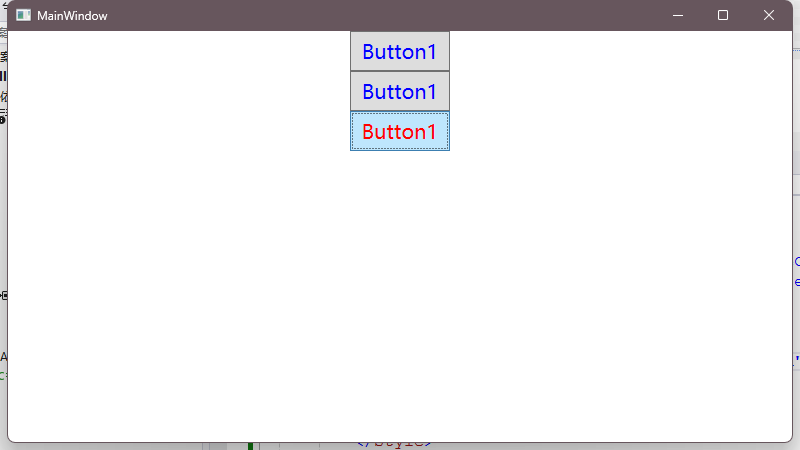
样式触发器
对应CSS的事件样式,当元素出现交互事件时更改样式效果
<Window x:Class="HelloWPF.MainWindow"xmlns="http://schemas.microsoft.com/winfx/2006/xaml/presentation"xmlns:x="http://schemas.microsoft.com/winfx/2006/xaml"xmlns:d="http://schemas.microsoft.com/expression/blend/2008"xmlns:mc="http://schemas.openxmlformats.org/markup-compatibility/2006"xmlns:local="clr-namespace:HelloWPF"mc:Ignorable="d"Title="MainWindow" Height="450" Width="800"><Window.Resources><Style x:Key="baseButtonStyle" TargetType="Button"><Setter Property="FontSize" Value="20"></Setter><Setter Property="Foreground" Value="Blue"></Setter></Style><Style x:Key="defaultStyle" TargetType="Button" BasedOn="{StaticResource baseButtonStyle}"><Setter Property="Width" Value="100"></Setter><Setter Property="Height" Value="40"></Setter><Style.Triggers><Trigger Property="IsMouseOver" Value="True"><Setter Property="Foreground" Value="Red"></Setter></Trigger><Trigger Property="IsMouseOver" Value="False"><Setter Property="Foreground" Value="Blue"></Setter></Trigger></Style.Triggers></Style><Style x:Key="default2Style" TargetType="Button" BasedOn="{StaticResource baseButtonStyle}"><Setter Property="Width" Value="200"></Setter><Setter Property="Height" Value="80"></Setter></Style></Window.Resources><Grid><StackPanel Orientation="Vertical"><Button Style="{ StaticResource defaultStyle }" Content="Button1"></Button><Button Style="{ StaticResource defaultStyle }" Content="Button1"></Button><Button Style="{ StaticResource defaultStyle }" Content="Button1"></Button></StackPanel></Grid>
</Window>
当鼠标进入按钮区域时,样式发生变更:

多条件触发器
触发条件存在多个的情况,需要声明组合条件
<Window x:Class="HelloWPF.MainWindow"xmlns="http://schemas.microsoft.com/winfx/2006/xaml/presentation"xmlns:x="http://schemas.microsoft.com/winfx/2006/xaml"xmlns:d="http://schemas.microsoft.com/expression/blend/2008"xmlns:mc="http://schemas.openxmlformats.org/markup-compatibility/2006"xmlns:local="clr-namespace:HelloWPF"mc:Ignorable="d"Title="MainWindow" Height="450" Width="800"><Window.Resources><Style x:Key="baseButtonStyle" TargetType="Button"><Setter Property="FontSize" Value="20"></Setter><Setter Property="Foreground" Value="Blue"></Setter></Style><Style x:Key="defaultStyle" TargetType="Button" BasedOn="{StaticResource baseButtonStyle}"><Setter Property="Width" Value="100"></Setter><Setter Property="Height" Value="40"></Setter><Style.Triggers><MultiTrigger><MultiTrigger.Conditions><Condition Property="IsMouseOver" Value="True"  /><Condition Property="IsFocused" Value="True"  /></MultiTrigger.Conditions><MultiTrigger.Setters><Setter Property="Foreground" Value="Red" /></MultiTrigger.Setters></MultiTrigger></Style.Triggers></Style><Style x:Key="default2Style" TargetType="Button" BasedOn="{StaticResource baseButtonStyle}"><Setter Property="Width" Value="200"></Setter><Setter Property="Height" Value="80"></Setter></Style></Window.Resources><Grid><StackPanel Orientation="Vertical"><Button Style="{ StaticResource defaultStyle }" Content="Button1"></Button><Button Style="{ StaticResource defaultStyle }" Content="Button1"></Button><Button Style="{ StaticResource defaultStyle }" Content="Button1"></Button></StackPanel></Grid>
</Window>
当鼠标悬浮该元素,并且聚焦的也是该元素时,样式变化
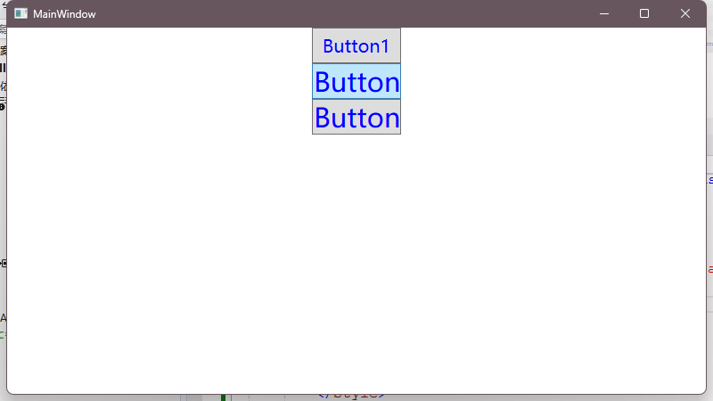
事件触发器&动画故事板
设置一个开始动画的故事板,指定动画结束后字体变为30号,持续时间为0.2秒
<Window x:Class="HelloWPF.MainWindow"xmlns="http://schemas.microsoft.com/winfx/2006/xaml/presentation"xmlns:x="http://schemas.microsoft.com/winfx/2006/xaml"xmlns:d="http://schemas.microsoft.com/expression/blend/2008"xmlns:mc="http://schemas.openxmlformats.org/markup-compatibility/2006"xmlns:local="clr-namespace:HelloWPF"mc:Ignorable="d"Title="MainWindow" Height="450" Width="800"><Window.Resources><Style x:Key="baseButtonStyle" TargetType="Button"><Setter Property="FontSize" Value="20"></Setter><Setter Property="Foreground" Value="Blue"></Setter></Style><Style x:Key="defaultStyle" TargetType="Button" BasedOn="{StaticResource baseButtonStyle}"><Setter Property="Width" Value="100"></Setter><Setter Property="Height" Value="40"></Setter><Style.Triggers><EventTrigger RoutedEvent="Mouse.MouseEnter"><EventTrigger.Actions><!-- 故事板? --><BeginStoryboard><Storyboard><DoubleAnimation Duration="0:0:0.2" Storyboard.TargetProperty="FontSize" To="30" /></Storyboard></BeginStoryboard></EventTrigger.Actions></EventTrigger></Style.Triggers></Style><Style x:Key="default2Style" TargetType="Button" BasedOn="{StaticResource baseButtonStyle}"><Setter Property="Width" Value="200"></Setter><Setter Property="Height" Value="80"></Setter></Style></Window.Resources><Grid><StackPanel Orientation="Vertical"><Button Style="{ StaticResource defaultStyle }" Content="Button1"></Button><Button Style="{ StaticResource defaultStyle }" Content="Button1"></Button><Button Style="{ StaticResource defaultStyle }" Content="Button1"></Button></StackPanel></Grid>
</Window>
通过故事板设置该元素在触发指定事件时发生的动画样式
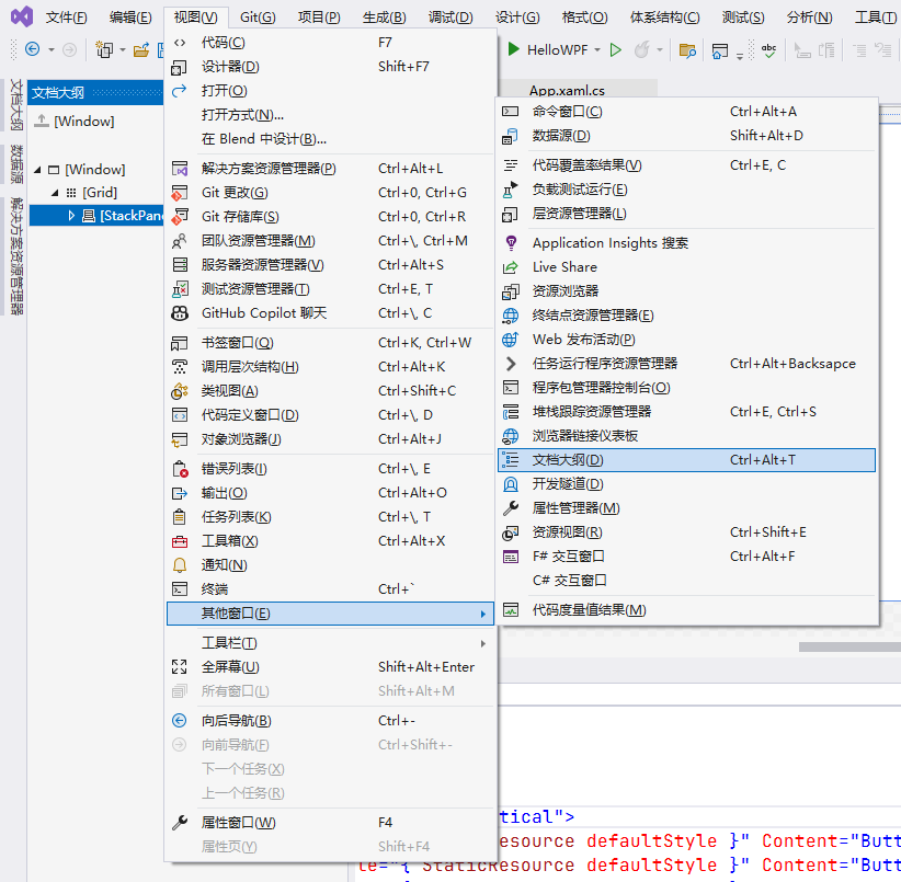
文本大纲
设置位置
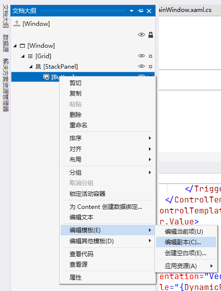
对控件元素设置控件模版,点击编辑模版并确认后自动生成在Resources标签中
<Window x:Class="HelloWPF.MainWindow"xmlns="http://schemas.microsoft.com/winfx/2006/xaml/presentation"xmlns:x="http://schemas.microsoft.com/winfx/2006/xaml"xmlns:d="http://schemas.microsoft.com/expression/blend/2008"xmlns:mc="http://schemas.openxmlformats.org/markup-compatibility/2006"xmlns:local="clr-namespace:HelloWPF"mc:Ignorable="d"Title="MainWindow" Height="450" Width="800"><Window.Resources><Style x:Key="FocusVisual"><Setter Property="Control.Template"><Setter.Value><ControlTemplate><Rectangle Margin="2" StrokeDashArray="1 2" Stroke="{DynamicResource {x:Static SystemColors.ControlTextBrushKey}}" SnapsToDevicePixels="true" StrokeThickness="1"/></ControlTemplate></Setter.Value></Setter></Style><SolidColorBrush x:Key="Button.Static.Background" Color="#FFDDDDDD"/><SolidColorBrush x:Key="Button.Static.Border" Color="#FF707070"/><SolidColorBrush x:Key="Button.MouseOver.Background" Color="#FFBEE6FD"/><SolidColorBrush x:Key="Button.MouseOver.Border" Color="#FF3C7FB1"/><SolidColorBrush x:Key="Button.Pressed.Background" Color="#FFC4E5F6"/><SolidColorBrush x:Key="Button.Pressed.Border" Color="#FF2C628B"/><SolidColorBrush x:Key="Button.Disabled.Background" Color="#FFF4F4F4"/><SolidColorBrush x:Key="Button.Disabled.Border" Color="#FFADB2B5"/><SolidColorBrush x:Key="Button.Disabled.Foreground" Color="#FF838383"/><Style x:Key="ButtonStyle1" TargetType="{x:Type Button}"><Setter Property="FocusVisualStyle" Value="{StaticResource FocusVisual}"/><Setter Property="Background" Value="{StaticResource Button.Static.Background}"/><Setter Property="BorderBrush" Value="{StaticResource Button.Static.Border}"/><Setter Property="Foreground" Value="{DynamicResource {x:Static SystemColors.ControlTextBrushKey}}"/><Setter Property="BorderThickness" Value="1"/><Setter Property="HorizontalContentAlignment" Value="Center"/><Setter Property="VerticalContentAlignment" Value="Center"/><Setter Property="Padding" Value="1"/><Setter Property="Template"><Setter.Value><ControlTemplate TargetType="{x:Type Button}"><Border x:Name="border" CornerRadius="10" Background="{TemplateBinding Background}" BorderBrush="{TemplateBinding BorderBrush}" BorderThickness="{TemplateBinding BorderThickness}" SnapsToDevicePixels="true"><ContentPresenter x:Name="contentPresenter" Focusable="False" HorizontalAlignment="{TemplateBinding HorizontalContentAlignment}" Margin="{TemplateBinding Padding}" RecognizesAccessKey="True" SnapsToDevicePixels="{TemplateBinding SnapsToDevicePixels}" VerticalAlignment="{TemplateBinding VerticalContentAlignment}"/></Border><ControlTemplate.Triggers><Trigger Property="IsDefaulted" Value="true"><Setter Property="BorderBrush" TargetName="border" Value="{DynamicResource {x:Static SystemColors.HighlightBrushKey}}"/></Trigger><Trigger Property="IsMouseOver" Value="true"><!-- <Setter Property="Background" TargetName="border" Value="{StaticResource Button.MouseOver.Background}"/> --><!-- <Setter Property="BorderBrush" TargetName="border" Value="{StaticResource Button.MouseOver.Border}"/> --><Setter Property="Background" TargetName="border" Value="yellow"/><Setter Property="BorderBrush" TargetName="border" Value="green"/></Trigger><Trigger Property="IsPressed" Value="true"><Setter Property="Background" TargetName="border" Value="{StaticResource Button.Pressed.Background}"/><Setter Property="BorderBrush" TargetName="border" Value="{StaticResource Button.Pressed.Border}"/></Trigger><Trigger Property="IsEnabled" Value="false"><Setter Property="Background" TargetName="border" Value="{StaticResource Button.Disabled.Background}"/><Setter Property="BorderBrush" TargetName="border" Value="{StaticResource Button.Disabled.Border}"/><Setter Property="TextElement.Foreground" TargetName="contentPresenter" Value="{StaticResource Button.Disabled.Foreground}"/></Trigger></ControlTemplate.Triggers></ControlTemplate></Setter.Value></Setter></Style></Window.Resources><Grid><StackPanel Orientation="Vertical" VerticalAlignment="Center"><Button Style="{DynamicResource ButtonStyle1}" Width="100" Height="40" Content="按钮1"></Button></StackPanel></Grid>
</Window>
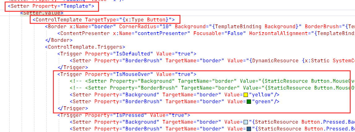
1 控件模版也是基于样式设置
2 样式设置名称为Template,样式设置的值是 控件模版标签,目标类型为按钮
3 其中里面定义的模版触发器,可以被调整
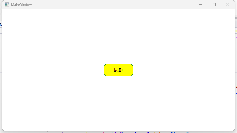
渲染结果:
自定义模版设置
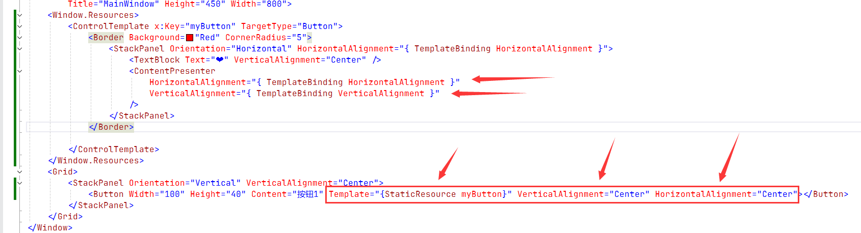
<Window x:Class="HelloWPF.MainWindow"xmlns="http://schemas.microsoft.com/winfx/2006/xaml/presentation"xmlns:x="http://schemas.microsoft.com/winfx/2006/xaml"xmlns:d="http://schemas.microsoft.com/expression/blend/2008"xmlns:mc="http://schemas.openxmlformats.org/markup-compatibility/2006"xmlns:local="clr-namespace:HelloWPF"mc:Ignorable="d"Title="MainWindow" Height="450" Width="800"><Window.Resources><ControlTemplate x:Key="myButton" TargetType="Button"><Border Background="Red" CornerRadius="5"><StackPanel Orientation="Horizontal" HorizontalAlignment="{ TemplateBinding HorizontalAlignment }"><TextBlock Text="❤" VerticalAlignment="Center" /><ContentPresenter HorizontalAlignment="{ TemplateBinding HorizontalAlignment }"VerticalAlignment="{ TemplateBinding VerticalAlignment }"    /></StackPanel></Border></ControlTemplate></Window.Resources><Grid><StackPanel Orientation="Vertical" VerticalAlignment="Center"><Button Width="100" Height="40" Content="按钮1" Template="{StaticResource myButton}" VerticalAlignment="Center" HorizontalAlignment="Center"></Button></StackPanel></Grid>
</Window>
内容呈现器标签设置了绑定的 垂直对齐和水平对齐的设定,
这两个设定交给实际控件使用时声明来决定
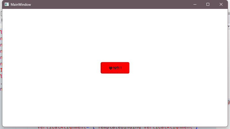
渲染效果
七、数据模版
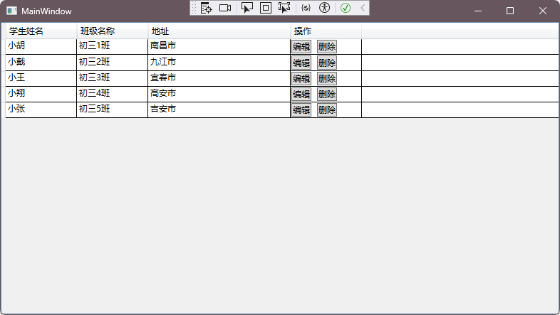
xaml文件定义了数据栅格标签,名称为gd
<Window x:Class="HelloWPF.MainWindow"xmlns="http://schemas.microsoft.com/winfx/2006/xaml/presentation"xmlns:x="http://schemas.microsoft.com/winfx/2006/xaml"xmlns:d="http://schemas.microsoft.com/expression/blend/2008"xmlns:mc="http://schemas.openxmlformats.org/markup-compatibility/2006"xmlns:local="clr-namespace:HelloWPF"mc:Ignorable="d"Title="MainWindow" Height="450" Width="800"><Window.Resources></Window.Resources><Grid><DataGrid Name="gd" AutoGenerateColumns="False" CanUserSortColumns="True"  CanUserAddRows="False"><DataGrid.Columns><DataGridTextColumn Binding="{Binding UserName}" Width="100" Header="学生姓名"/><DataGridTextColumn Binding="{Binding ClassName}" Width="100" Header="班级名称"/><DataGridTextColumn Binding="{Binding Address}" Width="200" Header="地址"/><DataGridTemplateColumn Header="操作" Width="100" ><DataGridTemplateColumn.CellTemplate><DataTemplate><StackPanel Orientation="Horizontal" VerticalAlignment="Center" HorizontalAlignment="Left"><Button Content="编辑"/><Button Margin="8 0 0 0" Content="删除" /></StackPanel></DataTemplate></DataGridTemplateColumn.CellTemplate></DataGridTemplateColumn></DataGrid.Columns></DataGrid></Grid>
</Window>
在代码初始化逻辑中:
初始数据集合,填充到模版属性中
using System.Text;
using System.Windows;
using System.Windows.Controls;
using System.Windows.Data;
using System.Windows.Documents;
using System.Windows.Input;
using System.Windows.Media;
using System.Windows.Media.Imaging;
using System.Windows.Navigation;
using System.Windows.Shapes;namespace HelloWPF
{/// <summary>/// Interaction logic for MainWindow.xaml/// </summary>public partial class MainWindow : Window{public MainWindow(){InitializeComponent();List<Student> students = new List<Student>();students.Add(new Student() { UserName = "小胡", ClassName = "初三1班", Address = "南昌市" });students.Add(new Student() { UserName = "小戴", ClassName = "初三2班", Address = "九江市" });students.Add(new Student() { UserName = "小王", ClassName = "初三3班", Address = "宜春市" });students.Add(new Student() { UserName = "小翔", ClassName = "初三4班", Address = "高安市" });students.Add(new Student() { UserName = "小张", ClassName = "初三5班", Address = "吉安市"  });gd.ItemsSource = students;}}public class Student { public String UserName {get;set;}public String ClassName {get;set;}public String Address { get; set; }}
}
渲染效果:
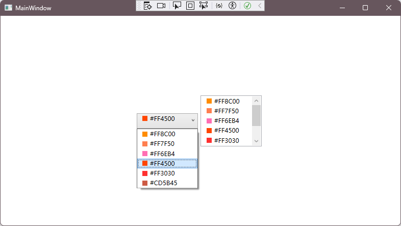
选择下拉项
xaml 部分
<Window x:Class="HelloWPF.MainWindow"xmlns="http://schemas.microsoft.com/winfx/2006/xaml/presentation"xmlns:x="http://schemas.microsoft.com/winfx/2006/xaml"xmlns:d="http://schemas.microsoft.com/expression/blend/2008"xmlns:mc="http://schemas.openxmlformats.org/markup-compatibility/2006"xmlns:local="clr-namespace:HelloWPF"mc:Ignorable="d"Title="MainWindow" Height="450" Width="800"><Window.Resources><DataTemplate x:Key="comTemplate"><StackPanel Orientation="Horizontal" Margin="5,0"><Border Width="10" Height="10" Background="{Binding Code}"/><TextBlock Text="{Binding Code}" Margin="5,0"/></StackPanel></DataTemplate></Window.Resources><Grid><StackPanel Orientation="Horizontal" HorizontalAlignment="Center"><ComboBox Name="cob" Width="120" Height="30" ItemTemplate="{StaticResource comTemplate}"/><ListBox Name="lib" Width="120" Height="100" Margin="5,0"  ItemTemplate="{StaticResource comTemplate}"/></StackPanel></Grid>
</Window>
主程序:
using System.Text;
using System.Windows;
using System.Windows.Controls;
using System.Windows.Data;
using System.Windows.Documents;
using System.Windows.Input;
using System.Windows.Media;
using System.Windows.Media.Imaging;
using System.Windows.Navigation;
using System.Windows.Shapes;namespace HelloWPF
{/// <summary>/// Interaction logic for MainWindow.xaml/// </summary>public partial class MainWindow : Window{public MainWindow(){InitializeComponent();List<Color> ColorList = new List<Color>();ColorList.Add(new Color() { Code = "#FF8C00" });ColorList.Add(new Color() { Code = "#FF7F50" });ColorList.Add(new Color() { Code = "#FF6EB4" });ColorList.Add(new Color() { Code = "#FF4500" });ColorList.Add(new Color() { Code = "#FF3030" });ColorList.Add(new Color() { Code = "#CD5B45" });cob.ItemsSource = ColorList;lib.ItemsSource = ColorList;}}public class Color{public String Code { get; set; }}
}
渲染效果:
元素渲染
逻辑代码部分
using System.Text;
using System.Windows;
using System.Windows.Controls;
using System.Windows.Data;
using System.Windows.Documents;
using System.Windows.Input;
using System.Windows.Media;
using System.Windows.Media.Imaging;
using System.Windows.Navigation;
using System.Windows.Shapes;
using static System.Net.Mime.MediaTypeNames;namespace HelloWPF
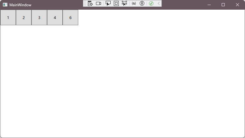
{/// <summary>/// Interaction logic for MainWindow.xaml/// </summary>public partial class MainWindow : Window{public MainWindow(){InitializeComponent();List<Test> tests = new List<Test>();tests.Add(new Test() { Code = "1" });tests.Add(new Test() { Code = "2" });tests.Add(new Test() { Code = "3" });tests.Add(new Test() { Code = "4" });tests.Add(new Test() { Code = "6" });ic.ItemsSource = tests;}}public class Test{public String Code { get; set; }}
}
用于批量创建控件元素:
<Window x:Class="HelloWPF.MainWindow"xmlns="http://schemas.microsoft.com/winfx/2006/xaml/presentation"xmlns:x="http://schemas.microsoft.com/winfx/2006/xaml"xmlns:d="http://schemas.microsoft.com/expression/blend/2008"xmlns:mc="http://schemas.openxmlformats.org/markup-compatibility/2006"xmlns:local="clr-namespace:HelloWPF"mc:Ignorable="d"Title="MainWindow" Height="450" Width="800"><Window.Resources></Window.Resources><Grid><ItemsControl Name="ic"><ItemsControl.ItemsPanel><ItemsPanelTemplate><WrapPanel Orientation="Horizontal"/></ItemsPanelTemplate></ItemsControl.ItemsPanel><ItemsControl.ItemTemplate><DataTemplate><Button Width="50" Height="50" Content="{Binding Code}"/></DataTemplate></ItemsControl.ItemTemplate></ItemsControl></Grid>
</Window>
渲染效果:可以看见,根据Test集合中的元素数量,对应的在模版中也渲染了
数据绑定
通过window资源标签绑定 一个数据源 在渲染界面的控件元素设置静态资源进行绑定
<Window x:Class="HelloWPF.MainWindow"xmlns="http://schemas.microsoft.com/winfx/2006/xaml/presentation"xmlns:x="http://schemas.microsoft.com/winfx/2006/xaml"xmlns:d="http://schemas.microsoft.com/expression/blend/2008"xmlns:mc="http://schemas.openxmlformats.org/markup-compatibility/2006"xmlns:local="clr-namespace:HelloWPF"mc:Ignorable="d"Title="MainWindow" Height="450" Width="800"><Window.Resources><TextBox x:Key="txt">Hello</TextBox></Window.Resources><Grid><StackPanel><!-- <Slider x:Name="sd" Width="200" /> --><!-- <TextBlock Text="{ Binding ElementName=sd, Path=Value, Mode=TwoWay }" /> --><TextBlock Text="{Binding Source={StaticResource txt}, Path=Text}" FontSize="60" /></StackPanel></Grid>
</Window>
后台数据更新通知:
绑定数据上下文
using System.ComponentModel;
using System.Text;
using System.Windows;
using System.Windows.Controls;
using System.Windows.Data;
using System.Windows.Documents;
using System.Windows.Input;
using System.Windows.Media;
using System.Windows.Media.Imaging;
using System.Windows.Navigation;
using System.Windows.Shapes;
using System.Xml.Linq;
using static System.Net.Mime.MediaTypeNames;namespace HelloWPF
{/// <summary>/// Interaction logic for MainWindow.xaml/// </summary>public partial class MainWindow : Window{public MainWindow(){InitializeComponent();txt.DataContext = new Person() { Name = "张三" };this.DataContext = new MainViewModel();}}public class Person{public required String Name { get; set; }}/* 通知属性更新需要实现INotifyPropertyChanged接口 */public class MainViewModel:INotifyPropertyChanged{public MainViewModel(){Name = "Test";Task.Run(async () => {await Task.Delay(3000);Name = "Task Delay 数据变更";});}private string name;public string Name { get { return name; }set{/* 设置值之后,需要声明更新的是哪一个属性 */name = value;OnPropertyChanged("Name");} }/* 该接口提供一个抽象方法?并可以被调用? */public event PropertyChangedEventHandler? PropertyChanged;/* 当属性变更时通知界面控件更新属性 */protected void OnPropertyChanged(string properName){if (PropertyChanged != null){PropertyChanged(this, new PropertyChangedEventArgs(properName));}}}
}
界面绑定:除了命名式的数据上下文,还支持窗体对象的数据上下文
窗体对象的数据上下文可以直接用属性名绑定
<Window x:Class="HelloWPF.MainWindow"xmlns="http://schemas.microsoft.com/winfx/2006/xaml/presentation"xmlns:x="http://schemas.microsoft.com/winfx/2006/xaml"xmlns:d="http://schemas.microsoft.com/expression/blend/2008"xmlns:mc="http://schemas.openxmlformats.org/markup-compatibility/2006"xmlns:local="clr-namespace:HelloWPF"mc:Ignorable="d"DataContext=""Title="MainWindow" Height="450" Width="800"><Window.Resources><!-- <TextBox x:Key="txt">Hello</TextBox> --></Window.Resources><Grid><StackPanel><!-- <Slider x:Name="sd" Width="200" /> --><!-- <TextBlock Text="{ Binding ElementName=sd, Path=Value, Mode=TwoWay }" /> --><!-- <TextBlock Text="{Binding Source={StaticResource txt}, Path=Text}" FontSize="60" /> --><TextBox x:Name="txt" FontSize="60" Text="{ Binding Name, FallbackValue='李四' }" /><TextBox FontSize="60" Text="{ Binding Name, FallbackValue='李四2' }" /></StackPanel></Grid>
</Window>
八、NUGET包管理(资源引用)
视频是从引用右击进入的,但是我发现我本地的资源没有
右击发现菜单多一个管理NuGet程序包,打开发现是对应的上的
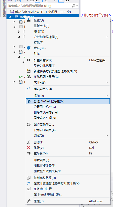
不过该版本已弃用...

更新逻辑为:
using System.ComponentModel;
using System.Text;
using System.Windows;
using System.Windows.Controls;
using System.Windows.Data;
using System.Windows.Documents;
using System.Windows.Input;
using System.Windows.Media;
using System.Windows.Media.Imaging;
using System.Windows.Navigation;
using System.Windows.Shapes;
using System.Xml.Linq;
using GalaSoft.MvvmLight;
using GalaSoft.MvvmLight.Command;
using static System.Net.Mime.MediaTypeNames;namespace HelloWPF
{/// <summary>/// Interaction logic for MainWindow.xaml/// </summary>public partial class MainWindow : Window{public MainWindow(){InitializeComponent();txt.DataContext = new Person() { Name = "张三" };this.DataContext = new MainViewModel();}}public class Person{public required String Name { get; set; }}/* 使用NuGet包程序管理引用的是 MvvmLight框架 *//* 1、需要继承 ViewModelBase类 ? */public class MainViewModel : ViewModelBase {public MainViewModel(){Name = "Test";/* 初始化时保存方法属性为 更新Name属性的值为 'SaveCommand' */SaveCommand = new RelayCommand(() =>{Name = "SaveCommand";});Task.Run(async () => {await Task.Delay(3000);Name = "Task Delay 数据变更";});}private string name;public string Name { get { return name; }set{/* 设置值之后 调用ViewModelBase的RaisePropertyChanged方法 */name = value;RaisePropertyChanged();} }/* 声明一个RelayCommand属性 */public RelayCommand SaveCommand { get; private set; }}
}
xaml给按钮设置一个保存命令:
<Window x:Class="HelloWPF.MainWindow"xmlns="http://schemas.microsoft.com/winfx/2006/xaml/presentation"xmlns:x="http://schemas.microsoft.com/winfx/2006/xaml"xmlns:d="http://schemas.microsoft.com/expression/blend/2008"xmlns:mc="http://schemas.openxmlformats.org/markup-compatibility/2006"xmlns:local="clr-namespace:HelloWPF"mc:Ignorable="d"DataContext=""Title="MainWindow" Height="450" Width="800"><Window.Resources></Window.Resources><Grid><StackPanel><TextBox x:Name="txt" FontSize="60" Text="{ Binding Name, FallbackValue='李四' }" /><TextBox FontSize="60" Text="{ Binding Name, FallbackValue='李四2' }" /><Button Command="{Binding SaveCommand}" Content="触发SaveCommand" Width="300" Height="60" /></StackPanel></Grid>
</Window>