控件,继承自 System.Windows.Contorl 类
控件分类
- 内容控件:Label/Button/ToolTip/ScrollViewer
- 带有标题的内容控件:TabItem/GroupBox/Expander
- 文本控件:Textbox/PasswordBox/RichTextBox
- 列表控件:ListBox/ComboBox
- 基于范围的控件:Slider/ProgressBar
- 日期控件:Calendar/DatePicker
控件类
✒ 什么是控件?
控件通常被描述为与用户交互的元素——能以旧换新焦点并接收键盘或鼠标输入的元素。
背景画刷和前景画刷
btn.Background = new SolidColorBrush(Colors.AliceBlue);
btn.Background = new SolidColorBrush(SystemColors.ControlColor); // 系统颜色
btn.Background = SystemColors.ControlBrush; // 系统预定义的画刷值
btn.Background = new SolidColorBrush(Color.FromRgb(0,255,0)); // 通过 R、G、B值定义颜色画刷(0~255)
btn.Background = new SolidColorBrush(Color.FromArgb(0,0, 255, 0)); // 通过 Alpha 值指定画刷透明值
btn.Background = new SolidColorBrush(Color.FromScRgb(0, 0, 255, 0)); // 通 ScRgb 的颜色值范围更广
<Button x:Name="btn"Background="Red"Content="Hello" /><Button Content="Hello"><Button.Background><SolidColorBrush Color="Red" /></Button.Background>
</Button><Button Background="#FFFF0000" Content="Hello" />
字体
Control 类中与字体相关属性
- FontFamily
- FontSize
- FontStyle
- FontWeight
- FontStretch
文本装饰和排版属性
TextDecorations:可为文本添加几类线,包括 Baseline/ OverLine/ Strikethrough和 Underline
❓ Typography: 提供特殊字体的变种,如 数字对齐方式、连字和小音标
当设置任何字体属性时,属性值都会流经嵌套的对象。
在 Control 类中,使用继承的属性:
- Foreground
- AllowDrop
- IsEnabled
- ❓ CultureInfo
- ❓ FlowDirection
不使用继承的属性: - Background
当需要使用的字体不明确时,可将 FontFamily 属性设置为由逗号分隔的字体选项列表
FontFamily = "字体A, 字体B, 字体C" 👉 如果字体名称中有逗号,需要使用两个逗号进行转义
查找本地支持的字体
foreach (FontFamily fontFamily in Fonts.SystemFontFamiles)
{ lst.Fonts.Items.Add(fontFamily.Source);}
字体嵌入
向程序添加 .ttf 字体文件,并将其添加到资源。需要在嵌入的字体名前加#号
<Label FontFamily="./#字体名" />
也可以便用URI格式语句查找嵌入的字体。
文本格式化模式:当小字体显示模式时的解决方案
在 96 dpi 显示器上使用15号的字体显示才不会模糊
解决小字模问题可使用属性:TextOptions.TextFormattingMode 附加属性,并设置值为 Display(默认值是 Ideal),但如果为15号以上的文本设置该属性,文本将不会同样清晰
<TextBlock FontSize="9"Text="Hello"TextOptions.TextFormattingMode="Display" />
为元素设置鼠标样式
this.Cursor = Cursors.Wait;
<Button Cursor="Help" />
<StackPanel Width="200" ForceCursor="True" Cursor="Hand"> 如果将父容器中的 ForceCursor="True" 属性设置为 True,则所有子元素的鼠标样式都将被父窗口的鼠标样式所覆盖
❓❓ 👆 解决被父容器覆盖的鼠标样式
Mouse.OverrideCursor = Cursors.Hand;
Mouse.OverrideCursor = null;
自定义鼠标样式
// 将 .cur 或 .ani 的光标文件添加到项目,并生成到资源中
// 使用 Application.GetRemoteStream 查找光标资源
// 使用该资源生成光标对象,并应用到当前光标上
StreamResourceInfo sri = Application.GetRemoteStream(new Uri("stopwatch.ani", UriKind.Relative));
Cursor customCursor = new Cursor(sri.Stream);
this.Cursor = customCursor;
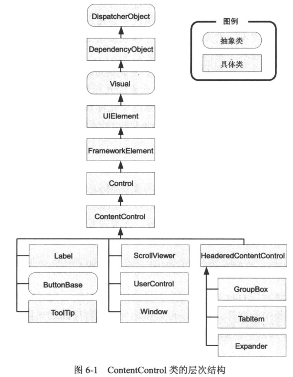
内容控件
所有内容控件都继承自抽象类 ContentControl
内容控件只能包含一个子元素。
属性:Content
Content 接受子元素对象
- 子元素可以是 UIElement 类的对象
- 也可以不是继承自 UIElement 类的对象
Windows 类虽然也是内容控件,但它必须是顶级窗口。
对齐
HorizontalAlignment 和 VerticalAlignment 控件控件本身的位置
HorizontalContentAlignment 和 VerticalContentAlignment 控件子元素的对齐
Leabel 支持记忆符
<Label Target="{Binding ElementName=txtA}" Content="跳转 _A"/>
<TextBox Name="txtA"/>
👆 当下按Alt + A 时,焦点会跳转到 txtA 控件,跳转符必须使用下划线
💡 ❓这个功能有啥用?
按钮类:
Button/CheckBox/RedioButton/ToggleButton/RepeatButton/GridViewColumnHeader 都继承自 ButtonBase类
ButtonBase 添加了 ClickMode 属性:表示在何时触发事件
- Release:引发的是 Click
- Press: 引发的是 按下事件
- Hover:引发的是光标进入事件
Button 添加了 IsCancel 属性,表示按下 Esc 键时触发事件;还添加了 IsDefault 属性,表示在当前窗体上按下回车时触发事件(当前焦点必须是一个非按钮上)
RepeatButton 按钮在鼠标按下时会一直触发事件
由 ToggleButton 派生出两个按钮:
- CheckBox
- RadioButton
<CheckBox IsChecked="{x:Null}" /> 表示没有选中
支持三种状态 IsChecked 👉 true/false/null
支持三种事件 Checked/UnChecked/Indeterminate
ToggleButton 的属性 IsThreeState 属性表示是否支持三种状态
RadioButton 可以使用 GroupName 进行分组,如果入在同一个容器下则表示同一组,比如放在 StackPanel 中或 GroupBox 中
ToolTip 控件
ToolTip 是内容控件,可以包含一个任意类型的内容对象。
<StackPanel Width="200"><Button Width="200"Height="40"Content="Hello"ToolTip="This is my tooltip" /><Button Height="40"><Button.ToolTip><StackPanel><TextBlock Text="Image and text" /><Image Width="100"Height="100"Source="../Images/happyface.jpg"Stretch="UniformToFill" /><TextBlock Margin="3" Text="Image and text" /></StackPanel></Button.ToolTip><Button.Content>I have a fancy tooltip</Button.Content></Button></StackPanel>
🔥📢 不要在工具提示中放置与用户进行交互的控件,因为 ToolTip 窗口不能接收焦点。
👆 此时应该考虑使用 Popup 控件。
ToolTip 属性
- HasDropShadow: 表示是否有阴影效果 ❓ 好像没有效果
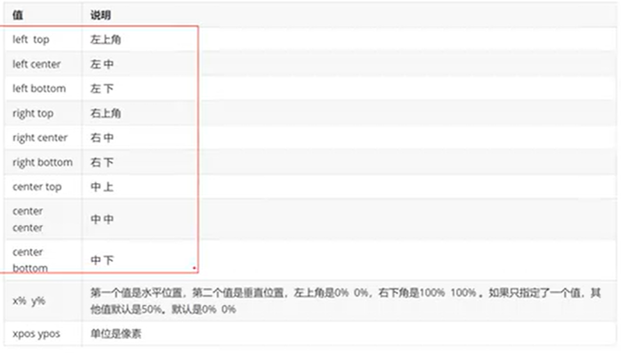
- Placement: 使用 PlacementMode 枚举值决定如何放置工具提示
- HorzintalOffset/VerticalOffest: 定位偏移量
- PlacementTarget: 提示框的相对目标是谁(Placement 值必须是 left/right/top/botton/center) ❓不生效
- PlacementRectangle: 使用一个范围定义偏移量
- CustomPopupPlacementCallback: 允许使用代码动态定位工具提示(Placement值发表在是Custom)
- StaysOpen: 该属性实际不生效
- IsEnable: 是否禁用
- IsOpen: 是否显示
ToolTipService 属性
当提示只有文本的时候,可以使用 ToolTipService 更简单的语法
包含两个路由事件:ToolTipOpening/ToolTipClosing
- InitialShowDelay: 初始的延时时间(毫秒)
- ShowDuration:鼠标不动时的显示时长,可以理解为是一个超时时间
- BetweenShowDelay:设置一个延时时间,在这个时间段内移动到另一个具有提示的目标上不会调用InitialShowDelay,即立刻显示提示
- ToolTip:提示内容
- HasDropShadow:是否显示阴影
- ShowOnDisabled:当目标被禁用时,是否可以显示提示
- Placement/PlacementTarget/PlacementRectangle/VerticalOffset:PlacementTarget 测试在这里是可以生效的
Popup 控件
属于内容控件,只能包含一个内容对象。
内容对象存储在 Popup.Child 属性中,而 ToolTip 控件的内容对象存储在 Tooltip.Content 属性中。💡 这两者都可以延伸出窗口的边界。
Popup 控件与 ToolTip 控件的大部分属性都是一样的。重点是理解它们的区别:
- Popup 不会自动显示,需要使用属性 IsOpen
- Popup.StaysOpen 属性默认是 true, 会一起显示,如果要关闭则需要将该属性设置为 false (但是这个关闭是在鼠标离开 Popup 的时候才会关闭,也可以理解为是单击其它地方的时候)
Popup 的其它属性:
- PopupAnimation: 指示以动画方式出现弹窗
- None
- Fade: 改变透明度弹出
- Scroll: 从窗口左上角滑入
- Slide: 从上向下滑入
- 💡 使用动画时,AllowsTransparency 属性必须是 true
- Popup 控件可接收焦点
- 如果要看子内容,必须设置 Popup 的背景色
特殊容器
💡 具有标题的内容控件,有 Header 属性和 Content 属性,Header 和 Content 属性一样,可以接受任意类型的对象
ScrollViewer
该控件继承自 ContentControl 类,提供了虚拟界面,允许用户围绕更大的元素滚动。
VertialScrollBarVisibility 属性说明:
- Auto: 自动,当内容过大时自动显示,否则隐藏
- Hide: 隐藏滚动条,但内容可被滚动
- Disable: 隐藏滚动条,并禁用滚动功能
- 水平滚动条属性同上
可被代码控制的滚动方式:
方法:
- LineUp
- LineDown
- PageDown
- PageUp
- LineLeft
- LineRight
- PageLeft
- PageRight
- ScrollToXxx
CanContentScroll 属性:当该属性值为true时,每次滚动的时候会定位到下一个子元素身上
GropBox
继承自:HeaderedContentControl 类
它显示为具有圆角和标题的方框
一般用来将 RadioButton 放为一组,但实际上它很少被使用
TabItem
  <TabControl Margin="5" TabStripPlacement="Left"><TabItem IsSelected="True"><!--Header--><TabItem.Header><StackPanel><TextBlock Margin="3">Image and Text Tab Title</TextBlock><Image Height="20" Source="../Images/happyface.jpg" /></StackPanel></TabItem.Header><!--Content--><!--<TabItem.Content></TabItem.Content>--><StackPanel Margin="3"><CheckBox Margin="3">Setting One</CheckBox><CheckBox Margin="3">Setting Two</CheckBox><CheckBox Margin="3">Setting Three</CheckBox></StackPanel></TabItem><TabItem Header="Tab Two" />
</TabControl>
TabStripPlacement: 指示选项上位的位置
IsSelected:指示选项卡是否是选中的
Expander
💡 一个用于折叠或展开子内容的控件
ExpandDirection="Left" 该属性可用于指定折叠的方向
文本控件
三个文本控件:
- TextBox
- RichTextBox
- PasswordBox
TextBox
属性:
- MaxLength: 字符的最大数量
- TextWrapping: 换行
- MinLines: 最小行数
- MaxLines: 最大行数
- LineCount: 获取文本中有多少行
- VerticalScrollBarVisibility/HorizontalScrollBarVisbility: 在支持换行的情况下显示或隐藏滚动条
- AcceptsRetrun: 支持按下回车键换行
- AcceptsTabs: 支持键入 Tab 符
- IsReadOnly: 只读
- IsEnabled: 禁用
方法:
当支持换行时:
- LineUp()
- LineDown()
- PageUp()
- PageDown()
- ScrollToHome()
- ScrollToEnd()
- ScrollToLine()
选择文本
属性
- SelectionStart: 指示从哪个索引开始选择
- SelectionLength: 选择的长度
- SelectedText: 被选中的文本
- AutoWordSelection: 当该属性值为 true 时,每次选中会选择整个单词
- CanUndo: 当此值为true时,允许用户撤销操作
方法:
- Undo() 该方法可与 control+z 一起使用,用于撤销用户的操作
- BeginChange() ❓
- EndChange() ❓
事件:
- SelectionChanged: 当选择的内容有变化时
支持拼写检查功能:
- SpellCheck.IsEnabled: 当该属性值为 true 时,可支持拼写检查
本功能需要添加 .lex 的扩展文件,只支持四种语言
略,有需要再查看其具体用法
PasswordBox
属性:
- PasswordChar: 用于屏蔽密码的字符,如圆点
- MaxLength: 密码的最大长度
方法:
- Clear()
- Paste()
- SelectAll()
事件:
- PasswordChanged: 当密码内容发生变化时
关于 System.Security.SecureString 对象
尽管可使用 Password 属性八为普通字符串读取和设置文本,但在内部 PasswordBox 类只使用 System.Security.SecureString 对象。
该对象是纯文本对象。区别是在内存中的存储方式。它以加密方式在内存中保存。用于加密字符串的密钥是随机生成的,存储在一块从来不会写入到磁盘的内存中。最终的结果是即使计算机崩溃,恶意用户也不可能通过检查页面文件来检索密码数据。即使找到,也只能找到加密版本。
列表控件
列表控件如ListBox/ComboBox/ListView/TreeView/ToolBar 都继承自 ItemsControl 对象。
常用的功能是数据源绑定:ItemsSource属性
还需要注意一个功能:继承自 Selector 类的选择器
ListBox
该列表控件允许用户从长度可变的列表中选择一项。
ListBox 的 Items 对象中存储的是 ListBoxItem 对象。
ListBoxItem 继承自 ContentControl 类,所以可以嵌套内容。也可以直接将 UIElement 对象入到 ListBox 中,比如可以直接放 StackPanel
💡 当在项有中其它元素时,该项被选中时,得到的 SelectedItem 是这个子元素
当子项直接使用 StackPanel 时,选中项 SelectedItem 将是 StackPanel;如果子项被放到 ListBoxItem 中时,选中项 SelectedItem 则是 ListBoxItem 对象。
属性:
- SelectionMode: 当值为 Multiple 或 Extended 时,允许选择多项,前者通过多次单击选择多项,后者需要使用 Ctrl 或 Shift 组合键进行多选
- SelectedItem: 选中项(单选情况下)
- SelectedItems: 选中的集合项(多选情况下)
- IsSelected: 是否被选中
事件:
- SelectionChanged
- SelectionChangedEventArgs: 事件参数,该参数中有 RemovedItems 属性,可得到被删除的项,还有 AddedItems 属性,即被加到项中的对象
- Selected
- Unselected
ContainerFromElement() 方法 ❓
ListBoxItem item = (ListBoxItem)lst.ContainerFromElement((DependencyObject)lst.SelectedItem);
ComboBox
属性:
- ComboBoxItem: 子项
- IsEditable: 当为 true 时,允许用户通过编辑文本选择一项(前提是:子项必须是文本类型)
- 其它子项的属性使用,也 ListBox 类似
基于范围的控件
- ScrollBar
- ProgressBar
- Slider
它们都继承自 RangeBase 类,该类又继承自 Control 类。
RangeBase 属性(范围控件都拥有的属性)
- Value:当前值
- Maximum:允许的最大值
- Minimum:允许的最小值
- SmallChange:Value 属性的最小变化值
- LargeChange:Value 属性的最大变化值
Slider
滑块。一般用来调整数字值。
属性:
- Orientation: 水平还是垂直
- Delay: 单击滑块移动时的延时时间
- Interval: 手动滑块时的延时时间
- TickPlacement: 刻度的位置
- TickFrequency: 刻度的间隔
- Ticks: 刻度(可自定义刻度集合)
- IsSnapToTickEnabled: 指示滑块移动的时候是否自动地贴合到刻度上
- IsSelectionRangeEnabled: 在可选择范围上显示高亮
- SelectionStart:可被滑动的起始值
- SelectionEnd: 可被滑动的终点值
ProgressBar
该控件不能与用户进行交互。
属性:
- Minimum
- Maximum
- Value
- IsIndeterminate: 不按值显示进度,而是重复显示一条脉冲样的外观,一般用来表示程序正在运行中
日期控件
- Calendar
- DataPicker
两者的共同属性:
- DisplayDateStart:显示的第一个日期
- DisplayDateEnd:显示的最后一个日期
- BlackoutDates:被禁用的日期范围
- SelectedDate:选中的日期
- SelectedDates:选中的日期范围集合
- DisplayDate:显示的当前日期
- FirstDayOfWeek:一周的第一天
- IsTodayHighlighted:当天日期是否高亮
Calendar 属性:
- DisplayMode:月历显示模式,比如是按年显示还是按月显示
- SelectionMode:日期的选择模式,一般是单选或者多选
DataPicker 属性:
- IsDropDownOpen:打开或隐藏下拉视图
- SelectedDateFormat:显示日期的格式
事件:
- SelectedDateChanged
- SelectedDatesChanged
- DisplayDateChanged
- CalenderOpended
- CalendarClosed
- DateValidationError ❓
private void cr_SelectedDatesChanged(object sender, SelectionChangedEventArgs e)
{foreach (DateTime selectedDate in e.AddedItems){if ((selectedDate.DayOfWeek == DayOfWeek.Saturday) || (selectedDate.DayOfWeek == DayOfWeek.Sunday)){((Calendar)sender).SelectedDates.Remove(selectedDate);}}
}