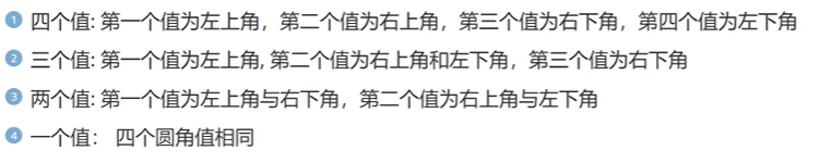
主要内容:
- 圆角
- 阴影
- 动画
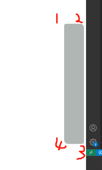
一、圆角(border-radius)
<head><meta charset="UTF-8"><meta name="viewport" content="width=device-width, initial-scale=1.0"><title>Document</title><style>div{width: 50px;height: 300px;background-color: rgb(176, 182, 180);position: fixed;right: 5px;top: 300px;border-radius: 5px 10px 5px 10px;}</style>
</head><body><div></div>
</body>
border-radius: 100%; 变成圆
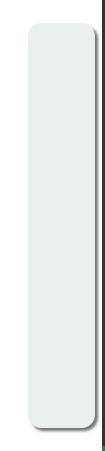
二、阴影(box-shadow)
- 向框添加一个或多个阴影。
-
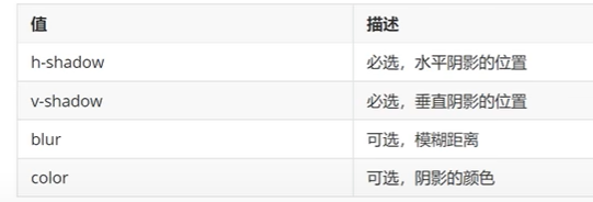
代码示例:
<head><meta charset="UTF-8"><meta name="viewport" content="width=device-width, initial-scale=1.0"><title>Document</title><style>div{width: 50px;height: 300px;background-color: rgb(235, 240, 238);position: fixed;right: 5px;top: 300px;border-radius: 10px;box-shadow:2px 2px 2px rgb(117, 116, 117);}</style>
</head><body><div></div>
</body>
三、动画
- 动画是使元素从一种样式逐渐变化为另一种样式的效果
- 您可以改变任意多的样式任意多的次数
- 请用百分比来规定变化发生的时间,或用关键词“from“和“to”,等同于0%和100%
- 0% 是动画的开始,100% 是动画的完成
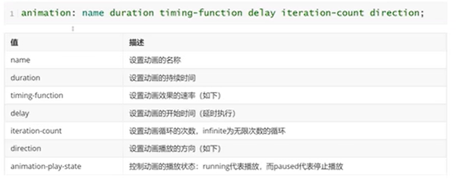
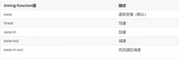
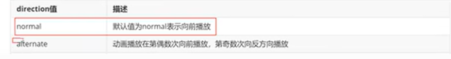
3.1动画执行
animation
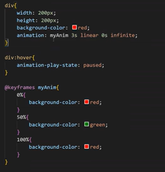
举例:呼吸效果等
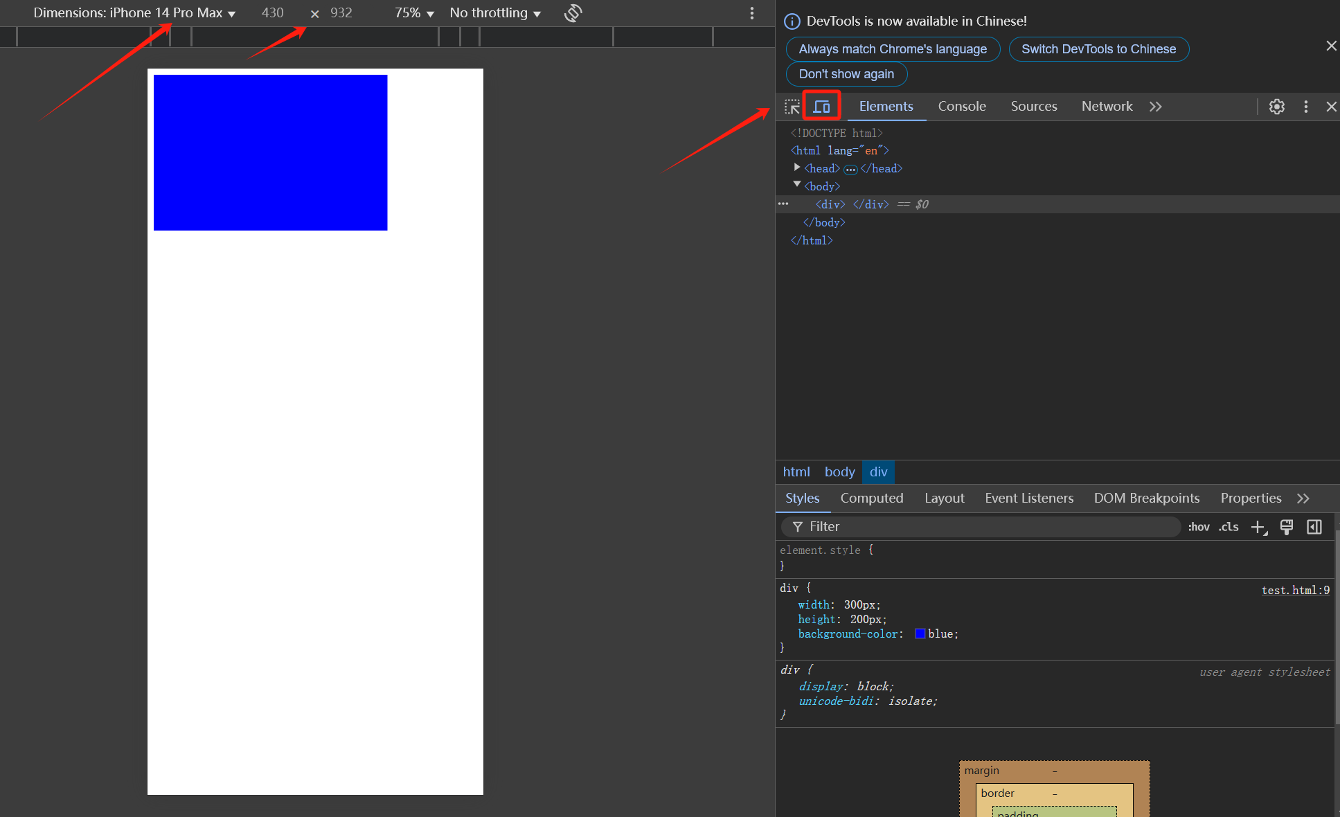
四、媒体查询(meta)
- 媒体查询能使页面在不同在终端设备下达到不同的效果。
- 媒体查询会根据设备的大小自动识别加载不同的样式。
4.1 设置meta标签
- 使用设备的宽度作为视图宽度并禁止初始的缩放。在<head>标签里加入这个meta标签。
- 暂时不用记meta的这几个属性,知道这段代码是在移动端显示的时候,仍然按原内容大小显示的效果。
<meta name="viewport" content="width=device-width, initial-scale=1.0, maximum-scale=1, user-scalable=no">
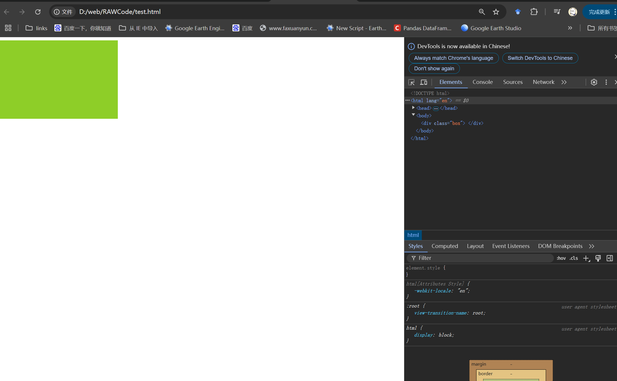
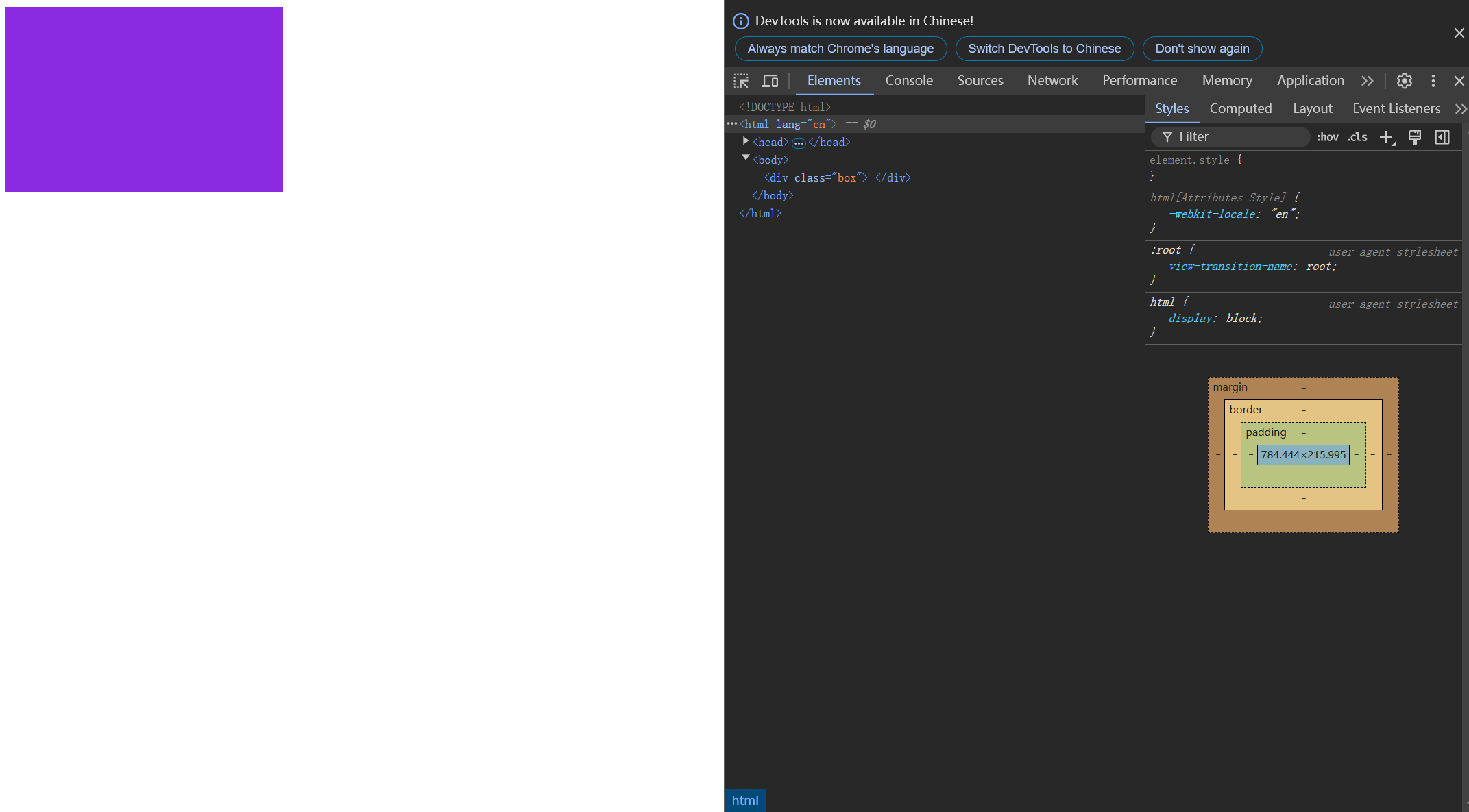
4.2媒体查询语法
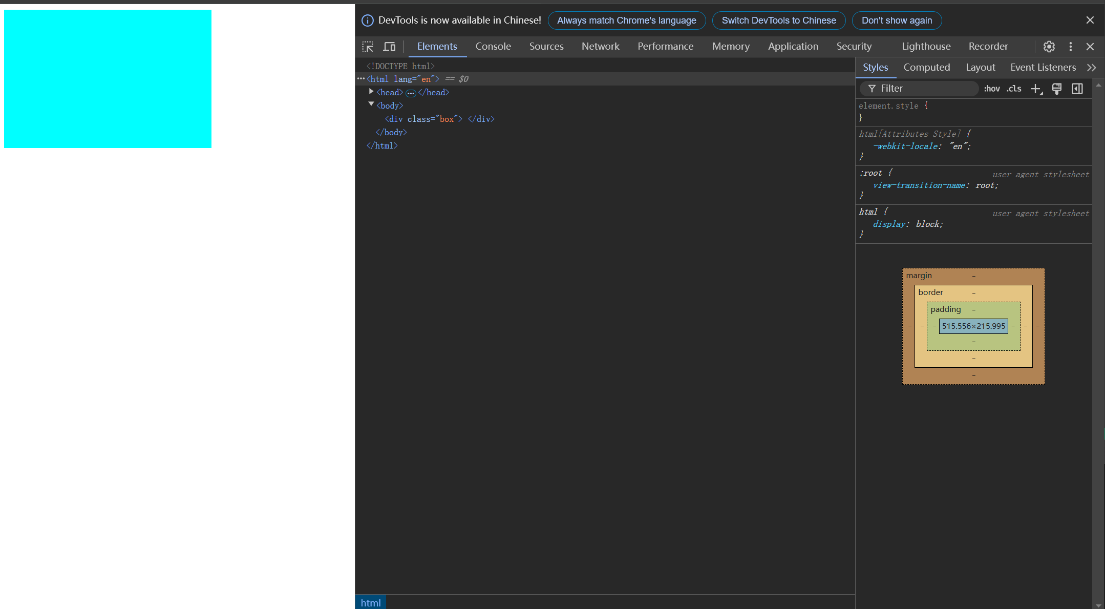
<!DOCTYPE html>
<html lang="en"><head><meta charset="UTF-8"><meta name="viewport" content="width=device-width, initial-scale=1.0, maximum-scale=1, user-scalable=no"><title>Document</title><style>.box{width: 300px;height: 200px;background-color: blue;}/* 768代表手机的最大像素宽度,苹果手机是双倍像素 */
        @media screen and (max-width:768px){.box{background-color: aqua;}}
        /* 平板宽度 */@media screen and (min-width:768px) and (max-width:996px){.box{background-color: blueviolet;}   }/* 电脑屏幕 */
        @media screen and (min-width:996px){.box{background-color: rgb(142, 206, 40);}   }</style>
</head><body><div class="box"></div>
</body></html>
电脑宽度:
平板宽度:
手机宽度:
举例:京东的


![[2025.2.27 JavaWeb学习]异常处理](https://img2024.cnblogs.com/blog/3574171/202502/3574171-20250228025524906-842347346.png)