媒体查询
示例
<!DOCTYPE html>
<html lang="en">
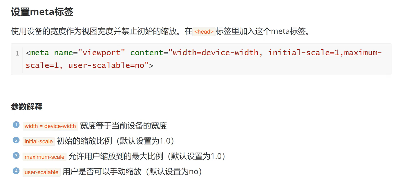
<head><meta charset="UTF-8"><meta http-equiv="X-UA-Compatible" content="IE=edge"><meta name="viewport" content="width=device-width, initial-scale=1.0"><title>Title</title>
</head>
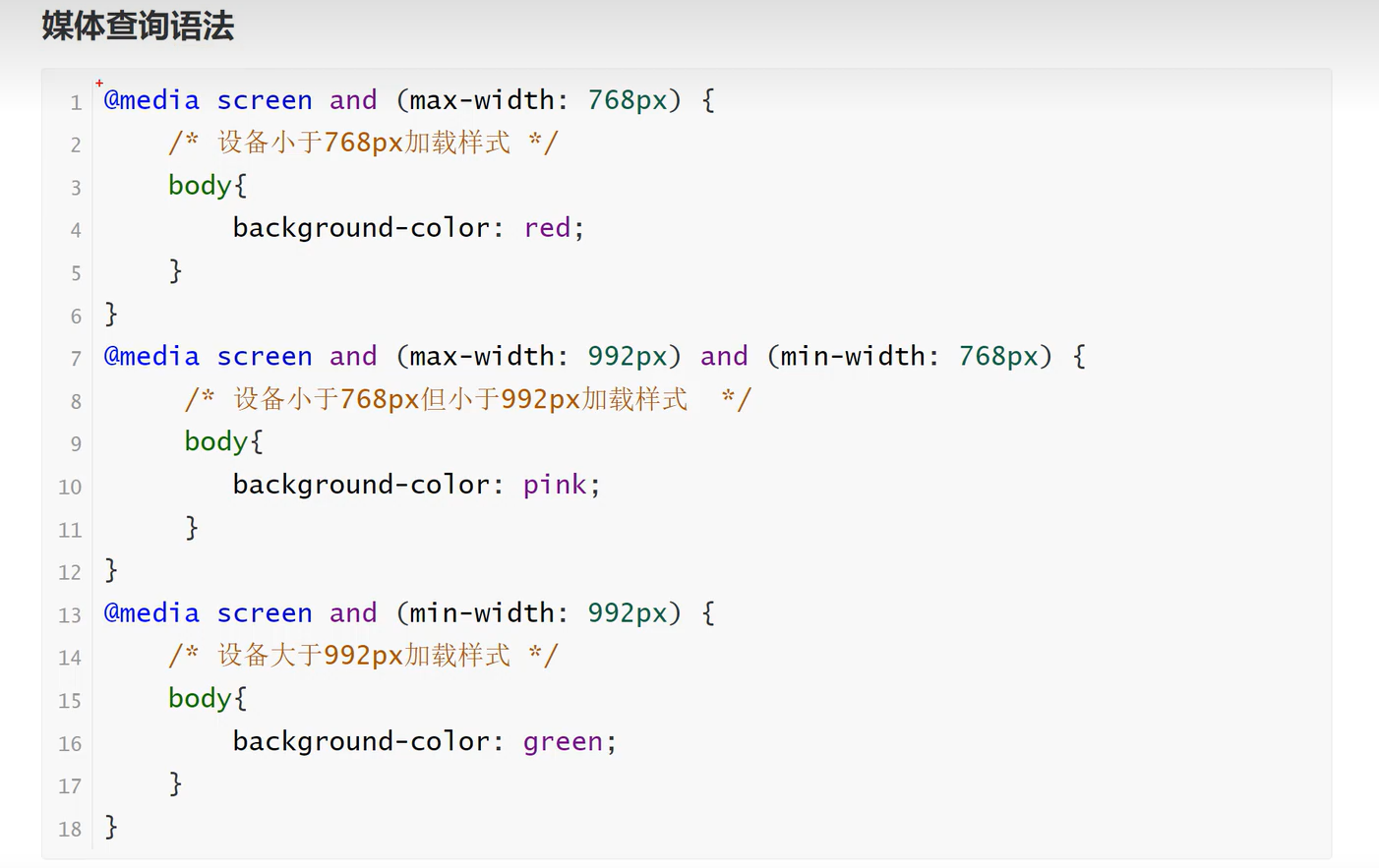
<style>.box{width: 100px;height: 100px;background-color: cyan;}@media screen and (max-width: 768px) {/*低于768px我们可以通过类名来达到更改的效果*/.box{background-color: red;}}@media screen and (max-width: 992px) and (min-width:768px) {/*768与992之间*/.box{background-color: green;}}@media screen and (min-width: 992px) {/*大于992*/.box{background-color: pink;}}
</style>
<body>
<div class="box"></div>
</body>
</html>
会根据屏幕的大小来进行数据的改变