容器组件指的是它可以包含一个或多个子组件的组件,除了前边介绍过的公共属性外。
一、线性布局容器(Row、Column)
线性容器类表示按照水平方向或者竖直方向排列子组件的容器,ArkUI开发框架通过 Row 和 Colum 来实现线性布局。
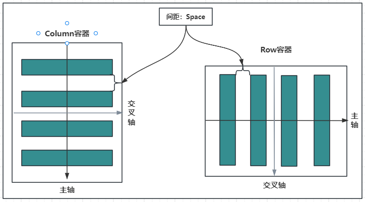
1.1.主轴和纵轴概念
什么是主轴和纵轴?
对于线性容器来说,有主轴和纵轴之分:
- 如果布局是沿水平方向,那么主轴就指水平方向,而纵轴就是垂直方向;
- 如果布局是沿垂直方向,那么主轴就是指垂直方向,而纵轴就是水平方向。
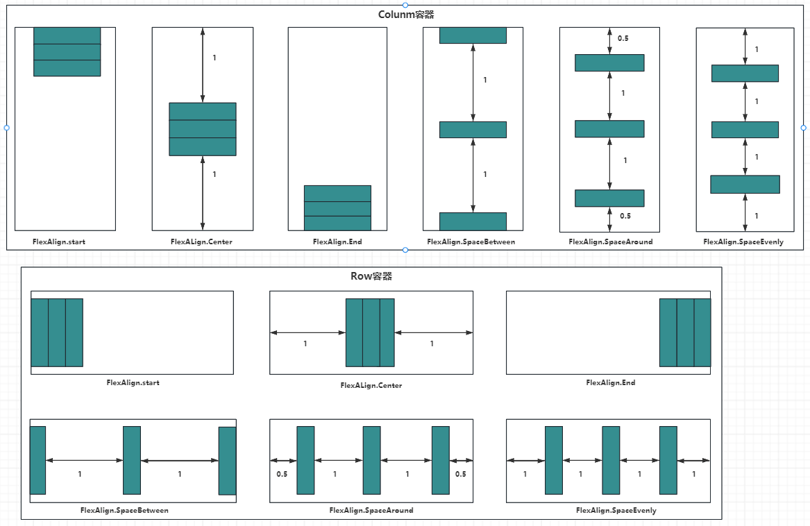
如下图所示:
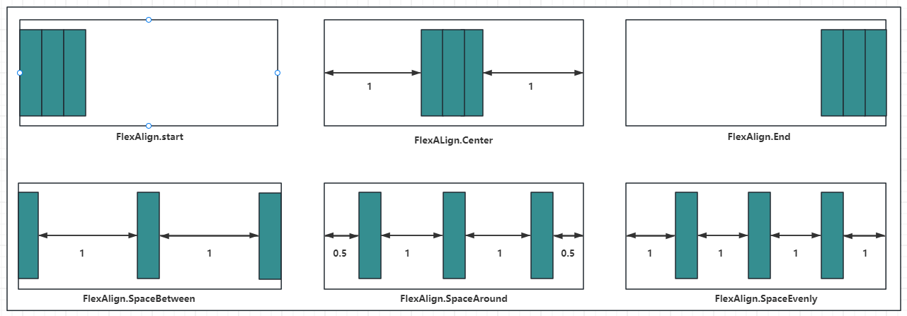
容器属性说明:
| 属性方法名 | 说明 | 参数 |
|---|---|---|
| justifyContent | 设置子元素在主轴方向的对齐格式 | FlexAlign枚举 |
| alignItems | 设置子元素在交叉轴方向的对齐格式 | Row容器使用VerticalAlign枚举Column容器使用HorizontalAlign 枚举 |
1.2.Column
Column 按照垂直方向布局子组件,主轴为垂直方向,纵轴为水平方向。
1.2.1.Column定义
沿垂直方向布局的容器。接口如下:
Column(value?: {space?: string | number})
value:可选参数, space 表示设置 Column 的子组件在垂直方向上的间距,参数:
| 参数名 | 参数类型 | 必填 | 参数描述 |
|---|---|---|---|
| space | string | number | 否 | 纵向布局元素垂直方向间距。从API version 9开始,space为负数或者justifyContent设置为FlexAlign.SpaceBetween、FlexAlign.SpaceAround、FlexAlign.SpaceEvenly时不生效。默认值:0说明:可选值为大于等于0的数字,或者可以转换为数字的字符串。 |
1.2.2.Column属性介绍
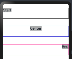
alignItems:设置子组件在水平方向上的布局方式, HorizontalAlign 定义了以下三种对其方式:
- Start:设置子组件在水平方向上按照语言方向起始端对齐。
- Center(默认值):设置子组件在水平方向上居中对齐。
- End:设置子组件在水平方向上按照语言方向末端对齐。
案例如下:
@Entry
@Component
struct ColumnExample {build() {//只能有一个根容器Column(){Column(){Text("Start").fontSize(20).backgroundColor("#A9A9A9")}.alignItems(HorizontalAlign.Start) //子容器:设置子组件在水平方向上按照语言方向起始端对齐。.size({width:"100%",height:60})    //容器的宽和高.borderWidth(2)                    //框线的宽度.borderColor("#000000")            //框线的颜色.margin({top:20, bottom:20})       //外上、下边距Column(){Text("Center").fontSize(20).backgroundColor("#A9A9A9")}.alignItems(HorizontalAlign.Center)//子容器:设置子组件在水平方向上居左对齐。.size({width:"100%",height:60})    //容器的宽和高.borderWidth(2)                    //框线的宽度.borderColor("#0000CD")            //框线的颜色.margin({top:20, bottom:20})       //外上、下边距Column(){Text("End").fontSize(20).backgroundColor("#A9A9A9")}.alignItems(HorizontalAlign.End)  //子容器:设置子组件在水平方向上按照语言方向末端对齐。.size({width:"100%",height:60})   //容器的宽和高.borderWidth(2)                   //框线的宽度.borderColor("#FF1493")           //框线的颜色.margin({top:20, bottom:20})      //外上、下边距}}
}
预览效果如下:
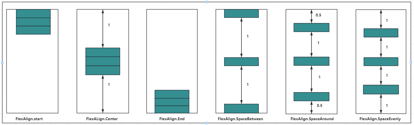
justifyContent:设置子组件在垂直方向上的对齐方式, FlexAlign枚举 定义了一下几种类型:
- Start:元素在主轴方向首端对齐, 第一个元素与行首对齐,同时后续的元素与前一个对齐。
- Center:元素在主轴方向中心对齐,第一个元素与行首的距离与最后一个元素与行尾距离相同。
- End:元素在主轴方向尾部对齐, 最后一个元素与行尾对齐,其他元素与后一个对齐。
- SpaceBetween:主轴方向均匀分配弹性元素,相邻元素之间距离相同。 第一个元素与行首对齐,最后一个元素与行尾对齐。
- SpaceAround:主轴方向均匀分配弹性元素,相邻元素之间距离相同。 第一个元素到行首的距离和最后一个元素到行尾的距离时相邻元素之间距离的一半。
- SpaceEvenly:主轴方向元素等间距布局, 相邻元素之间的间距、第一个元素与行首的间距、最后一个元素到行尾的间距都完全一样。
如下图所示:
案例代码如下:
@Entry
@Component
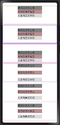
struct ColumnExample {build() {Column({space:5}){ // 设置子元素垂直方向间距为5Column(){Text("黄河之水天上来").size({width:160, height:25}).backgroundColor("#808080")Text("奔流到海不复回").size({width:160, height:25}).backgroundColor("#BC8F8F")Text("人生得意须尽欢").size({width:160, height:25}).backgroundColor("#DCDCDC")}.alignItems(HorizontalAlign.Center) //设置水平方向子容器居中.justifyContent(FlexAlign.Start) //元素在主轴方向首端对齐, 第一个元素与行首对齐,同时后续的元素与前一个对齐.size({width:"100%", height:120}) //容器大小.borderWidth(2).borderColor("#D2B48C")Column(){Text("黄河之水天上来").size({width:160, height:25}).backgroundColor("#808080")Text("奔流到海不复回").size({width:160, height:25}).backgroundColor("#BC8F8F")Text("人生得意须尽欢").size({width:160, height:25}).backgroundColor("#DCDCDC")}.alignItems(HorizontalAlign.Center) //设置水平方向子容器居中.justifyContent(FlexAlign.Center) //元素在主轴方向中心对齐,第一个元素与行首的距离与最后一个元素与行尾距离相同。.size({width:"100%", height:120}) //容器大小.borderWidth(2).borderColor("#8A2BE2")Column(){Text("黄河之水天上来").size({width:160, height:25}).backgroundColor("#808080")Text("奔流到海不复回").size({width:160, height:25}).backgroundColor("#BC8F8F")Text("人生得意须尽欢").size({width:160, height:25}).backgroundColor("#DCDCDC")}.alignItems(HorizontalAlign.Center) //设置水平方向子容器居中.justifyContent(FlexAlign.End) //元素在主轴方向尾部对齐, 最后一个元素与行尾对齐,其他元素与后一个对齐。.size({width:"100%", height:120}) //容器大小.borderWidth(2).borderColor("#FF69B4")Column(){Text("黄河之水天上来").size({width:160, height:25}).backgroundColor("#808080")Text("奔流到海不复回").size({width:160, height:25}).backgroundColor("#BC8F8F")Text("人生得意须尽欢").size({width:160, height:25}).backgroundColor("#DCDCDC")}.alignItems(HorizontalAlign.Center) //设置水平方向子容器居中.justifyContent(FlexAlign.SpaceBetween) //元素在主轴方向均匀分配弹性元素,相邻元素之间距离相同。 第一个元素与行首对齐,最后一个元素与行尾对齐。Q.size({width:"100%", height:120}) //容器大小.borderWidth(2).borderColor("#DDA0DD")Column(){Text("黄河之水天上来").size({width:160, height:25}).backgroundColor("#808080")Text("奔流到海不复回").size({width:160, height:25}).backgroundColor("#BC8F8F")Text("人生得意须尽欢").size({width:160, height:25}).backgroundColor("#DCDCDC")}.alignItems(HorizontalAlign.Center) //设置水平方向子容器居中.justifyContent(FlexAlign.SpaceAround) //元素在主轴方向均匀分配弹性元素,相邻元素之间距离相同。 第一个元素到行首的距离和最后一个元素到行尾的距离时相邻元素之间距离的一半。.size({width:"100%", height:120}) //容器大小.borderWidth(2).borderColor("#E6E6FA")Column(){Text("黄河之水天上来").size({width:160, height:25}).backgroundColor("#808080")Text("奔流到海不复回").size({width:160, height:25}).backgroundColor("#BC8F8F")Text("人生得意须尽欢").size({width:160, height:25}).backgroundColor("#DCDCDC")}.alignItems(HorizontalAlign.Center) //设置水平方向子容器居中.justifyContent(FlexAlign.SpaceEvenly) //元素在主轴方向元素等间距布局, 相邻元素之间的间距、第一个元素与行首的间距、最后一个元素到行尾的间距都完全一样。.size({width:"100%", height:120}) //容器大小.borderWidth(2).borderColor("#FFB6C1")}.width("100%").margin({top:20})}
}
预览效果如下:
1.3.Row
Row 按照水平方向布局子组件,主轴为水平方向,纵轴为竖直方向。
1.3.1.Row定义介绍
沿水平方向布局容器。接口如下:
Row(value?:{space?: number | string })
value:可选参数, space 表示设置 Row 的子组件在水平方向上的间距,案例如下:
@Entry
@Component
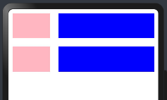
struct RowExample01 {build() {Column({space:20}){Row(){Text().width(90).height("100%").backgroundColor("#FFB6C1")Text().width(20).height("100%") //模拟元素直接间隔/*** 父容器尺寸确定时,设置了layoutWeight属性的子元素与兄弟元素占主轴尺寸按照权重进行分配,忽略元素本身尺寸设置,表示自适应占满剩余空间。默认值:0说明:仅在Row/Column/Flex布局中生效。可选值为大于等于0的数字,或者可以转换为数字的字符串。*/Text().width(20).height("100%").layoutWeight(1).backgroundColor(Color.Blue)}.width("100%").height(60)Row({space:20}){ //Row容器的间隔Text().width(90).height("100%").backgroundColor("#FFB6C1")/*** 父容器尺寸确定时,设置了layoutWeight属性的子元素与兄弟元素占主轴尺寸按照权重进行分配,忽略元素本身尺寸设置,表示自适应占满剩余空间。默认值:0说明:仅在Row/Column/Flex布局中生效。可选值为大于等于0的数字,或者可以转换为数字的字符串。*/Text().width(20).height("100%").layoutWeight(1).backgroundColor(Color.Blue)}.width("100%").height(60)}.width("100%").padding(10)}
}
注意:
layoutWeight:父容器尺寸确定时,设置了layoutWeight属性的子元素与兄弟元素占主轴尺寸按照权重进行分配,忽略元素本身尺寸设置,表示自适应占满剩余空间。默认值:0说明:
- 仅在Row/Column/Flex布局中生效。
- 可选值为大于等于0的数字,或者可以转换为数字的字符串。
预览效果如下:
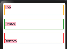
1.3.2.Row属性介绍
alignItems:参数类型为 VerticalAlign ,表示子组件在垂直方向上的布局方式, VerticalAlign 定义了以下三种对其方式:
- Top:设置子组件在竖直方向上居顶部对齐。
- Center(默认值):设置子组件在竖直方向上居中对其。
- Bottom:设置子组件在竖直方向上居底部对齐。
案例代码如下:
@Entry
@Component
struct RowExample01 {build() {Column({space:20}){Row(){//这里为了看到消息,不要设置子元素的宽和高Text("Top").fontSize(20).backgroundColor("#FFB6C1")}.width("100%").height(60).alignItems(VerticalAlign.Top)  //设置子组件在垂直方法顶部对象.borderWidth(2)                 //设置框线宽度.borderColor(Color.Orange)      //框线颜色Row({space:20}){ //Row容器的间隔Text("Center").fontSize(20).backgroundColor("#FFB6C1")}.width("100%").height(60).alignItems(VerticalAlign.Center)  //设置子组件在垂直方法居中对齐.borderWidth(2)                 //设置框线宽度.borderColor(Color.Green)       //框线颜色Row({space:20}){ //Row容器的间隔Text("Bottom").fontSize(20).backgroundColor("#FFB6C1")}.width("100%").height(60).alignItems(VerticalAlign.Bottom)  //设置子组件在垂直方法居中对齐.borderWidth(2)                    //设置框线宽度.borderColor(Color.Red)            //框线颜色}.width("100%").padding(10)}
}
预览效果如下:
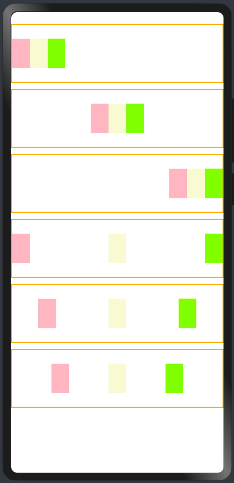
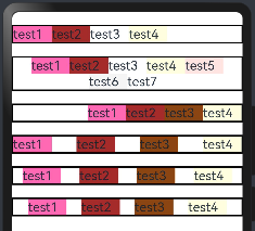
justifyContent:设置子组件在水平方向上的对齐方式, FlexAlign 定义了一下几种类型:
- Start:元素在主轴方向首端对齐, 第一个元素与行首对齐,同时后续的元素与前一个对齐。
- Center:元素在主轴方向中心对齐,第一个元素与行首的距离与最后一个元素与行尾距离相同。
- End:元素在主轴方向尾部对齐, 最后一个元素与行尾对齐,其他元素与后一个对齐。
- SpaceBetween:主轴方向均匀分配弹性元素,相邻元素之间距离相同。 第一个元素与行首对齐,最后一个元素与行尾对齐。
- SpaceAround:主轴方向均匀分配弹性元素,相邻元素之间距离相同。 第一个元素到行首的距离和最后一个元素到行尾的距离时相邻元素之间距离的一半。
- SpaceEvenly:主轴方向元素等间距布局, 相邻元素之间的间距、第一个元素与行首的间距、最后一个元素到行尾的间距都完全一样。
示意图如下:
案例代码如下:
@Entry
@Component
struct RowExample03 {build() {Column({space:10}){Row(){Text().size({width:30,height:50}).backgroundColor("#FFB6C1")Text().size({width:30,height:50}).backgroundColor("#FAFAD2")Text().size({width:30,height:50}).backgroundColor("#7FFF00")}.justifyContent(FlexAlign.Start) //元素在主轴方向首端对齐, 第一个元素与行首对齐,同时后续的元素与前一个对齐。.size({width:"100%", height:100}).borderWidth(2).borderColor(Color.Orange)Row(){Text().size({width:30,height:50}).backgroundColor("#FFB6C1")Text().size({width:30,height:50}).backgroundColor("#FAFAD2")Text().size({width:30,height:50}).backgroundColor("#7FFF00")}.justifyContent(FlexAlign.Center) //元素在主轴方向中心对齐,第一个元素与行首的距离与最后一个元素与行尾距离相同。.size({width:"100%", height:100}).borderWidth(2).borderColor(Color.Orange)Row(){Text().size({width:30,height:50}).backgroundColor("#FFB6C1")Text().size({width:30,height:50}).backgroundColor("#FAFAD2")Text().size({width:30,height:50}).backgroundColor("#7FFF00")}.justifyContent(FlexAlign.End) //元素在主轴方向尾部对齐, 最后一个元素与行尾对齐,其他元素与后一个对齐。.size({width:"100%", height:100}).borderWidth(2).borderColor(Color.Orange)Row(){Text().size({width:30,height:50}).backgroundColor("#FFB6C1")Text().size({width:30,height:50}).backgroundColor("#FAFAD2")Text().size({width:30,height:50}).backgroundColor("#7FFF00")}.justifyContent(FlexAlign.SpaceBetween) //主轴方向均匀分配弹性元素,相邻元素之间距离相同。 第一个元素与行首对齐,最后一个元素与行尾对齐.size({width:"100%", height:100}).borderWidth(2).borderColor(Color.Orange)Row(){Text().size({width:30,height:50}).backgroundColor("#FFB6C1")Text().size({width:30,height:50}).backgroundColor("#FAFAD2")Text().size({width:30,height:50}).backgroundColor("#7FFF00")}.justifyContent(FlexAlign.SpaceAround) //主轴方向均匀分配弹性元素,相邻元素之间距离相同。 第一个元素到行首的距离和最后一个元素到行尾的距离时相邻元素之间距离的一半。.size({width:"100%", height:100}).borderWidth(2).borderColor(Color.Orange)Row(){Text().size({width:30,height:50}).backgroundColor("#FFB6C1")Text().size({width:30,height:50}).backgroundColor("#FAFAD2")Text().size({width:30,height:50}).backgroundColor("#7FFF00")}.justifyContent(FlexAlign.SpaceEvenly) //主轴方向元素等间距布局, 相邻元素之间的间距、第一个元素与行首的间距、最后一个元素到行尾的间距都完全一样。.size({width:"100%", height:100}).borderWidth(2).borderColor(Color.Orange)}.width("100%").padding({top:20})}
}
如果 Row 设置了 space 参数,则 justifyContent 参数不起作用。预览效果如下:
1.4.Blank
Blank 表示空白填充组件,它用在 Row 和 Column 组件内来填充组件在主轴方向上的剩余尺寸的能力。
1.4.1.Blank定义
空白填充组件,在容器主轴方向上,空白填充组件具有自动填充容器空余部分的能力。仅当父组件为Row/Column/Flex时生效。接口如下:
Blank(min?: number | string)
参数:
| 参数名 | 参数类型 | 必填 | 参数描述 |
|---|---|---|---|
| min | number | string | 否 | 空白填充组件在容器主轴上的最小大小。默认值:0说明:不支持设置百分比。负值使用默认值。当最小值大于容器可用空间时,使用最小值作为自身大小并超出容器。 |
1.4.2.Blank属性
除支持通用属性外,还支持以下属性:
| 名称 | 参数类型 | 描述 |
|---|---|---|
| color | ResourceColor | 设置空白填充的填充颜色。默认值:Color.Transparent从API version 9开始,该接口支持在ArkTS卡片中使用。 |
1.4.3.案例
案例代码如下:
@Entry
@Component
struct BlackExample {build() {Column({space:20}){// blank父组件不设置宽度时,Blank失效,可以通过设置min最小宽度填充固定宽度Row(){Text("Bluetooth").fontSize(20) //文本Blank().color(Color.Green) //不设置空白颜色Toggle({type:ToggleType.Switch}) //按钮开关}.backgroundColor(Color.Pink).borderRadius(8).size({height:80}).justifyContent(FlexAlign.SpaceBetween) //设置.padding(10)Row(){Text("Bluetooth").fontSize(20) //靠左显示// 设置最小宽度为160Blank(160).color(Color.Orange) //设置空白颜色Toggle({type:ToggleType.Switch}) //按钮开关}.backgroundColor(Color.Pink).borderRadius(8).size({width:"100%", height:80}).justifyContent(FlexAlign.SpaceBetween) //设置.padding(10)}.padding(20).size({width: "100%", height: "100%"})}
}
预览效果如下:
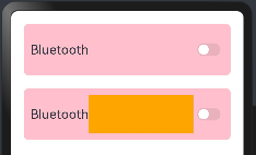
Blank 的特点:
- Black只在
Row和Column容器中生效。 - 除了
color外不支持通用属性。 - 只在
Row和Column有剩余空间才生效。 - 适合用在多设备适配场景中。
1.5.完整案例演示
学习上面的内容需要知道:纵向布局使用Column容器,横向布局采用Row容器,通过justifyContent和alignItems分别用来设置主轴和交叉轴的对齐方式:
| 属性方法名 | 说明 | 参数 |
|---|---|---|
| justifyContent | 设置子元素在主轴方向的对齐格式 | FlexAlign枚举 |
| alignItems | 设置子元素在交叉轴方向的对齐格式 | Row容器使用VerticalAlign枚举Column容器使用HorizontalAlign 枚举 |
1.5.1.需求如下
实现商品列表的展示,如下:
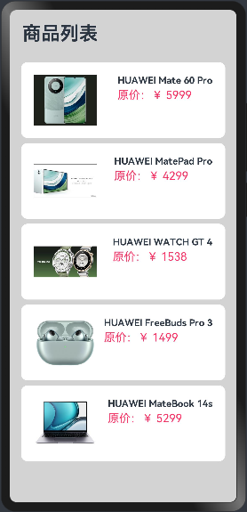
分析页面元素构成:
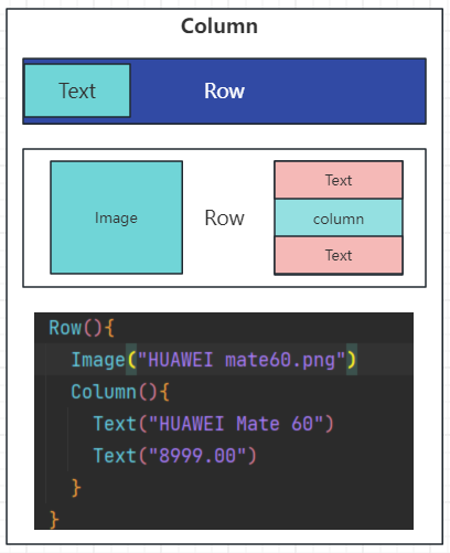
1.5.2.实现思路
这里的商品列表是,不能通过一个一个的Row容器实现,需要通过ForEach实现,很多时间是不确定有多少个商品的,如下:
代码如下:
@Entry
@Component
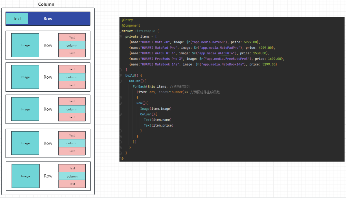
struct ListExample {private items = [{name:"HUAWEI Mate 60", image: $r("app.media.mate60"), price: 5999.00},{name:"HUAWEI MatePad Pro", image: $r("app.media.MatePadPro"), price: 4299.00},{name:"HUAWEI WATCH GT 4", image: $r("app.media.WATCHGT4"), price: 1538.00},{name:"HUAWEI FreeBuds Pro 3", image: $r("app.media.FreeBudsPro3"), price: 1499.00},{name:"HUAWEI MateBook 14s", image: $r("app.media.MateBook14s"), price: 5299.00}]build() {Column(){ForEach(this.items, //遍历的数组(item: any, index?:number)=> //页面组件生成函数{Row(){Image(item.image)Column(){Text(item.name)Text(item.price)}}})}}
}
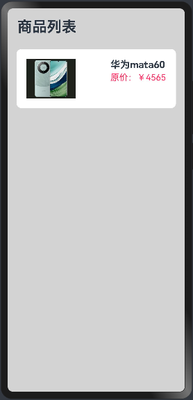
1.5.3.实现单个商品展示
不要一蹴而就,先编写单个商品的展示,调整好样式,在考虑后续的,代码如下:
@Entry
@Component
struct ListExample {build() {Column({space:8}){Row(){Text("商品列表").fontSize(30).fontWeight(FontWeight.Bold)}.width("100%").padding(20)Row({space:10}){Image($r('app.media.mate60')).width(100)Column({space:4}){Text("华为mata60").fontSize(20).fontWeight(FontWeight.Bold)Text("原价:¥4565").fontColor("#F36").fontSize(18)}.height("100%").alignItems(HorizontalAlign.Start) //设置子组件在水平方向上按照语言方向起始端对齐。}.width("90%")  //设置宽度.height(120)    //设置高度.justifyContent(FlexAlign.SpaceBetween) //设置主轴方向主轴方向均匀分配弹性元素,相邻元素之间距离相同。 第一个元素与行首对齐,最后一个元素与行尾对齐。.backgroundColor("#FFFFFF") //设置背景为白色.borderRadius(10) //这是圆角班级.padding(20) //内边距}.width("100%").height("100%").backgroundColor("#D3D3D3")}
}
预览效果如下:
1.5.4.实现商品列表,展示商品
由于后期商品很多数量不确定,不可能写多个Row标签,所以这里使用ForEach循环渲染出来商品列表信息:
class Item{//定位属性name: stringimage: anyprice: numberconstructor(name: string, image: any, price: number) {this.name = namethis.image = imagethis.price = price}
}@Entry
@Component
struct ListExample {private items:Array<Item> = [new Item("HUAWEI Mate 60 Pro",$r("app.media.mate60"),  5999.00),new Item("HUAWEI MatePad Pro",$r("app.media.MatePadPro"),4299.00),new Item("HUAWEI WATCH GT 4", $r("app.media.WATCHGT4"), 1538.00),new Item("HUAWEI FreeBuds Pro 3", $r("app.media.FreeBudsPro3"), 1499.00),new Item("HUAWEI MateBook 14s", $r("app.media.MateBook14s"), 5299.00)]build() {Column({space:8}){Row(){Text("商品列表").fontSize(30).fontWeight(FontWeight.Bold)}.width("100%").padding(20)ForEach(this.items,(item: Item, index?:number)=>{Row({space:10}){Image(item.image).width(100)Column({space:4}){Text(item.name).fontSize(15).fontWeight(FontWeight.Bold)Text(`原价:¥ ${item.price}`).fontColor("#F36").fontSize(18)}.height("100%").alignItems(HorizontalAlign.Start)}.width("90%")  //设置宽度.height(120)    //设置高度.justifyContent(FlexAlign.SpaceBetween) //设置主轴方向主轴方向均匀分配弹性元素,相邻元素之间距离相同。 第一个元素与行首对齐,最后一个元素与行尾对齐。.backgroundColor("#FFFFFF") //设置背景为白色.borderRadius(10) //这是圆角班级.padding(20) //内边距})}.width("100%").height("100%").backgroundColor("#D3D3D3")}
}
预览效果如下:
上面的内容虽然可以展示商品,但是商品的数量过多,无法展示出来,这时候就要采用List容器来采用滚动的方式实现。
二、弹性布局容器(Flex)
ArkUI 开发框架为了方便开发者实现灵活的页面布局方式,提供了弹性布局 Flex ,它用来为盒装模型提供最大的灵活性。 Flex 和 Row 、 Column 组件一样,也有主轴和纵轴之分。
说明:
- Flex组件在渲染时存在二次布局过程,因此在对性能有严格要求的场景下建议使用Column、Row代替。
- Flex组件主轴默认不设置时撑满父容器,Column、Row组件主轴不设置时默认是跟随子节点大小。
2.1.Flex接口
Flex(value?: { direction?: FlexDirection, wrap?: FlexWrap, justifyContent?: FlexAlign, alignItems?: ItemAlign, alignContent?: FlexAlign })
2.2.参数
value是一个对象。
2.2.1.direction
direction:设置子组件的的排列方向即主轴方向, 类型FlexDirection 定义了以下4种排列方式:
| 名称 | 描述 |
|---|---|
| Row | 主轴与行方向一致作为布局模式。 |
| RowReverse | 与Row方向相反方向进行布局。 |
| Column | 主轴与列方向一致作为布局模式。 |
| ColumnReverse | 与Column相反方向进行布局。 |
示例图如下:
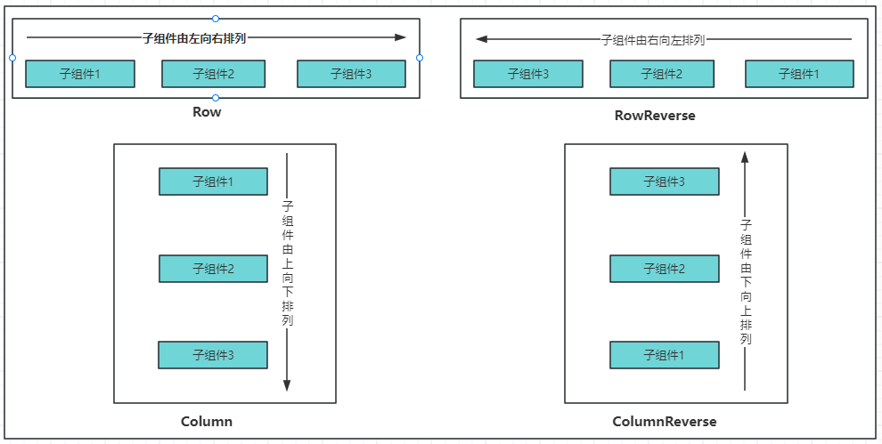
说明:
1)Row(默认值):子组件水平排列,即主轴为水平方向纵轴为竖直方向,子组件由左向右排列:
2)Column:子组件竖直排列,即主轴为垂直方向,起点在上边,子组件由上到下排列。
3)Column:子组件竖直排列,即主轴为垂直方向,起点在上边,子组件由上到下排列。
4)ColumnReverse:子组件竖直排列,即主轴为垂直方向,起点在下边,子组件由下到上排列。
案例代码如下:
@Entry
@Component
struct FlexExample {build() {Column({space:10}){//Row(默认值):子组件水平排列,即主轴为水平方向纵轴为竖直方向,子组件由左向右排列。Flex({direction: FlexDirection.Row}){Text("test1").fontSize(20).backgroundColor("#FF69B4").width(50).height(25)Text("test2").fontSize(20).backgroundColor("#A52A2A").width(50).height(25)Text("test3").fontSize(20).backgroundColor("#FFFFFF").width(50).height(25)Text("test4").fontSize(20).backgroundColor("#FFFFE0").width(50).height(25)}.width("100%").height(60).backgroundColor("#808080").padding({top:20,bottom:20})//RowReverse:子组件水平排列,即主轴为水平方向纵轴为竖直方向,子组件由右向左排列。Flex({direction: FlexDirection.RowReverse}){Text("test1").fontSize(20).backgroundColor("#FF69B4").width(50).height(25)Text("test2").fontSize(20).backgroundColor("#A52A2A").width(50).height(25)Text("test3").fontSize(20).backgroundColor("#FFFFFF").width(50).height(25)Text("test4").fontSize(20).backgroundColor("#FFFFE0").width(50).height(25)}.width("100%").height(60).backgroundColor("#808080").padding({top:20,bottom:20})//Column:子组件竖直排列,即主轴为垂直方向,起点在上边,子组件由上到下排列。Flex({direction: FlexDirection.Column}){Text("test1").fontSize(20).backgroundColor("#FF69B4").width(50).height(25)Text("test2").fontSize(20).backgroundColor("#A52A2A").width(50).height(25)Text("test3").fontSize(20).backgroundColor("#FFFFFF").width(50).height(25)Text("test4").fontSize(20).backgroundColor("#FFFFE0").width(50).height(25)}.width("100%").height(150).backgroundColor("#808080").padding({top:20,bottom:20})//ColumnReverse:子组件竖直排列,即主轴为垂直方向,起点在下边,子组件由下到上排列。Flex({direction: FlexDirection.ColumnReverse}){Text("test1").fontSize(20).backgroundColor("#FF69B4").width(50).height(25)Text("test2").fontSize(20).backgroundColor("#A52A2A").width(50).height(25)Text("test3").fontSize(20).backgroundColor("#FFFFFF").width(50).height(25)Text("test4").fontSize(20).backgroundColor("#FFFFE0").width(50).height(25)}.width("100%").height(150).backgroundColor("#808080").padding({top:20,bottom:20})}.width("100%").height("100%")}
}
预览效果如下:
2.2.2.wrap
wrap:设置子组件是单行/列还是多行/列排序, FlexWrap枚举提供了以下3种类型:
| 名称 | 描述 |
|---|---|
| NoWrap | Flex容器的元素单行/列布局,子项不允许超出容器。 |
| Wrap | Flex容器的元素多行/列排布,子项允许超出容器。 |
| WrapReverse | Flex容器的元素反向多行/列排布,子项允许超出容器。 |
案例代码如下:
@Entry
@Component
struct FlexExample02 {build() {Column({space:20}){//1.NoWrap(默认值):子组件单行/列排序,子组件不允许超出容器。会挤在一起Flex({direction:FlexDirection.Row, wrap: FlexWrap.NoWrap}){Text("test1").fontSize(20).backgroundColor("#FF69B4").width(60).height(25)Text("test2").fontSize(20).backgroundColor("#A52A2A").width(60).height(25)Text("test3").fontSize(20).backgroundColor("#FFFFFF").width(60).height(25)Text("test4").fontSize(20).backgroundColor("#FFFFE0").width(60).height(25)Text("test5").fontSize(20).backgroundColor("#FFE4E1").width(60).height(25)Text("test6").fontSize(20).backgroundColor("#F5F5F5").width(60).height(25)Text("test7").fontSize(20).backgroundColor("#FFFFFF").width(60).height(25)}.borderWidth(2)//2.Wrap:子组件多行/列排序,子组件允许超出容器。Flex({direction:FlexDirection.Row, wrap: FlexWrap.Wrap}){Text("test1").fontSize(20).backgroundColor("#FF69B4").width(60).height(25)Text("test2").fontSize(20).backgroundColor("#A52A2A").width(60).height(25)Text("test3").fontSize(20).backgroundColor("#FFFFFF").width(60).height(25)Text("test4").fontSize(20).backgroundColor("#FFFFE0").width(60).height(25)Text("test5").fontSize(20).backgroundColor("#FFE4E1").width(60).height(25)Text("test6").fontSize(20).backgroundColor("#F5F5F5").width(60).height(25)Text("test7").fontSize(20).backgroundColor("#FFFFFF").width(60).height(25)}.borderWidth(2)//3.WrapReverse:子组件反向多行/列排序,子组件允许超出容器。Flex({direction:FlexDirection.Row, wrap: FlexWrap.WrapReverse}){Text("test1").fontSize(20).backgroundColor("#FF69B4").width(60).height(25)Text("test2").fontSize(20).backgroundColor("#A52A2A").width(60).height(25)Text("test3").fontSize(20).backgroundColor("#FFFFFF").width(60).height(25)Text("test4").fontSize(20).backgroundColor("#FFFFE0").width(60).height(25)Text("test5").fontSize(20).backgroundColor("#FFE4E1").width(60).height(25)Text("test6").fontSize(20).backgroundColor("#F5F5F5").width(60).height(25)Text("test7").fontSize(20).backgroundColor("#FFFFFF").width(60).height(25)}.borderWidth(2)}.width("100%").height("100%").padding({top:20, bottom:20})}
}
预览效果如下:
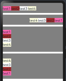
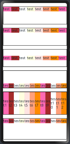
2.2.3.justifyContent
justifyContent:设置子组件在主轴上的对齐方式, FlexAlign 提供了以下 6 种对齐方式:
| 名称 | 描述 |
|---|---|
| Start | 元素在主轴方向首端对齐,第一个元素与行首对齐,同时后续的元素与前一个对齐。 |
| Center | 元素在主轴方向中心对齐,第一个元素与行首的距离与最后一个元素与行尾距离相同。 |
| End | 元素在主轴方向尾部对齐,最后一个元素与行尾对齐,其他元素与后一个对齐。 |
| SpaceBetween | Flex主轴方向均匀分配弹性元素,相邻元素之间距离相同。第一个元素与行首对齐,最后一个元素与行尾对齐。 |
| SpaceAround | Flex主轴方向均匀分配弹性元素,相邻元素之间距离相同。第一个元素到行首的距离和最后一个元素到行尾的距离是相邻元素之间距离的一半。 |
| SpaceEvenly | Flex主轴方向均匀分配弹性元素,相邻元素之间的距离、第一个元素与行首的间距、最后一个元素到行尾的间距都完全一样。 |
如下图所示:
案例代码如下:
@Entry
@Component
struct FlexExample02 {build() {Column({space:20}){//Start(默认值):元素在主轴方向首端对齐, 第一个元素与行首对齐,同时后续的元素与前一个对齐。Flex({direction:FlexDirection.Row, wrap: FlexWrap.Wrap, justifyContent:FlexAlign.Start}){Text("test1").fontSize(20).backgroundColor("#FF69B4").width(60).height(25)Text("test2").fontSize(20).backgroundColor("#A52A2A").width(60).height(25)Text("test3").fontSize(20).backgroundColor("#FFFFFF").width(60).height(25)Text("test4").fontSize(20).backgroundColor("#FFFFE0").width(60).height(25)}.borderWidth(2)//Center:元素在主轴方向中心对齐,第一个元素与行首的距离与最后一个元素与行尾距离相同。Flex({direction:FlexDirection.Row, wrap: FlexWrap.Wrap,justifyContent:FlexAlign.Center}){Text("test1").fontSize(20).backgroundColor("#FF69B4").width(60).height(25)Text("test2").fontSize(20).backgroundColor("#A52A2A").width(60).height(25)Text("test3").fontSize(20).backgroundColor("#FFFFFF").width(60).height(25)Text("test4").fontSize(20).backgroundColor("#FFFFE0").width(60).height(25)Text("test5").fontSize(20).backgroundColor("#FFE4E1").width(60).height(25)Text("test6").fontSize(20).backgroundColor("#F5F5F5").width(60).height(25)Text("test7").fontSize(20).backgroundColor("#FFFFFF").width(60).height(25)}.borderWidth(2)//End:元素在主轴方向尾部对齐, 最后一个元素与行尾对齐,其他元素与后一个对齐。Flex({direction:FlexDirection.Row, wrap: FlexWrap.Wrap,justifyContent:FlexAlign.End}){Text("test1").fontSize(20).backgroundColor("#FF69B4").width(60).height(25)Text("test2").fontSize(20).backgroundColor("#A52A2A").width(60).height(25)Text("test3").fontSize(20).backgroundColor("#8B4513").width(60).height(25)Text("test4").fontSize(20).backgroundColor("#FFFFE0").width(60).height(25)}.borderWidth(2)//SpaceBetween:Flex 主轴方向均匀分配弹性元素,相邻元素之间距离相同。 第一个元素与行首对齐,最后一个元素与行尾对齐。Flex({direction:FlexDirection.Row, wrap: FlexWrap.Wrap,justifyContent:FlexAlign.SpaceBetween}){Text("test1").fontSize(20).backgroundColor("#FF69B4").width(60).height(25)Text("test2").fontSize(20).backgroundColor("#A52A2A").width(60).height(25)Text("test3").fontSize(20).backgroundColor("#8B4513").width(60).height(25)Text("test4").fontSize(20).backgroundColor("#FFFFE0").width(60).height(25)}.borderWidth(2)//SpaceAround: Flex 主轴方向均匀分配弹性元素,相邻元素之间距离相同。 第一个元素到行首的距离和最后一个元素到行尾的距离时相邻元素之间距离的一半。Flex({direction:FlexDirection.Row, wrap: FlexWrap.Wrap,justifyContent:FlexAlign.SpaceAround}){Text("test1").fontSize(20).backgroundColor("#FF69B4").width(60).height(25)Text("test2").fontSize(20).backgroundColor("#A52A2A").width(60).height(25)Text("test3").fontSize(20).backgroundColor("#8B4513").width(60).height(25)Text("test4").fontSize(20).backgroundColor("#FFFFE0").width(60).height(25)}.borderWidth(2)//SpaceEvenly: Flex 主轴方向元素等间距布局, 相邻元素之间的间距、第一个元素与行首的间距、最后一个元素到行尾的间距都完全一样。Flex({direction:FlexDirection.Row, wrap: FlexWrap.Wrap,justifyContent:FlexAlign.SpaceEvenly}){Text("test1").fontSize(20).backgroundColor("#FF69B4").width(60).height(25)Text("test2").fontSize(20).backgroundColor("#A52A2A").width(60).height(25)Text("test3").fontSize(20).backgroundColor("#8B4513").width(60).height(25)Text("test4").fontSize(20).backgroundColor("#FFFFE0").width(60).height(25)}.borderWidth(2)}.width("100%").height("100%").padding({top:20, bottom:20})}
}
预览效果如下:
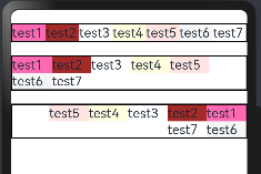
2.2.4.alignItems
所有子组件在Flex容器交叉轴上的对齐格式。默认值是ItemAlign.Start,ItemAlign枚举有6种对齐方式:
| 名称 | 描述 |
|---|---|
| Auto | 使用Flex容器中默认配置。 |
| Start | 元素在Flex容器中,交叉轴方向首部对齐。 |
| Center | 元素在Flex容器中,交叉轴方向居中对齐。 |
| End | 元素在Flex容器中,交叉轴方向底部对齐。 |
| Stretch | 元素在Flex容器中,交叉轴方向拉伸填充。容器为Flex且设置Wrap为FlexWrap.Wrap或FlexWrap.WrapReverse时,元素拉伸到与当前行/列交叉轴长度最长的元素尺寸。其余情况在元素未设置尺寸时,拉伸到容器尺寸。 |
| Baseline | 元素在Flex容器中,交叉轴方向文本基线对齐。 |
代码如下:为了看到效果,不要设置wrap(设置子组件是单行/列还是多行/列排序)
@Entry
@Component
struct FlexExample02 {build() {Column({space:20}){//ItemAlign.Auto使用Flex容器中默认配置。Flex({direction:FlexDirection.Row, alignItems:ItemAlign.Auto}){Text("test1").fontSize(20).backgroundColor("#FF69B4").width(60).height(25)Text("test2").fontSize(20).backgroundColor("#A52A2A").width(60).height(25)Text("test3").fontSize(20).backgroundColor("#FFFFFF").width(60).height(25)Text("test4").fontSize(20).backgroundColor("#FFFFE0").width(60).height(25)Text("test5").fontSize(20).backgroundColor("#FFE4E1").width(60).height(25)Text("test6").fontSize(20).backgroundColor("#FFA07A").width(60).height(25)Text("test7").fontSize(20).backgroundColor("#FF8C00").width(60).height(25)Text("test8").fontSize(20).backgroundColor("#FF69B4").width(60).height(25)}.borderWidth(2).width("100%").height(100)//ItemAlign.Start 元素在Flex容器中,交叉轴方向首部对齐。。Flex({direction:FlexDirection.Row, alignItems:ItemAlign.Start}){Text("test1").fontSize(20).backgroundColor("#FF69B4").width(60).height(25)Text("test2").fontSize(20).backgroundColor("#A52A2A").width(60).height(25)Text("test3").fontSize(20).backgroundColor("#FFFFFF").width(60).height(25)Text("test4").fontSize(20).backgroundColor("#FFFFE0").width(60).height(25)Text("test5").fontSize(20).backgroundColor("#FFE4E1").width(60).height(25)Text("test6").fontSize(20).backgroundColor("#FFA07A").width(60).height(25)Text("test7").fontSize(20).backgroundColor("#FF8C00").width(60).height(25)Text("test8").fontSize(20).backgroundColor("#FF69B4").width(60).height(25)}.borderWidth(2).width("100%").height(100)//ItemAlign.Center 元素在Flex容器中,交叉轴方向居中对齐Flex({direction:FlexDirection.Row,alignItems:ItemAlign.Center}){Text("test1").fontSize(20).backgroundColor("#FF69B4").width(60).height(25)Text("test2").fontSize(20).backgroundColor("#A52A2A").width(60).height(25)Text("test3").fontSize(20).backgroundColor("#FFFFFF").width(60).height(25)Text("test4").fontSize(20).backgroundColor("#FFFFE0").width(60).height(25)Text("test5").fontSize(20).backgroundColor("#FFE4E1").width(60).height(25)Text("test6").fontSize(20).backgroundColor("#FFA07A").width(60).height(25)Text("test7").fontSize(20).backgroundColor("#FF8C00").width(60).height(25)Text("test8").fontSize(20).backgroundColor("#FF69B4").width(60).height(25)}.borderWidth(2).width("100%").height(100)//ItemAlign.End:元素在Flex容器中,交叉轴方向底部对齐。Flex({direction:FlexDirection.Row, alignItems:ItemAlign.End}){Text("test1").fontSize(20).backgroundColor("#FF69B4").width(60).height(25)Text("test2").fontSize(20).backgroundColor("#A52A2A").width(60).height(25)Text("test3").fontSize(20).backgroundColor("#FFFFFF").width(60).height(25)Text("test4").fontSize(20).backgroundColor("#FFFFE0").width(60).height(25)Text("test5").fontSize(20).backgroundColor("#FFE4E1").width(60).height(25)Text("test6").fontSize(20).backgroundColor("#FFA07A").width(60).height(25)Text("test7").fontSize(20).backgroundColor("#FF8C00").width(60).height(25)Text("test8").fontSize(20).backgroundColor("#FF69B4").width(60).height(25)Text("test9").fontSize(20).backgroundColor("#A52A2A").width(60).height(25)Text("test10").fontSize(20).backgroundColor("#FFFFFF").width(60).height(25)Text("test11").fontSize(20).backgroundColor("#FFA07A").width(60).height(25)Text("test12").fontSize(20).backgroundColor("#FF8C00").width(60).height(25)}.borderWidth(2).width("100%").height(100)//ItemAlign.Stretch:元素在Flex容器中,交叉轴方向拉伸填充。//容器为Flex且设置Wrap为FlexWrap.Wrap或FlexWrap.WrapReverse时,//元素拉伸到与当前行/列交叉轴长度最长的元素尺寸。其余情况在元素未设置尺寸时,拉伸到容器尺寸。Flex({direction:FlexDirection.Row, alignItems:ItemAlign.Stretch}){Text("test1").fontSize(20).backgroundColor("#FF69B4").width(60).height(25)Text("test2").fontSize(20).backgroundColor("#A52A2A").width(60).height(25)Text("test3").fontSize(20).backgroundColor("#FFFFFF").width(60).height(25)Text("test4").fontSize(20).backgroundColor("#FFFFE0").width(60).height(25)Text("test5").fontSize(20).backgroundColor("#FFE4E1").width(60).height(25)Text("test6").fontSize(20).backgroundColor("#FFA07A").width(60).height(25)Text("test7").fontSize(20).backgroundColor("#FF8C00").width(60).height(25)Text("test8").fontSize(20).backgroundColor("#FF69B4").width(60).height(25)Text("test9").fontSize(20).backgroundColor("#A52A2A").width(60).height(25)Text("test10").fontSize(20).backgroundColor("#FFFFFF").width(60).height(25)Text("test11").fontSize(20).backgroundColor("#FFA07A").width(60).height(25)Text("test12").fontSize(20).backgroundColor("#FF8C00").width(60).height(25)}.borderWidth(2).width("100%").height(130)//ItemAlign.Baseline:元素在Flex容器中,交叉轴方向文本基线对齐。。Flex({direction:FlexDirection.Row, alignItems:ItemAlign.Baseline}){Text("test1").fontSize(20).backgroundColor("#FF69B4").width(60).height(25)Text("test2").fontSize(20).backgroundColor("#A52A2A").width(60).height(25)Text("test3").fontSize(20).backgroundColor("#FFFFFF").width(60).height(25)Text("test4").fontSize(20).backgroundColor("#FFFFE0").width(60).height(25)Text("test5").fontSize(20).backgroundColor("#FFE4E1").width(60).height(25)Text("test6").fontSize(20).backgroundColor("#FFA07A").width(60).height(25)Text("test7").fontSize(20).backgroundColor("#FF8C00").width(60).height(25)Text("test8").fontSize(20).backgroundColor("#FF69B4").width(60).height(25)Text("test9").fontSize(20).backgroundColor("#A52A2A").width(60).height(25)Text("test10").fontSize(20).backgroundColor("#FFFFFF").width(60).height(25)Text("test11").fontSize(20).backgroundColor("#FFA07A").width(60).height(25)Text("test12").fontSize(20).backgroundColor("#FF8C00").width(60).height(25)}.borderWidth(2).width("100%").height(120)}.width("100%").height("100%").padding({top:20, bottom:20})}
}
预览效果如下:
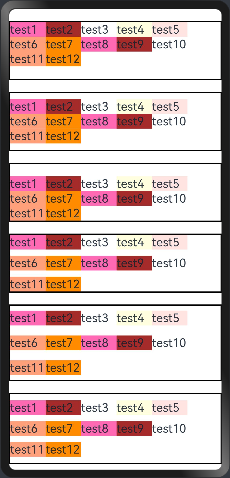
2.2.5.alignContent
alignContent:当交叉轴有额外的空间时,多行内容的对齐方式。该属性仅在 wrap 属性为 Wrap 或者 WrapReverse 时才生效, FlexAlign 定义了以下 6 种对齐方式:
| 名称 | 描述 |
|---|---|
| Start | 元素在主轴方向首端对齐,第一个元素与行首对齐,同时后续的元素与前一个对齐。 |
| Center | 元素在主轴方向中心对齐,第一个元素与行首的距离与最后一个元素与行尾距离相同。 |
| End | 元素在主轴方向尾部对齐,最后一个元素与行尾对齐,其他元素与后一个对齐。 |
| SpaceBetween | Flex主轴方向均匀分配弹性元素,相邻元素之间距离相同。第一个元素与行首对齐,最后一个元素与行尾对齐。 |
| SpaceAround | Flex主轴方向均匀分配弹性元素,相邻元素之间距离相同。第一个元素到行首的距离和最后一个元素到行尾的距离是相邻元素之间距离的一半。 |
| SpaceEvenly | Flex主轴方向均匀分配弹性元素,相邻元素之间的距离、第一个元素与行首的间距、最后一个元素到行尾的间距都完全一样。 |
案例代码如下:
@Entry
@Component
struct FlexExample02 {build() {Column({space:20}){//Start(默认值):设置子组件在交叉轴(纵轴)方向首部对齐。Flex({direction:FlexDirection.Row, wrap: FlexWrap.Wrap, alignContent:FlexAlign.Start}){Text("test1").fontSize(20).backgroundColor("#FF69B4").width(60).height(25)Text("test2").fontSize(20).backgroundColor("#A52A2A").width(60).height(25)Text("test3").fontSize(20).backgroundColor("#FFFFFF").width(60).height(25)Text("test4").fontSize(20).backgroundColor("#FFFFE0").width(60).height(25)Text("test5").fontSize(20).backgroundColor("#FFE4E1").width(60).height(25)Text("test6").fontSize(20).backgroundColor("#FFA07A").width(60).height(25)Text("test7").fontSize(20).backgroundColor("#FF8C00").width(60).height(25)Text("test8").fontSize(20).backgroundColor("#FF69B4").width(60).height(25)Text("test9").fontSize(20).backgroundColor("#A52A2A").width(60).height(25)Text("test10").fontSize(20).backgroundColor("#FFFFFF").width(60).height(25)Text("test11").fontSize(20).backgroundColor("#FFA07A").width(60).height(25)Text("test12").fontSize(20).backgroundColor("#FF8C00").width(60).height(25)}.borderWidth(2).width("100%").height(100)//Center:设置子组件在交叉轴(纵轴)方向居中对齐。Flex({direction:FlexDirection.Row, wrap: FlexWrap.Wrap,alignContent:FlexAlign.Center}){Text("test1").fontSize(20).backgroundColor("#FF69B4").width(60).height(25)Text("test2").fontSize(20).backgroundColor("#A52A2A").width(60).height(25)Text("test3").fontSize(20).backgroundColor("#FFFFFF").width(60).height(25)Text("test4").fontSize(20).backgroundColor("#FFFFE0").width(60).height(25)Text("test5").fontSize(20).backgroundColor("#FFE4E1").width(60).height(25)Text("test6").fontSize(20).backgroundColor("#FFA07A").width(60).height(25)Text("test7").fontSize(20).backgroundColor("#FF8C00").width(60).height(25)Text("test8").fontSize(20).backgroundColor("#FF69B4").width(60).height(25)Text("test9").fontSize(20).backgroundColor("#A52A2A").width(60).height(25)Text("test10").fontSize(20).backgroundColor("#FFFFFF").width(60).height(25)Text("test11").fontSize(20).backgroundColor("#FFA07A").width(60).height(25)Text("test12").fontSize(20).backgroundColor("#FF8C00").width(60).height(25)}.borderWidth(2).width("100%").height(100)//End:设置子组件在交叉轴(纵轴)方向尾部对齐。Flex({direction:FlexDirection.Row, wrap: FlexWrap.Wrap,alignContent:FlexAlign.End}){Text("test1").fontSize(20).backgroundColor("#FF69B4").width(60).height(25)Text("test2").fontSize(20).backgroundColor("#A52A2A").width(60).height(25)Text("test3").fontSize(20).backgroundColor("#FFFFFF").width(60).height(25)Text("test4").fontSize(20).backgroundColor("#FFFFE0").width(60).height(25)Text("test5").fontSize(20).backgroundColor("#FFE4E1").width(60).height(25)Text("test6").fontSize(20).backgroundColor("#FFA07A").width(60).height(25)Text("test7").fontSize(20).backgroundColor("#FF8C00").width(60).height(25)Text("test8").fontSize(20).backgroundColor("#FF69B4").width(60).height(25)Text("test9").fontSize(20).backgroundColor("#A52A2A").width(60).height(25)Text("test10").fontSize(20).backgroundColor("#FFFFFF").width(60).height(25)Text("test11").fontSize(20).backgroundColor("#FFA07A").width(60).height(25)Text("test12").fontSize(20).backgroundColor("#FF8C00").width(60).height(25)}.borderWidth(2).width("100%").height(100)//SpaceBetween:设置子组件在交叉轴(纵轴)方向等间距布局。Flex({direction:FlexDirection.Row, wrap: FlexWrap.Wrap,alignContent:FlexAlign.SpaceBetween}){Text("test1").fontSize(20).backgroundColor("#FF69B4").width(60).height(25)Text("test2").fontSize(20).backgroundColor("#A52A2A").width(60).height(25)Text("test3").fontSize(20).backgroundColor("#FFFFFF").width(60).height(25)Text("test4").fontSize(20).backgroundColor("#FFFFE0").width(60).height(25)Text("test5").fontSize(20).backgroundColor("#FFE4E1").width(60).height(25)Text("test6").fontSize(20).backgroundColor("#FFA07A").width(60).height(25)Text("test7").fontSize(20).backgroundColor("#FF8C00").width(60).height(25)Text("test8").fontSize(20).backgroundColor("#FF69B4").width(60).height(25)Text("test9").fontSize(20).backgroundColor("#A52A2A").width(60).height(25)Text("test10").fontSize(20).backgroundColor("#FFFFFF").width(60).height(25)Text("test11").fontSize(20).backgroundColor("#FFA07A").width(60).height(25)Text("test12").fontSize(20).backgroundColor("#FF8C00").width(60).height(25)}.borderWidth(2).width("100%").height(100)//SpaceAround:设置子组件在交叉轴(纵轴)方向间距布局,并且首尾子组件到 Flex 的间距是子组件间距的一半。Flex({direction:FlexDirection.Row, wrap: FlexWrap.Wrap,alignContent:FlexAlign.SpaceAround}){Text("test1").fontSize(20).backgroundColor("#FF69B4").width(60).height(25)Text("test2").fontSize(20).backgroundColor("#A52A2A").width(60).height(25)Text("test3").fontSize(20).backgroundColor("#FFFFFF").width(60).height(25)Text("test4").fontSize(20).backgroundColor("#FFFFE0").width(60).height(25)Text("test5").fontSize(20).backgroundColor("#FFE4E1").width(60).height(25)Text("test6").fontSize(20).backgroundColor("#FFA07A").width(60).height(25)Text("test7").fontSize(20).backgroundColor("#FF8C00").width(60).height(25)Text("test8").fontSize(20).backgroundColor("#FF69B4").width(60).height(25)Text("test9").fontSize(20).backgroundColor("#A52A2A").width(60).height(25)Text("test10").fontSize(20).backgroundColor("#FFFFFF").width(60).height(25)Text("test11").fontSize(20).backgroundColor("#FFA07A").width(60).height(25)Text("test12").fontSize(20).backgroundColor("#FF8C00").width(60).height(25)}.borderWidth(2).width("100%").height(130)//SpaceEvenly:设置子组件在交叉轴(纵轴)方向等间距布局,并且首尾子组件到 Flex 的间距子组件之间的间距都相等。Flex({direction:FlexDirection.Row, wrap: FlexWrap.Wrap,alignContent:FlexAlign.SpaceEvenly}){Text("test1").fontSize(20).backgroundColor("#FF69B4").width(60).height(25)Text("test2").fontSize(20).backgroundColor("#A52A2A").width(60).height(25)Text("test3").fontSize(20).backgroundColor("#FFFFFF").width(60).height(25)Text("test4").fontSize(20).backgroundColor("#FFFFE0").width(60).height(25)Text("test5").fontSize(20).backgroundColor("#FFE4E1").width(60).height(25)Text("test6").fontSize(20).backgroundColor("#FFA07A").width(60).height(25)Text("test7").fontSize(20).backgroundColor("#FF8C00").width(60).height(25)Text("test8").fontSize(20).backgroundColor("#FF69B4").width(60).height(25)Text("test9").fontSize(20).backgroundColor("#A52A2A").width(60).height(25)Text("test10").fontSize(20).backgroundColor("#FFFFFF").width(60).height(25)Text("test11").fontSize(20).backgroundColor("#FFA07A").width(60).height(25)Text("test12").fontSize(20).backgroundColor("#FF8C00").width(60).height(25)}.borderWidth(2).width("100%").height(120)}.width("100%").height("100%").padding({top:20, bottom:20})}
}
预览结果如下: