一. 内容简介
qml中toolbox控件、ComboBox控件、PlainText实现及美化
二. 软件环境
2.1vsCode
2.2Anaconda
version: conda 22.9.0
2.3pytorch
安装pytorch(http://t.csdnimg.cn/GVP23)
2.4QT 5.14.1
新版QT6.4,,6.5在线安装经常失败,而5.9版本又无法编译64位程序,所以就采用5.14.1这个用的比较多也比较稳定的一个版本。
QT编译器采用的是MSVC2017 64bit。
链接:https://pan.baidu.com/s/1ER98DPAkTUPlIyCC6osNNQ?pwd=1234
三.主要流程
3.1 toolbox代码
下面是toollbox代码,没有每页的内容,代码如下,图片就是图标图片,位置都留好了,只换图就可可以了,可以上网自己下载
使用代码
ToolBox{Layout.preferredWidth: 300 - 16Layout.leftMargin: 8Layout.preferredHeight: 600
}
实现代码,里面每个页面我都单独创建一个qml文件写的,如果想在一个文件里面写的话,就是我注释的那个代码,换成那个就可以了
import QtQuick 2.12
import QtQuick.Window 2.12
import QtQuick.Controls 2.5
import QtQuick.Layouts 1.3// 这玩意是播放用的
import QtMultimedia 5.12
import Qt.labs.settings 1.1
import QtQuick.Layouts 1.3Rectangle{ListView {// 禁止滚动,固定位置interactive: falseid: listViewanchors.fill: parentheight: 400clip: truespacing: 0model: ListModel {ListElement { name: "     粒子群算法参数设置"; module: "Module1" }ListElement { name: "     优化结果选取"; module: "Module2" }ListElement { name: "     动压轴承性能计算"; module: "Module3" }// Add more items as needed}Component.onCompleted: {// 执行一些操作var currentItem = listView.contentItem.children[0];currentItem.children[0].children[1].visible = true;// 其他操作...}delegate:Rectangle {width: listView.widthheight: content.visible ? 500:40clip: trueColumnLayout{anchors.fill: parentspacing: 0Rectangle {Layout.preferredWidth: parent.widthLayout.preferredHeight: 40color: listView.currentIndex === index ? "#eff0ff" : "white"radius: 8 // 设置圆角半径为 10clip: trueText {anchors.fill: parenttext: model.namefont.pixelSize: 14 // 设置字体大小为 14 像素font.family: "Arial" // 设置字体样式为 ArialhorizontalAlignment: Text.AlignLeft // 水平左对齐verticalAlignment: Text.AlignVCenter // 垂直居中对齐color: listView.currentIndex === index ? "#646cff" : "#333333"}Rectangle {anchors.right: parent.rightanchors.verticalCenter: parent.verticalCenteranchors.rightMargin: 20 // 向左偏移 20 个像素width: 24height: 24color: listView.currentIndex === index ? "#eff0ff" : "white"Image {anchors.centerIn: parentsource: listView.currentIndex === index ? "images/down.png" : "images/right.png"width: 16height: 16}}MouseArea {anchors.fill: parentonClicked: {for (var i = 0; i <= listView.count; ++i) {var currentItem = listView.contentItem.children[i];if (currentItem && currentItem.children.length > 0) {if( listView.currentIndex == index){continue;}currentItem.children[0].children[1].visible = false;}}listView.currentIndex = index;content.visible = !content.visible;// console.log(content.visible);// console.log("点击了");// Handle item click event// Handle item click event}}}Rectangle{id: contentLayout.preferredWidth: parent.widthLayout.preferredHeight: 460visible: false// 在上面已经给定大小了Loader{id: loadervisible: trueanchors.fill: parent
//                        sourceComponent: {
//                            if (model.module === "module1") {
//                                return module1;
//                            } else if (model.module === "module2") {
//                                return module2;
//                            } else if (model.module === "module3") {
//                                return module3;
//                            }
//                            // Add more conditions as needed
//                        }source: model.module+".qml"}}}}}
}
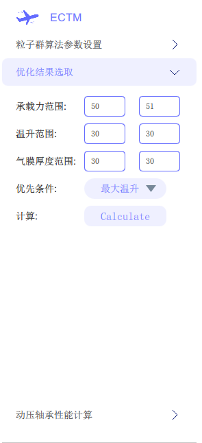
3.2 页面代码Module2.qml
ComboBox的样式在这个页面里面
import QtQuick 2.12
import QtQuick.Window 2.12
import QtQuick.Controls 2.5
import QtQuick.Layouts 1.3// 这玩意是播放用的
import QtMultimedia 5.12
import Qt.labs.settings 1.1
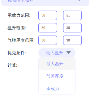
import QtQuick.Layouts 1.3Rectangle{id:module2clip: trueanchors.fill: parent// 第一个-----------------------------------------------------------// 第1个-----------------------------------------------------------// 第一个-----------------------------------------------------------Rectangle{clip: truewidth: parent.widthheight: 40anchors.left: parent.leftanchors.leftMargin: 20anchors.top: parent.topanchors.topMargin: 10Rectangle{clip: truewidth: 100height: 40anchors.left: parent.leftText {anchors.fill: parenttext: qsTr("承载力范围:")font.pixelSize: 14 // 设置字体大小为 14 像素font.family: "Arial" // 设置字体样式为 ArialhorizontalAlignment: Text.AlignLeft // 水平左对齐verticalAlignment: Text.AlignVCenter // 垂直居中对齐}}// 输入框Rectangle{clip: truewidth: 60height:30anchors.left: parent.leftanchors.leftMargin: 100anchors.verticalCenter: parent.verticalCenterTextField{id: ffminanchors.fill: parenttext: "50" // 设置默认值placeholderText: qsTr("下限")background: Rectangle {border.color: "#646cff" // 设置边框颜色radius: 5}}}Rectangle{clip: truewidth: 60height:30anchors.left: parent.leftanchors.leftMargin: 180anchors.verticalCenter: parent.verticalCenterTextField{id: ffmaxanchors.fill: parenttext: "51" // 设置默认值placeholderText: qsTr("上限")background: Rectangle {border.color: "#646cff" // 设置边框颜色radius: 5}}}}// 第二个-----------------------------------------------------------Rectangle{clip: truewidth: parent.widthheight: 40anchors.left: parent.leftanchors.leftMargin: 20anchors.top: parent.topanchors.topMargin: 10 + 40 * 1Rectangle{clip: truewidth: 100height: 40anchors.left: parent.leftText {anchors.fill: parenttext: qsTr("温升范围:")font.pixelSize: 14 // 设置字体大小为 14 像素font.family: "Arial" // 设置字体样式为 ArialhorizontalAlignment: Text.AlignLeft // 水平左对齐verticalAlignment: Text.AlignVCenter // 垂直居中对齐}}// 输入框Rectangle{clip: truewidth: 60height:30anchors.left: parent.leftanchors.leftMargin: 100anchors.verticalCenter: parent.verticalCenterTextField{id: ttminanchors.fill: parenttext: "30" // 设置默认值placeholderText: qsTr("下限")background: Rectangle {border.color: "#646cff" // 设置边框颜色radius: 5}}}Rectangle{clip: truewidth: 60height:30anchors.left: parent.leftanchors.leftMargin: 180anchors.verticalCenter: parent.verticalCenterTextField{id: ttmaxanchors.fill: parenttext: "30" // 设置默认值placeholderText: qsTr("上限")background: Rectangle {border.color: "#646cff" // 设置边框颜色radius: 5}}}}// 第三个-----------------------------------------------------------Rectangle{clip: truewidth: parent.widthheight: 40anchors.left: parent.leftanchors.leftMargin: 20anchors.top: parent.topanchors.topMargin: 10 + 40 * 2Rectangle{clip: truewidth: 100height: 40anchors.left: parent.leftText {anchors.fill: parenttext: qsTr("气膜厚度范围:")font.pixelSize: 14 // 设置字体大小为 14 像素font.family: "Arial" // 设置字体样式为 ArialhorizontalAlignment: Text.AlignLeft // 水平左对齐verticalAlignment: Text.AlignVCenter // 垂直居中对齐}}// 输入框Rectangle{clip: truewidth: 60height:30anchors.left: parent.leftanchors.leftMargin: 100anchors.verticalCenter: parent.verticalCenterTextField{id: hhminanchors.fill: parenttext: "30" // 设置默认值placeholderText: qsTr("下限")background: Rectangle {border.color: "#646cff" // 设置边框颜色radius: 5}}}Rectangle{clip: truewidth: 60height:30anchors.left: parent.leftanchors.leftMargin: 180anchors.verticalCenter: parent.verticalCenterTextField{id: hhmaxanchors.fill: parenttext: "30" // 设置默认值placeholderText: qsTr("上限")background: Rectangle {border.color: "#646cff" // 设置边框颜色radius: 5}}}}// 第4个-----------------------------------------------------------Rectangle{clip: truewidth: parent.widthheight: 40anchors.left: parent.leftanchors.leftMargin: 20anchors.top: parent.topanchors.topMargin: 10 + 40*3Rectangle{clip: truewidth: 100height: 40anchors.left: parent.leftText {anchors.fill: parenttext: qsTr("优先条件:")font.pixelSize: 14 // 设置字体大小为 14 像素font.family: "Arial" // 设置字体样式为 ArialhorizontalAlignment: Text.AlignLeft // 水平左对齐verticalAlignment: Text.AlignVCenter // 垂直居中对齐}}// 按钮Rectangle{clip: truewidth: 120height:30anchors.left: parent.leftanchors.leftMargin: 100anchors.verticalCenter: parent.verticalCenterradius: 20ComboBox{id:controlanchors.fill:parentanchors.centerIn: parentfont.pixelSize:18// font{// pixelSize: 12 // 设置字体大小为 14 像素// family: "Arial" // 设置字体样式为 Arial// }contentItem:Text{leftPadding: 24id:showtexttext:control.model.get(0).mText// color:"#646cff"color:"#646cff"// font.pixelSize: 10 // 设置字体大小为 14 像素
// font: control.fontelide: Text.ElideRightverticalAlignment: Text.AlignVCenterfont.pixelSize: 14 // 设置字体大小为 14 像素}onActivated: {// 用户选择后更改显示文本项的颜色showtext.text = control.currentText; // 设置选中项的字体颜色为红色}//指定combobox的外形(椭圆)background:Rectangle{implicitWidth: 200implicitHeight: 40color:"#eff0ff"radius: 20}//添加数据model:ListModel{ListElement{mText:"最大温升"}ListElement{mText:"气膜厚度"}ListElement{mText:"承载力"}}// contentItem: Text {// id: displayText// color: "black" // 设置默认的字体颜色为黑色// }//指定每一个数据项的展现形式delegate:ItemDelegate{width: control.widthcontentItem: Text{text:mText// color:"#646cff"color:"#646cff"// font.pixelSize: 10 // 设置字体大小为 14 像素
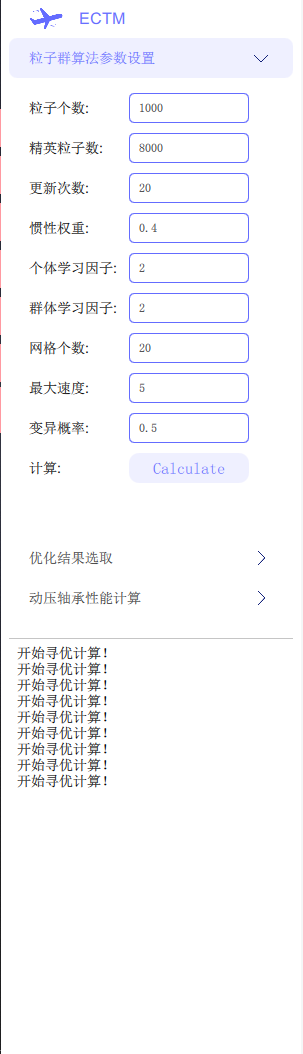
// font: control.fontelide: Text.ElideRightverticalAlignment: Text.AlignVCenterfont.pixelSize: 14 // 设置字体大小为 14 像素leftPadding: 12}//指定高亮显示highlighted: control.highlightedIndex === index}//设计右侧的小图标的样式indicator: Canvas {id: canvasx: control.width - width - control.rightPaddingy: control.topPadding + (control.availableHeight - height) / 2width: 15height: 10contextType: "2d"Connections {target: controlfunction onPressedChanged() { canvas.requestPaint(); }}onPaint: {context.reset();context.moveTo(0, 0);context.lineTo(width, 0);context.lineTo(width / 2, height);context.closePath();context.fillStyle = control.pressed ? "#d3d3d3" : "#778899";context.fill();}}//设计弹出框的样式(点击下拉按钮后的弹出框)popup: Popup {y: control.height - 1width: control.widthimplicitHeight: contentItem.implicitHeightpadding: 1//弹出框以listview的形式呈现contentItem: ListView {clip: trueimplicitHeight: contentHeightmodel: control.popup.visible ? control.delegateModel : nullcurrentIndex: control.highlightedIndexScrollIndicator.vertical: ScrollIndicator { }}//设计弹出框的外观background: Rectangle {border.color: "#eff0ff"radius: 10}}}}}// 第5个-----------------------------------------------------------Rectangle{clip: truewidth: parent.widthheight: 40anchors.left: parent.leftanchors.leftMargin: 20anchors.top: parent.topanchors.topMargin: 10 + 40 * 4Rectangle{clip: truewidth: 100height: 40anchors.left: parent.leftText {anchors.fill: parenttext: qsTr("计算:")font.pixelSize: 14 // 设置字体大小为 14 像素font.family: "Arial" // 设置字体样式为 ArialhorizontalAlignment: Text.AlignLeft // 水平左对齐verticalAlignment: Text.AlignVCenter // 垂直居中对齐}}// 按钮Rectangle{clip: truewidth: 120height:30anchors.left: parent.leftanchors.leftMargin: 100anchors.verticalCenter: parent.verticalCenterButton {text: "Calculate"anchors.fill: parentanchors.centerIn: parentonClicked: {texttt.words += "开始寻优计算!\n"}onPressed: bg.color="white"onReleased: bg.color="#eff0ff"background: Rectangle {id: bgcolor: "#eff0ff"radius: 10 // 圆角半径}contentItem: Text {text: "Calculate"font.pixelSize: 16color: "#646cff" // 文本颜色verticalAlignment: Text.AlignVCenterhorizontalAlignment: Text.AlignHCenter}}}}}3.3 PlainText.qml代码
import QtQuick 2.12
import QtQuick.Window 2.12
import QtQuick.Controls 2.5
import QtQuick.Layouts 1.3// 这玩意是播放用的
import QtMultimedia 5.12
import Qt.labs.settings 1.1
import QtQuick.Layouts 1.3Rectangle{id: ccccproperty string words: ""clip: trueRectangle{anchors.top: parent.topwidth: parent.widthheight: 1color: "#c5c5c5"}//    ScrollView {//         anchors.fill: parent//    TextEdit {//        id: textEdit//        width:parent.width//        height:parent.height - 4//        anchors.top: parent.top//        anchors.topMargin: 4 //  上面间距为20 个像素//        wrapMode: TextEdit.Wrap//        font.pixelSize: 14//        text: parent.words//    }}//  内容自动下移动Flickable {id: flickablewidth: parent.widthheight: parent.height - 4contentWidth: textEdit.widthcontentHeight: textEdit.contentHeightclip: truecontentY: textEdit.contentHeight <= height ? 0 : textEdit.contentHeight - heightboundsBehavior: Flickable.StopAtBounds // 禁用回弹效果TextEdit {id: textEditheight:parent.height - 8anchors.top: parent.topanchors.topMargin: 8 //  上面间距为20 个像素anchors.left: parent.leftanchors.leftMargin: 8//  上面间距为20 个像素wrapMode: TextEdit.NoWrapfont.pixelSize: 14text: cccc.words}}}
3.4 效果
四.参考
http://t.csdnimg.cn/2jfvK
http://t.csdnimg.cn/ks0Aj