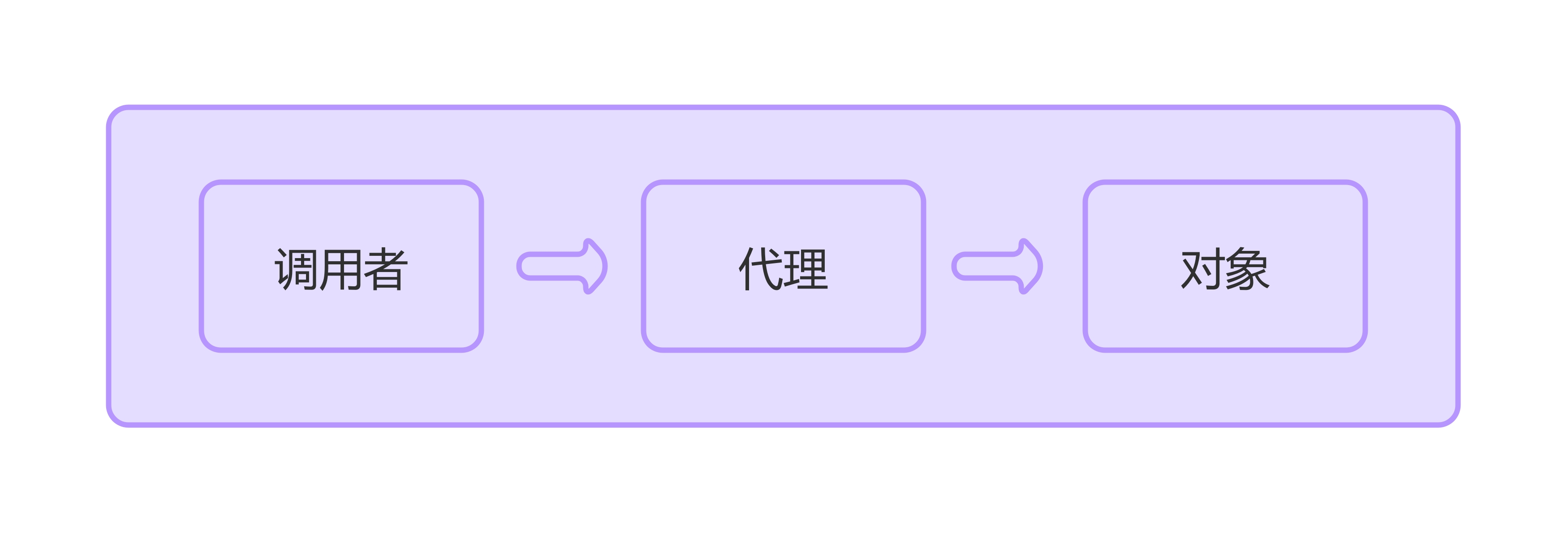
🚀 What .container actually does:
• Provides responsive horizontal padding and margins.
• Sets maximum width to keep content centered within the viewport.
✅ How to correctly activate the grid system:
You must explicitly use Bootstrap’s .row and .col-* classes inside the container:
<div class="container"><div class="row"><div class="col-4">Column 1</div><div class="col-4">Column 2</div><div class="col-4">Column 3</div></div>
</div>
✅ Conclusion:
A Bootstrap .container does not automatically apply a grid layout.
You must explicitly use .row and .col-* classes.
