在deepseek中输入:
创建一个vue组件
组件实现button的功能
预设4种颜色,分别对应:success: 绿色,危险按钮:红色,警告按钮:橘色,信息按钮:灰色
预设几个带icon的按钮,分别是:搜索,确定,取消,删除,上一页,下一页,分享,编辑
需要让调用该组件是可以自定义一些属性:尺寸,是否圆角,是否禁用,是否有icon
deepseek返回的代码:
首先是组件的代码:
<template><buttonclass="custom-button":class="[
      typeClass,sizeClass,{ 'is-round': isRound },{ 'has-icon': icon }]"
    :disabled="disabled"@click="handleClick"><span v-if="icon" class="icon-wrapper"><svgv-if="iconType"class="button-icon"viewBox="0 0 24 24":style="{ width: iconSize, height: iconSize }"><path :d="currentIcon" /></svg></span><span class="button-content"><slot></slot></span></button>
</template><script setup>
import { defineProps, computed } from 'vue'const props = defineProps({type: {type: String,default: 'default',validator: (value) => ['success','danger','warning','info','default'].includes(value)},size: {type: String,default: 'medium',validator: (value) => ['small', 'medium', 'large'].includes(value)},isRound: {type: Boolean,default: false},disabled: {type: Boolean,default: false},icon: {type: String,validator: (value) => ['search','confirm','cancel','delete','prev','next','share','edit'].includes(value)}
})// 图标映射表
const iconMap = {search: 'M15.5 14h-.79l-.28-.27C15.41 12.59 16 11.11 16 9.5 16 5.91 13.09 3 9.5 3S3 5.91 3 9.5 5.91 16 9.5 16c1.61 0 3.09-.59 4.23-1.57l.27.28v.79l5 4.99L20.49 19l-4.99-5zm-6 0C7.01 14 5 11.99 5 9.5S7.01 5 9.5 5 14 7.01 14 9.5 11.99 14 9.5 14z',confirm: 'M9 16.17L4.83 12l-1.42 1.41L9 19 21 7l-1.41-1.41L9 16.17z',cancel: 'M19 6.41L17.59 5 12 10.59 6.41 5 5 6.41 10.59 12 5 17.59 6.41 19 12 13.41 17.59 19 19 17.59 13.41 12 19 6.41z',delete: 'M6 19c0 1.1.9 2 2 2h8c1.1 0 2-.9 2-2V7H6v12zM19 4h-3.5l-1-1h-5l-1 1H5v2h14V4z',prev: 'M15.41 16.59L10.83 12l4.58-4.59L14 6l-6 6 6 6 1.41-1.41z',next: 'M8.59 16.59L13.17 12 8.59 7.41 10 6l6 6-6 6-1.41-1.41z',share: 'M18 16.08c-.76 0-1.44.3-1.96.77L8.91 12.7c.05-.23.09-.46.09-.7s-.04-.47-.09-.7l7.05-4.11c.54.5 1.25.81 2.04.81 1.66 0 3-1.34 3-3s-1.34-3-3-3-3 1.34-3 3c0 .24.04.47.09.7L8.04 9.81C7.5 9.31 6.79 9 6 9c-1.66 0-3 1.34-3 3s1.34 3 3 3c.79 0 1.5-.31 2.04-.81l7.12 4.16c-.05.21-.08.43-.08.65 0 1.61 1.31 2.92 2.92 2.92s2.92-1.31 2.92-2.92c0-1.61-1.31-2.92-2.92-2.92zM18 4c.55 0 1 .45 1 1s-.45 1-1 1-1-.45-1-1 .45-1 1-1zM6 13c-.55 0-1-.45-1-1s.45-1 1-1 1 .45 1 1-.45 1-1 1zm12 7.02c-.55 0-1-.45-1-1s.45-1 1-1 1 .45 1 1-.45 1-1 1z',edit: 'M3 17.25V21h3.75L17.81 9.94l-3.75-3.75L3 17.25zM20.71 7.04c.39-.39.39-1.02 0-1.41l-2.34-2.34a.9959.9959 0 0 0-1.41 0l-1.83 1.83 3.75 3.75 1.83-1.83z'
}// 计算属性
const typeClass = computed(() => `button-${props.type}`)
const sizeClass = computed(() => `button-${props.size}`)
const iconSize = computed(() => {return {small: '14px',medium: '16px',large: '18px'}[props.size]
})
const currentIcon = computed(() => iconMap[props.icon] || '')
</script><style scoped>
.custom-button {display: inline-flex;align-items: center;justify-content: center;padding: 8px 16px;font-size: 14px;border: 1px solid #ddd;border-radius: 4px;cursor: pointer;transition: all 0.3s ease;
}/* 颜色类型 */
.button-success {background-color: #67c23a;color: white;
}
.button-danger {background-color: #f56c6c;color: white;
}
.button-warning {background-color: #e6a23c;color: white;
}
.button-info {background-color: #909399;color: white;
}/* 尺寸 */
.button-small {padding: 6px 12px;font-size: 12px;
}
.button-medium {padding: 8px 16px;font-size: 14px;
}
.button-large {padding: 10px 20px;font-size: 16px;
}/* 圆角 */
.is-round {border-radius: 20px;
}/* 禁用状态 */
.custom-button:disabled {opacity: 0.6;cursor: not-allowed;
}/* 图标相关 */
.has-icon {gap: 6px;
}
.button-icon {fill: currentColor;
}
</style>
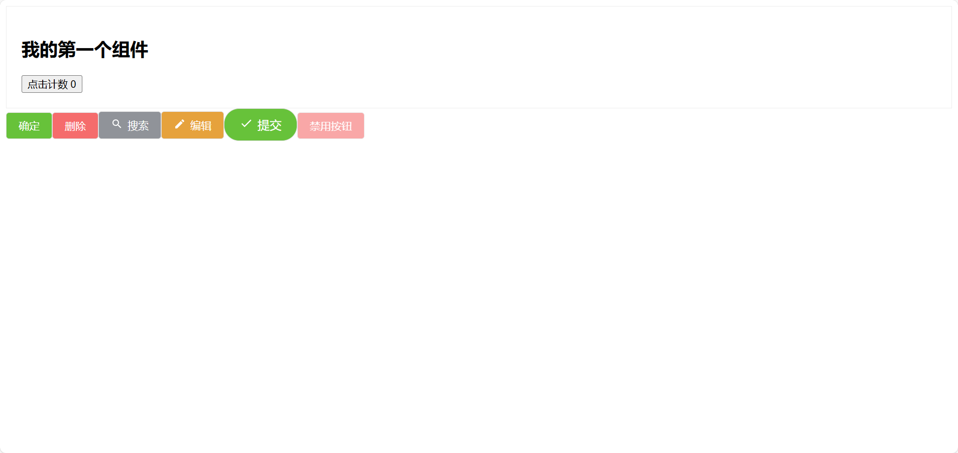
然后deepseek还返回了一个组件的引用代码
<template><div><!-- 基础按钮 --><CustomButton type="success">确定</CustomButton><CustomButton type="danger">删除</CustomButton><!-- 带图标按钮 --><CustomButton type="info" icon="search">搜索</CustomButton><CustomButton type="warning" icon="edit">编辑</CustomButton><!-- 自定义属性 --><CustomButton type="success" size="large" :isRound="true" icon="confirm">提交</CustomButton><!-- 禁用状态 --><CustomButton type="danger" :disabled="true">禁用按钮</CustomButton></div>
</template><script setup>
import CustomButton from './components/CustomButton.vue'
</script>
当然我们需要对代码进行一些修改,比如组件名我们可以重命名一下
然后也有一些bug
比如icon的显示,这里引用一个我们不曾定义的iconType在if语句里(v-if="iconType"),简单的处理就是我们可以把这句删除
<svgv-if="iconType"class="button-icon"viewBox="0 0 24 24":style="{ width: iconSize, height: iconSize }"><path :d="currentIcon" /></svg>
然后运行,我们就可以看到deepseek给我们写的这个组件了