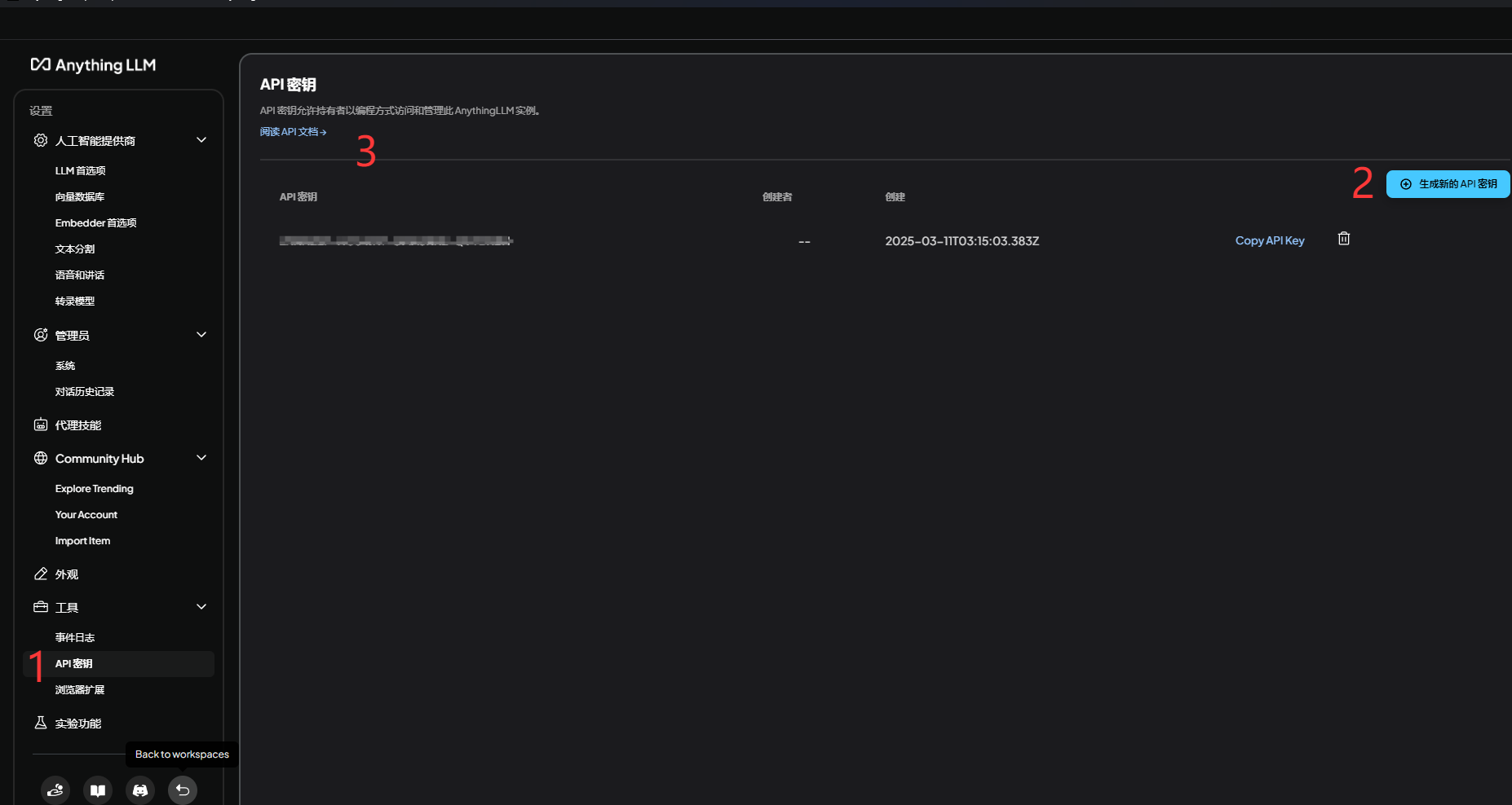
001、
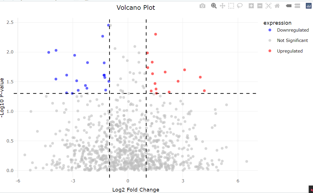
# 生成随机数据
set.seed(123)  # 设置种子以便结果可重复
genes <- paste("Gene", 1:1000)  # 基因名称
logFC <- rnorm(1000, mean = 0, sd = 2)  # log2 fold change,均值为0,标准差为2的正态分布
pvalue <- runif(1000, min = 0, max = 1)  # p值,0到1之间的均匀分布
genes
logFC
pvalue
# 创建数据框
data <- data.frame(genes = genes, logFC = logFC, pvalue = pvalue)
head(data)# 添加一列来标记显著性
data$significant <- ifelse(abs(data$logFC) > 1 & data$pvalue < 0.05, "Significant", "Not Significant")
head(data)
# 绘制火山图
ggplot(data, aes(x = logFC, y = -log10(pvalue), color = significant)) +geom_point(alpha = 0.6, size = 1.5) +  # 绘制散点,alpha控制透明度,size控制点的大小scale_color_manual(values = c("grey", "red")) +  # 自定义颜色,显著基因用红色theme_minimal() +  # 使用简单的主题风格labs(title = "Volcano Plot", x = "Log2 Fold Change", y = "-Log10 P-value") +  # 添加标题和轴标签theme(plot.title = element_text(hjust = 0.5))  # 将标题居中ggplot(data, aes(x = logFC, y = -log10(pvalue), color = significant)) +geom_point(alpha = 0.6, size = 1.5) +scale_color_manual(values = c("grey", "red")) +theme_minimal() +labs(title = "Volcano Plot", x = "Log2 Fold Change", y = "-Log10 P-value") +theme(plot.title = element_text(hjust = 0.5)) +geom_vline(xintercept = c(-1, 1), linetype = "dashed", color = "blue") +  # 添加竖线,表示logFC的阈值geom_hline(yintercept = -log10(0.05), linetype = "dashed", color = "blue")  # 添加横线,表示p-value的阈值# 根据logFC和p-value进一步分类
data$expression <- ifelse(data$logFC > 1 & data$pvalue < 0.05, "Upregulated",ifelse(data$logFC < -1 & data$pvalue < 0.05, "Downregulated", "Not Significant"))# 查看数据框的前几行,确认分类是否正确
head(data)ggplot(data, aes(x = logFC, y = -log10(pvalue), color = expression)) +geom_point(alpha = 0.6, size = 1.5) +  # 绘制散点,透明度和点的大小scale_color_manual(values = c("blue", "grey", "red")) +  # 自定义颜色:下调为蓝色,不显著为灰色,上调为红色theme_minimal() +  # 简洁主题labs(title = "Volcano Plot", x = "Log2 Fold Change", y = "-Log10 P-value") +  # 添加标题和轴标签theme(plot.title = element_text(hjust = 0.5)) +  # 标题居中geom_vline(xintercept = c(-1, 1), linetype = "dashed", color = "black") +  # 添加阈值竖线geom_hline(yintercept = -log10(0.05), linetype = "dashed", color = "black")  # 添加阈值横线# 安装 ggrepel 包
# install.packages("ggrepel")# 加载 ggrepel 包
library(ggrepel)# 只标记显著的上调和下调基因
significant_genes <- data[data$expression != "Not Significant", ]# 绘制带基因标记的火山图
ggplot(data, aes(x = logFC, y = -log10(pvalue), color = expression)) +geom_point(alpha = 0.6, size = 1.5) +scale_color_manual(values = c("blue", "grey", "red")) +theme_minimal() +labs(title = "Volcano Plot", x = "Log2 Fold Change", y = "-Log10 P-value") +theme(plot.title = element_text(hjust = 0.5)) +geom_vline(xintercept = c(-1, 1), linetype = "dashed", color = "black") +geom_hline(yintercept = -log10(0.05), linetype = "dashed", color = "black") +#避免标签重叠的函数,可以让基因名称显得更加清晰。geom_text_repel(data = significant_genes, aes(label = genes), size = 3, box.padding = 0.3, point.padding = 0.3)ggplot(data, aes(x = logFC, y = -log10(pvalue), color = expression)) +geom_point(aes(size = -log10(pvalue), alpha = abs(logFC))) +  # 点的大小和透明度。#size = -log10(pvalue):显著性越高的点越大。#alpha = abs(logFC):log2 fold change 越大,点越不透明。scale_color_manual(values = c("blue", "grey", "red")) +theme_minimal() +labs(title = "Volcano Plot", x = "Log2 Fold Change", y = "-Log10 P-value") +theme(plot.title = element_text(hjust = 0.5)) +geom_vline(xintercept = c(-1, 1), linetype = "dashed", color = "black") +geom_hline(yintercept = -log10(0.05), linetype = "dashed", color = "black")# 为数据添加一个模拟条件列
data$condition <- sample(c("Condition A", "Condition B"), nrow(data), replace = TRUE)ggplot(data, aes(x = logFC, y = -log10(pvalue), color = expression)) +geom_point(alpha = 0.6, size = 1.5) +scale_color_manual(values = c("blue", "grey", "red")) +theme_minimal() +labs(title = "Volcano Plot", x = "Log2 Fold Change", y = "-Log10 P-value") +theme(plot.title = element_text(hjust = 0.5)) +geom_vline(xintercept = c(-1, 1), linetype = "dashed", color = "black") +geom_hline(yintercept = -log10(0.05), linetype = "dashed", color = "black") +facet_wrap(~ condition)  # 按条件分面显示# 安装 plotly 包
# install.packages("plotly")# 加载 plotly 包
library(plotly)p <- ggplot(data, aes(x = logFC, y = -log10(pvalue), color = expression)) +geom_point(alpha = 0.6, size = 1.5) +scale_color_manual(values = c("blue", "grey", "red")) +theme_minimal() +labs(title = "Volcano Plot", x = "Log2 Fold Change", y = "-Log10 P-value") +theme(plot.title = element_text(hjust = 0.5)) +geom_vline(xintercept = c(-1, 1), linetype = "dashed", color = "black") +geom_hline(yintercept = -log10(0.05), linetype = "dashed", color = "black")# 转换为交互式图形
ggplotly(p)
。
source:
01、https://blog.csdn.net/zegeai/article/details/142934945